for (pkg in c("desplot", "emmeans", "ggtext", "here", "MetBrewer",
              "multcomp", "multcompView", "tidyverse")) {
  if (!require(pkg, character.only = TRUE)) install.packages(pkg)
}

library(desplot)
library(emmeans)
library(ggtext)
library(here)
library(MetBrewer)
library(multcomp)
library(multcompView)
library(tidyverse)To install and load all the packages used in this chapter, run the following code:
From one treatment factor to two
In the “Linear Models in Experiments” chapters, every analysis revolved around a single treatment factor: one set of cultivars, varieties or genotypes whose means we wanted to compare. Real experiments, however, often vary two treatment factors at the same time. A classic example is a fertilizer trial in which several genotypes are each grown at several nitrogen levels. We are then interested not only in “which genotype is best?” and “which nitrogen level is best?”, but also in how the two factors work together.
What is an interaction?
With two treatment factors, a new question arises that simply did not exist with a single factor: do the factors act independently, or does the effect of one factor depend on the level of the other? This is the idea of an interaction.
- If nitrogen increases yield by roughly the same amount for every genotype, the two factors act independently (no interaction). We could then describe a general nitrogen effect and a general genotype effect separately.
- If, however, some genotypes respond strongly to nitrogen while others barely react, then the nitrogen effect depends on the genotype. This is an interaction (written
N:G), and it changes how we interpret the results.
Detecting and respecting this interaction is the whole point of a two-way analysis. As we will see, a significant interaction tells us that we should compare the individual factor-level combinations rather than the main effects in isolation.
The design is still an RCBD
The experimental design itself is nothing new: the trial is laid out as a randomized complete block design (RCBD), exactly as in the one-way RCBD chapter. There are three complete blocks (rep), and each of the 24 nitrogen-genotype combinations appears exactly once in every block. The only thing that changes compared to the earlier RCBD chapter is that our treatment is now a factorial combination of two factors instead of a single one.
Data
This dataset is a slightly modified version of a yield (kg/ha) trial originally published in Gomez and Gomez (1984). It crosses 4 genotypes (G) with 6 nitrogen levels (N), giving 24 treatment combinations, each replicated in 3 complete blocks (rep) - 72 plots in total.
Import
Rows: 72 Columns: 6
── Column specification ────────────────────────────────────────────────────────
Delimiter: ","
chr (3): rep, N, G
dbl (3): row, col, yield

ℹ Use `spec()` to retrieve the full column specification for this data.
ℹ Specify the column types or set `show_col_types = FALSE` to quiet this message.
# A tibble: 72 × 6
row col rep N G yield
<dbl> <dbl> <chr> <chr> <chr> <dbl>
1 2 6 rep1 Goomba Simba 4520
2 3 4 rep1 Koopa Simba 5598
3 2 3 rep1 Toad Simba 6192
4 1 1 rep1 Peach Simba 8542
5 2 1 rep1 Diddy Simba 5806
6 3 1 rep1 Yoshi Simba 7470
7 4 5 rep1 Goomba Nala 4034
8 4 1 rep1 Koopa Nala 6682
9 3 2 rep1 Toad Nala 6869
10 1 2 rep1 Peach Nala 6318
# ℹ 62 more rowsThe dataset contains:
-
N: Six nitrogen levels (the first treatment factor) -
G: Four genotypes (the second treatment factor) -
rep: Three complete blocks -
yield: Crop yield in kg/ha -
rowandcol: Field plot coordinates for visualization via desplot
Format
As always, the categorical columns should be encoded as factors. Here this concerns the block (rep) and both treatment factors (N and G):
# A tibble: 72 × 6
     row   col rep   N      G     yield
   <dbl> <dbl> <fct> <fct>  <fct> <dbl>
 1     2     6 rep1  Goomba Simba  4520
 2     3     4 rep1  Koopa  Simba  5598
 3     2     3 rep1  Toad   Simba  6192
 4     1     1 rep1  Peach  Simba  8542
 5     2     1 rep1  Diddy  Simba  5806
 6     3     1 rep1  Yoshi  Simba  7470
 7     4     5 rep1  Goomba Nala   4034
 8     4     1 rep1  Koopa  Nala   6682
 9     3     2 rep1  Toad   Nala   6869
10     1     2 rep1  Peach  Nala   6318
# ℹ 62 more rows
Explore
Let us first summarize yield separately for each treatment factor. This gives a first impression of the two main effects:
# A tibble: 6 × 4
  N      count mean_yield sd_yield
  <fct>  <int>      <dbl>    <dbl>
1 Diddy     12      5866.     832.
2 Toad      12      5864.    1434.
3 Yoshi     12      5812     2349.
4 Peach     12      5797.    2660.
5 Koopa     12      5478.     657.
6 Goomba    12      4054.     672.
# A tibble: 4 × 4
G count mean_yield sd_yield
<fct> <int> <dbl> <dbl>
1 Simba 18 6554. 1475.
2 Nala 18 6156. 1078.
3 Timon 18 5563. 1269.
4 Pumba 18 3642. 1434.These one-factor summaries are useful, but they hide exactly the thing we care about most: whether the nitrogen effect is the same for every genotype. To see that, we need to look at the factor-level combinations. A convenient way to do so is to plot yield against nitrogen and draw one panel (facet) per genotype.
We first define a fixed set of colors for the six nitrogen levels that we will reuse throughout the chapter:
ggplot(data = dat) +
  aes(y = yield, x = N, color = N) +
  facet_wrap(~G, labeller = label_both) +
  stat_summary(
    fun = mean,
    colour = "grey",
    geom = "line",
    linetype = "dotted",
    group = 1
  ) +
  geom_point() +
  scale_x_discrete(name = "Nitrogen") +
  scale_y_continuous(
    name = "Yield",
    limits = c(0, NA),
    expand = expansion(mult = c(0, 0.1))
  ) +
  scale_color_manual(values = Ncolors, guide = "none") +
  theme_bw() +
  theme(axis.text.x = element_text(angle = 45, hjust = 1, vjust = 1))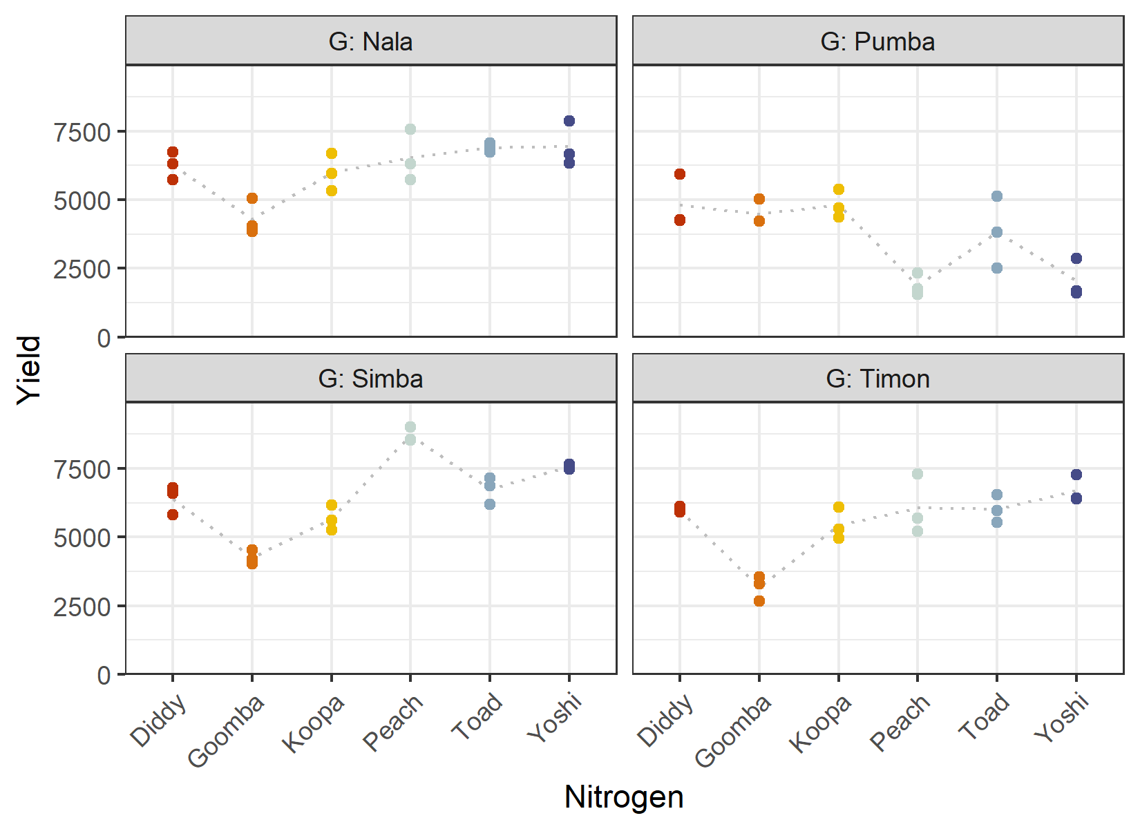
The dotted grey line connects the mean yield per nitrogen level within each genotype. If the factors acted perfectly independently, these profiles would have the same shape in every panel. They clearly do not - the ranking and spacing of the nitrogen levels differ between genotypes. This is a first visual hint of an interaction, which we will test formally in the ANOVA.
Since this is a designed experiment, it also makes sense to look at the field layout. We can do this with desplot() from the {desplot} package. Here we color the genotype labels according to their nitrogen level and draw lines between blocks:
desplot(
  data = dat,
  form = rep ~ col + row | rep, # one panel per block
  col.regions = c("white", "grey95", "grey90"),
  text = G,            # genotype names per plot
  cex = 0.8,           # genotype names: font size
  shorten = "abb",     # genotype names: abbreviate
  col = N,             # color genotype names by nitrogen level
  col.text = Ncolors,  # use the custom nitrogen colors
  out1 = col, out1.gpar = list(col = "darkgrey"), # lines between columns
  out2 = row, out2.gpar = list(col = "darkgrey"), # lines between rows
  main = "Field layout",
  show.key = TRUE,
  key.cex = 0.7
)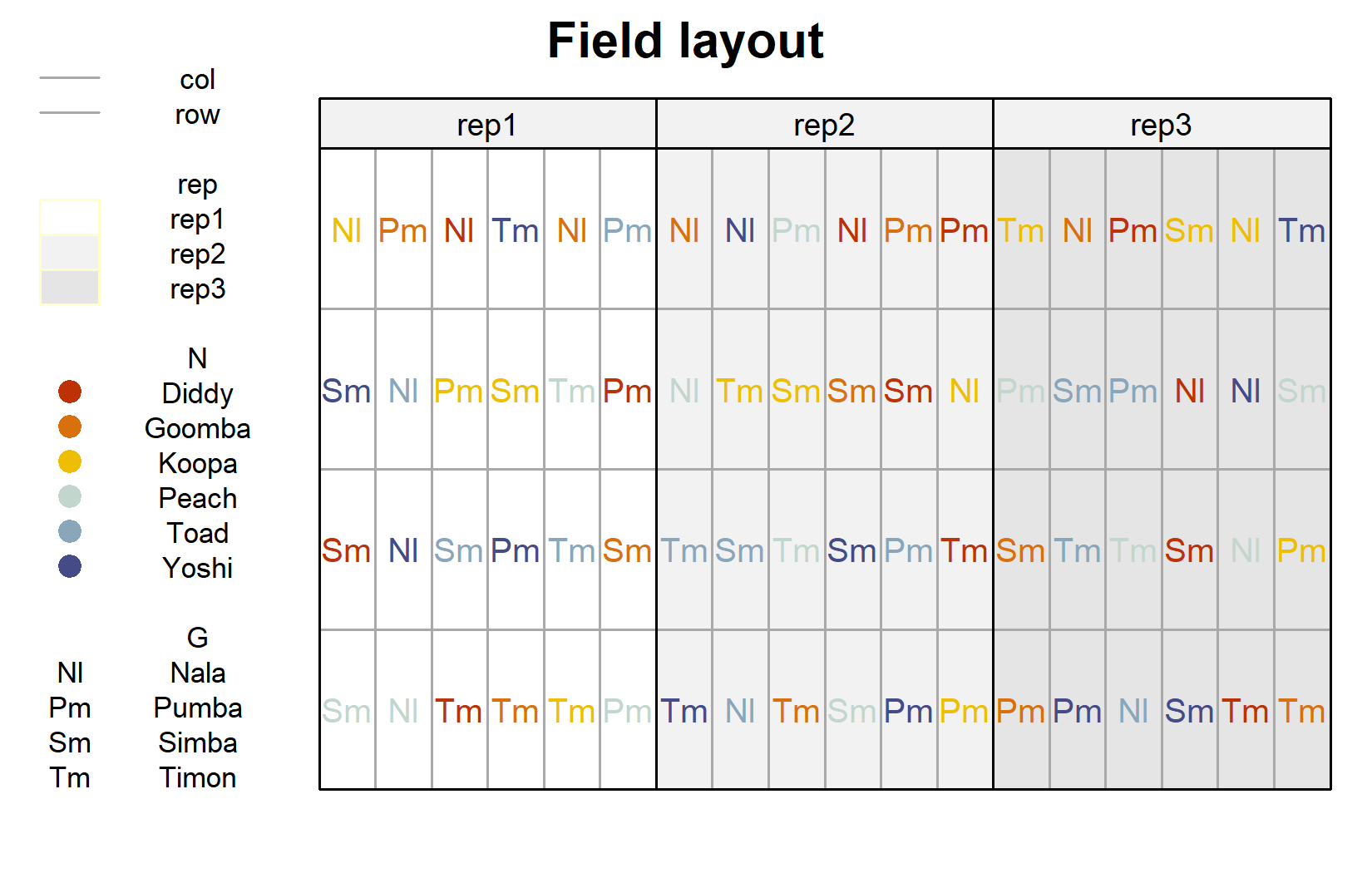
The layout confirms that every nitrogen-genotype combination appears once per block and that the 24 combinations are freshly randomized within each of the three blocks - the defining feature of an RCBD.
Model
We now fit a linear model with yield as the response. It helps to mentally group the model terms into treatment effects and design effects. The treatments here are the genotypes G and the nitrogen levels N, which we include as main effects and through their interaction N:G. The design contributes the block effect rep.
mod <- lm(yield ~ N + G + N:G + rep, data = dat)Compared with the one-way RCBD model yield ~ cultivar + block, the only structural addition is the second treatment factor and the interaction term N:G. Everything else - fitting with lm(), running anova(), obtaining adjusted means with emmeans() - works exactly as before.
WarningModel assumptions met?
It is at this point (i.e. after fitting the model and before interpreting the ANOVA) that one should check whether the model assumptions are met. Find out more in Appendix A1: Model Diagnostics.
ANOVA
Based on our model, we can conduct an ANOVA:
ANOVA <- anova(mod)
ANOVA
Analysis of Variance Table
Response: yield
Df Sum Sq Mean Sq F value Pr(>F)
N 5 30480453 6096091 15.4677 6.509e-09 ***
G 3 89885035 29961678 76.0221 < 2.2e-16 ***
rep 2 1084820 542410 1.3763 0.2627
N:G 15 69378044 4625203 11.7356 4.472e-11 ***
Residuals 46 18129432 394118
---
Signif. codes: 0 '***' 0.001 '**' 0.01 '*' 0.05 '.' 0.1 ' ' 1The ANOVA table now contains a row for each model term, including the interaction N:G. In this trial the interaction is statistically significant (see its p-value in the table above), which confirms the impression from our exploratory plot: the effect of nitrogen is not the same for every genotype.
Important
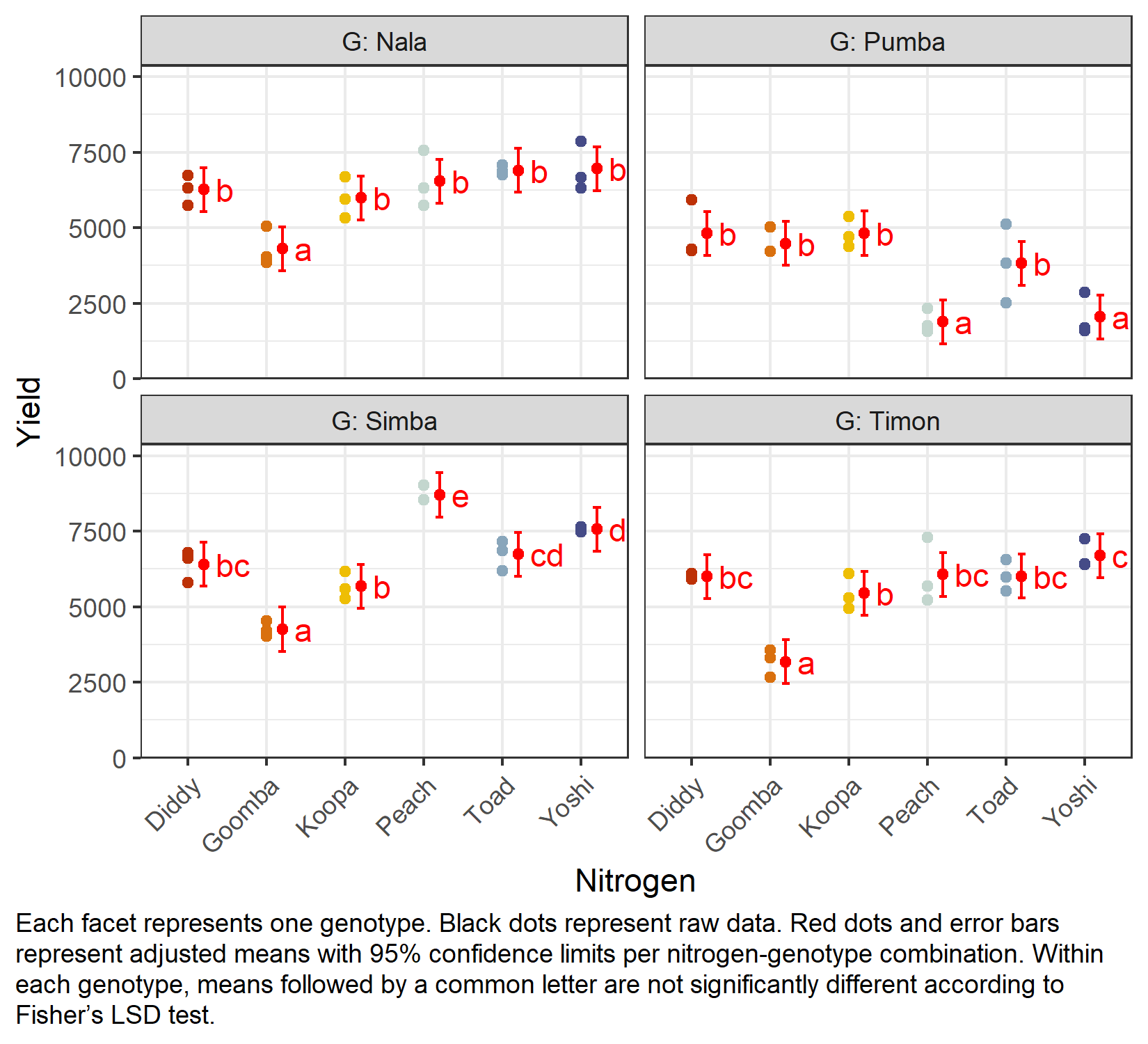
A significant interaction has a direct consequence for interpretation. When N:G is significant, we should not interpret the N and G main effects in isolation, because the effect of one factor depends on the level of the other. Instead, the mean comparison should focus on the individual N:G combinations.
Mean comparison
Because of the significant interaction, we compare adjusted means for the factor-level combinations rather than for the main effects. A natural and readable way to do this is to compare the nitrogen levels within each genotype, which is what specs = ~ N | G requests:
G = Nala:
 N      emmean  SE df lower.CL upper.CL .group
 Goomba   4306 362 46     3576     5036  a
 Koopa    5982 362 46     5252     6712   b
 Diddy    6259 362 46     5529     6989   b
 Peach    6540 362 46     5811     7270   b
 Toad     6895 362 46     6165     7625   b
 Yoshi    6951 362 46     6221     7680   b

G = Pumba:
 N      emmean  SE df lower.CL upper.CL .group
 Peach    1881 362 46     1151     2610  a
 Yoshi    2047 362 46     1317     2776  a
 Toad     3816 362 46     3086     4546   b
 Goomba   4481 362 46     3752     5211   b
 Diddy    4812 362 46     4082     5542   b
 Koopa    4816 362 46     4086     5546   b

G = Simba:
 N      emmean  SE df lower.CL upper.CL .group
 Goomba   4253 362 46     3523     4982  a
 Koopa    5672 362 46     4942     6402   b
 Diddy    6400 362 46     5670     7130   bc
 Toad     6733 362 46     6003     7462    cd
 Yoshi    7563 362 46     6834     8293     d
 Peach    8701 362 46     7971     9430      e

G = Timon:
 N      emmean  SE df lower.CL upper.CL .group
 Goomba   3177 362 46     2448     3907  a
 Koopa    5443 362 46     4713     6172   b
 Diddy    5994 362 46     5264     6724   bc
 Toad     6014 362 46     5284     6744   bc
 Peach    6065 362 46     5336     6795   bc
 Yoshi    6687 362 46     5958     7417    c

Results are averaged over the levels of: rep
Confidence level used: 0.95
significance level used: alpha = 0.05
NOTE: If two or more means share the same grouping symbol,
      then we cannot show them to be different.
      But we also did not show them to be the same.
Here we leave the comparisons unadjusted (adjust = "none", i.e. Fisher’s LSD); for an overview of when and how to correct for multiplicity, see Appendix A4: Multiplicity Adjustments. The result is presented as a compact letter display (see Appendix A5: Compact Letter Display): within each genotype, nitrogen levels that share a letter are not significantly different. To see the underlying pairwise differences, simply add details = TRUE to the cld() call.
Finally, we create a plot that shows both the raw data and the results, i.e. the adjusted means with their confidence limits and the compact letter display, one panel per genotype:
my_caption <- "Each facet represents one genotype. Black dots represent raw data.
Red dots and error bars represent adjusted means with 95% confidence limits per
nitrogen-genotype combination. Within each genotype, means followed by a common
letter are not significantly different according to Fisher's LSD test."

ggplot() +
  facet_wrap(~G, labeller = label_both) +
  aes(x = N) +
  # black dots representing the raw data
  geom_point(
    data = dat,
    aes(y = yield, color = N)
  ) +
  # red dots representing the adjusted means
  geom_point(
    data = mean_comp,
    aes(y = emmean),
    color = "red",
    position = position_nudge(x = 0.2)
  ) +
  # red error bars representing the confidence limits of the adjusted means
  geom_errorbar(
    data = mean_comp,
    aes(ymin = lower.CL, ymax = upper.CL),
    color = "red",
    width = 0.1,
    position = position_nudge(x = 0.2)
  ) +
  # red letters
  geom_text(
    data = mean_comp,
    aes(y = emmean, label = str_trim(.group)),
    color = "red",
    position = position_nudge(x = 0.35),
    hjust = 0
  ) +
  scale_x_discrete(name = "Nitrogen") +
  scale_y_continuous(
    name = "Yield",
    limits = c(0, NA),
    expand = expansion(mult = c(0, 0.1))
  ) +
  scale_color_manual(values = Ncolors, guide = "none") +
  theme_bw() +
  labs(caption = my_caption) +
  theme(
    plot.caption = element_textbox_simple(margin = margin(t = 5)),
    plot.caption.position = "plot",
    axis.text.x = element_text(angle = 45, hjust = 1, vjust = 1)
  )
Wrapping Up
You have now analyzed a two-factor experiment in a randomized complete block design. The mechanics are a small extension of the one-way RCBD: add the second treatment factor and its interaction, then let the interaction guide how you compare means.
NoteKey Takeaways
Two treatment factors are included as main effects plus an interaction term:
yield ~ N + G + N:G + rep.The interaction
N:Gasks whether the effect of one factor depends on the level of the other. It is the central new question in a two-way analysis.A significant interaction means the main effects should not be interpreted in isolation; compare the factor-level combinations instead.
emmeans(specs = ~ N | G)compares nitrogen levels within each genotype - a readable way to break down a significant interaction.The design is unchanged: this is still an RCBD analyzed with
lm(), just with a factorial treatment structure.
In this chapter, all 24 treatment combinations were freshly randomized within each block. But what if one of the factors has to be applied to larger units - for example, if nitrogen can only be managed on bigger field strips? Then the same data would come from a different design. In the next chapter we re-analyze this very trial as a split-plot design and see how that changes the model and the inference.
References
Gomez, Kwanchai A, and Arturo A Gomez. 1984. Statistical Procedures for Agricultural Research. 2nd ed. An International Rice Research Institute Book. Nashville, TN: John Wiley & Sons.
Citation
BibTeX citation:
@online{schmidt2026,
  author = {{Dr. Paul Schmidt}},
  publisher = {BioMath GmbH},
  title = {1. {Two-way} {ANOVA} in an {RCBD}},
  date = {2026-06-08},
  url = {https://biomathcontent.netlify.app/content/lin_mod_adv/01_twoway_rcbd.html},
  langid = {en}
}
For attribution, please cite this work as:
Dr. Paul Schmidt. 2026. “1. Two-Way ANOVA in an RCBD.”
BioMath GmbH. June 8, 2026. https://biomathcontent.netlify.app/content/lin_mod_adv/01_twoway_rcbd.html.