for (pkg in c("desplot", "emmeans", "ggtext", "here", "lme4", "lmerTest",
              "MetBrewer", "multcomp", "multcompView", "tidyverse")) {
  if (!require(pkg, character.only = TRUE)) install.packages(pkg)
}

library(desplot)
library(emmeans)
library(ggtext)
library(here)
library(lme4)
library(lmerTest)
library(MetBrewer)
library(multcomp)
library(multcompView)
library(tidyverse)To install and load all the packages used in this chapter, run the following code:
From an RCBD to a split-plot
In the previous chapter we analyzed a two-factor trial - 4 genotypes crossed with 6 nitrogen levels - laid out as a randomized complete block design. There, all 24 treatment combinations were freshly randomized within each block, so every plot was an independent experimental unit.
In practice, this full randomization is not always possible. Some treatment factors are simply easier to apply to large units than to small ones. Nitrogen fertilization, irrigation, tillage or sowing date are typical examples: managing them plot by plot is impractical, so they are applied to larger strips, and a second factor is then varied within those strips. This is exactly the situation a split-plot design is built for - and it is the design behind the data in this chapter.
What is a split-plot design?
A split-plot design has two levels of experimental units and therefore two randomizations:
- Whole plots: large units to which the levels of one factor (the whole-plot factor) are randomly assigned. In our trial, the six nitrogen levels are applied to whole plots.
- Subplots: each whole plot is divided into smaller units, to which the levels of the second factor (the subplot factor) are randomly assigned. Here, the four genotypes are randomized within each whole plot.
Concretely, our trial has 3 blocks, and within each block the 6 nitrogen levels sit on 6 whole plots (18 whole plots in total). Each whole plot is then split into 4 subplots, one per genotype - 72 plots, the same 72 yield values as in the previous chapter, but arranged according to a different randomization.
Why a mixed model?
The two randomizations create two sources of random variation: one between whole plots and one between subplots within a whole plot. To analyze the data correctly, the model must reflect this by including a random effect for the whole plots. This is our first practical mixed model: we fit it with lmer() from the {lmerTest} package, specifying the whole-plot random effect as (1 | rep:mainplot).
TipBackground reading
For the theoretical background on mixed models - why we treat some effects as random, what BLUEs and BLUPs are, and how degrees of freedom are approximated - see the appendix chapter Linear Mixed Models.
Data
This is the same trial as in the previous chapter, again from Gomez and Gomez (1984): a yield (kg/ha) trial crossing 4 genotypes (G) with 6 nitrogen levels (N). The only difference is the experimental design - and, accordingly, an extra column mainplot that identifies the 18 whole plots.
Note
The yield values in this dataset are identical to those in the previous chapter; only the spatial arrangement (and thus the mainplot column) differs. This lets us see, on the very same numbers, how the assumed design changes the model and the inference.
Import
Rows: 72 Columns: 7
── Column specification ────────────────────────────────────────────────────────
Delimiter: ","
chr (4): rep, mainplot, G, N
dbl (3): yield, row, col

ℹ Use `spec()` to retrieve the full column specification for this data.
ℹ Specify the column types or set `show_col_types = FALSE` to quiet this message.
# A tibble: 72 × 7
yield row col rep mainplot G N
<dbl> <dbl> <dbl> <chr> <chr> <chr> <chr>
1 4520 4 1 rep1 mp01 Simba Goomba
2 5598 2 2 rep1 mp02 Simba Koopa
3 6192 1 3 rep1 mp03 Simba Toad
4 8542 2 4 rep1 mp04 Simba Peach
5 5806 2 5 rep1 mp05 Simba Diddy
6 7470 1 6 rep1 mp06 Simba Yoshi
7 4034 2 1 rep1 mp01 Nala Goomba
8 6682 4 2 rep1 mp02 Nala Koopa
9 6869 3 3 rep1 mp03 Nala Toad
10 6318 4 4 rep1 mp04 Nala Peach
# ℹ 62 more rowsThe dataset contains:
-
N: Six nitrogen levels - the whole-plot factor -
G: Four genotypes - the subplot factor -
rep: Three complete blocks -
mainplot: The 18 whole plots (6 per block) -
yield: Crop yield in kg/ha -
rowandcol: Field plot coordinates for visualization via desplot
Format
We encode the block, the whole-plot identifier and both treatment factors as factors:
# A tibble: 72 × 7
   yield   row   col rep   mainplot G     N
   <dbl> <dbl> <dbl> <fct> <fct>    <fct> <fct>
 1  4520     4     1 rep1  mp01     Simba Goomba
 2  5598     2     2 rep1  mp02     Simba Koopa
 3  6192     1     3 rep1  mp03     Simba Toad
 4  8542     2     4 rep1  mp04     Simba Peach
 5  5806     2     5 rep1  mp05     Simba Diddy
 6  7470     1     6 rep1  mp06     Simba Yoshi
 7  4034     2     1 rep1  mp01     Nala  Goomba
 8  6682     4     2 rep1  mp02     Nala  Koopa
 9  6869     3     3 rep1  mp03     Nala  Toad
10  6318     4     4 rep1  mp04     Nala  Peach
# ℹ 62 more rows
Explore
As before, we start with one-factor summaries of yield:
# A tibble: 6 × 4
  N      count mean_yield sd_yield
  <fct>  <int>      <dbl>    <dbl>
1 Diddy     12      5866.     832.
2 Toad      12      5864.    1434.
3 Yoshi     12      5812     2349.
4 Peach     12      5797.    2660.
5 Koopa     12      5478.     657.
6 Goomba    12      4054.     672.
# A tibble: 4 × 4
G count mean_yield sd_yield
<fct> <int> <dbl> <dbl>
1 Simba 18 6554. 1475.
2 Nala 18 6156. 1078.
3 Timon 18 5563. 1269.
4 Pumba 18 3642. 1434.Since these are the same yield values as before, the summaries match those in the previous chapter. We again define a fixed palette for the six nitrogen levels and plot yield against nitrogen, one panel per genotype:
ggplot(data = dat) +
  aes(y = yield, x = N, color = N) +
  facet_wrap(~G, labeller = label_both) +
  stat_summary(
    fun = mean,
    colour = "grey",
    geom = "line",
    linetype = "dotted",
    group = 1
  ) +
  geom_point() +
  scale_x_discrete(name = "Nitrogen") +
  scale_y_continuous(
    name = "Yield",
    limits = c(0, NA),
    expand = expansion(mult = c(0, 0.1))
  ) +
  scale_color_manual(values = Ncolors, guide = "none") +
  theme_bw() +
  theme(axis.text.x = element_text(angle = 45, hjust = 1, vjust = 1))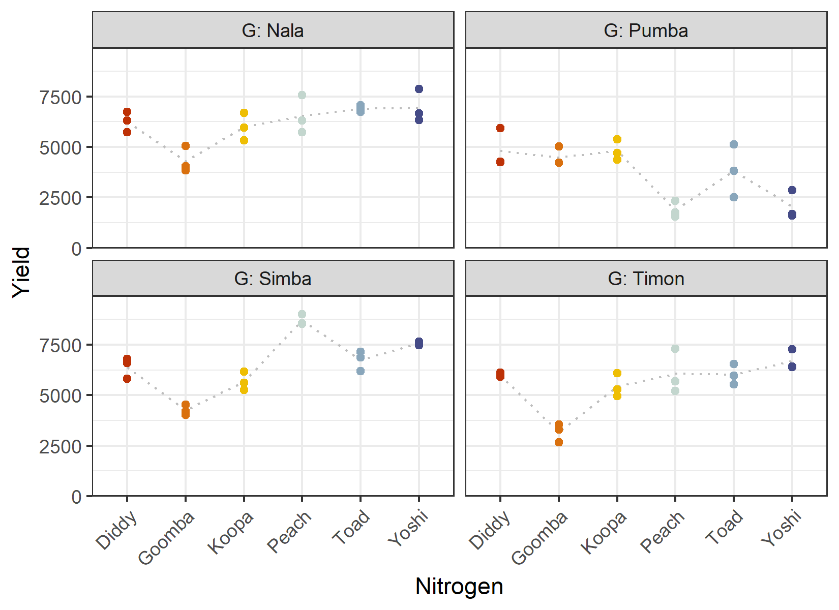
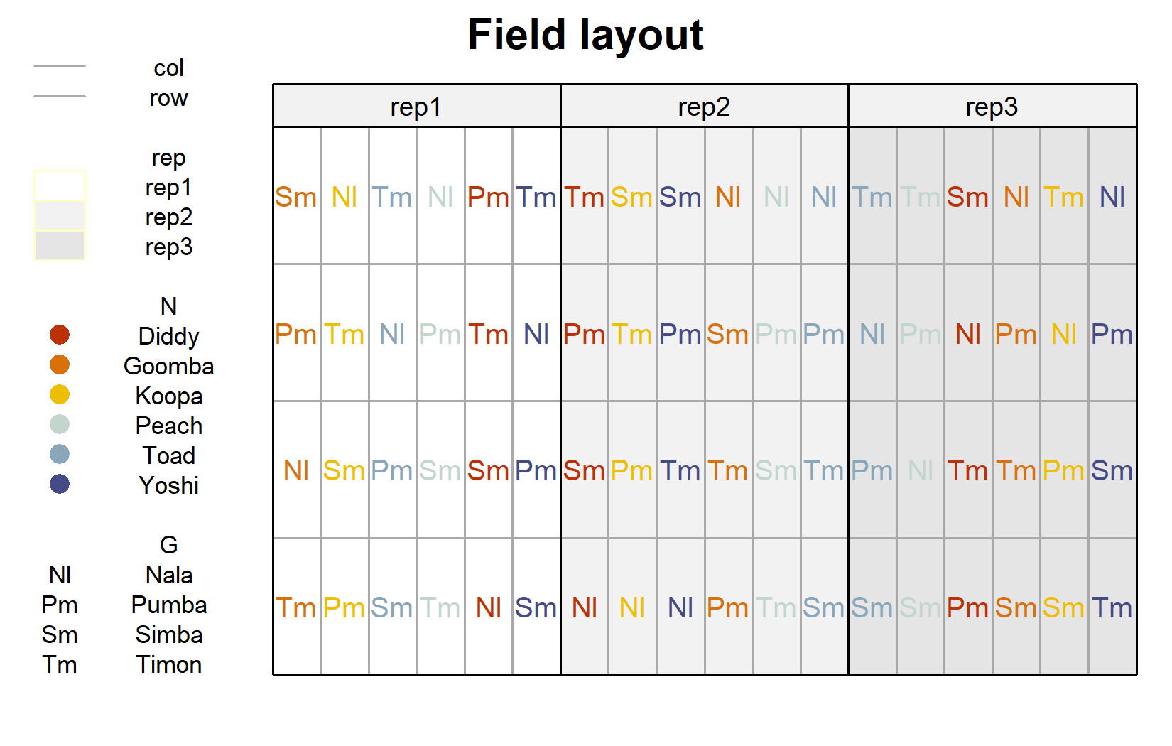
The field layout is where the split-plot structure becomes visible. We first plot the usual layout (genotype labels colored by nitrogen level), and then highlight the whole plots:
desplot(
  data = dat,
  form = rep ~ col + row | rep, # one panel per block
  col.regions = c("white", "grey95", "grey90"),
  text = G,            # genotype names per plot
  cex = 0.8,           # genotype names: font size
  shorten = "abb",     # genotype names: abbreviate
  col = N,             # color genotype names by nitrogen level
  col.text = Ncolors,  # use the custom nitrogen colors
  out1 = col, out1.gpar = list(col = "darkgrey"), # lines between columns
  out2 = row, out2.gpar = list(col = "darkgrey"), # lines between rows
  main = "Field layout",
  show.key = TRUE,
  key.cex = 0.7
)
# one distinct color per whole plot (18 in total)
mainplotcolors <- c(met.brewer("VanGogh3", 6),
                    met.brewer("Hokusai2", 6),
                    met.brewer("OKeeffe2", 6)) %>%
  as.vector() %>%
  set_names(levels(dat$mainplot))

desplot(
  data = dat,
  form = mainplot ~ col + row | rep, # color by whole plot, one panel per block
  col.regions = mainplotcolors,
  out1 = col, out1.gpar = list(col = "darkgrey"),
  out2 = row, out2.gpar = list(col = "darkgrey"),
  main = "Whole plots",
  show.key = FALSE
)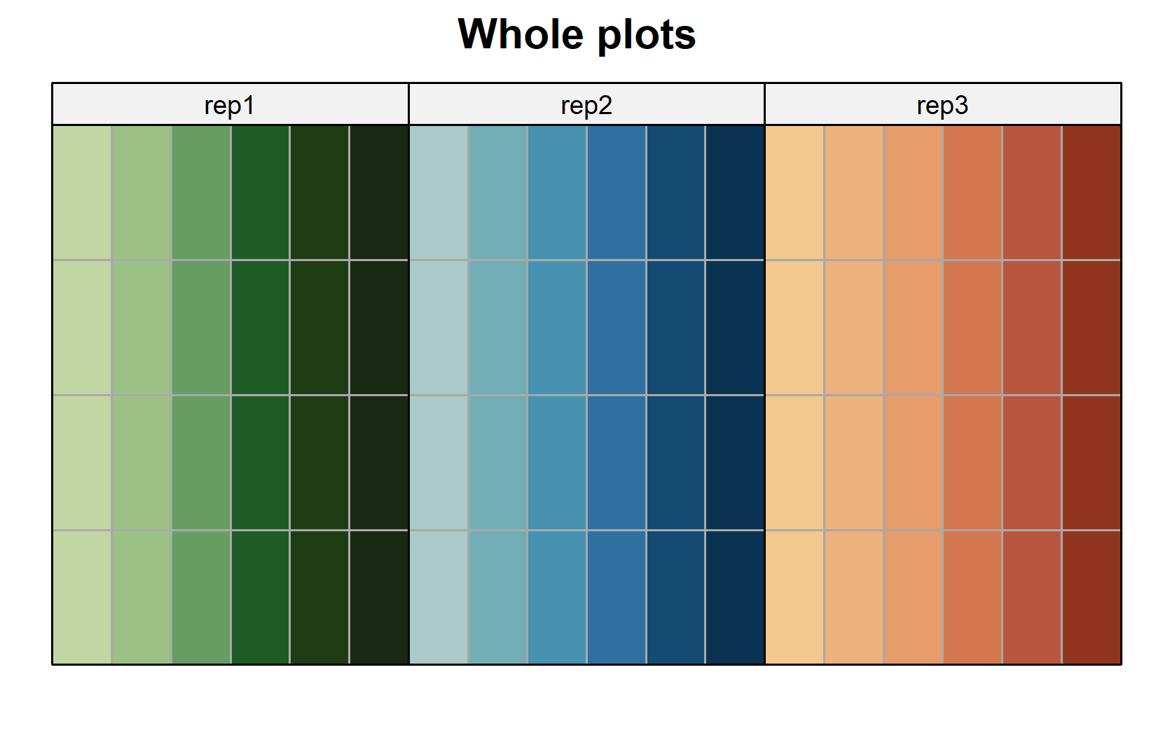
The second layout makes the design explicit: each colored block of cells is one whole plot, carrying a single nitrogen level, and is internally split into the four genotype subplots. The nitrogen levels are randomized between whole plots, the genotypes within them.
Model
The treatment part of the model is the same as in the RCBD chapter: the two treatment factors G and N as main effects plus their interaction G:N, and the block effect rep. What is new is the random effect for the whole plots, (1 | rep:mainplot), which represents the 18 whole plots as an additional level of randomization:
mod <- lmer(yield ~ G + N + G:N + rep + (1 | rep:mainplot),
            data = dat)
The syntax (1 | rep:mainplot) tells lmer() to treat the combination of rep and mainplot (i.e. the 18 unique whole plots) as a random effect. This is the only structural difference from the RCBD model lm(yield ~ N + G + N:G + rep) of the previous chapter.
WarningModel assumptions met?
It is at this point (i.e. after fitting the model and before interpreting the ANOVA) that one should check whether the model assumptions are met. Find out more in Appendix A1: Model Diagnostics.
ANOVA
For mixed models we use an ANOVA with Kenward-Roger degrees of freedom, which provides more accurate F-tests in the small-sample situations typical of designed experiments:
ANOVA <- anova(mod, ddf = "Kenward-Roger")
ANOVA
Type III Analysis of Variance Table with Kenward-Roger's method
Sum Sq Mean Sq NumDF DenDF F value Pr(>F)
G 89885051 29961684 3 36 85.7416 < 2.2e-16 ***
N 19192886 3838577 5 10 10.9849 0.0008277 ***
rep 683088 341544 2 10 0.9774 0.4095330
G:N 69378044 4625203 15 36 13.2360 2.078e-10 ***
---
Signif. codes: 0 '***' 0.001 '**' 0.01 '*' 0.05 '.' 0.1 ' ' 1The interaction G:N is statistically significant, just as in the RCBD analysis. The most instructive part of this table, however, is the denominator degrees of freedom (DenDF):
- The whole-plot factor
Nis tested against only 10 denominator degrees of freedom, because it is compared at the level of the whole plots, of which there are few. - The subplot factor
Gand the interactionG:Nare tested against 36 denominator degrees of freedom, because they are compared at the finer subplot level.
This is the hallmark of a split-plot design: the whole-plot factor is estimated less precisely than the subplot factor and the interaction. We will return to this when comparing the two analyses below.
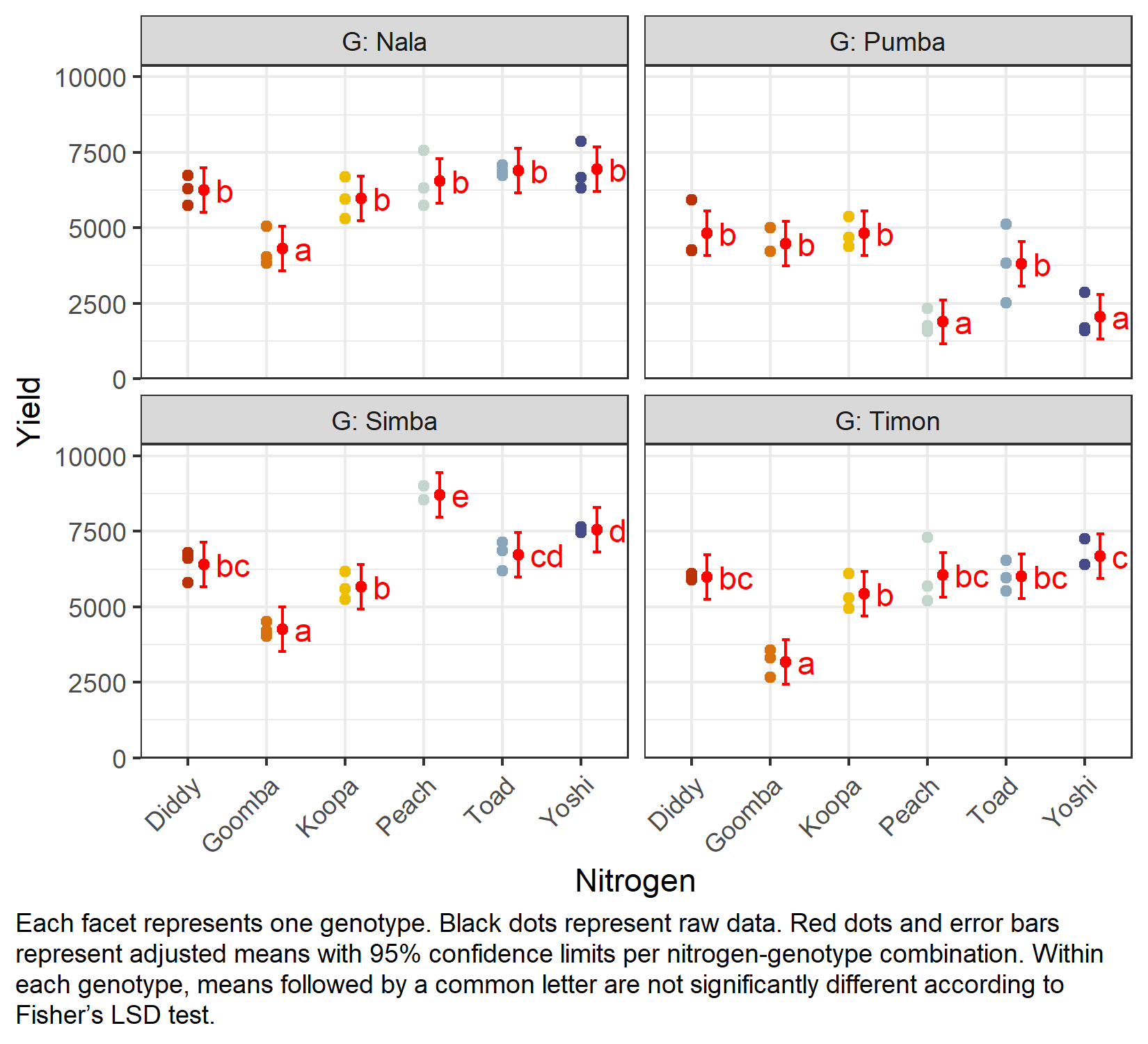
Mean comparison
Because of the significant interaction, we again compare nitrogen levels within each genotype via specs = ~ N | G:
G = Nala:
 N      emmean  SE   df lower.CL upper.CL .group
 Goomba   4306 366 41.9     3568     5044  a
 Koopa    5982 366 41.9     5244     6720   b
 Diddy    6259 366 41.9     5521     6997   b
 Peach    6540 366 41.9     5803     7278   b
 Toad     6895 366 41.9     6157     7633   b
 Yoshi    6951 366 41.9     6213     7688   b

G = Pumba:
 N      emmean  SE   df lower.CL upper.CL .group
 Peach    1881 366 41.9     1143     2618  a
 Yoshi    2047 366 41.9     1309     2784  a
 Toad     3816 366 41.9     3078     4554   b
 Goomba   4481 366 41.9     3744     5219   b
 Diddy    4812 366 41.9     4074     5550   b
 Koopa    4816 366 41.9     4078     5554   b

G = Simba:
 N      emmean  SE   df lower.CL upper.CL .group
 Goomba   4253 366 41.9     3515     4990  a
 Koopa    5672 366 41.9     4934     6410   b
 Diddy    6400 366 41.9     5662     7138   bc
 Toad     6733 366 41.9     5995     7470    cd
 Yoshi    7563 366 41.9     6826     8301     d
 Peach    8701 366 41.9     7963     9438      e

G = Timon:
 N      emmean  SE   df lower.CL upper.CL .group
 Goomba   3177 366 41.9     2440     3915  a
 Koopa    5443 366 41.9     4705     6180   b
 Diddy    5994 366 41.9     5256     6732   bc
 Toad     6014 366 41.9     5276     6752   bc
 Peach    6065 366 41.9     5328     6803   bc
 Yoshi    6687 366 41.9     5950     7425    c

Results are averaged over the levels of: rep
Degrees-of-freedom method: kenward-roger
Confidence level used: 0.95
significance level used: alpha = 0.05
NOTE: If two or more means share the same grouping symbol,
      then we cannot show them to be different.
      But we also did not show them to be the same.
As in the previous chapter, the comparisons are left unadjusted (adjust = "none", i.e. Fisher’s LSD); see Appendix A4: Multiplicity Adjustments for the alternatives and Appendix A5: Compact Letter Display for the letter display. Note that the standard errors now come from the mixed model and therefore correctly reflect the split-plot error structure.
my_caption <- "Each facet represents one genotype. Black dots represent raw data.
Red dots and error bars represent adjusted means with 95% confidence limits per
nitrogen-genotype combination. Within each genotype, means followed by a common
letter are not significantly different according to Fisher's LSD test."

ggplot() +
  facet_wrap(~G, labeller = label_both) +
  aes(x = N) +
  # black dots representing the raw data
  geom_point(
    data = dat,
    aes(y = yield, color = N)
  ) +
  # red dots representing the adjusted means
  geom_point(
    data = mean_comp,
    aes(y = emmean),
    color = "red",
    position = position_nudge(x = 0.2)
  ) +
  # red error bars representing the confidence limits of the adjusted means
  geom_errorbar(
    data = mean_comp,
    aes(ymin = lower.CL, ymax = upper.CL),
    color = "red",
    width = 0.1,
    position = position_nudge(x = 0.2)
  ) +
  # red letters
  geom_text(
    data = mean_comp,
    aes(y = emmean, label = str_trim(.group)),
    color = "red",
    position = position_nudge(x = 0.35),
    hjust = 0
  ) +
  scale_x_discrete(name = "Nitrogen") +
  scale_y_continuous(
    name = "Yield",
    limits = c(0, NA),
    expand = expansion(mult = c(0, 0.1))
  ) +
  scale_color_manual(values = Ncolors, guide = "none") +
  theme_bw() +
  labs(caption = my_caption) +
  theme(
    plot.caption = element_textbox_simple(margin = margin(t = 5)),
    plot.caption.position = "plot",
    axis.text.x = element_text(angle = 45, hjust = 1, vjust = 1)
  )
RCBD vs split-plot: what changed?
Because the yield values are identical to those in the previous chapter, we can compare the two analyses directly and isolate the effect of the design assumption alone.
-
The treatment terms are the same. Both models contain
G,N,G:Nandrep. The point estimates of the means are essentially unchanged. -
The error structure differs. The RCBD model has a single residual error (
lm()); the split-plot model adds a random whole-plot effect(1 | rep:mainplot), splitting the variation into a whole-plot stratum and a subplot stratum. -
The consequence is precision. In the RCBD analysis, the nitrogen main effect was tested against the large residual error (many degrees of freedom). In the split-plot analysis, it is tested against the whole-plot error (only 10 degrees of freedom). The evidence for a nitrogen effect is therefore noticeably weaker here - not because the data changed, but because a split-plot acknowledges that nitrogen was not independently randomized to every plot. Conversely, the subplot factor
Gand the interactionG:Nare estimated with good precision.
The take-home message is that the design dictates the analysis. Treating a split-plot trial as if it were a fully randomized RCBD would overstate the precision of the whole-plot factor and could lead to false-positive conclusions about it.
Wrapping Up
You have now fitted your first practical mixed model and seen how a split-plot design separates whole-plot from subplot information. The treatment structure looked just like the two-way RCBD, but a single random-effect term changed the inference in a way that exactly mirrors how the experiment was actually conducted.
NoteKey Takeaways
A split-plot design has two levels of experimental units: whole plots (here: nitrogen) and subplots (here: genotypes), with a separate randomization at each level.
Two randomizations require a mixed model. The whole plots enter as a random effect:
yield ~ G + N + G:N + rep + (1 | rep:mainplot), fitted withlmer().Kenward-Roger degrees of freedom are used for the ANOVA of the mixed model.
Whole-plot factors are tested less precisely than subplot factors and the interaction - visible in the much smaller denominator degrees of freedom for
N.Same data, different design, different inference. Compared with the RCBD analysis of the identical yields, the split-plot correctly reflects the experiment’s structure and changes the precision of the whole-plot factor.
References
Gomez, Kwanchai A, and Arturo A Gomez. 1984. Statistical Procedures for Agricultural Research. 2nd ed. An International Rice Research Institute Book. Nashville, TN: John Wiley & Sons.
Citation
BibTeX citation:
@online{schmidt2026,
  author = {{Dr. Paul Schmidt}},
  publisher = {BioMath GmbH},
  title = {2. {Two-way} {ANOVA} in a Split-Plot Design},
  date = {2026-06-08},
  url = {https://biomathcontent.netlify.app/content/lin_mod_adv/02_splitplot.html},
  langid = {en}
}
For attribution, please cite this work as:
Dr. Paul Schmidt. 2026. “2. Two-Way ANOVA in a Split-Plot
Design.” BioMath GmbH. June 8, 2026. https://biomathcontent.netlify.app/content/lin_mod_adv/02_splitplot.html.