To install and load all the packages used in this chapter, run the following code:
Two new things
In this and the next chapter, two things are fundamentally different from our previous chapters/analyses:
On one hand, we now have data from a designed experiment, where we deliberately chose an influencing treatment factor, arranged the experiment in a certain way, and then measured the response variable. In our previous datasets, we more or less took a spontaneous survey of the world around us.
On the other hand, we will analyze categorical predictors (factors) instead of continuous predictors. Thus, our response variable (\(y\)) is still continuous, but our predictor variable (\(x\)) is categorical. Accordingly, correlation and simple linear regression are not appropriate anymore. Instead, we will use Analysis of Variance (ANOVA) and post-hoc tests (t-Test, Tukey Test) to analyze the data.
The only difference between this and the next chapter is which experimental design was used. In this chapter, we will analyze data from a Completely Randomized Design (CRD), which is the simplest possible design, while in the next chapter we will analyze data from a Randomized Complete Block Design (RCBD). Accordingly, we will focus more on the switch to analyzing categorical predictors in this chapter, while the next chapter will focus more on the experimental design and the differences between CRD and RCBD.
From Regression to ANOVA
So far, we studied relationships between continuous variables using correlation and regression. In contrast, in this chapter, we’ll examine the effect of categorical predictors (factors) on a continuous response. For instance, we might ask: “Do different varieties of crops produce significantly different yields?”
This shift from continuous to categorical predictors requires us to use Analysis of Variance (ANOVA) instead of simple linear regression, although both techniques are actually related and based on the same underlying framework: a general linear model.
Data
For this example, we’ll use data from a melon variety trial. Four different melon varieties were tested, with each variety planted in six randomly assigned plots in a field. Because the assignment of varieties to plots was completely random, this experiment follows a completely randomized design (CRD).
Let’s import the data:
Rows: 24 Columns: 4
── Column specification ────────────────────────────────────────────────────────
Delimiter: ","
chr (1): variety
dbl (3): yield, row, col

ℹ Use `spec()` to retrieve the full column specification for this data.
ℹ Specify the column types or set `show_col_types = FALSE` to quiet this message.
# A tibble: 24 × 4
variety yield row col
<chr> <dbl> <dbl> <dbl>
1 v1 25.1 4 2
2 v1 17.2 1 6
3 v1 26.4 4 1
4 v1 16.1 1 4
5 v1 22.2 1 2
6 v1 15.9 2 4
7 v2 40.2 4 4
8 v2 35.2 3 1
9 v2 32.0 4 6
10 v2 36.5 2 1
# ℹ 14 more rowsThe dataset contains information about:
-
variety: The melon variety (v1, v2, v3 and v4) -
yield: The yield measurement for each plot -
rowandcol: The row and column coordinates of each plot in the field layout. This information is not necessary for the analysis, but only required if you want to plot a field plan usingdesplot()(see below)
Format
An important first step when working with categorical variables is to ensure they’re properly encoded as factors. By default, R has imported columns with text in them as the data type chr (character), but it is better to instantly convert them to fct (factor) for categorical variables. We can achieve this formatting by using the mutate() function from the dplyr package and overwriting the original variety column with itself, but converted to a factor:
# A tibble: 24 × 4
   variety yield   row   col
   <fct>   <dbl> <dbl> <dbl>
 1 v1       25.1     4     2
 2 v1       17.2     1     6
 3 v1       26.4     4     1
 4 v1       16.1     1     4
 5 v1       22.2     1     2
 6 v1       15.9     2     4
 7 v2       40.2     4     4
 8 v2       35.2     3     1
 9 v2       32.0     4     6
10 v2       36.5     2     1
# ℹ 14 more rows
This step is beneficial because R’s statistical functions may treat factors differently from character variables. With factors, R understands that we’re dealing with distinct levels of a categorical variable.
Explore
Before formal analysis, let’s explore our data to understand what we’re working with:
# A tibble: 4 × 6
  variety count mean_yield sd_yield min_yield max_yield
  <fct>   <int>      <dbl>    <dbl>     <dbl>     <dbl>
1 v2          6       37.4     3.95      32.0      43.3
2 v4          6       29.9     2.23      27.6      33.2
3 v1          6       20.5     4.69      15.9      26.4
4 v3          6       19.5     5.56      11.4      25.9
Apparently, variety v2 has the highest mean yield, followed by v4, v1, and v3. Even the lowest value of v2 is higher than all values of v1 and v3. Let’s also visualize the data:
myplot <- ggplot(data = dat) +
  aes(y = yield, x = variety) +
  geom_point() +
  scale_x_discrete(
    name = "Variety"
  ) +
  scale_y_continuous(
    name = "Yield",
    limits = c(0, NA),
    expand = expansion(mult = c(0, 0.1))
  ) +
  theme_classic()

myplot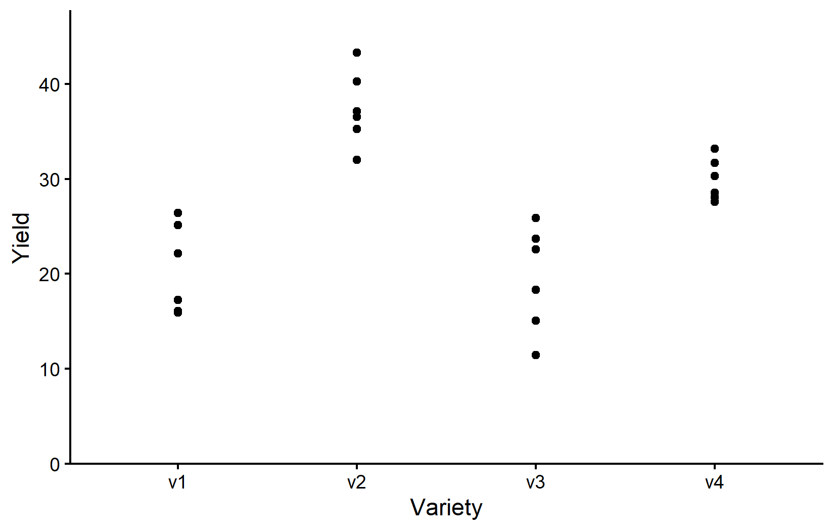
Note that while we now have a categorical x variable, we mostly used the exact same ggplot code as before. The only difference is that we now need to use scale_x_discrete() instead of scale_x_continuous() to adjust the x-axis. The y-axis is still continuous, so we can keep using scale_y_continuous().
Accordingly, the resulting plot is still a scatter plot with one point per observation. However, since we have a categorical x variable, the points are now grouped by variety. Moreover, there can actually never be any points between the varieties and therefore it would also be nonsensical to fit e.g. a regression line to the data.
Depending on your background and supervisors, you might be used to seeing boxplots instead of scatter plots. Boxplots are a great way to visualize the distribution of data within each category. However, let’s actually not use boxplots instead of scatter plots, but rather in addition to scatter plots. This way, we can see the individual data points and the distribution of the data at the same time. You are certainly allowed to do that and I highly recommend doing it. Since we have saved our ggplot from above into myplot, we can simply add one more layer to this plot like so:
myplot +
  geom_boxplot()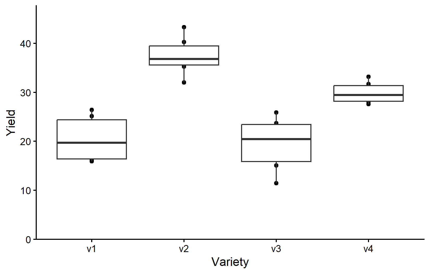
However, since we added geom_boxplot() after geom_point() (and because it is using the same aes()), the boxes are drawn right on top of the points and therefore hiding some of them. We can instead make the boxes thinner and move them to the side for an even better plot:
myplot +
  geom_boxplot(
    width = 0.1, # 10% width
    position = position_nudge(x = -0.15) # nudge to the left
  )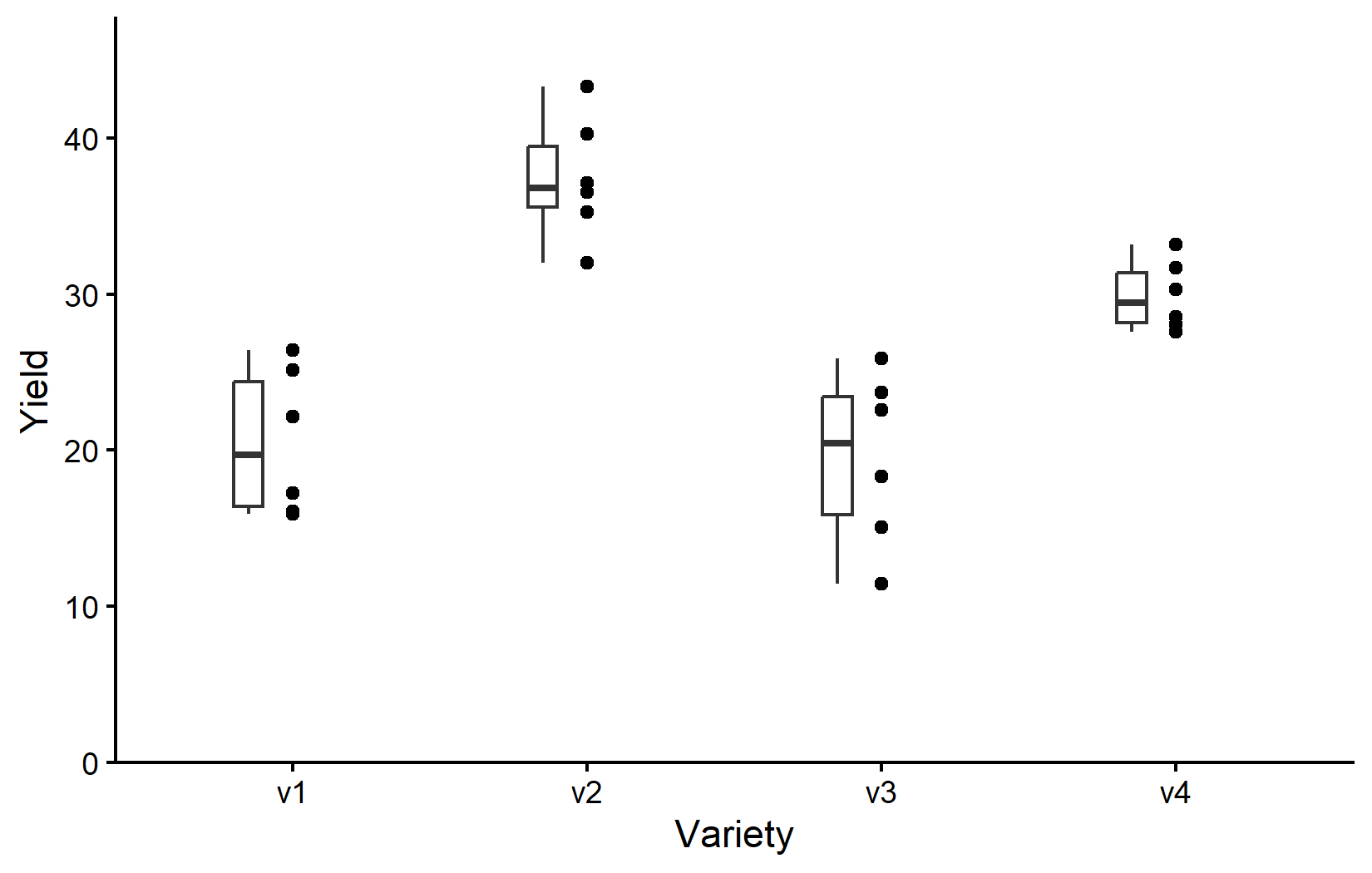
So as it is often the case, this plot is giving us a better feeling for the data than just tables, even though e.g. the four mean values are not even shown here.
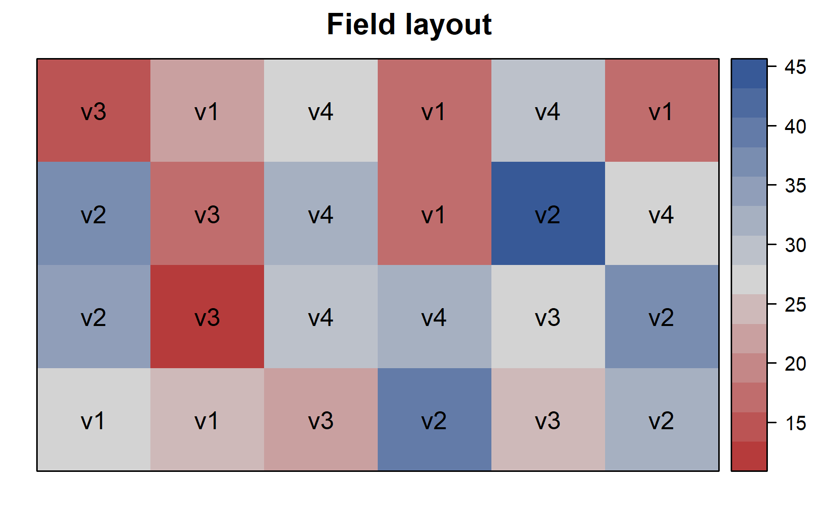
Additionally, since this is a field experiment with a specific layout, let’s visualize the field plan to understand how varieties were spatially distributed. This can be done very nicely as long as you have the coordinates of each experimental unit (i.e. field plot) on the field like we do in columns row and col. You can then use the desplot() function from the {desplot} package:
desplot(
  data = dat,
  flip = TRUE, # row 1 on top, not on bottom
  form = variety ~ col + row, # fill color per variety; col/row info
  text = variety, # variety names per plot
  cex = 1, # variety names: font size
  main = "Field layout", # plot title
  show.key = FALSE # hide legend
)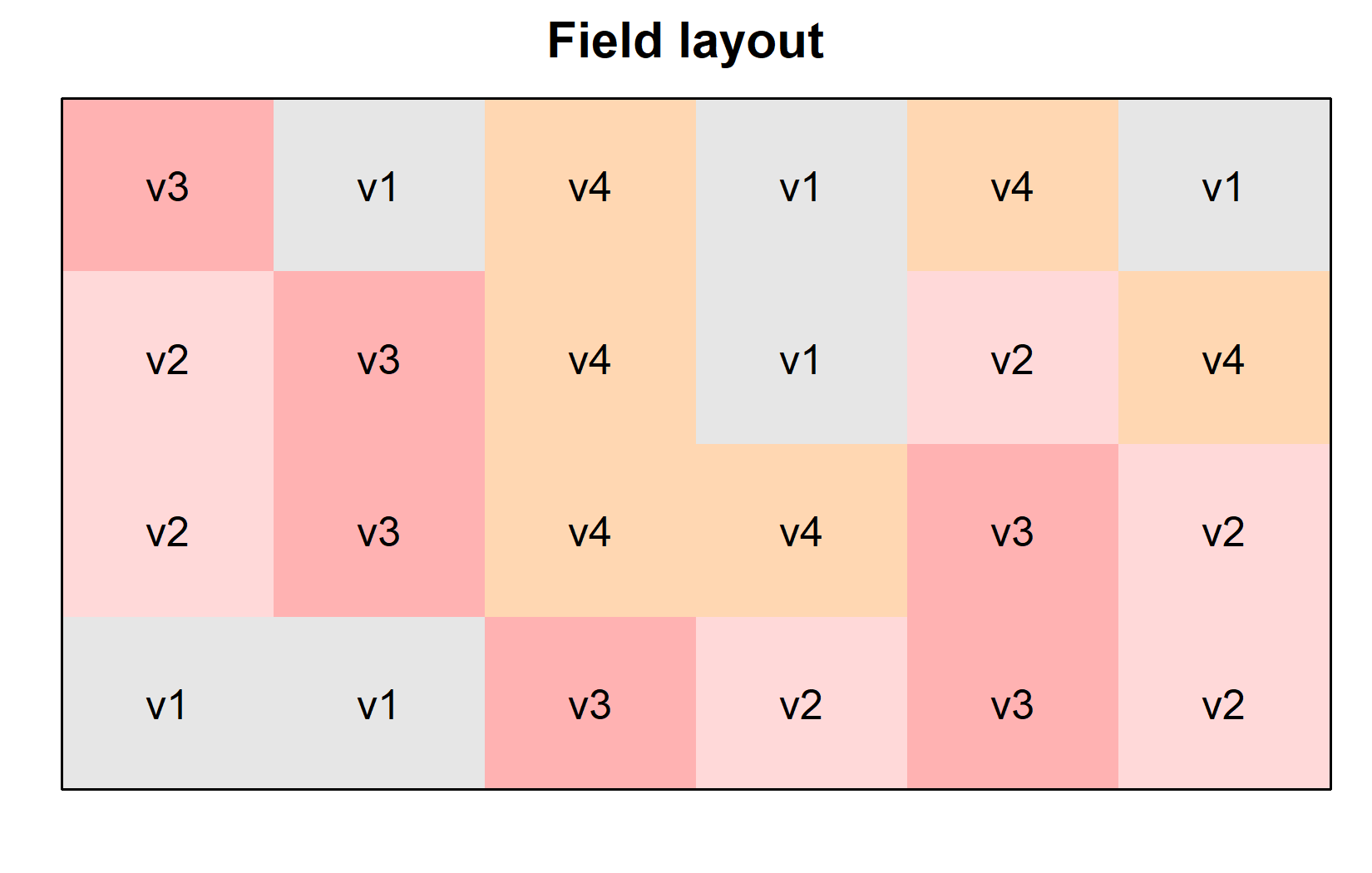
This plot confirms that the varieties were randomly distributed across the field, which is characteristic of a completely randomized design (CRD). We can create a second version of this field plan where we color the plots according to their yield instead of their variety. This can be done by simply changing the form argument in the desplot() function:
desplot(
  data = dat,
  flip = TRUE, # row 1 on top, not on bottom
  form = yield ~ col + row, # fill color per variety; col/row info
  text = variety, # variety names per plot
  cex = 1, # variety names: font size
  main = "Field layout", # plot title
  show.key = FALSE # hide legend
)
We now have done enough descriptive statistics and visualizations. The next step is to analyze the data and test whether the differences in yield among the varieties are statistically significant. This is where Analysis of Variance (ANOVA) comes into play.
Model and ANOVA
Understanding One-Way ANOVA
Analysis of Variance (ANOVA) is a statistical method used to test for differences among group means. In our case, we want to determine if there are significant differences in yield among the four melon varieties.
One-way ANOVA addresses the question: “Is there a significant difference among the group means?” It is called “one-way” because it involves only one categorical predictor (the variety). The null hypothesis is that all group means are equal:
\(H_0: \mu_A = \mu_B = \mu_C = \mu_D\)
The alternative hypothesis is that at least one group mean differs from the others. Note that we are using the Greek letter \(\mu\) to denote the true mean of each variety. In this case, we have four varieties (A, B, C, and D), so we have four means. The estimates for these means based on our sample/experimental data are denoted by \(\bar{y}_A\), \(\bar{y}_B\), \(\bar{y}_C\), and \(\bar{y}_D\), instead. This is analogous to how we used the Greek letter \(\rho\) to denote the true/population correlation coefficient, but used the letter \(r\) to denote the sample correlation coefficient.
Under the hood, ANOVA works by comparing:
- The variation between groups (how different group means are from each other)
- The variation within groups (how much scatter/noise exists within each group)
If the between-group variation is much larger than the within-group variation, we have evidence that the group means differ significantly.
Fitting the Model
In R, we fit a linear model using the lm() function, just like we did for regression. The key difference is that our predictor \(x\) is now a categorical factor rather than a continuous variable. R knows this, because of what the variety column is formatted as - a factor. So even though we basically write the exact same formula as before (y ~ x), the interpretation is different. You can see this immediately when looking at the results:
mod <- lm(yield ~ variety, data = dat)
mod
Call:
lm(formula = yield ~ variety, data = dat)

Coefficients:
(Intercept)    varietyv2    varietyv3    varietyv4
    20.4900      16.9133      -0.9983       9.4067
Sure, there is once again an intercept, but then there is not one slope, but instead three more coefficients for varieties v2, v3, and v4. Obviously we cannot have a slope here, as we cannot multiply a number with the name of a variety. Instead, each variety gets its own additional intercept. Well, each variety except one - v1 seems to be missing. It isn’t really missing, though. Instead, v1 is set to 0 and thus the reference level that all other varieties are compared to.
Note that for factorial experiments, we typically focus on the ANOVA table rather than these coefficients. However, see the video explanation for a more detailed discussion of the coefficients and their interpretation.
It is at this point (i.e. after fitting the model and before interpreting the ANOVA) that one should check whether the model assumptions are met. Find out more in Appendix A1: Model Diagnostics.
Conducting the ANOVA
We can produce an ANOVA table from our model using the anova() function:
ANOVA <- anova(mod)
ANOVA
Analysis of Variance Table
Response: yield
Df Sum Sq Mean Sq F value Pr(>F)
variety 3 1291.48 430.49 23.418 9.439e-07 ***
Residuals 20 367.65 18.38
---
Signif. codes: 0 '***' 0.001 '**' 0.01 '*' 0.05 '.' 0.1 ' ' 1The ANOVA table provides:
- Df: Degrees of freedom for the factor (varieties) and residuals
- Sum Sq: Sum of squares, measuring variation
- Mean Sq: Mean sum of squares (Sum Sq / Df)
- F value: F statistic (ratio of between-group to within-group variation)
- Pr(>F): p-value for the F test
As said before, this table compares the variation between groups (varieties) to the variation within groups (residuals). If the F statistic is large and the p-value is small, we reject the null hypothesis and conclude that at least one group mean is significantly different from the others. However, we will not go into details of how to compute these individual values, but feel free to dig deeper e.g. via the resources below.
The p-value is very small and < 0.05, leading us to reject the null hypothesis and thus indicating that there are statistically significant differences in yield among the varieties. However, the ANOVA only tells us that there are differences, not which specific varieties differ from each other. For that, we can compare the means via post-hoc tests.
Mean Comparisons
Understanding Post-Hoc Tests
Once we’ve determined through ANOVA that there are significant differences among groups, we typically want to know which specific groups differ from each other. This is where post-hoc tests come in.
Common post-hoc tests include Fisher’s LSD test, Tukey’s HSD test, and Bonferroni-Holm correction. Fisher’s LSD is essentially a standard t-test, but using the pooled standard deviation from the model residual variance for all comparisons.
All of them have in common that one test is performed for each pair of groups. For example, if we have three groups (A, B & C), we would perform three tests (A vs B, B vs C and A vs C). Post hoc tests are called “post hoc” (“after this”) because they are performed after the initial analysis has indicated that differences exist, allowing researchers to determine exactly where those differences lie among multiple groups
For now, it is enough to understand that these tests are used to determine whether specific group means are significantly different from each other, but feel free to dig deeper e.g. via the resources below.
Using the emmeans Package
We are actually not going to use functions like t.test(), which would use the raw data as input to calculate a single t-test. Instead, we will use the emmeans() function from the emmeans package, which automatically calculates estimated marginal means (EMMs; a.k.a. least-squares means or adjusted means) for each group, taking into account the model structure and residual variance:
# Calculate adjusted means for each variety
means <- emmeans(mod, specs = ~ variety)
means
variety emmean SE df lower.CL upper.CL
v1 20.5 1.75 20 16.8 24.1
v2 37.4 1.75 20 33.8 41.1
v3 19.5 1.75 20 15.8 23.1
v4 29.9 1.75 20 26.2 33.5
Confidence level used: 0.95 These are the estimated mean yields for each variety, adjusted for the model. In a simple one-way design like ours, these match the arithmetic means, but in more complex designs, they can differ. In other words: Because our model is so very simple, these adjusted means were actually not adjusted at all and are identical to the variety means we calculated above. However, in more complex models and with unbalanced data this may not be the case. In any case, another advantage of using emmeans() is that it automatically takes care of comparing every mean with every other mean like so:
# Pairwise comparisons
pairs <- pairs(means, adjust = "tukey")
pairs
contrast estimate SE df t.ratio p.value
v1 - v2 -16.913 2.48 20 -6.833 <0.0001
v1 - v3 0.998 2.48 20 0.403 0.9772
v1 - v4 -9.407 2.48 20 -3.800 0.0057
v2 - v3 17.912 2.48 20 7.236 <0.0001
v2 - v4 7.507 2.48 20 3.033 0.0307
v3 - v4 -10.405 2.48 20 -4.203 0.0023
P value adjustment: tukey method for comparing a family of 4 estimates This output shows all pairwise comparisons between varieties. For example: the comparison between v1 and v2 shows a difference of -16.913. You can easily verify this by looking at the means table above. The mean for v1 is 20.5 and for v2 is 37.4, so v1 - v2 is indeed -16.9. Yet, besides this absolute difference, the table also shows the standard error, degrees of freedom, t-ratio, and p-value belonging to this difference. Since we wrote adjust = "tukey", each p-value corresponds to a Tukey test (use adjust = "none" for Fisher’s LSD Test). Accordingly, all but one of the p-values are below 0.05, indicating that all varieties are significantly different from each other except for v1 - v3.
Compact Letter Display
It is likely that running the code below for the first time will cause an ERROR to appear. This is likely because of a weird bug with the cld() function. It can usually be fixed by restarting R and running the code again. In other words: The ERROR only appears the very first time you are running cld(). If you run it again, it should work. Thus, if you do see that ERROR, either close and open RStudio completely or click Session > Restart R in the menu bar. Remember that after doing so, you need to rerun the entire code starting with loading the packages and importing the data.
A common way to present such mean comparison results is with a “compact letter display” (CLD), where means that are not significantly different share the same letter:
# Compact letter display
mean_comp <- cld(means, Letters = letters, adjust = "tukey")
mean_comp
variety emmean SE df lower.CL upper.CL .group
v3 19.5 1.75 20 14.7 24.3 a
v1 20.5 1.75 20 15.7 25.3 a
v4 29.9 1.75 20 25.1 34.7 b
v2 37.4 1.75 20 32.6 42.2 c
Confidence level used: 0.95
Conf-level adjustment: sidak method for 4 estimates
P value adjustment: tukey method for comparing a family of 4 estimates
significance level used: alpha = 0.05
NOTE: If two or more means share the same grouping symbol,
then we cannot show them to be different.
But we also did not show them to be the same. Varieties that share the same letter in the .group column are not significantly different from each other. For example, varieties that both have the letter “a” are not significantly different from each other. Thus, this display is compact because it displays the general findings of all our six tukey tests (statistically significant or not) via a short combination of letters next to our four mean values.
If you are wondering about the note we got when executing the code Note: adjust = "tukey" was changed to "sidak" because "tukey" is only appropriate for one set of pairwise comparison, please visit the “compact letter display” (CLD) chapter. There, you will also find other pieces of information about all this that goes beyond this introduction.
Combining Steps
Note that while we just obtained these results in multiple steps, this was only done to make it easier to understand. In practice, we can combine all this into one command:
mean_comp variety emmean SE df lower.CL upper.CL .group
v3 19.5 1.75 20 14.7 24.3 a
v1 20.5 1.75 20 15.7 25.3 a
v4 29.9 1.75 20 25.1 34.7 b
v2 37.4 1.75 20 32.6 42.2 c
Confidence level used: 0.95
Conf-level adjustment: sidak method for 4 estimates
P value adjustment: tukey method for comparing a family of 4 estimates
significance level used: alpha = 0.05
NOTE: If two or more means share the same grouping symbol,
then we cannot show them to be different.
But we also did not show them to be the same. Visualizing Results
Finally, let’s create a plot that combines the raw data with our statistical results.
ggplot() +
  aes(x = variety) +
  # black dots representing the raw data
  geom_point(
    data = dat,
    aes(y = yield)
  ) +
  # black boxes representing the distribution of the raw data
  geom_boxplot(
    data = dat,
    aes(y = yield),
    width = 0.1, # 10% width
    position = position_nudge(x = -0.15) # nudge to the left
  ) +
  # red dots representing the adjusted means
  geom_point(
    data = mean_comp,
    aes(y = emmean),
    color = "red",
    position = position_nudge(x = 0.1)
  ) +
  # red error bars representing the confidence limits of the adjusted means
  geom_errorbar(
    data = mean_comp,
    aes(ymin = lower.CL, ymax = upper.CL),
    color = "red",
    width = 0.1,
    position = position_nudge(x = 0.1)
  ) +
  # red letters
  geom_text(
    data = mean_comp,
    aes(y = emmean, label = .group),
    color = "red",
    position = position_nudge(x = 0.2),
    hjust = 0
  ) +
  scale_x_discrete(
    name = "Variety"
  ) +
  scale_y_continuous(
    name = "Yield",
    limits = c(0, NA),
    expand = expansion(mult = c(0, 0.1))
  ) +
  theme_classic()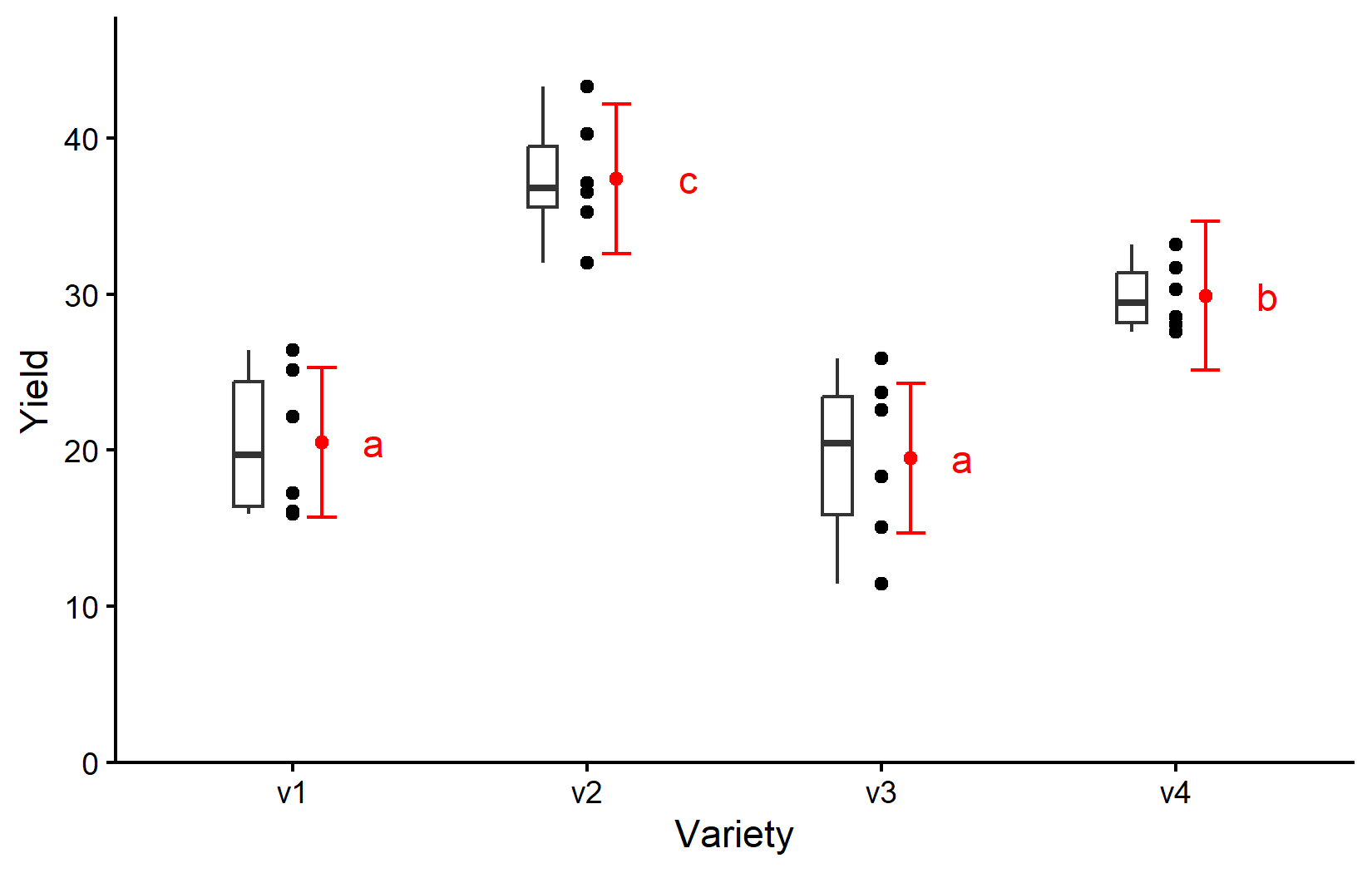
We will talk more about how to create this ggplot in the next chapter. For now, be aware that
- black dots represent raw data,
- black boxes represent the distribution of the raw data,
- red dots and error bars represent adjusted means with 95% confidence limits and
- means followed by a common letter are not significantly different according to the Tukey-test.
Wrapping Up
Congratulations! You’ve conducted your first analysis of variance and mean comparisons for a completely randomized design. This is a fundamental technique in experimental data analysis that you can use in many different contexts.
Completely Randomized Design (CRD) is the simplest experimental design, where treatments are randomly assigned to experimental units.
-
One-way ANOVA tests whether there are significant differences among group means:
- The model formula is
response ~ factor - The ANOVA table shows whether there are significant differences overall
- The model formula is
-
Post-hoc tests determine which specific groups differ from each other:
- Estimated marginal means (emmeans) provide adjusted means for each group
- Pairwise comparisons between all means/groups are performed
- Compact letter display (CLD) presents results with letters for easy interpretation
In the next chapter, we’ll explore the Randomized Complete Block Design (RCBD), which builds on the CRD by accounting for known sources of variation in your experimental units.
Citation
@online{schmidt2026,
  author = {{Dr. Paul Schmidt}},
  publisher = {BioMath GmbH},
  title = {1. {One-way} {ANOVA} in a {CRD}},
  date = {2026-06-08},
  url = {https://biomathcontent.netlify.app/content/lin_mod_exp/01_oneway_crd.html},
  langid = {en}
}