for (pkg in c("ggplot2", "scales", "RColorBrewer", "MetBrewer", "viridis")) {
  if (!require(pkg, character.only = TRUE)) install.packages(pkg)
}
Color is one of the most powerful tools in data visualization. A well-chosen color scheme can highlight group differences, guide the reader’s attention, and make a plot immediately accessible. A poorly chosen one can obscure patterns, confuse readers, or exclude those with color vision deficiencies.
In ggplot2, visual properties like color, shape, size, and transparency can be set in two fundamentally different ways: as static values (the same for all data points) or mapped dynamically to variables in the data via aes(). Understanding this distinction is essential - it determines whether a visual property is purely cosmetic or actually encodes information.
We continue with the refined plot from the previous chapter:
myplot <- ggplot(data = PlantGrowth) +
  aes(y = weight, x = group) +
  scale_y_continuous(
    name = "Weight (g)",
    limits = c(0, NA),
    breaks = seq(0, 6),
    expand = expansion(mult = c(0, 0.05))
  ) +
  scale_x_discrete(
    name = "Treatment Group",
    labels = c(
      ctrl = "Control",
      trt1 = "Treatment 1",
      trt2 = "Treatment 2"
    )
  ) +
  theme_classic()
Static aesthetics
When aesthetic properties are set directly inside a geom_*() function - but outside of aes() - they apply uniformly to all data points. This is the simpler of the two approaches: one chooses a fixed color, shape, or size, and every point looks the same. This is useful when the grouping is already conveyed through the axis (as in our plot, where groups are separated along the x-axis) and additional color coding would be redundant.
myplot +
  geom_point(color = "orange")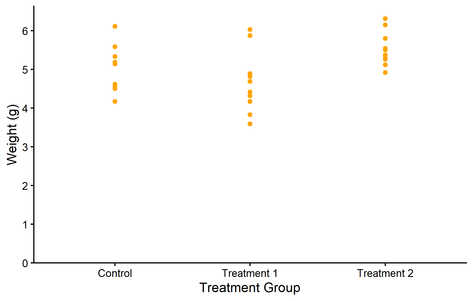
myplot +
  geom_point(
    color = "purple",
    shape = 18,
    size = 5,
    alpha = 0.5
  )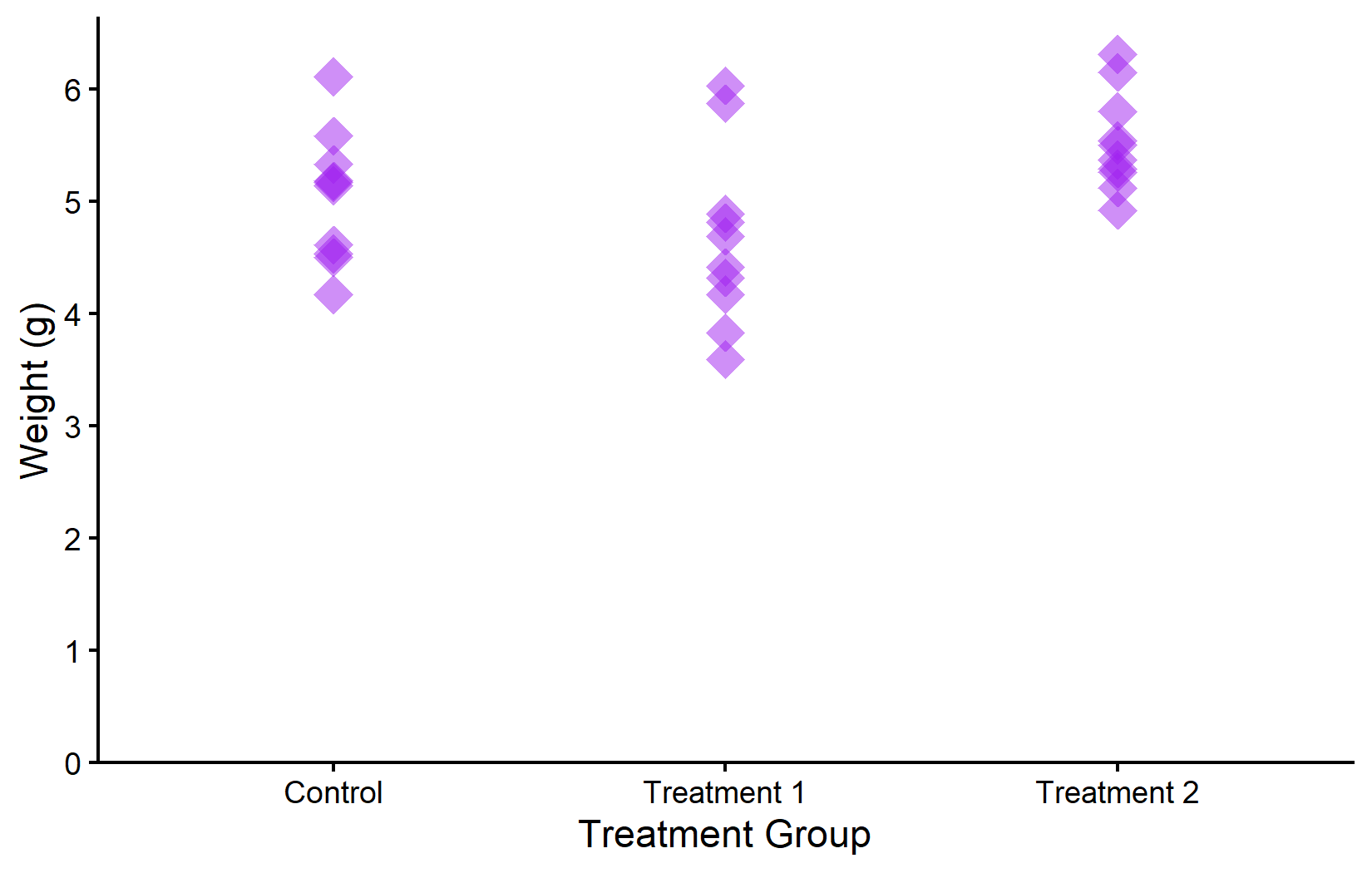
In the first plot, all points are orange. In the second, we modify multiple properties at once: purple color, diamond shape (18), larger size, and 50% transparency. Notice that these modifications are purely cosmetic - they do not encode any information from the data.
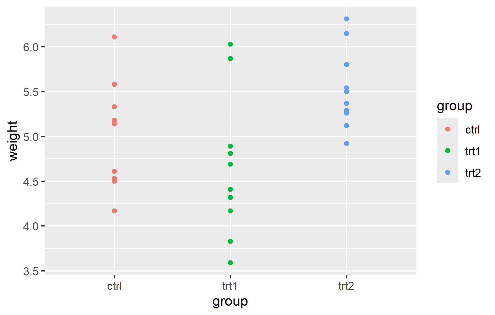
Aesthetic mapping with aes()
The real power of ggplot2 lies in dynamic mapping through aes(). Instead of setting a fixed color for all points, we can map a variable to the color aesthetic so that each group automatically receives its own color. This is how we tell ggplot2: “Use color to represent the grouping in my data.”
An important detail: aes() and data can be defined either globally in ggplot() (applied to all layers) or locally inside a specific geom_*() function (applied only to that layer). For simple plots with a single geom, both produce the same result. The distinction becomes important when combining multiple geoms with different data sources - a technique we will use in later chapters.
ggplot(data = PlantGrowth) +
  aes(y = weight, x = group, color = group) +
  geom_point()
ggplot() +
  geom_point(
    data = PlantGrowth,
    aes(y = weight, x = group, color = group)
  )
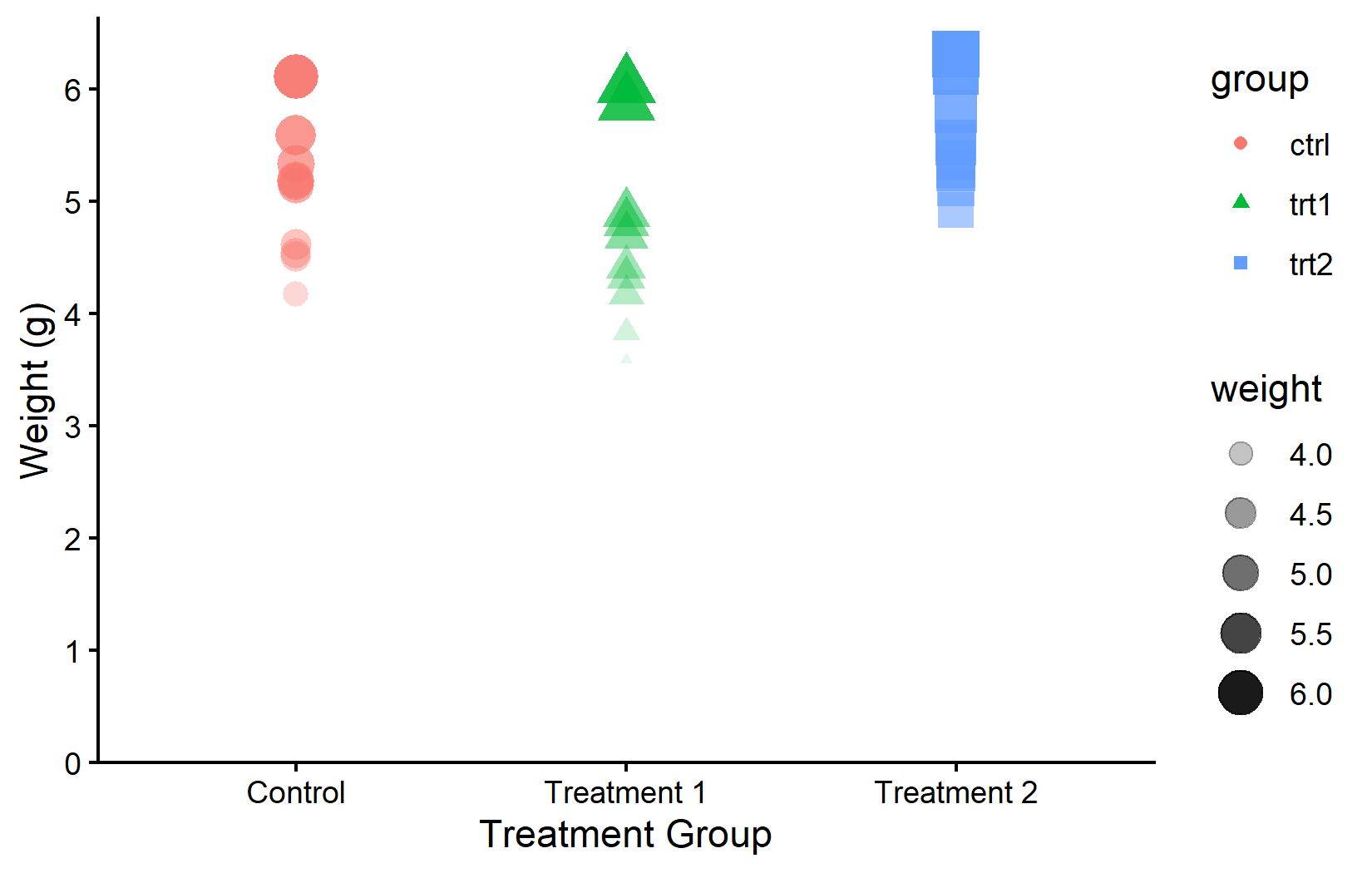
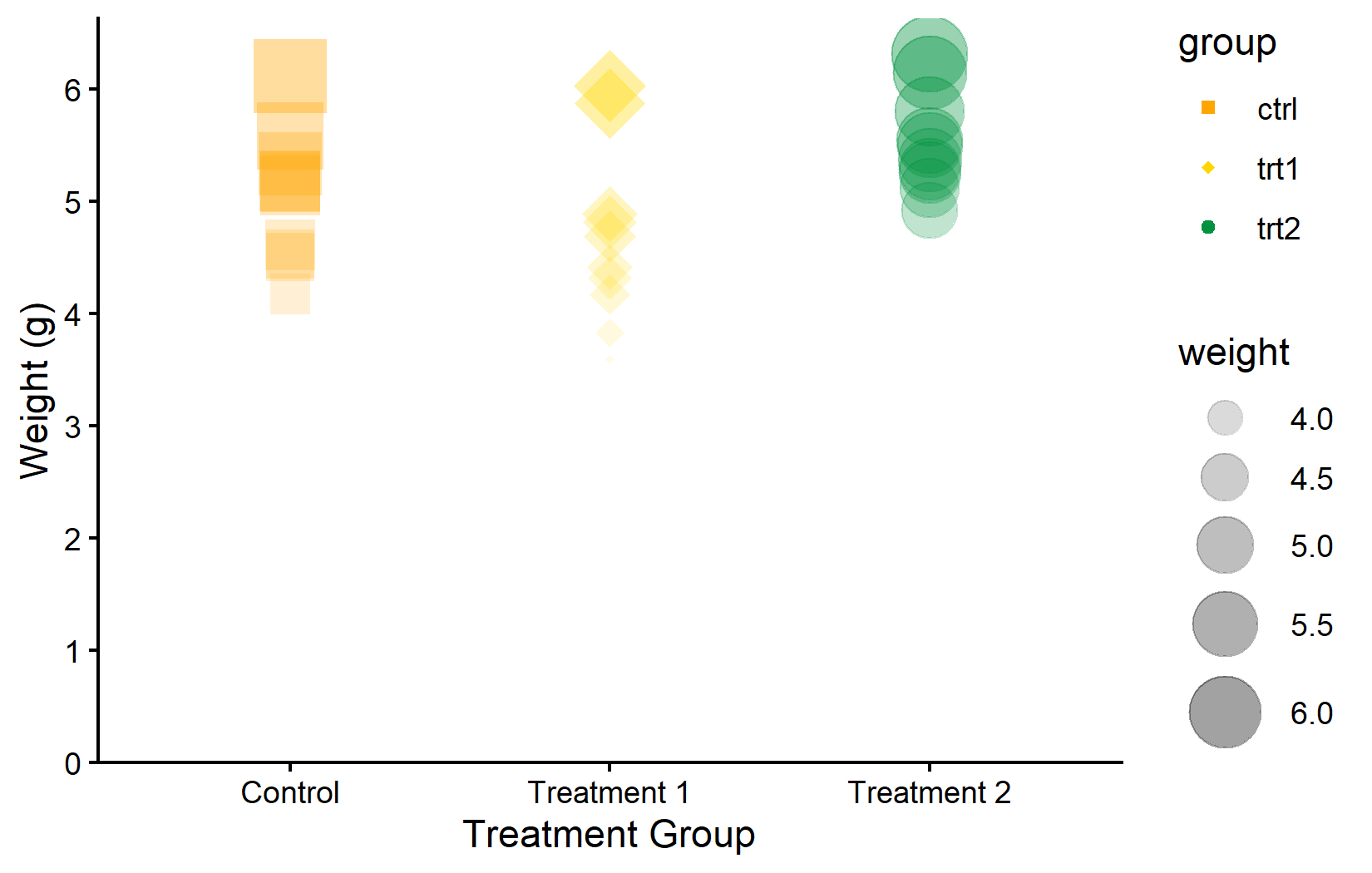
Multiple aesthetics can be mapped simultaneously. This is useful when a single visual channel is not sufficient - for example, mapping both color and shape to the same variable provides redundant encoding that helps colorblind readers. Here, color and shape depend on group, while size and transparency depend on weight:
myplot +
  geom_point(aes(
    color = group,
    shape = group,
    size = weight,
    alpha = weight
  ))
Just as scale_x_* and scale_y_* control axis appearance, there are scale functions for each aesthetic. These provide complete control over the mapping:
Color palettes
Manually choosing individual colors from long lists is tedious and often results in combinations that clash visually or are hard to distinguish. A better approach is to use curated color palettes - predefined sets of colors that are designed to be harmonious, distinguishable, and often accessible to people with color vision deficiencies.
There are two general approaches: one can generate a color vector from a palette and pass it to scale_color_manual(), or one can use a dedicated scale_color_*() function that applies the palette directly. Both are shown below.
RColorBrewer
The {RColorBrewer} package offers a well-established collection of palettes, originally designed for cartography but widely used in all fields. It provides three types of palettes: sequential (for ordered data), diverging (for data with a meaningful midpoint), and qualitative (for categorical groups like ours).
color_vector <- RColorBrewer::brewer.pal(3, "Dark2")

myplot +
  geom_point(aes(color = group), size = 5) +
  scale_color_manual(values = color_vector)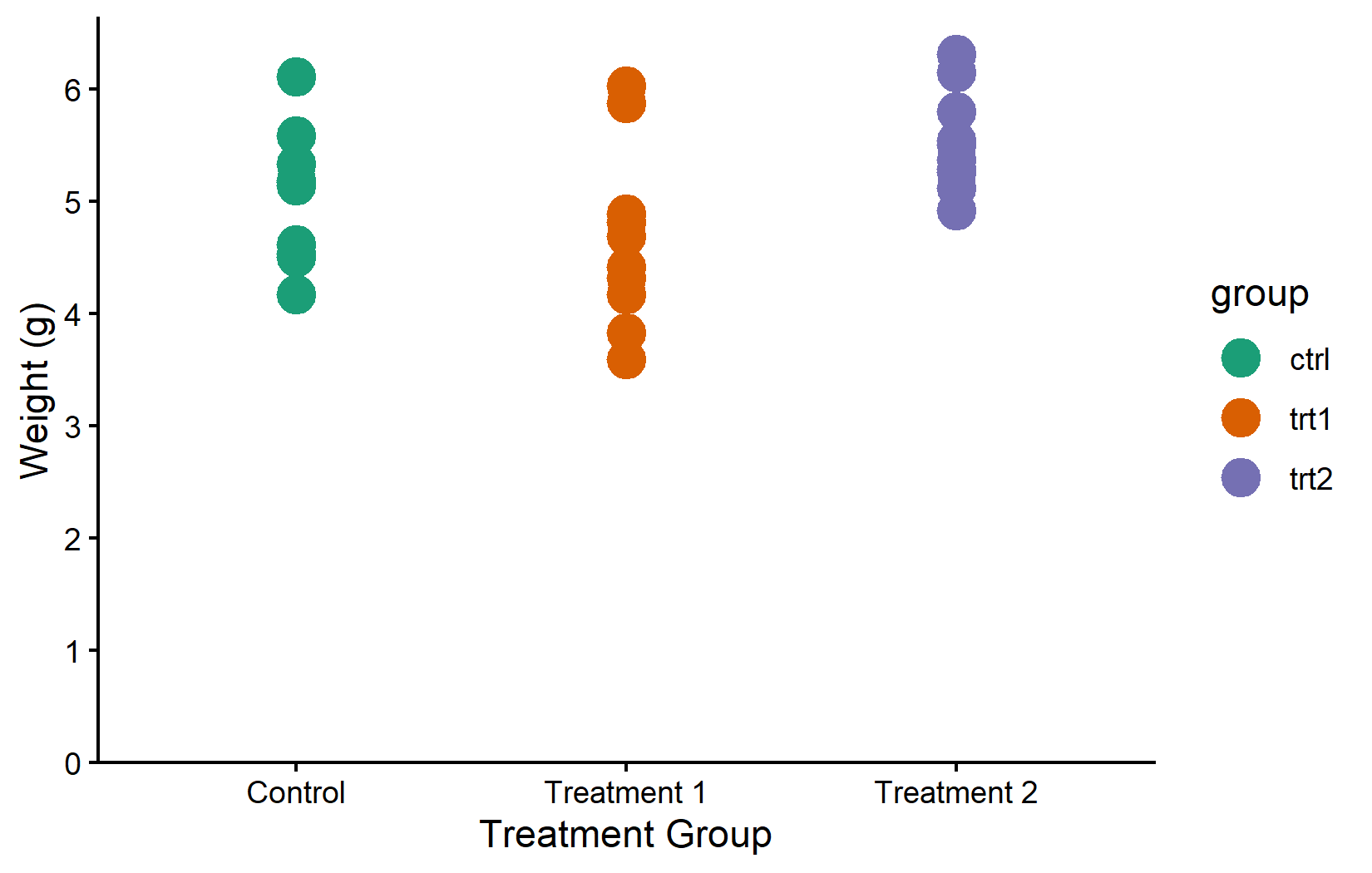
myplot +
  geom_point(aes(color = group), size = 5) +
  scale_color_brewer(palette = "Pastel1")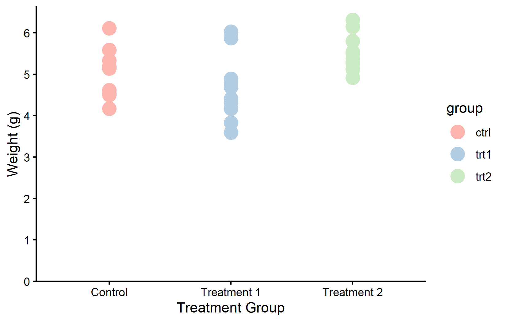
MetBrewer
The {MetBrewer} package provides palettes inspired by works of art at the Metropolitan Museum of Art.
color_vector <- MetBrewer::met.brewer("VanGogh2", 3)

myplot +
  geom_point(aes(color = group), size = 5) +
  scale_color_manual(values = color_vector)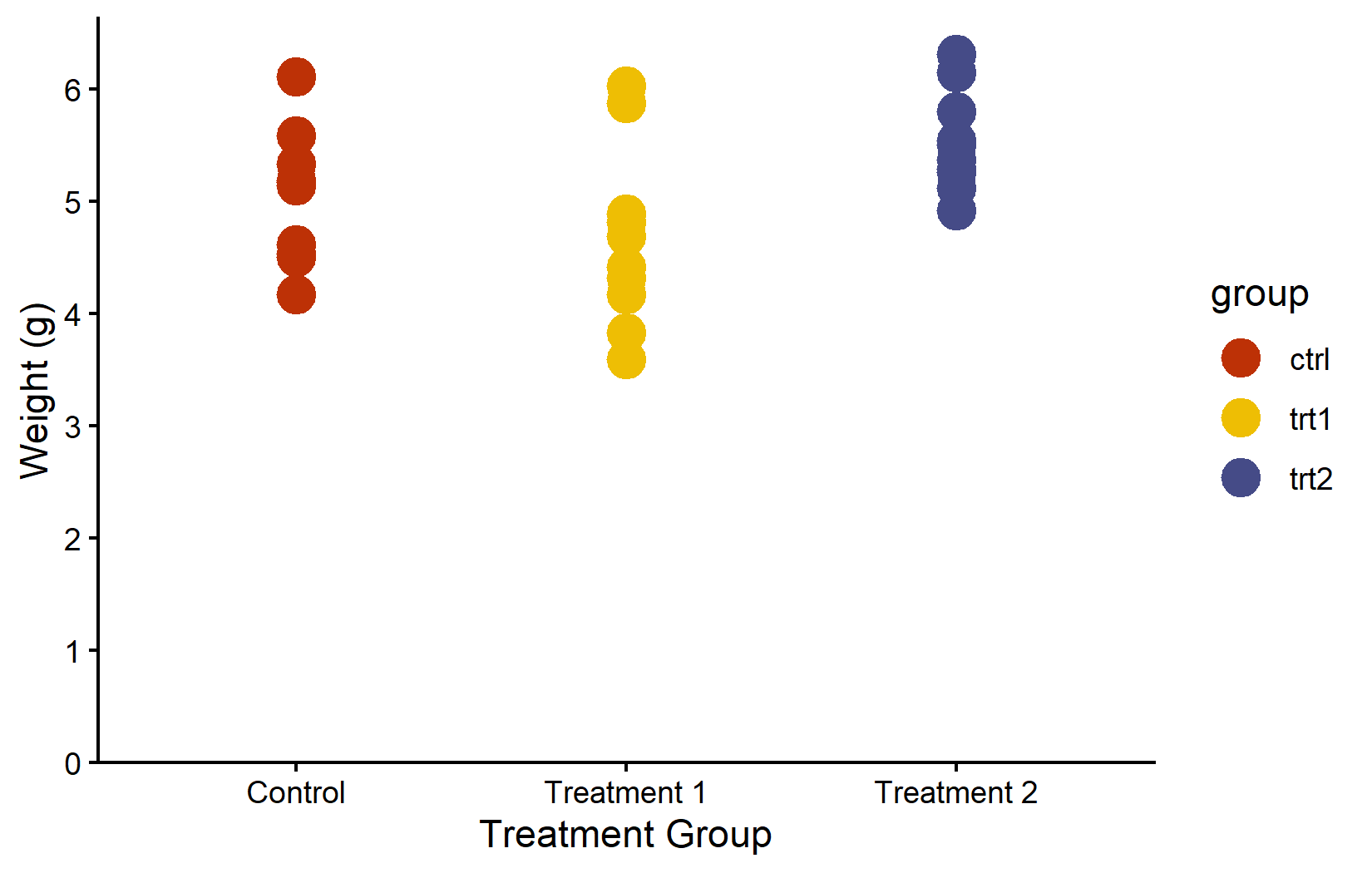
Colorblind-friendly: viridis
When creating plots for publication or presentation, colorblind accessibility should not be an afterthought. Approximately 8% of men and 0.5% of women have some form of color vision deficiency. The viridis family of palettes is specifically designed to be perceptually uniform (equal steps in data produce equal visual steps) and accessible to people with the most common forms of color blindness.
myplot +
  geom_point(aes(color = group), size = 5) +
  scale_color_viridis_d()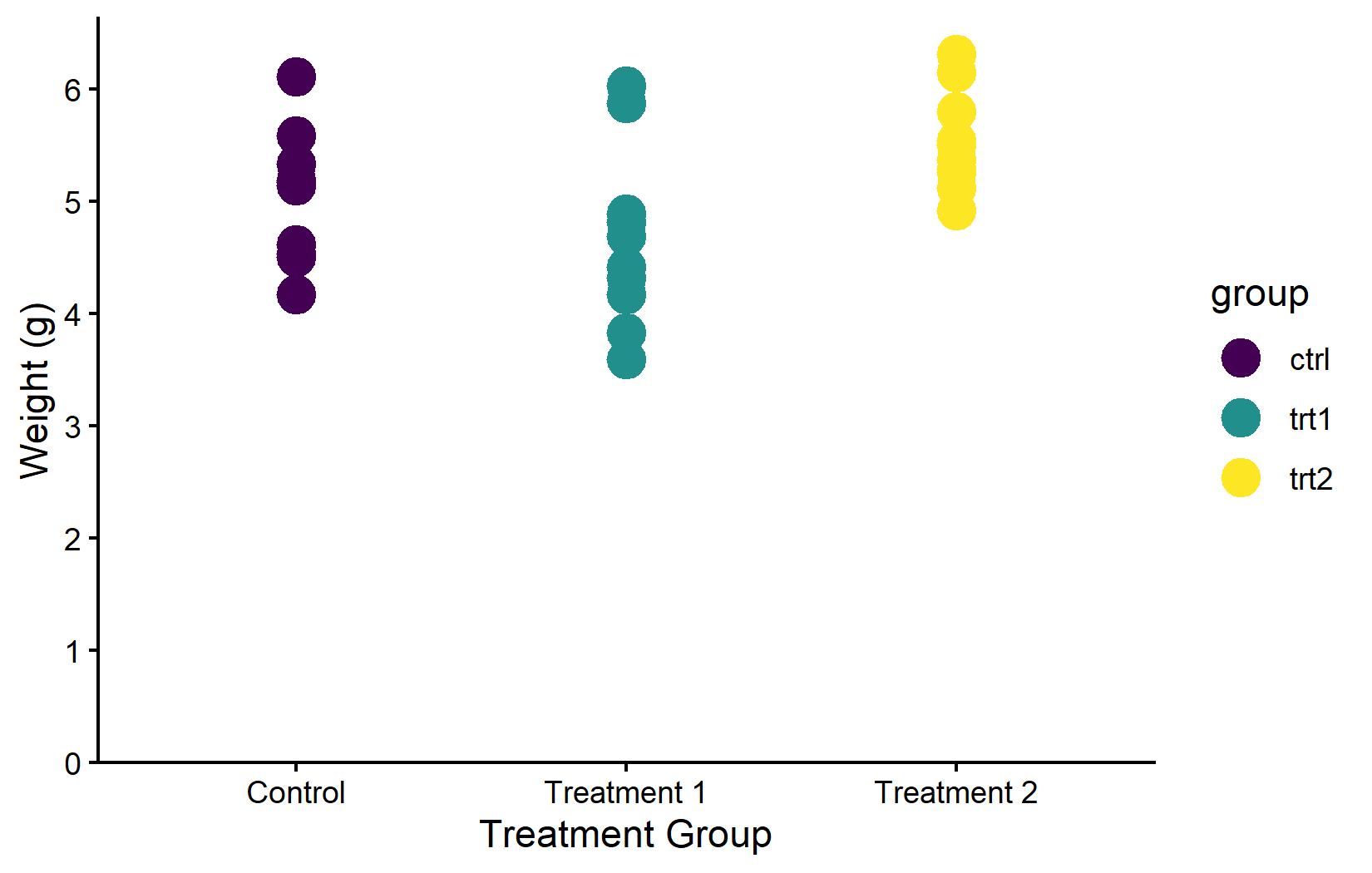
Corporate design
In practice, the choice of colors is often not free at all - many organizations have a corporate design guide that specifies exact hex colors for all graphics. In such cases, one simply defines the required colors and passes them via scale_color_manual(). For example, BioMath’s corporate green is #00923f:
myplot +
  geom_point(aes(color = group), size = 5) +
  scale_color_manual(values = c("#00923f", "#201E50", "#AAAAAA"))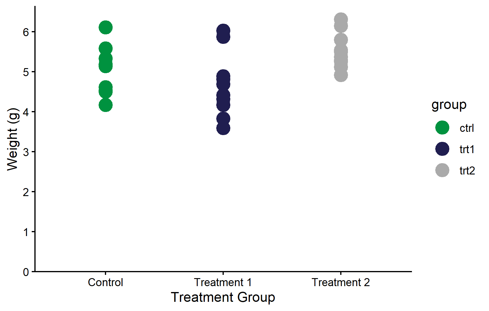
Color vs. fill
A common source of confusion - especially for beginners - is the difference between color and fill. The rule is straightforward: color controls the outline of a geom (points, lines, borders of bars), while fill controls its interior (the filled area of bars, boxplots, violin plots, and ribbon-like geoms). The corresponding scale functions follow the same pattern: everything we covered above with scale_color_*() works identically with scale_fill_*().
The distinction matters most for geoms that have both an outline and an interior, like geom_boxplot() or geom_col(). For these, one typically maps fill to a grouping variable (to color the body of each bar or box) while leaving color at its default.
ggplot(data = PlantGrowth) +
  aes(y = weight, x = group, fill = group) +
  geom_boxplot() +
  scale_fill_brewer(palette = "Set2") +
  theme_classic()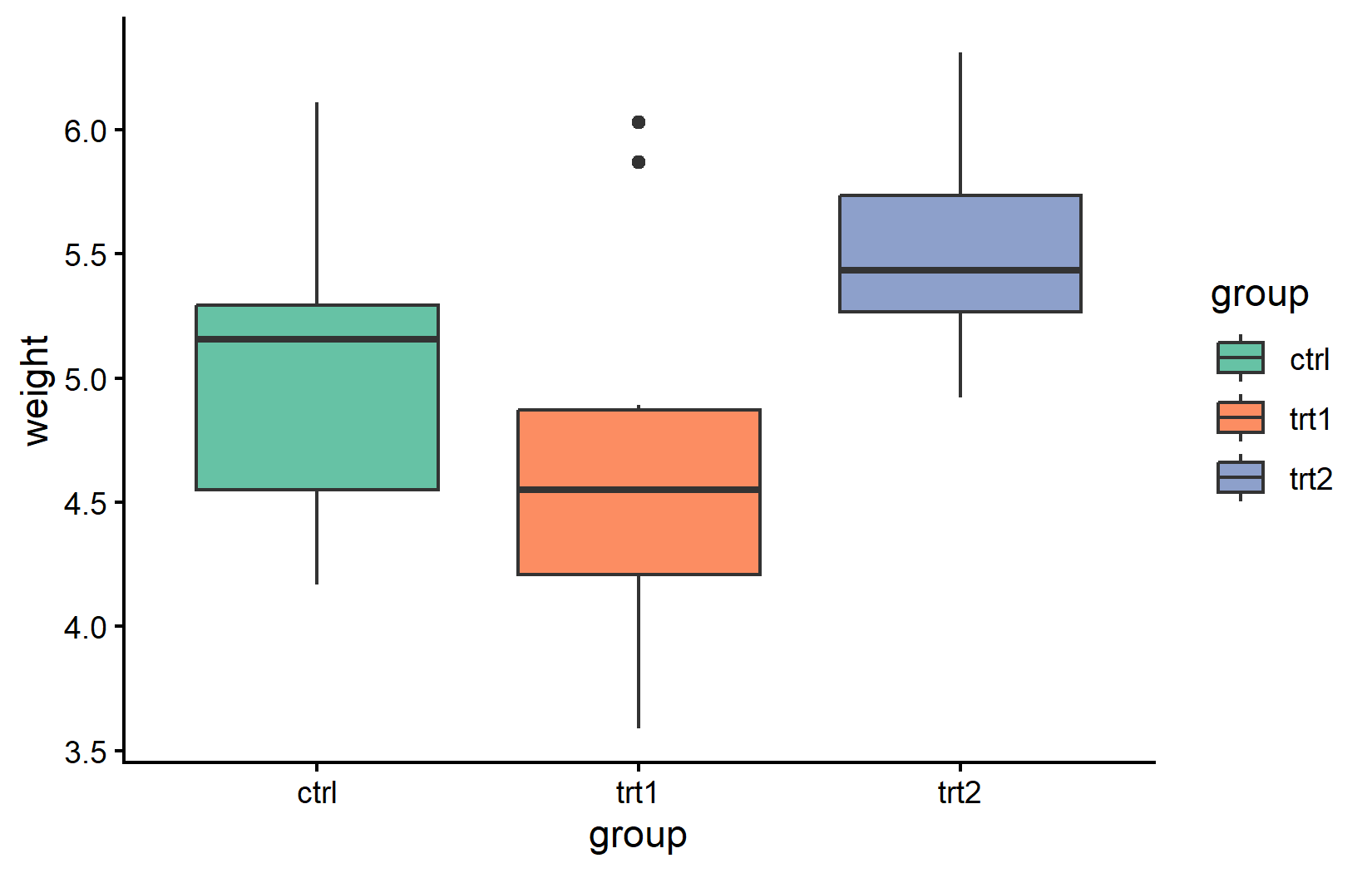
Citation
BibTeX citation:
@online{schmidt2026,
  author = {{Dr. Paul Schmidt}},
  publisher = {BioMath GmbH},
  title = {2. {Colors,} {Shapes} and {Palettes}},
  date = {2026-03-12},
  url = {https://biomathcontent.netlify.app/content/ggplot2/02_colors.html},
  langid = {en}
}
For attribution, please cite this work as:
Dr. Paul Schmidt. 2026. “2. Colors, Shapes and Palettes.”
BioMath GmbH. March 12, 2026. https://biomathcontent.netlify.app/content/ggplot2/02_colors.html.