for (pkg in c("tidyverse", "gapminder", "showtext", "ggtext", "ggh4x", "scales")) {
  if (!require(pkg, character.only = TRUE)) install.packages(pkg)
}

showtext::showtext_opts(dpi = 300)
When working with data that has multiple numeric variables or natural subgroups, one often wants to show the same type of plot for each variable or group side by side. Creating these plots manually - copy-pasting code and adjusting the variable name each time - is tedious and error-prone. Facetting solves this elegantly: facet_wrap() automatically splits the data by one or more variables and creates a panel for each group, all sharing the same aesthetic mappings, scales, and theme.
In this chapter we apply facetting to the gapminder dataset from the previous chapter, creating a multi-panel dumbbell plot that compares life expectancy, population, and GDP per capita in a single graphic. Along the way, we address a common challenge: when facets display variables on very different scales, the default axis formatting becomes unreadable. We solve this using custom label formatting and the {ggh4x} package for per-facet axis control.
Setup
We reuse the data preparation and theme from the previous chapter:
dat <- gapminder::gapminder %>%
  filter(year == 1952 | year == 2007) %>%
  filter(country %in% c(
    "Canada", "Germany", "Japan",
    "Netherlands", "Nigeria", "Vietnam", "Zimbabwe"
  )) %>%
  mutate(year = as.factor(year)) %>%
  droplevels()

sorted_countries <- dat %>%
  filter(year == "2007") %>%
  arrange(lifeExp) %>%
  pull(country) %>%
  as.character()

dat <- dat %>%
  mutate(country = fct_relevel(country, sorted_countries))

sysfonts::font_add_google("Kanit", "kanit")
showtext::showtext_auto()

year_colors <- c("1952" = "#F7AA59", "2007" = "#37A9E1")

theme_nature <- function(base_size = 12) {
  theme_minimal(base_size = base_size) +
    theme(
      text = element_text(family = "kanit"),
      plot.title.position = "plot",
      plot.title = element_text(size = 15, face = "bold"),
      plot.subtitle = ggtext::element_textbox_simple(
        size = 10, margin = margin(0, 0, 10, 0)
      ),
      axis.line.y = element_blank(),
      axis.text.x = element_text(color = "#AAAAAA"),
      axis.ticks.x = element_line(color = "#AAAAAA", linewidth = 0.4),
      axis.ticks.length.x = unit(4, "pt"),
      axis.line.x = element_line(color = "black", linewidth = 0.6),
      panel.grid.minor = element_blank(),
      panel.grid.major.y = element_blank(),
      panel.grid.major.x = element_line(
        linetype = "dotted", color = "#AAAAAA", linewidth = 0.3
      )
    )
}
Restructuring data for facets
To create one facet per variable, all numeric values must live in a single column - this is the “long format” that ggplot2 works best with. The gapminder data currently has three separate columns (lifeExp, pop, gdpPercap), so we need to pivot them into two columns: one for the variable name (statistic) and one for the value (value).
dat_long <- dat %>%
  pivot_longer(
    cols = c(lifeExp, pop, gdpPercap),
    names_to = "statistic",
    values_to = "value"
  )

dat_long
# A tibble: 42 × 5
country continent year statistic value
<fct> <fct> <fct> <chr> <dbl>
1 Canada Americas 1952 lifeExp 68.8
2 Canada Americas 1952 pop 14785584
3 Canada Americas 1952 gdpPercap 11367.
4 Canada Americas 2007 lifeExp 80.7
5 Canada Americas 2007 pop 33390141
6 Canada Americas 2007 gdpPercap 36319.
7 Germany Europe 1952 lifeExp 67.5
8 Germany Europe 1952 pop 69145952
9 Germany Europe 1952 gdpPercap 7144.
10 Germany Europe 2007 lifeExp 79.4
# ℹ 32 more rowsWe also need a wide version for the dumbbell segments and difference labels:
dat_wide <- dat_long %>%
  pivot_wider(
    names_from = year,
    values_from = value,
    names_prefix = "year_"
  ) %>%
  mutate(
    max_x = pmax(year_2007, year_1952),
    diff = year_2007 - year_1952
  )
Basic facetting
Adding facet_wrap(~ statistic) splits the plot into three panels, one per variable. The critical addition here is scales = "free_x", which allows each panel to have its own x-axis range. Without this, all three panels would share one axis, and life expectancy values (40-80) would be invisible next to population values (in the millions).
The scales argument accepts four options: "fixed" (the default - all panels share the same axes), "free_x" (each panel gets its own x-axis range), "free_y" (each panel gets its own y-axis range), and "free" (both axes are independent). Choosing the right option depends on what one wants to emphasize: shared scales make comparisons across panels easier, while free scales prevent variables on different orders of magnitude from squashing each other.
subtitle_text <- glue::glue(
  "In <b style='color:{year_colors[['2007']]};'>2007</b>, ",
  "compared to <b style='color:{year_colors[['1952']]};'>1952</b>, ",
  "life expectancy, GDP per capita, and population reflect significant changes."
)

ggplot(data = dat_long) +
  aes(x = value, y = country, color = fct_rev(year)) +
  facet_wrap(~ statistic, scales = "free_x") +
  geom_segment(
    data = dat_wide,
    aes(x = year_1952, xend = year_2007, y = country, yend = country),
    color = "#AAAAAA", linewidth = 1
  ) +
  geom_point(size = 3) +
  scale_color_manual(
    limits = c("1952", "2007"),
    values = year_colors, guide = "none"
  ) +
  scale_y_discrete(name = NULL) +
  scale_x_continuous(name = NULL) +
  labs(
    title = "GDP, LIFE EXPECTANCY & POPULATION",
    subtitle = subtitle_text
  ) +
  theme_nature()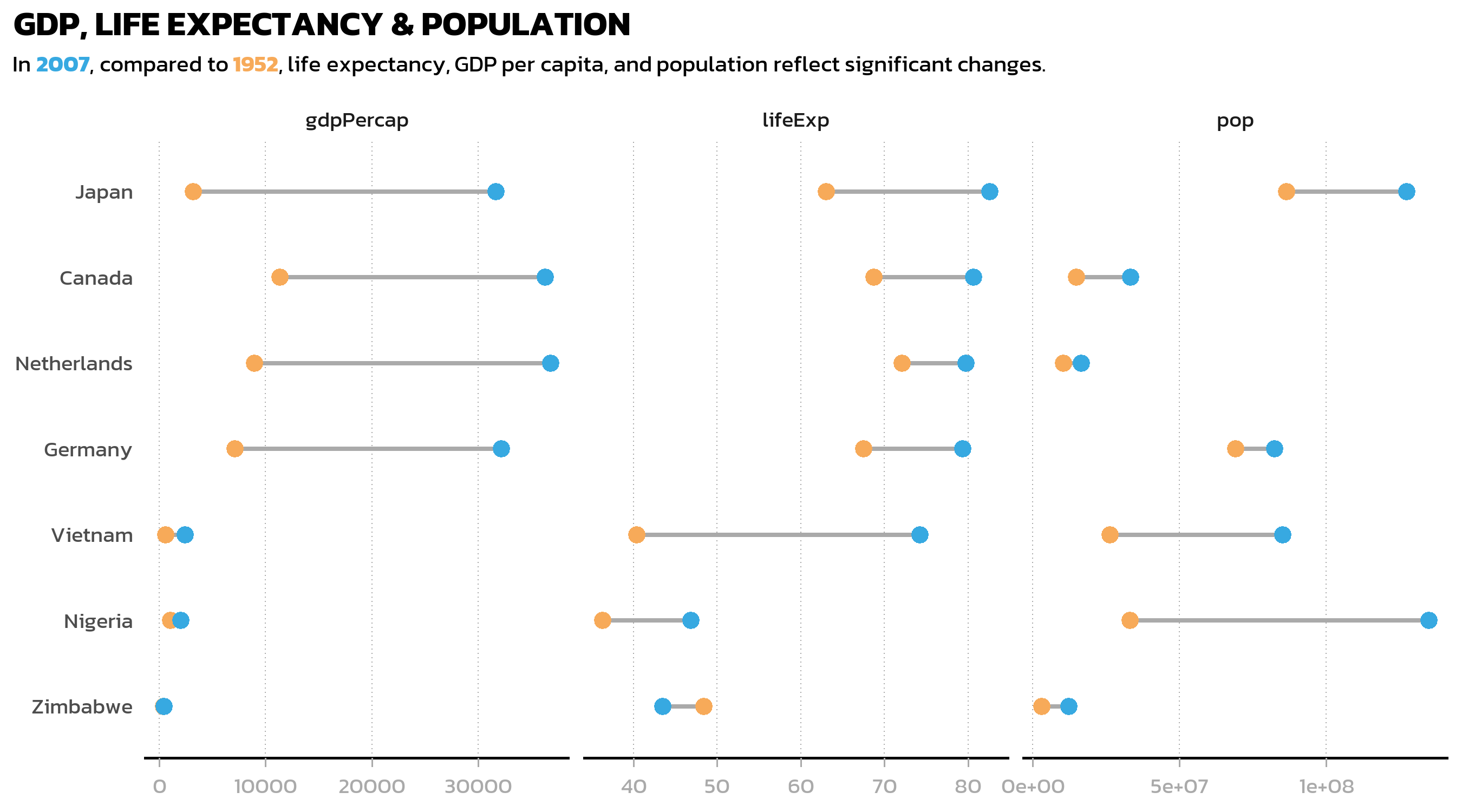
This is already a useful overview, but two things stand out: the axis labels for population and GDP are raw numbers in the millions (unreadable), and the default facet strip labels just show the variable names from the data (gdpPercap, lifeExp, pop). Both problems are easily fixed.
Custom facet labels and data labels
A key principle of good visualization is that the reader should never have to do mental arithmetic. Displaying “130000000” on an axis when one could write “130m” is an unnecessary cognitive burden. The {scales} package provides number() for exactly this purpose - it formats numbers with custom accuracy, scaling, and suffixes.
We create formatted value labels for each statistic, and also compute difference labels (“+38”, “+2.1k”) for the dumbbell plot:
dat_long <- dat_long %>%
  mutate(value_lab = case_when(
    statistic == "lifeExp"   ~ number(value, accuracy = 1),
    statistic == "pop"       ~ number(value, accuracy = 1, scale = 1/1e6, suffix = "m"),
    statistic == "gdpPercap" ~ number(value, accuracy = 0.1, scale = 1/1e3, suffix = "k")
  ))

dat_wide <- dat_wide %>%
  mutate(
    diff_lab = case_when(
      statistic == "lifeExp" ~ number(
        diff, style_positive = "plus", style_negative = "minus", accuracy = 1
      ),
      statistic == "pop" ~ number(
        diff, style_positive = "plus", style_negative = "minus",
        accuracy = 1, scale = 1/1e6, suffix = "m"
      ),
      statistic == "gdpPercap" ~ number(
        diff, style_positive = "plus", style_negative = "minus",
        accuracy = 0.1, scale = 1/1e3, suffix = "k"
      )
    ),
    x_pos_lab = case_when(
      statistic == "lifeExp"   ~ max_x + 3,
      statistic == "pop"       ~ max_x + 10000000,
      statistic == "gdpPercap" ~ max_x + 3000
    )
  )
Next, we define human-readable names for the facet strip labels. The labeller() function accepts a named vector that maps internal variable names to display labels:
facet_labels <- c(
  lifeExp = "Life Expectancy [years]",
  pop = "Population",
  gdpPercap = "GDP per Capita [$]"
)
Now we assemble the complete faceted dumbbell plot, combining all the elements from the previous chapter (segments, points, labels, custom theme) with the facetting layer:
p3 <- ggplot(data = dat_long) +
  aes(x = value, y = country, color = fct_rev(year)) +
  facet_wrap(
    ~ statistic,
    scales = "free_x",
    labeller = labeller(statistic = facet_labels)
  ) +
  geom_segment(
    data = dat_wide,
    aes(x = year_1952, xend = year_2007, y = country, yend = country),
    color = "#AAAAAA", linewidth = 1
  ) +
  geom_point(size = 3) +
  geom_text(
    mapping = aes(
      label = value_lab,
      vjust = if_else(year == "1952", 2, -1)
    ),
    size = 2.5, family = "kanit"
  ) +
  geom_text(
    data = dat_wide,
    mapping = aes(x = x_pos_lab, label = diff_lab),
    size = 2.5, hjust = 0,
    color = "#AAAAAA", family = "kanit"
  ) +
  scale_color_manual(
    limits = c("1952", "2007"),
    values = year_colors, guide = "none"
  ) +
  scale_y_discrete(name = NULL) +
  scale_x_continuous(name = NULL) +
  labs(
    title = "GDP, LIFE EXPECTANCY & POPULATION",
    subtitle = subtitle_text
  ) +
  theme_nature() +
  theme(
    panel.spacing = unit(1, "lines"),
    strip.background = element_rect(fill = NA, color = "black")
  )

p3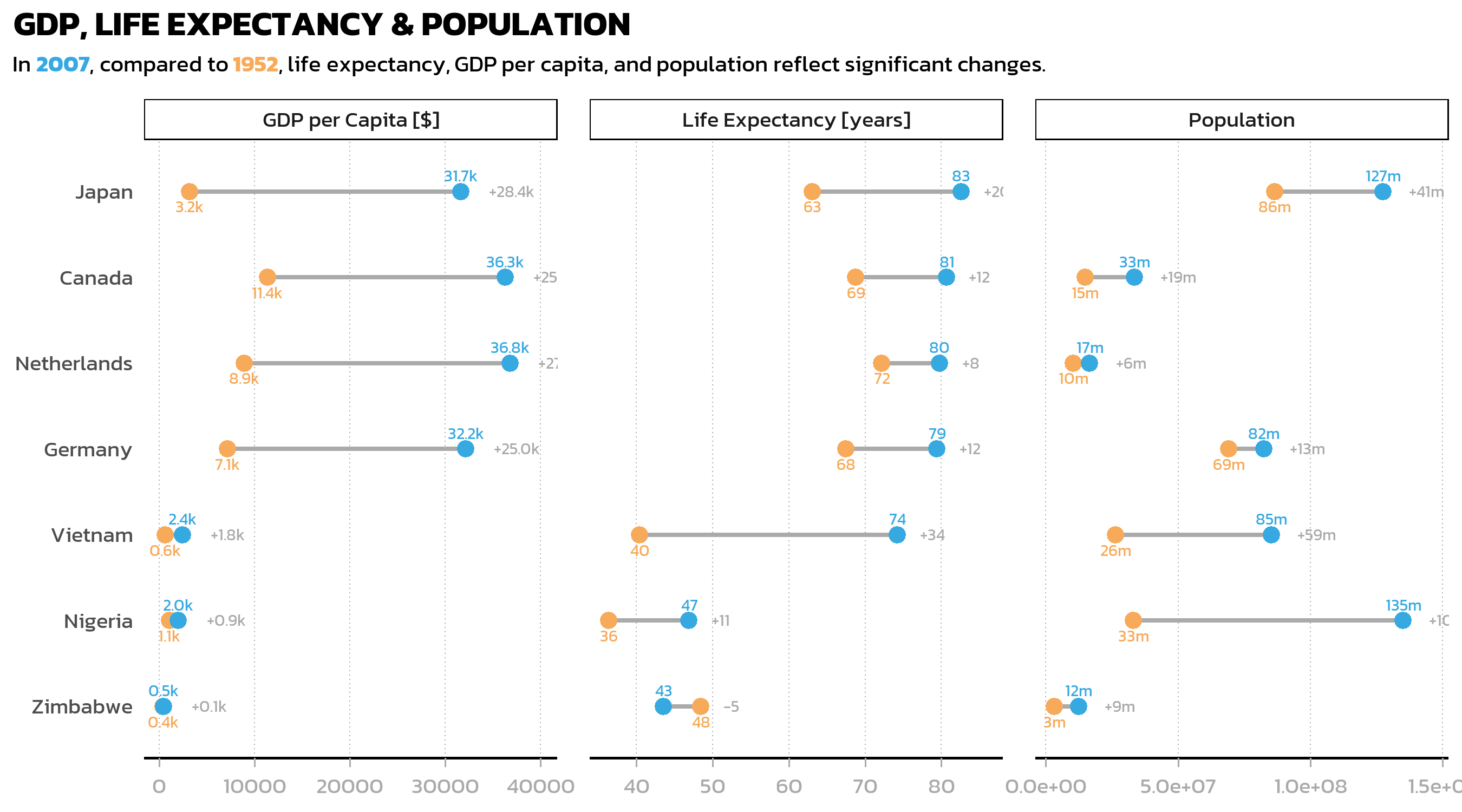
A useful trick in this code is vjust = if_else(year == "1952", 2, -1) inside aes(): this places 1952 labels below their points and 2007 labels above, preventing overlap where values are close together. Since vjust is inside aes(), it is computed per observation, allowing conditional positioning.
The panel.spacing and strip.background adjustments in theme() add visual separation between facets: more space between panels and a subtle border around the strip labels.
Individual scales per facet with ggh4x
While scales = "free_x" lets each facet have its own axis range, standard ggplot2 applies the same axis formatting to all facets. In our case, we need fundamentally different formatting: plain numbers for life expectancy (35, 55, 75), millions with an “m” suffix for population (0m, 50m, 100m), and thousands with a “k” suffix for GDP (0k, 25k). The {ggh4x} package provides facetted_pos_scales() for exactly this purpose - it allows individual scale_x_continuous() definitions per facet.
p3 <- p3 + facetted_pos_scales(
  x = list(
    statistic == "lifeExp" ~ scale_x_continuous(
      limits = c(35, 90),
      breaks = breaks_width(20),
      labels = number_format(accuracy = 1)
    ),
    statistic == "pop" ~ scale_x_continuous(
      limits = c(0, 150000000),
      expand = expansion(mult = c(0.05, 0.2)),
      breaks = breaks_width(50000000),
      labels = number_format(accuracy = 1, scale = 1/1e6, suffix = "m")
    ),
    statistic == "gdpPercap" ~ scale_x_continuous(
      limits = c(0, 50000),
      expand = expansion(mult = c(0.075, 0.075)),
      breaks = breaks_width(25000),
      labels = number_format(accuracy = 1, scale = 1/1e3, suffix = "k")
    )
  )
) + xlab(NULL)

p3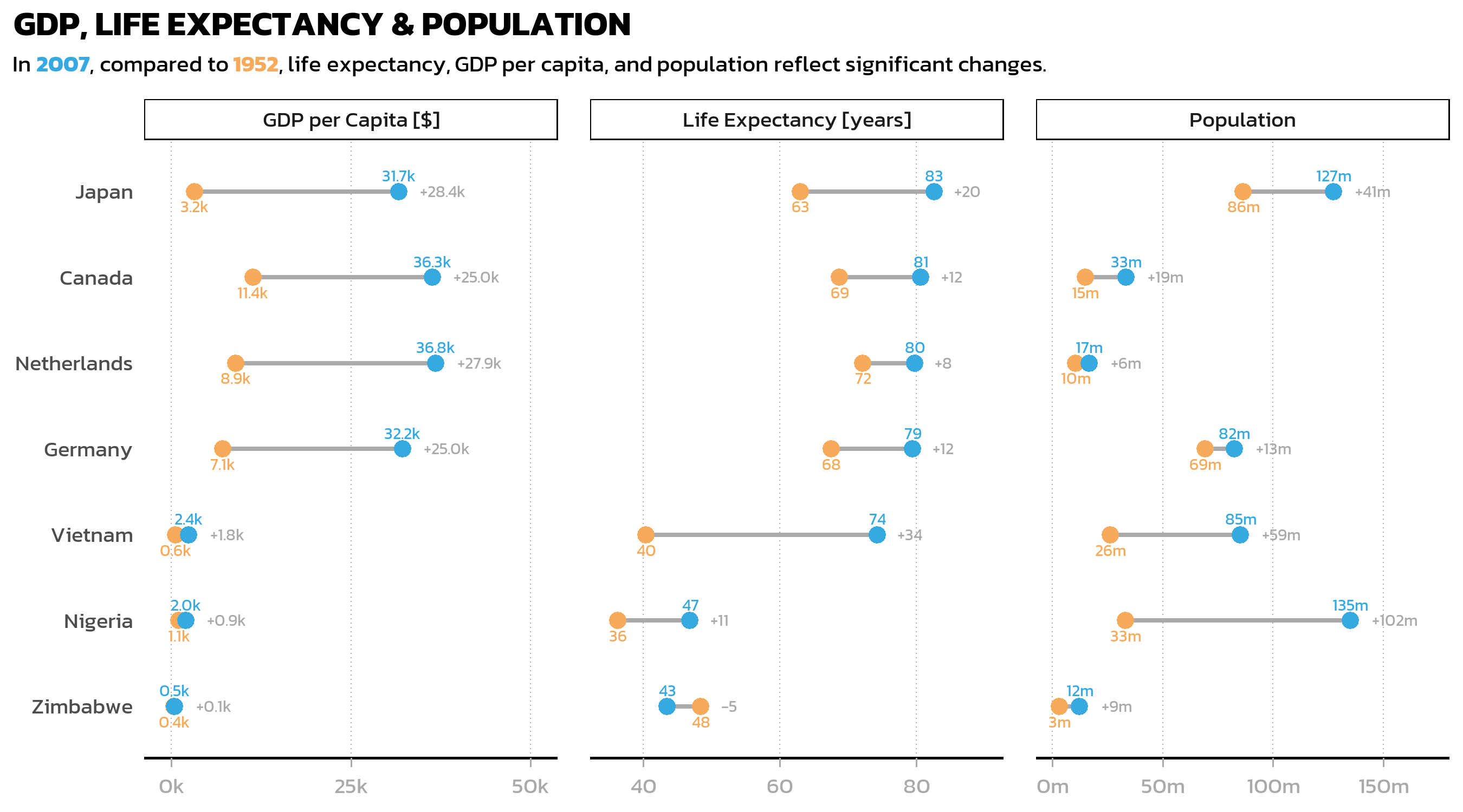
Each facet now has properly formatted axis labels: “35, 55, 75” for life expectancy, “0m, 50m, 100m” for population, and “0k, 25k” for GDP. The limits and expand arguments for each facet are tuned individually to ensure that no data labels are cut off at the edges.
The formula syntax (statistic == "lifeExp" ~ scale_x_continuous(...)) makes the code highly readable: each line clearly states which facet gets which scale configuration. This is one of the most useful features of ggh4x and worth keeping in mind whenever facets display variables with fundamentally different units or magnitudes.
Tip
The {scales} package is the backbone of axis label formatting. Key functions include:
-
number_format()- general number formatting withaccuracy,scale,suffix -
breaks_width()- set break intervals by width -
label_percent(),label_comma(),label_dollar()- specialized formatters
Citation
BibTeX citation:
@online{schmidt2026,
  author = {{Dr. Paul Schmidt}},
  publisher = {BioMath GmbH},
  title = {6. {Facets}},
  date = {2026-03-12},
  url = {https://biomathcontent.netlify.app/content/ggplot2/06_facets.html},
  langid = {en}
}
For attribution, please cite this work as:
Dr. Paul Schmidt. 2026. “6. Facets.” BioMath GmbH. March
12, 2026. https://biomathcontent.netlify.app/content/ggplot2/06_facets.html.