for (pkg in c("tidyverse", "gapminder", "showtext", "ggtext")) {
  if (!require(pkg, character.only = TRUE)) install.packages(pkg)
}

showtext::showtext_opts(dpi = 300)
In the previous chapters we learned the individual building blocks of ggplot2: axes, colors, themes, and export. Now it is time to combine them into complete, publication-ready graphics. To do this, we switch from the small PlantGrowth dataset to the {gapminder} dataset - a much richer dataset tracking life expectancy, population, and GDP per capita for 142 countries from 1952 to 2007.
Along the way, we will encounter several practical challenges that arise when building real-world plots: how to control the order of categories, how to add data labels that align correctly with grouped bars, and how to build a custom theme function step by step - inspired by the clean design of Nature graphics.
Data preparation
We start by filtering the gapminder data to compare two time points - 1952 and 2007 - for seven selected countries that span a range of development patterns. The year column needs to be converted to a factor because ggplot2 treats numeric values as continuous by default, and we want distinct groups rather than a continuous scale.
# A tibble: 14 × 6
   country     continent year  lifeExp       pop gdpPercap
   <fct>       <fct>     <fct>   <dbl>     <int>     <dbl>
 1 Canada      Americas  1952     68.8  14785584    11367.
 2 Canada      Americas  2007     80.7  33390141    36319.
 3 Germany     Europe    1952     67.5  69145952     7144.
 4 Germany     Europe    2007     79.4  82400996    32170.
 5 Japan       Asia      1952     63.0  86459025     3217.
 6 Japan       Asia      2007     82.6 127467972    31656.
 7 Netherlands Europe    1952     72.1  10381988     8942.
 8 Netherlands Europe    2007     79.8  16570613    36798.
 9 Nigeria     Africa    1952     36.3  33119096     1077.
10 Nigeria     Africa    2007     46.9 135031164     2014.
11 Vietnam     Asia      1952     40.4  26246839      605.
12 Vietnam     Asia      2007     74.2  85262356     2442.
13 Zimbabwe    Africa    1952     48.5   3080907      407.
14 Zimbabwe    Africa    2007     43.5  12311143      470.
Factor level reordering
By default, ggplot2 sorts factor levels alphabetically and applies this order from bottom to top on the y-axis (and left to right on the x-axis). For our plot this would mean Canada at the bottom and Zimbabwe at the top - a purely arbitrary order that makes it harder for the reader to spot patterns. It makes much more sense to sort countries by a meaningful variable, such as their 2007 life expectancy.
The {forcats} package (loaded with tidyverse) provides convenient functions for reordering factor levels. Here we use fct_relevel() with a pre-sorted vector of country names:
sorted_countries <- dat %>%
  filter(year == "2007") %>%
  arrange(lifeExp) %>%
  pull(country) %>%
  as.character()

dat <- dat %>%
  mutate(country = fct_relevel(country, sorted_countries))
TipAlternative approaches to reordering
Instead of creating a sorted vector and using fct_relevel(), there are other options:
-
fct_rev()directly inaes():aes(y = fct_rev(country))reverses the current order without changing the data. This is quick but only reverses - it does not sort by a variable. -
limitsin the scale:scale_y_discrete(limits = c("Zimbabwe", "Nigeria", ...))manually specifies the order. This works but is fragile - if a country name changes or a level is missing, the plot silently drops it. -
fct_reorder():mutate(country = fct_reorder(country, lifeExp))sorts by another variable. This is the most concise approach for simple cases but requires care when the sorting variable exists for multiple years.
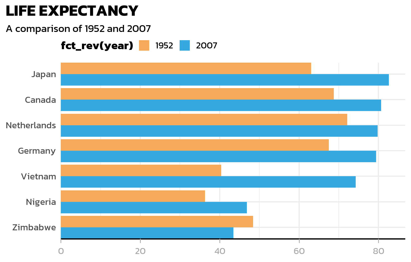
Grouped bar chart
A classic way to visualize paired comparisons is a grouped bar chart. geom_col() creates bars from the data, and position_dodge() places bars for different groups side by side rather than stacking them:
ggplot(data = dat) +
  aes(x = lifeExp, y = country, fill = fct_rev(year)) +
  geom_col(position = position_dodge()) +
  scale_fill_discrete(limits = c("1952", "2007"))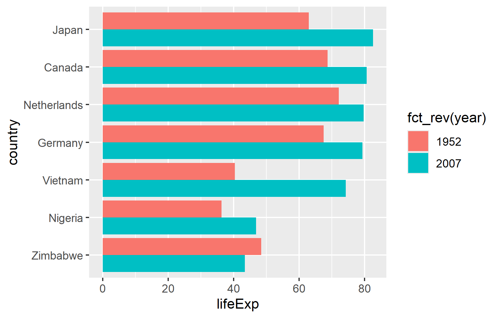
There are two details worth noting here. First, fct_rev(year) reverses the year factor so that 2007 bars appear above 1952 bars within each country group - matching the intuitive “newer on top” expectation. Second, limits = c("1952", "2007") in the scale ensures the legend shows 1952 before 2007 (chronological order), regardless of how the factor levels are internally ordered.
TipAlternative for legend order: guides()
Instead of using limits in the scale, one can also reverse the legend order with guides(fill = guide_legend(reverse = TRUE)). This is sometimes more convenient when the scale already has other settings configured.
Building a custom theme step by step
Instead of applying a ready-made theme, we will build one from scratch - inspired by the clean, minimalist style of Nature graphics. This step-by-step approach makes it easy to understand what each theme element does, and the result is a reusable theme_nature() function.
Starting point
We begin with theme_minimal() and a custom color palette for the two years:
sysfonts::font_add_google("Kanit", "kanit")
showtext::showtext_auto()

year_colors <- c("1952" = "#F7AA59", "2007" = "#37A9E1")

ggplot(data = dat) +
  aes(x = lifeExp, y = country, fill = fct_rev(year)) +
  geom_col(position = position_dodge()) +
  scale_fill_manual(limits = names(year_colors), values = year_colors) +
  theme_minimal()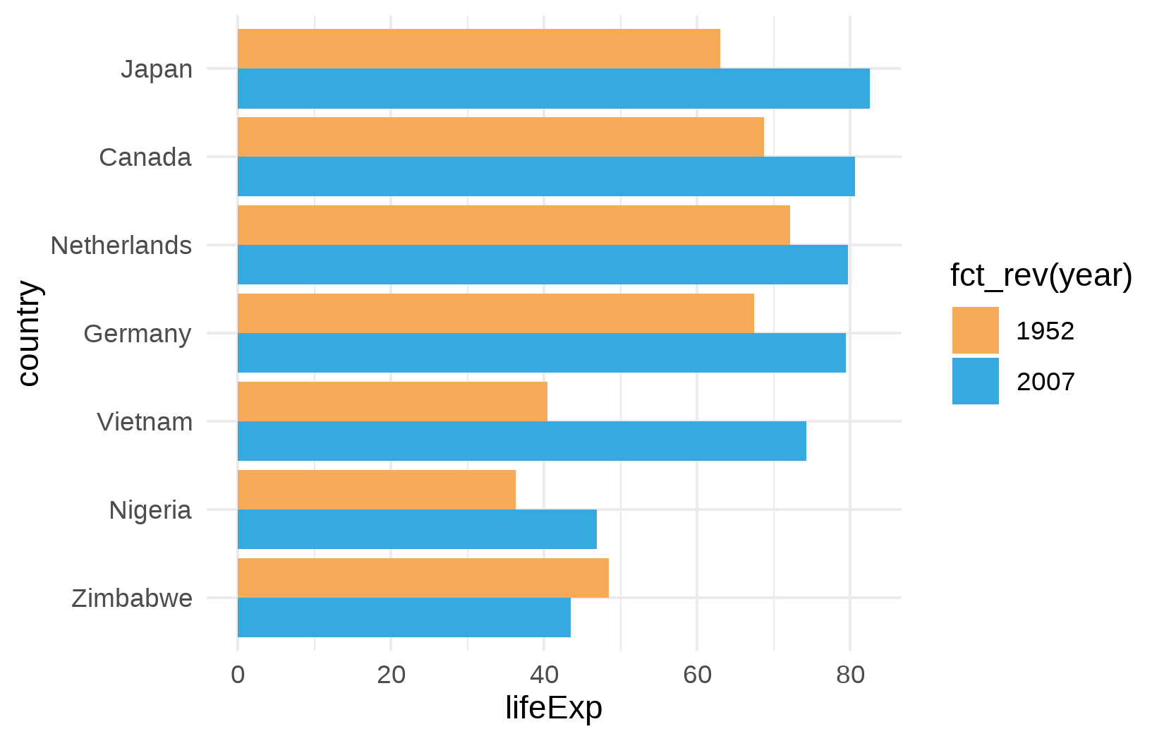
This already looks cleaner than the default theme, but the font is still generic, the title is missing, and several elements need refinement.
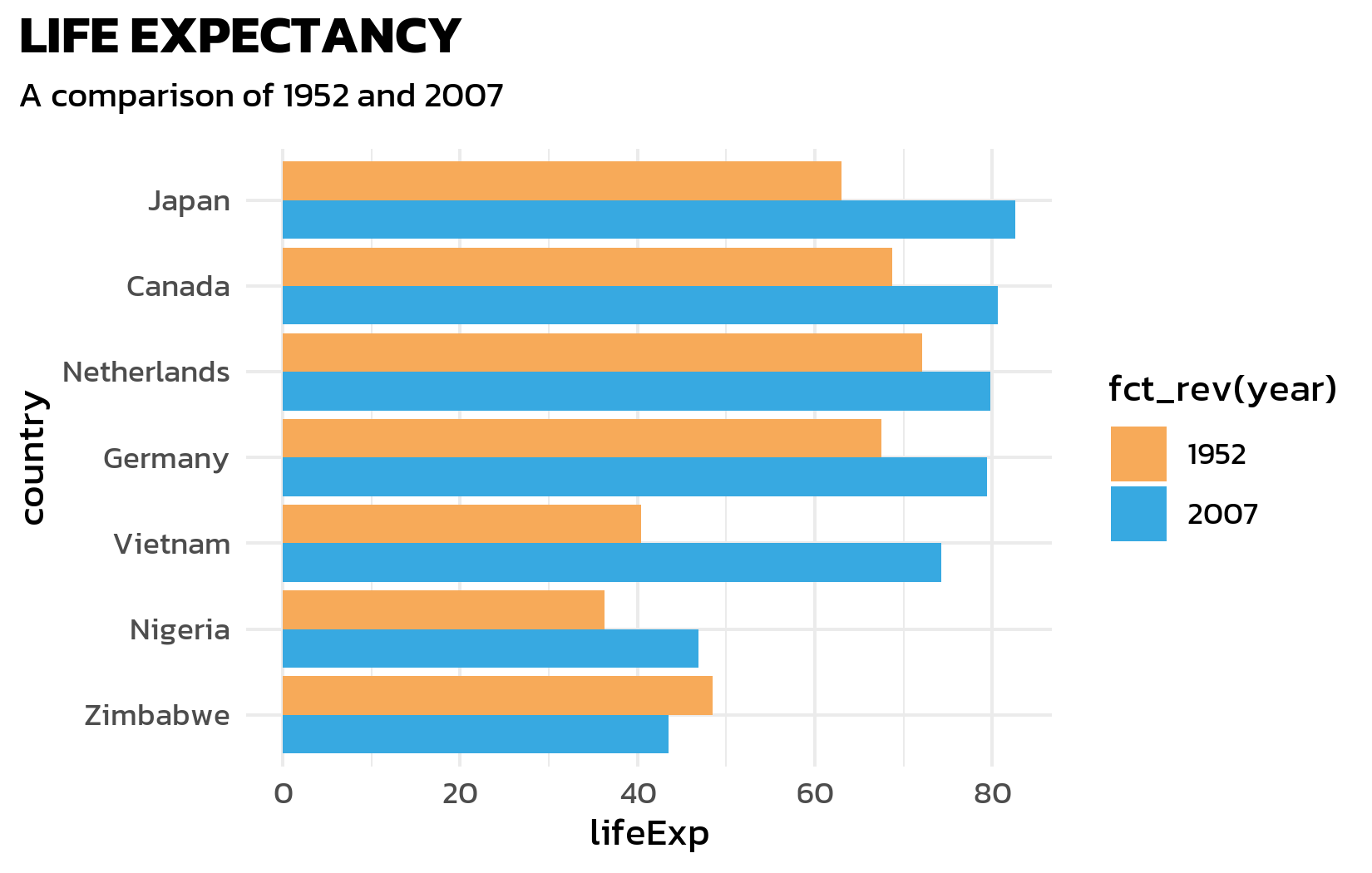
Font, title, and subtitle
Next, we apply the Kanit font, add a bold title, and use element_textbox_simple() from {ggtext} for a subtitle that supports HTML formatting - this will be useful later for color-coded text:
ggplot(data = dat) +
  aes(x = lifeExp, y = country, fill = fct_rev(year)) +
  geom_col(position = position_dodge()) +
  scale_fill_manual(limits = names(year_colors), values = year_colors) +
  labs(title = "LIFE EXPECTANCY", subtitle = "A comparison of 1952 and 2007") +
  theme_minimal() +
  theme(
    text = element_text(family = "kanit"),
    plot.title.position = "plot",
    plot.title = element_text(size = 15, face = "bold"),
    plot.subtitle = ggtext::element_textbox_simple(
      size = 10, margin = margin(0, 0, 10, 0)
    )
  )
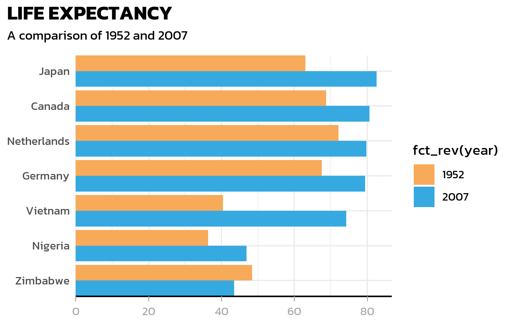
Axis customization
The y-axis line is unnecessary for a horizontal bar chart (the bars themselves define the categories). The x-axis gets a clean black line with subtle grey tick marks:
ggplot(data = dat) +
  aes(x = lifeExp, y = country, fill = fct_rev(year)) +
  geom_col(position = position_dodge()) +
  scale_fill_manual(limits = names(year_colors), values = year_colors) +
  scale_y_discrete(name = NULL, expand = c(0, 0)) +
  scale_x_continuous(name = NULL, expand = expansion(mult = c(0, 0.05))) +
  labs(title = "LIFE EXPECTANCY", subtitle = "A comparison of 1952 and 2007") +
  theme_minimal() +
  theme(
    text = element_text(family = "kanit"),
    plot.title.position = "plot",
    plot.title = element_text(size = 15, face = "bold"),
    plot.subtitle = ggtext::element_textbox_simple(
      size = 10, margin = margin(0, 0, 10, 0)
    ),
    axis.line.y = element_blank(),
    axis.text.x = element_text(color = "#AAAAAA"),
    axis.ticks.x = element_line(color = "#AAAAAA", linewidth = 0.4),
    axis.ticks.length.x = unit(4, "pt"),
    axis.line.x = element_line(color = "black", linewidth = 0.6)
  )
Legend positioning
The legend moves to the top-left corner. A subtle but important detail: legend.margin with a negative top margin pulls the legend closer to the subtitle, reducing wasted white space:
ggplot(data = dat) +
  aes(x = lifeExp, y = country, fill = fct_rev(year)) +
  geom_col(position = position_dodge()) +
  scale_fill_manual(limits = names(year_colors), values = year_colors) +
  scale_y_discrete(name = NULL, expand = c(0, 0)) +
  scale_x_continuous(name = NULL, expand = expansion(mult = c(0, 0.05))) +
  labs(title = "LIFE EXPECTANCY", subtitle = "A comparison of 1952 and 2007") +
  theme_minimal() +
  theme(
    text = element_text(family = "kanit"),
    plot.title.position = "plot",
    plot.title = element_text(size = 15, face = "bold"),
    plot.subtitle = ggtext::element_textbox_simple(
      size = 10, margin = margin(0, 0, 10, 0)
    ),
    axis.line.y = element_blank(),
    axis.text.x = element_text(color = "#AAAAAA"),
    axis.ticks.x = element_line(color = "#AAAAAA", linewidth = 0.4),
    axis.ticks.length.x = unit(4, "pt"),
    axis.line.x = element_line(color = "black", linewidth = 0.6),
    legend.position = "top",
    legend.box.just = "left",
    legend.justification = "left",
    legend.title = element_text(face = "bold"),
    legend.key.size = unit(0.4, "cm"),
    legend.margin = margin(-5, 0, 0, 0)
  )
NoteThe negative margin trick
legend.margin = margin(-5, 0, 0, 0) uses a negative top margin to pull the legend upward, closer to the subtitle. This is a common trick to tighten the layout when the legend sits at the top. The value needs to be tuned by eye - too large a negative margin and the legend overlaps the subtitle.
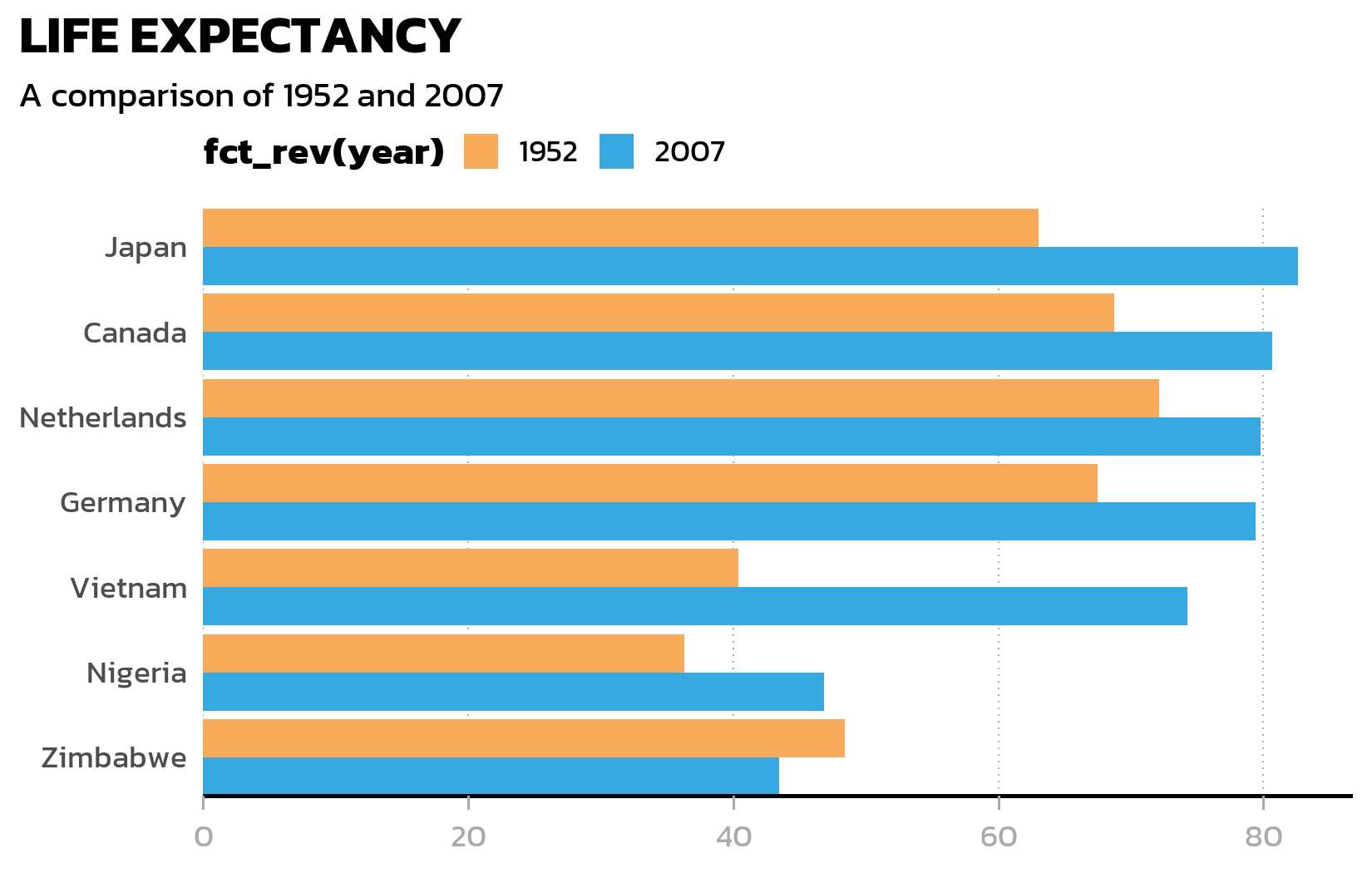
Grid lines
Finally, we remove the minor grid and horizontal major gridlines (they add clutter to a bar chart), keeping only vertical dotted gridlines as subtle reference marks:
ggplot(data = dat) +
  aes(x = lifeExp, y = country, fill = fct_rev(year)) +
  geom_col(position = position_dodge()) +
  scale_fill_manual(limits = names(year_colors), values = year_colors) +
  scale_y_discrete(name = NULL, expand = c(0, 0)) +
  scale_x_continuous(name = NULL, expand = expansion(mult = c(0, 0.05))) +
  labs(title = "LIFE EXPECTANCY", subtitle = "A comparison of 1952 and 2007") +
  theme_minimal() +
  theme(
    text = element_text(family = "kanit"),
    plot.title.position = "plot",
    plot.title = element_text(size = 15, face = "bold"),
    plot.subtitle = ggtext::element_textbox_simple(
      size = 10, margin = margin(0, 0, 10, 0)
    ),
    axis.line.y = element_blank(),
    axis.text.x = element_text(color = "#AAAAAA"),
    axis.ticks.x = element_line(color = "#AAAAAA", linewidth = 0.4),
    axis.ticks.length.x = unit(4, "pt"),
    axis.line.x = element_line(color = "black", linewidth = 0.6),
    legend.position = "top",
    legend.box.just = "left",
    legend.justification = "left",
    legend.title = element_text(face = "bold"),
    legend.key.size = unit(0.4, "cm"),
    legend.margin = margin(-5, 0, 0, 0),
    panel.grid.minor = element_blank(),
    panel.grid.major.y = element_blank(),
    panel.grid.major.x = element_line(
      linetype = "dotted", color = "#AAAAAA", linewidth = 0.3
    )
  )
Wrapping it in a function
Now that we are happy with every element, we wrap the entire theme() call into a reusable function. This way, applying the theme to any plot is a single line of code:
theme_nature <- function(base_size = 12) {
  theme_minimal(base_size = base_size) +
    theme(
      text = element_text(family = "kanit"),
      plot.title.position = "plot",
      plot.title = element_text(size = 15, face = "bold"),
      plot.subtitle = ggtext::element_textbox_simple(
        size = 10, margin = margin(0, 0, 10, 0)
      ),
      axis.line.y = element_blank(),
      axis.text.x = element_text(color = "#AAAAAA"),
      axis.ticks.x = element_line(color = "#AAAAAA", linewidth = 0.4),
      axis.ticks.length.x = unit(4, "pt"),
      axis.line.x = element_line(color = "black", linewidth = 0.6),
      legend.position = "top",
      legend.box.just = "left",
      legend.justification = "left",
      legend.title = element_text(face = "bold"),
      legend.key.size = unit(0.4, "cm"),
      legend.margin = margin(-5, 0, 0, 0),
      panel.grid.minor = element_blank(),
      panel.grid.major.y = element_blank(),
      panel.grid.major.x = element_line(
        linetype = "dotted", color = "#AAAAAA", linewidth = 0.3
      )
    )
}
Styled bar chart with data labels
Now we combine everything: the grouped bar chart, the custom theme, data labels inside the bars, and an HTML-formatted subtitle where the color coding is explained directly in the text - replacing the need for a separate legend:
long_subtitle <- "The data reflect a world where life expectancy in <b style='color:#37A9E1;'>2007</b> often mirrors an improved quality of life compared to <b style='color:#F7AA59;'>1952</b>."

p <- ggplot(data = dat) +
  aes(x = lifeExp, y = country, fill = fct_rev(year)) +
  geom_col(position = position_dodge()) +
  geom_text(
    mapping = aes(label = round(lifeExp), group = fct_rev(year)),
    position = position_dodge(width = 0.9),
    hjust = 1.1,
    color = "white",
    family = "kanit"
  ) +
  scale_y_discrete(name = NULL, expand = c(0, 0)) +
  scale_x_continuous(
    name = NULL,
    expand = expansion(mult = c(0, 0.05))
  ) +
  scale_fill_manual(
    guide = "none",
    name = "Year",
    limits = names(year_colors),
    values = year_colors
  ) +
  labs(
    title = "LIFE EXPECTANCY",
    subtitle = long_subtitle
  ) +
  theme_nature()

p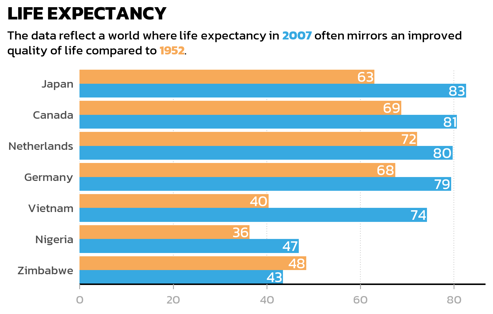
Several details in this code deserve explanation:
-
group = fct_rev(year)ingeom_text(): Without an explicitgroupaesthetic,geom_text()does not know which bar each label belongs to and cannot dodge the labels correctly. Thegroupmust match the fill aesthetic (including thefct_rev()) so that labels and bars are dodged in exactly the same way. -
position_dodge(width = 0.9): The default dodge width forgeom_col()is 0.9. When adding labels or other layers on top of dodged bars, one must specify this width explicitly - otherwise the labels dodge at a different width than the bars, causing misalignment. -
family = "kanit"ingeom_text(): Unlike most theme elements, text inside geoms is not affected by thetheme()settings. If the plot uses a custom font, it must be specified explicitly in everygeom_text()orgeom_label()call. -
guide = "none": This removes the legend since the color-coded subtitle already explains the meaning of each color - a cleaner design that reduces visual clutter.
ImportantGeoms do not inherit font family from the theme
This is a common source of confusion: theme(text = element_text(family = "kanit")) sets the font for theme elements (titles, axis labels, legend text), but not for text drawn by geoms like geom_text() or geom_label(). These geoms use the default font unless family is set explicitly. Forgetting this leads to plots where the title uses one font but the data labels use another.
TipLegend alternative: color-coded subtitle
Instead of a traditional legend, the styled subtitle uses HTML <b style='color:...'> tags to color the year labels directly in the text. This only works when the subtitle uses element_textbox_simple() from ggtext (which our theme_nature() does). The advantage is a cleaner design - the reader sees the color coding in context rather than having to match legend entries to plot elements.
NoteCheckpoint: Grouped bar chart
This standalone code block reproduces the styled bar chart from scratch:
show/hide code
library(tidyverse)
library(gapminder)
library(showtext)
library(ggtext)

showtext_opts(dpi = 300)
font_add_google("Kanit", "kanit")
showtext_auto()

dat <- gapminder %>%
  filter(year %in% c(1952, 2007)) %>%
  filter(country %in% c(
    "Canada", "Germany", "Japan",
    "Netherlands", "Nigeria", "Vietnam", "Zimbabwe"
  )) %>%
  mutate(year = as.factor(year)) %>%
  droplevels()

sorted_countries <- dat %>%
  filter(year == "2007") %>%
  arrange(lifeExp) %>%
  pull(country) %>%
  as.character()

dat <- dat %>%
  mutate(country = fct_relevel(country, sorted_countries))

year_colors <- c("1952" = "#F7AA59", "2007" = "#37A9E1")

theme_nature <- function(base_size = 12) {
  theme_minimal(base_size = base_size) +
    theme(
      text = element_text(family = "kanit"),
      plot.title.position = "plot",
      plot.title = element_text(size = 15, face = "bold"),
      plot.subtitle = element_textbox_simple(
        size = 10, margin = margin(0, 0, 10, 0)
      ),
      axis.line.y = element_blank(),
      axis.text.x = element_text(color = "#AAAAAA"),
      axis.ticks.x = element_line(color = "#AAAAAA", linewidth = 0.4),
      axis.ticks.length.x = unit(4, "pt"),
      axis.line.x = element_line(color = "black", linewidth = 0.6),
      legend.position = "top",
      legend.box.just = "left",
      legend.justification = "left",
      legend.title = element_text(face = "bold"),
      legend.key.size = unit(0.4, "cm"),
      legend.margin = margin(-5, 0, 0, 0),
      panel.grid.minor = element_blank(),
      panel.grid.major.y = element_blank(),
      panel.grid.major.x = element_line(
        linetype = "dotted", color = "#AAAAAA", linewidth = 0.3
      )
    )
}

long_subtitle <- "The data reflect a world where life expectancy in <b style='color:#37A9E1;'>2007</b> often mirrors an improved quality of life compared to <b style='color:#F7AA59;'>1952</b>."

ggplot(data = dat) +
  aes(x = lifeExp, y = country, fill = fct_rev(year)) +
  geom_col(position = position_dodge()) +
  geom_text(
    mapping = aes(label = round(lifeExp), group = fct_rev(year)),
    position = position_dodge(width = 0.9),
    hjust = 1.1, color = "white", family = "kanit"
  ) +
  scale_y_discrete(name = NULL, expand = c(0, 0)) +
  scale_x_continuous(name = NULL, expand = expansion(mult = c(0, 0.05))) +
  scale_fill_manual(
    guide = "none", name = "Year",
    limits = names(year_colors), values = year_colors
  ) +
  labs(title = "LIFE EXPECTANCY", subtitle = long_subtitle) +
  theme_nature()
Dumbbell plot
A grouped bar chart works well for comparing absolute values, but when the focus is on the change between two time points, a dumbbell plot often tells the story more clearly. It connects two data points with a line segment, making the direction and magnitude of change immediately visible - especially when some countries improved dramatically while others barely changed.
We first need a wide-format version of the data, with one column per year, so that geom_segment() can draw lines from the 1952 value to the 2007 value:
# A tibble: 7 × 6
  country     year_1952 year_2007 max_x  diff diff_lab
  <fct>           <dbl>     <dbl> <dbl> <dbl> <chr>
1 Canada           68.8      80.7  80.7 11.9  +12
2 Germany          67.5      79.4  79.4 11.9  +12
3 Japan            63.0      82.6  82.6 19.6  +20
4 Netherlands      72.1      79.8  79.8  7.63 +8
5 Nigeria          36.3      46.9  46.9 10.5  +11
6 Vietnam          40.4      74.2  74.2 33.8  +34
7 Zimbabwe         48.5      43.5  48.5 -4.96 -5
The pmax() function finds the larger of the two years for each country - we need this later to position the difference labels to the right of each dumbbell. The sprintf("%+d", ...) formatting ensures that positive changes display a + sign (like “+38”) for immediate visual clarity.
The dumbbell plot uses three layers: geom_segment() for the connecting lines, geom_point() for the colored endpoints, and two geom_text() layers for the value labels and difference labels:
p2 <- ggplot(data = dat) +
  aes(x = lifeExp, y = country, color = fct_rev(year)) +
  geom_segment(
    data = dat_wide,
    aes(x = year_1952, xend = year_2007, y = country, yend = country),
    color = "#AAAAAA",
    linewidth = 1
  ) +
  geom_point(size = 3) +
  geom_text(
    mapping = aes(label = round(lifeExp)),
    size = 2.5,
    vjust = -1,
    family = "kanit"
  ) +
  geom_text(
    data = dat_wide,
    mapping = aes(x = max_x, label = diff_lab),
    size = 2.5,
    hjust = 0,
    position = position_nudge(x = 1),
    color = "#AAAAAA",
    family = "kanit"
  ) +
  scale_color_manual(
    name = "Year",
    limits = c("1952", "2007"),
    values = year_colors,
    guide = "none"
  ) +
  scale_y_discrete(name = NULL) +
  scale_x_continuous(name = NULL) +
  labs(
    title = "LIFE EXPECTANCY",
    subtitle = long_subtitle
  ) +
  theme_nature()

p2
The first geom_text() adds the actual values above each colored point. The second geom_text() uses the wide-format data to place difference labels (like “+38” or “+3”) to the right of each dumbbell - position_nudge(x = 1) shifts the label slightly so it does not overlap with the rightmost point.
Notice that the segment layer uses a separate data argument (data = dat_wide) while the point layer uses the original long-format dat. This is a common pattern in ggplot2: different layers can draw from different data sources, as long as the aesthetics match up.
NoteCheckpoint: Dumbbell plot
This standalone code block reproduces the dumbbell plot from scratch:
show/hide code
library(tidyverse)
library(gapminder)
library(showtext)
library(ggtext)

showtext_opts(dpi = 300)
font_add_google("Kanit", "kanit")
showtext_auto()

dat <- gapminder %>%
  filter(year %in% c(1952, 2007)) %>%
  filter(country %in% c(
    "Canada", "Germany", "Japan",
    "Netherlands", "Nigeria", "Vietnam", "Zimbabwe"
  )) %>%
  mutate(year = as.factor(year)) %>%
  droplevels()

sorted_countries <- dat %>%
  filter(year == "2007") %>%
  arrange(lifeExp) %>%
  pull(country) %>%
  as.character()

dat <- dat %>%
  mutate(country = fct_relevel(country, sorted_countries))

year_colors <- c("1952" = "#F7AA59", "2007" = "#37A9E1")

theme_nature <- function(base_size = 12) {
  theme_minimal(base_size = base_size) +
    theme(
      text = element_text(family = "kanit"),
      plot.title.position = "plot",
      plot.title = element_text(size = 15, face = "bold"),
      plot.subtitle = element_textbox_simple(
        size = 10, margin = margin(0, 0, 10, 0)
      ),
      axis.line.y = element_blank(),
      axis.text.x = element_text(color = "#AAAAAA"),
      axis.ticks.x = element_line(color = "#AAAAAA", linewidth = 0.4),
      axis.ticks.length.x = unit(4, "pt"),
      axis.line.x = element_line(color = "black", linewidth = 0.6),
      legend.position = "top",
      legend.box.just = "left",
      legend.justification = "left",
      legend.title = element_text(face = "bold"),
      legend.key.size = unit(0.4, "cm"),
      legend.margin = margin(-5, 0, 0, 0),
      panel.grid.minor = element_blank(),
      panel.grid.major.y = element_blank(),
      panel.grid.major.x = element_line(
        linetype = "dotted", color = "#AAAAAA", linewidth = 0.3
      )
    )
}

long_subtitle <- "The data reflect a world where life expectancy in <b style='color:#37A9E1;'>2007</b> often mirrors an improved quality of life compared to <b style='color:#F7AA59;'>1952</b>."

dat_wide <- dat %>%
  select(country, year, lifeExp) %>%
  pivot_wider(
    names_from = year, values_from = lifeExp, names_prefix = "year_"
  ) %>%
  mutate(
    max_x = pmax(year_2007, year_1952),
    diff = year_2007 - year_1952,
    diff_lab = sprintf("%+d", round(diff))
  )

ggplot(data = dat) +
  aes(x = lifeExp, y = country, color = fct_rev(year)) +
  geom_segment(
    data = dat_wide,
    aes(x = year_1952, xend = year_2007, y = country, yend = country),
    color = "#AAAAAA", linewidth = 1
  ) +
  geom_point(size = 3) +
  geom_text(
    mapping = aes(label = round(lifeExp)),
    size = 2.5, vjust = -1, family = "kanit"
  ) +
  geom_text(
    data = dat_wide,
    mapping = aes(x = max_x, label = diff_lab),
    size = 2.5, hjust = 0,
    position = position_nudge(x = 1),
    color = "#AAAAAA", family = "kanit"
  ) +
  scale_color_manual(
    name = "Year", limits = c("1952", "2007"),
    values = year_colors, guide = "none"
  ) +
  scale_y_discrete(name = NULL) +
  scale_x_continuous(name = NULL) +
  labs(title = "LIFE EXPECTANCY", subtitle = long_subtitle) +
  theme_nature()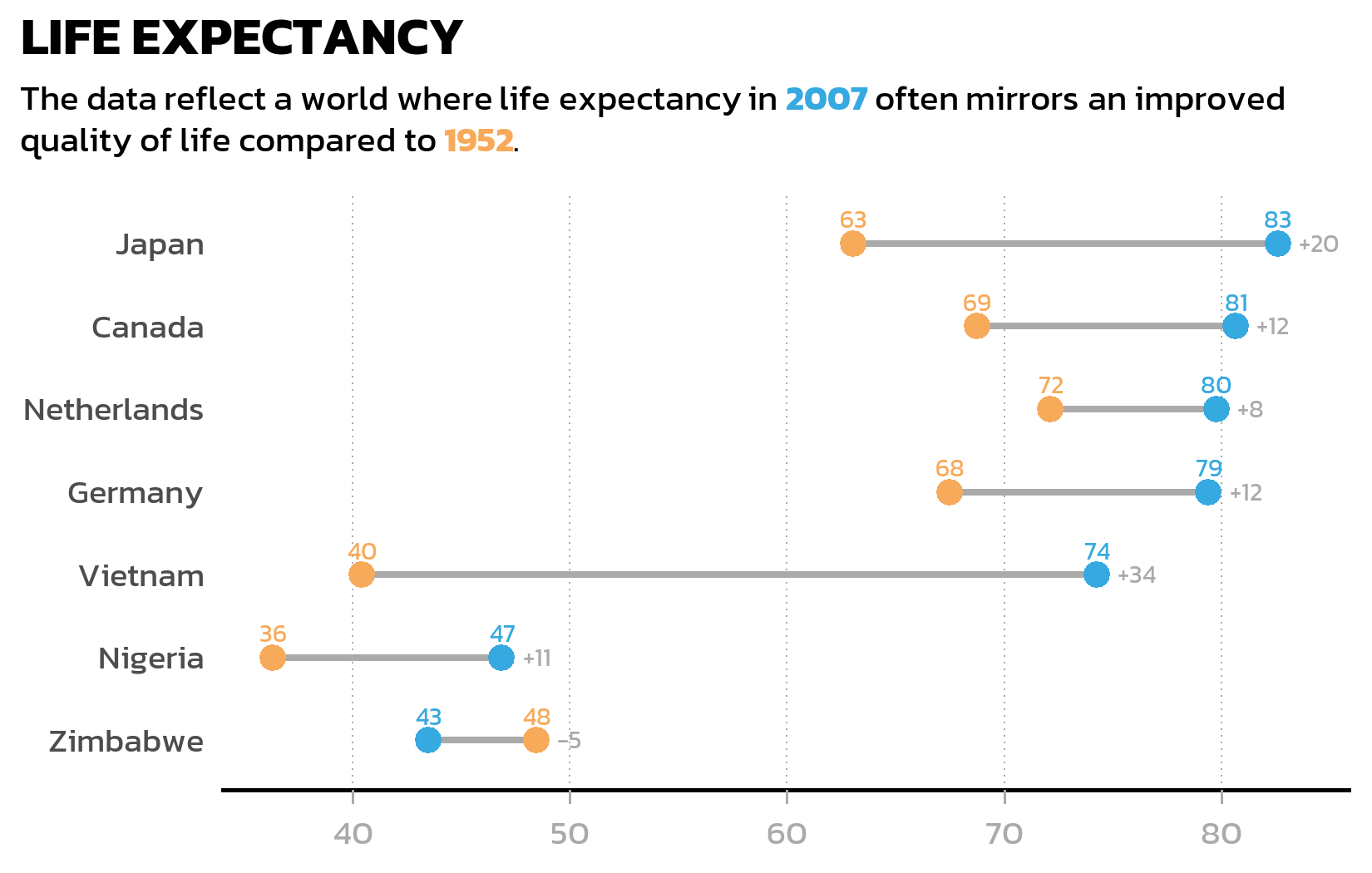
Citation
BibTeX citation:
@online{schmidt2026,
  author = {{Dr. Paul Schmidt}},
  publisher = {BioMath GmbH},
  title = {5. {Advanced} {Plots}},
  date = {2026-03-12},
  url = {https://biomathcontent.netlify.app/content/ggplot2/05_advanced_plots.html},
  langid = {en}
}
For attribution, please cite this work as:
Dr. Paul Schmidt. 2026. “5. Advanced Plots.” BioMath GmbH.
March 12, 2026. https://biomathcontent.netlify.app/content/ggplot2/05_advanced_plots.html.