for (pkg in c("ggplot2", "showtext", "ggtext")) {
  if (!require(pkg, character.only = TRUE)) install.packages(pkg)
}
Everything we have done so far - axes, colors, shapes - affects how the data is represented. The theme() function, by contrast, controls all the non-data visual elements: backgrounds, grid lines, axis lines, text styling, legends, spacing, and more. While these elements carry no data, they have an enormous impact on how professional and readable a plot looks.
Mastering themes is what separates a quick exploratory plot from a publication-ready graphic. The good news is that ggplot2 makes this remarkably systematic: there are only four types of theme elements to learn, and a handful of complete themes that provide sensible starting points.
We continue with the PlantGrowth plot from previous chapters:
myplot <- ggplot(data = PlantGrowth) +
  aes(y = weight, x = group) +
  geom_point() +
  scale_y_continuous(
    name = "Weight (g)",
    limits = c(0, NA),
    breaks = seq(0, 6),
    expand = expansion(mult = c(0, 0.05))
  ) +
  scale_x_discrete(
    name = "Treatment Group",
    labels = c(
      ctrl = "Control",
      trt1 = "Treatment 1",
      trt2 = "Treatment 2"
    )
  )
Complete themes
Rather than configuring every visual detail from scratch, ggplot2 ships with several predefined “complete themes” that change the overall appearance in one step. The default is theme_grey() - recognizable by its grey background and white grid lines. While functional, it is rarely what one wants in a report or publication. Here are some popular alternatives:
myplot +
  theme_classic()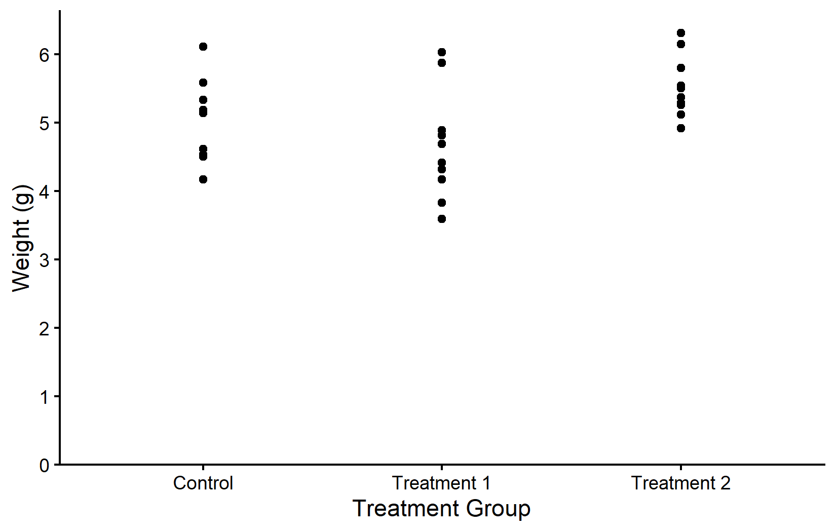
myplot +
  theme_bw()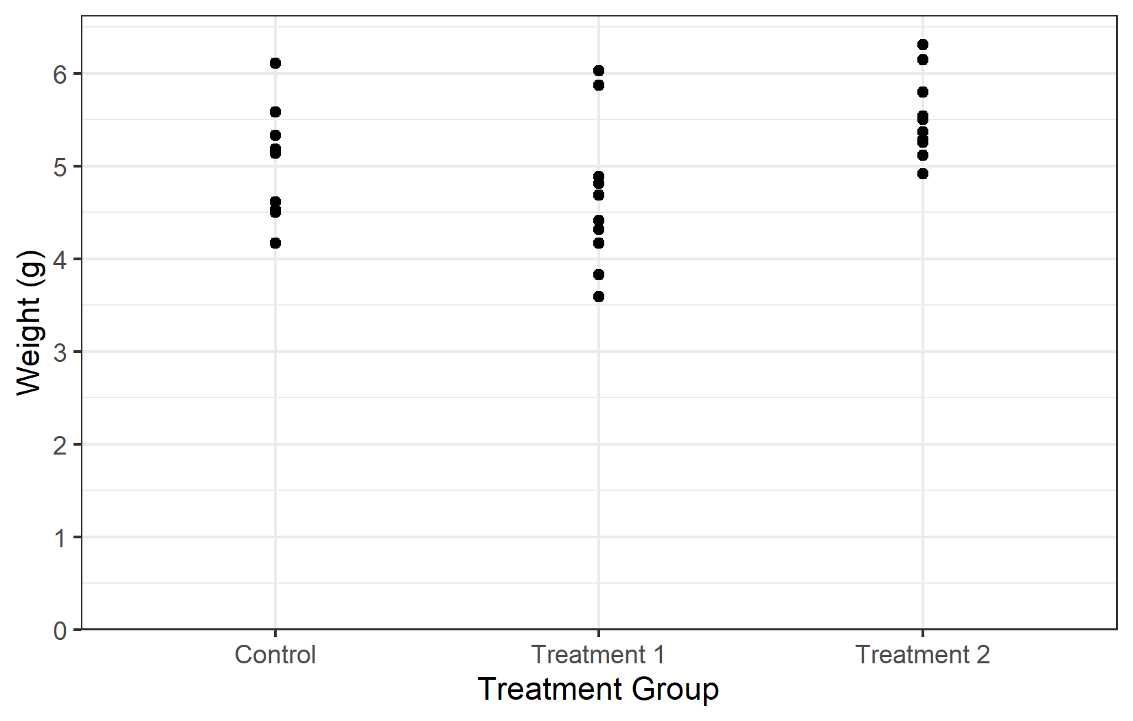
myplot +
  theme_minimal()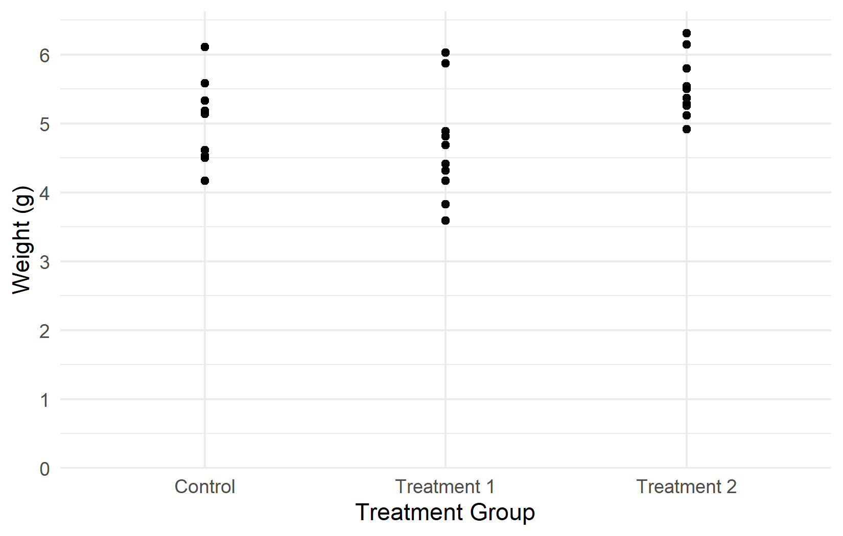
myplot +
  theme_dark()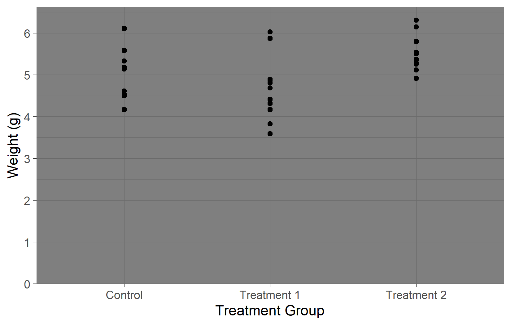
All complete themes accept a base_size argument that proportionally scales all text elements. This is especially useful when preparing plots for presentations (larger) vs. publications (smaller):
myplot +
  theme_classic(base_size = 16)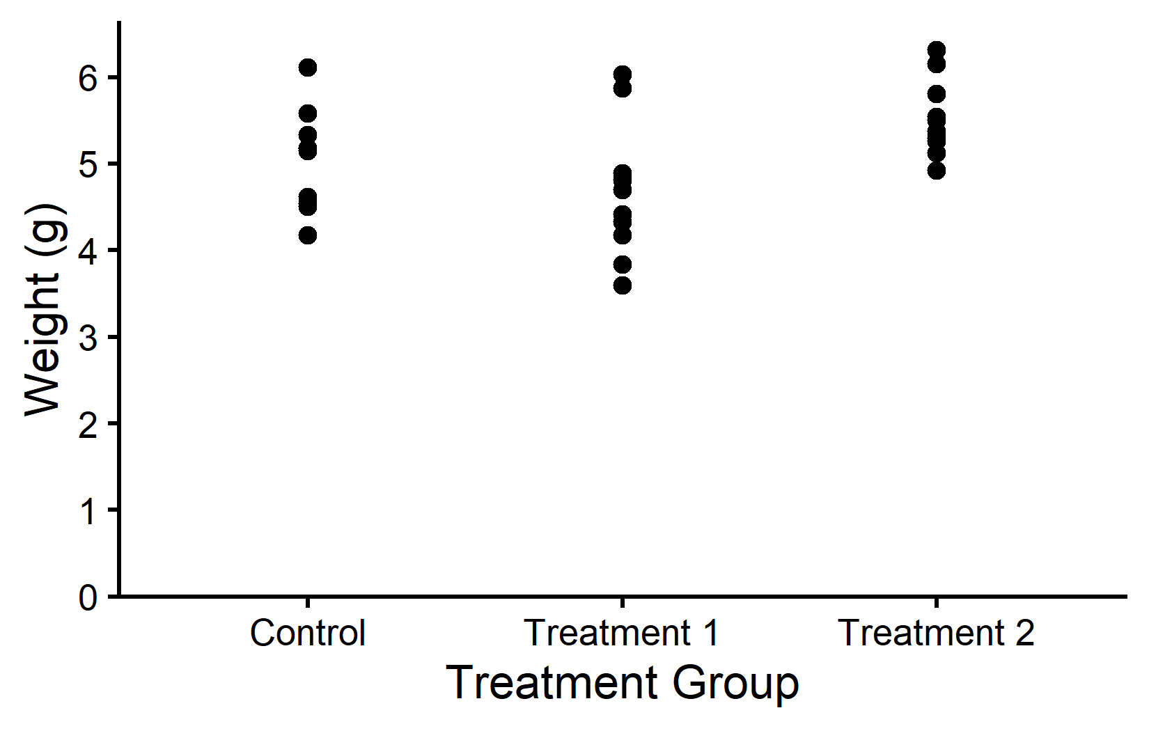
Customizing theme elements
A complete theme provides a good starting point, but one almost always wants to tweak individual details - perhaps remove the minor grid lines, change the axis line color, or adjust the text size. This is where theme() comes in. The key is to first apply a complete theme, then override specific elements with theme(). The order matters: theme() calls after a complete theme override its defaults.
In practice, almost every theme adjustment uses one of these four element types:
-
element_blank()- removes the element entirely -
element_rect()- for borders and backgrounds -
element_line()- for lines (axes, grid) -
element_text()- for all text elements
(Since ggplot2 3.5.0 there are also element_polygon() and element_geom() for less common cases, but the four above cover the vast majority of theme tweaks.) Once one knows these building blocks, any theme adjustment becomes a matter of finding the right element name (like plot.background, axis.line, panel.grid.major.y) and setting it to the appropriate element type. Here are two deliberately exaggerated examples to illustrate the mechanism:
myplot +
  theme(plot.background = element_rect(fill = "lightyellow"))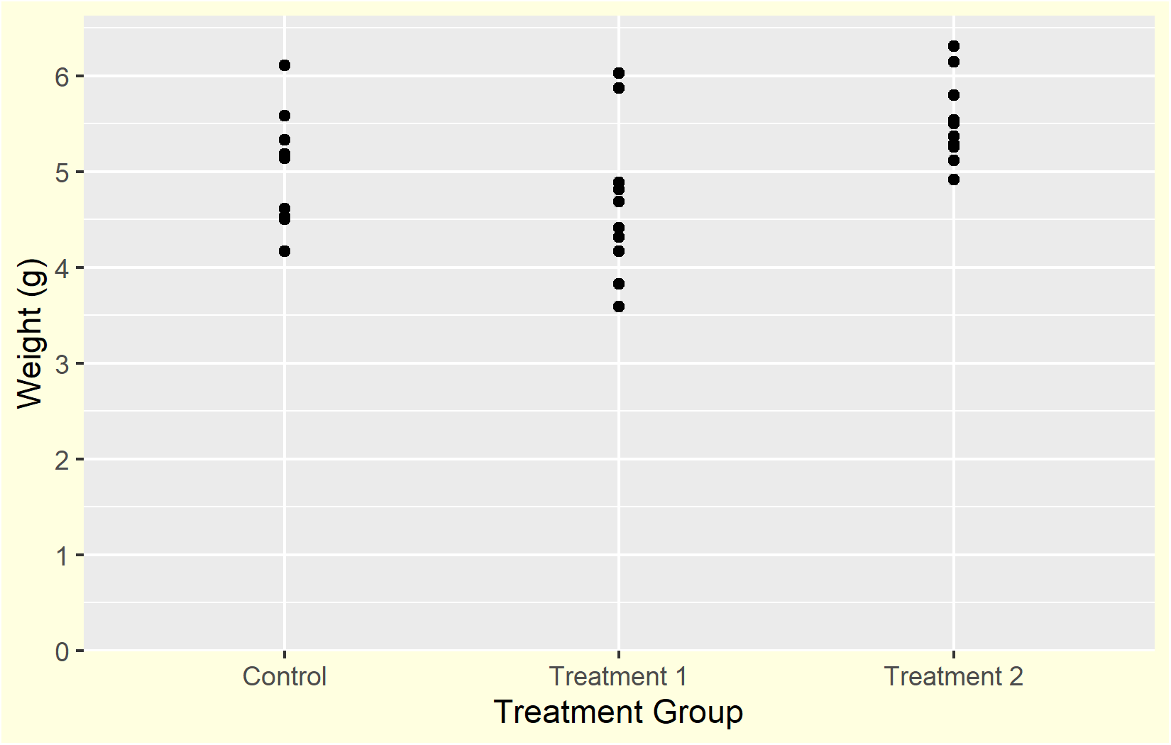
myplot +
  theme(axis.line = element_line(color = "red", linewidth = 2))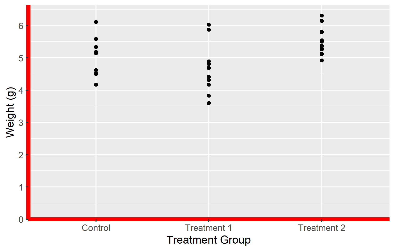
A more practical example: starting from theme_classic() and removing the x-axis line while adding subtle horizontal grid lines:
myplot +
  theme_classic() +
  theme(
    panel.grid.major.y = element_line(linetype = "dotted", color = "#CCCCCC"),
    axis.line.x = element_line(color = "black", linewidth = 0.6),
    axis.ticks.x = element_line(color = "#AAAAAA"),
    axis.text = element_text(color = "#333333")
  )
Google Fonts with showtext
The default fonts available in R plots are limited to a handful of system fonts. For publication-quality graphics, one often needs a specific typeface - whether to match a corporate design, a journal style, or simply for a cleaner look. The {showtext} package solves this by making any Google Font available in ggplot2.
The workflow has three steps:
-
sysfonts::font_add_google()downloads the font -
showtext::showtext_auto()activates custom font rendering -
showtext::showtext_opts(dpi = 300)ensures the correct resolution
sysfonts::font_add_google("Kanit", "kanit")
showtext::showtext_auto()
showtext::showtext_opts(dpi = 300)
Note
The showtext_opts(dpi = 300) call is important: showtext defaults to 72 dpi, while ggsave() defaults to 300 dpi. Without matching these, fonts in exported plots will appear at the wrong size.
Warning
font_add_google() requires an internet connection to download the font. If the download fails (slow network, firewall, offline work), the font will not be available and plots using it will fall back to a default font or produce an error. For offline work, one can download the .ttf file manually from Google Fonts and use sysfonts::font_add() with a local file path instead.
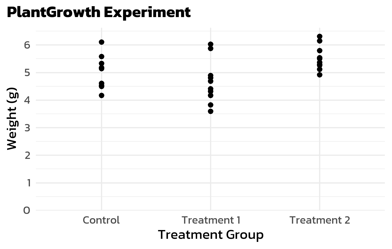
Once set up, the font can be used in theme() via the family argument in element_text():
myplot +
  labs(title = "PlantGrowth Experiment") +
  theme_minimal(base_size = 14) +
  theme(
    text = element_text(family = "kanit"),
    plot.title = element_text(face = "bold", size = 16),
    plot.title.position = "plot"
  )
Note
When rendering in Quarto, one needs fig-showtext: TRUE in the knitr options (or as a chunk option #| fig-showtext: true) for showtext fonts to render correctly.
Formatted text with ggtext
Standard ggplot2 text elements only support plain text - one cannot use bold, italic, or colored words within a title. The {ggtext} package lifts this restriction by allowing HTML and Markdown formatting in plot titles, subtitles, axis labels, and annotations.
The package provides two replacement functions for element_text():
-
ggtext::element_markdown()— for single-line text (titles, axis labels). Renders HTML/Markdown inline. -
ggtext::element_textbox_simple()— for multi-line text with automatic line wrapping (subtitles, captions).
Regular element_text() will not render any formatting — HTML tags would appear as literal text.
The formatting itself uses simple HTML: <b>bold</b> for bold, <i>italic</i> for italic, and <b style='color:#00923f;'>green bold</b> for colored text. One does not need to know HTML well — these few tags cover most use cases.
Here is a complete example that replaces the legend with color-coded text in the subtitle:
myplot +
  aes(color = group) +
  scale_color_manual(
    values = c(ctrl = "#00923f", trt1 = "#201E50", trt2 = "#201E50"),
    guide = "none"
  ) +
  labs(
    title = "PLANT GROWTH",
    subtitle = "Comparing <b style='color:#00923f;'>control</b> plants with two <b style='color:#201E50;'>treatments</b>"
  ) +
  theme_minimal(base_size = 14) +
  theme(
    text = element_text(family = "kanit"),
    plot.title = element_text(face = "bold", size = 16),
    plot.title.position = "plot",
    plot.subtitle = ggtext::element_textbox_simple(
      size = 11,
      margin = margin(0, 0, 5, 0)
    )
  )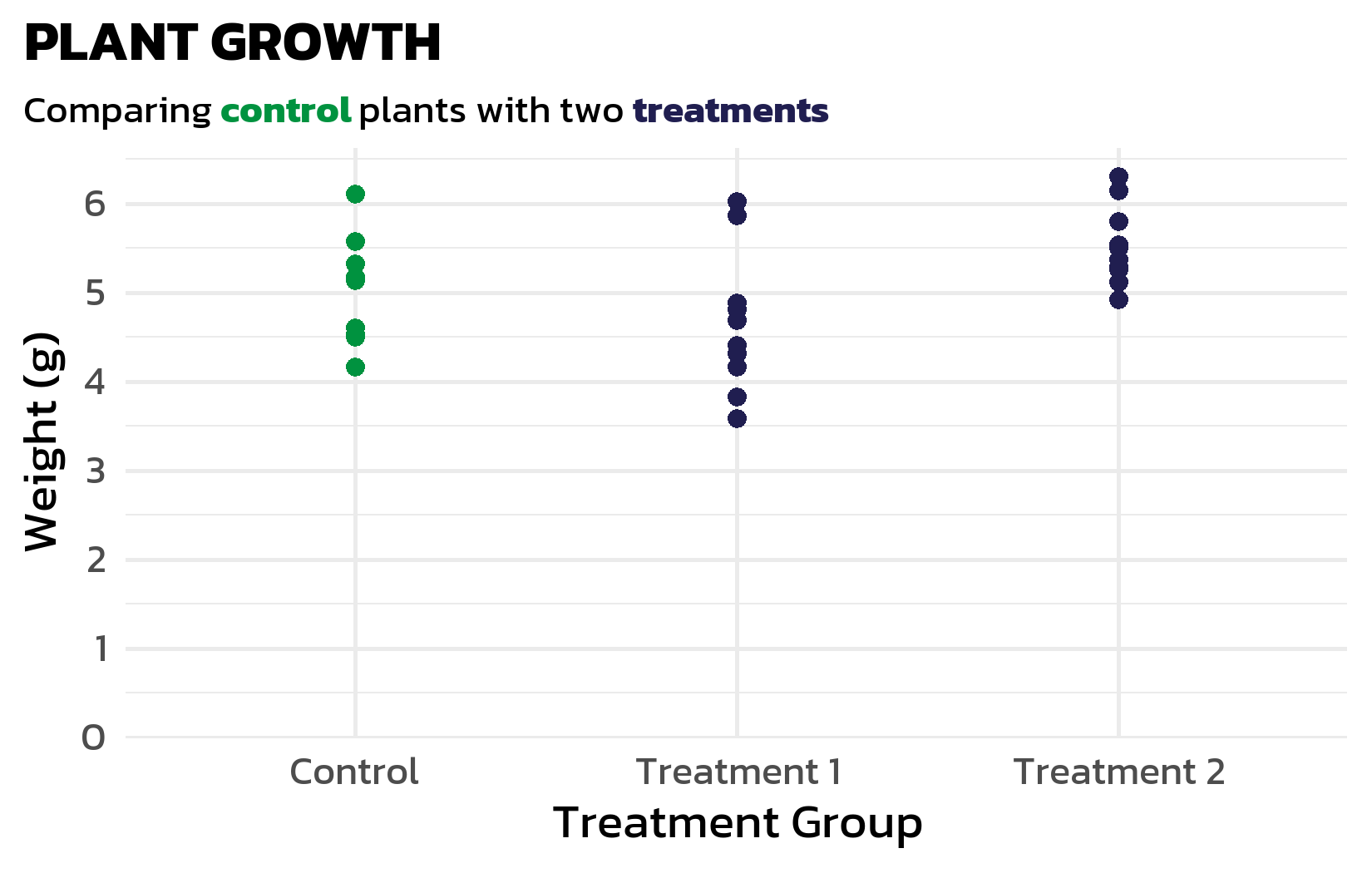
This technique becomes especially powerful when the legend is replaced by color-coded text in the subtitle - we will use this approach extensively in the next chapters to reduce visual clutter.
Building a custom theme function
When working on a project with multiple plots, one quickly finds that the same theme settings are copy-pasted again and again. This is both tedious and error-prone - changing one detail means updating every plot. A better approach is to wrap the theme settings in a custom function, which keeps the code DRY (Don’t Repeat Yourself) and ensures visual consistency across all plots:
theme_clean <- function(base_size = 12) {
  theme_minimal(base_size = base_size) +
    theme(
      text = element_text(family = "kanit"),
      plot.title.position = "plot",
      plot.title = element_text(face = "bold", size = base_size + 4),
      plot.subtitle = ggtext::element_textbox_simple(
        size = base_size,
        margin = margin(0, 0, 8, 0)
      ),
      panel.grid.minor = element_blank(),
      panel.grid.major.y = element_blank(),
      panel.grid.major.x = element_line(
        linetype = "dotted", color = "#AAAAAA", linewidth = 0.3
      ),
      axis.line.x = element_line(color = "black", linewidth = 0.6),
      axis.ticks.x = element_line(color = "#AAAAAA", linewidth = 0.4)
    )
}

myplot +
  labs(title = "A Clean Look") +
  theme_clean()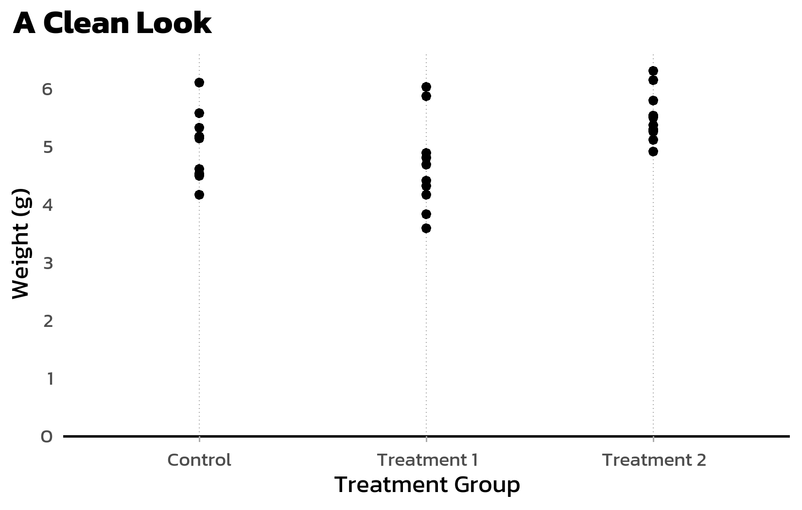
This theme_clean() function will be reused in the following chapters when building more complex plots.
Citation
BibTeX citation:
@online{schmidt2026,
  author = {{Dr. Paul Schmidt}},
  publisher = {BioMath GmbH},
  title = {3. {Themes}},
  date = {2026-06-08},
  url = {https://biomathcontent.netlify.app/content/ggplot2/03_themes.html},
  langid = {en}
}
For attribution, please cite this work as:
Dr. Paul Schmidt. 2026. “3. Themes.” BioMath GmbH. June 8,
2026. https://biomathcontent.netlify.app/content/ggplot2/03_themes.html.