for (pkg in c("tidyverse", "gapminder", "ggrepel")) {
  if (!require(pkg, character.only = TRUE)) install.packages(pkg)
}
Scatter plots with many data points often benefit from text labels that identify individual observations - country names, gene IDs, or sample codes. The most straightforward approach is geom_text(), but as soon as the number of labeled points grows beyond a handful, labels start overlapping each other and the data points themselves, making the plot unreadable.
The {ggrepel} package solves this problem by providing two drop-in replacements: geom_text_repel() and geom_label_repel(). Both use an iterative algorithm to nudge labels away from each other and from data points, drawing thin line segments to connect each label to its point. Because the functions share the same aesthetic interface as geom_text() and geom_label(), switching from the base ggplot2 versions requires nothing more than changing the function name.
In this chapter we use the gapminder dataset for the year 2007, plotting GDP per capita against life expectancy for all 142 countries - a dense scatter plot where automatic label placement makes a real difference.
Setup
We filter the gapminder data to the year 2007 and keep all countries. Since GDP per capita spans several orders of magnitude (from a few hundred to over 40,000 USD), we use a log-scaled x-axis throughout.
# A tibble: 142 × 6
   country     continent  year lifeExp       pop gdpPercap
   <fct>       <fct>     <int>   <dbl>     <int>     <dbl>
 1 Afghanistan Asia       2007    43.8  31889923      975.
 2 Albania     Europe     2007    76.4   3600523     5937.
 3 Algeria     Africa     2007    72.3  33333216     6223.
 4 Angola      Africa     2007    42.7  12420476     4797.
 5 Argentina   Americas   2007    75.3  40301927    12779.
 6 Australia   Oceania    2007    81.2  20434176    34435.
 7 Austria     Europe     2007    79.8   8199783    36126.
 8 Bahrain     Asia       2007    75.6    708573    29796.
 9 Bangladesh  Asia       2007    64.1 150448339     1391.
10 Belgium     Europe     2007    79.4  10392226    33693.
# ℹ 132 more rows
To illustrate the labeling problem, here is a scatter plot with geom_text() - every country name is placed directly at its data point:
ggplot(dat, aes(x = gdpPercap, y = lifeExp)) +
  geom_point(aes(size = pop, color = continent), alpha = 0.7) +
  geom_text(aes(label = country), size = 2.5) +
  scale_x_log10() +
  scale_size_continuous(guide = "none") +
  labs(
    x = "GDP per capita (log scale)",
    y = "Life expectancy (years)",
    color = "Continent"
  ) +
  theme_minimal()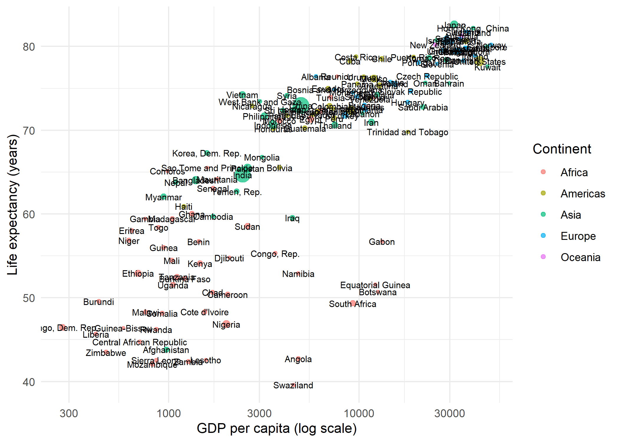
The result is a crowded mess: labels overlap each other and obscure the points. This is exactly the problem ggrepel was designed to solve.
geom_text_repel
Replacing geom_text() with geom_text_repel() is all it takes. The function automatically repositions labels so they do not overlap, drawing a small line segment from each label to its data point:
ggplot(dat, aes(x = gdpPercap, y = lifeExp)) +
  geom_point(aes(size = pop, color = continent), alpha = 0.7) +
  geom_text_repel(aes(label = country), size = 2.5) +
  scale_x_log10() +
  scale_size_continuous(guide = "none") +
  labs(
    x = "GDP per capita (log scale)",
    y = "Life expectancy (years)",
    color = "Continent"
  ) +
  theme_minimal()
Warning: ggrepel: 68 unlabeled data points (too many overlaps). Consider
increasing max.overlaps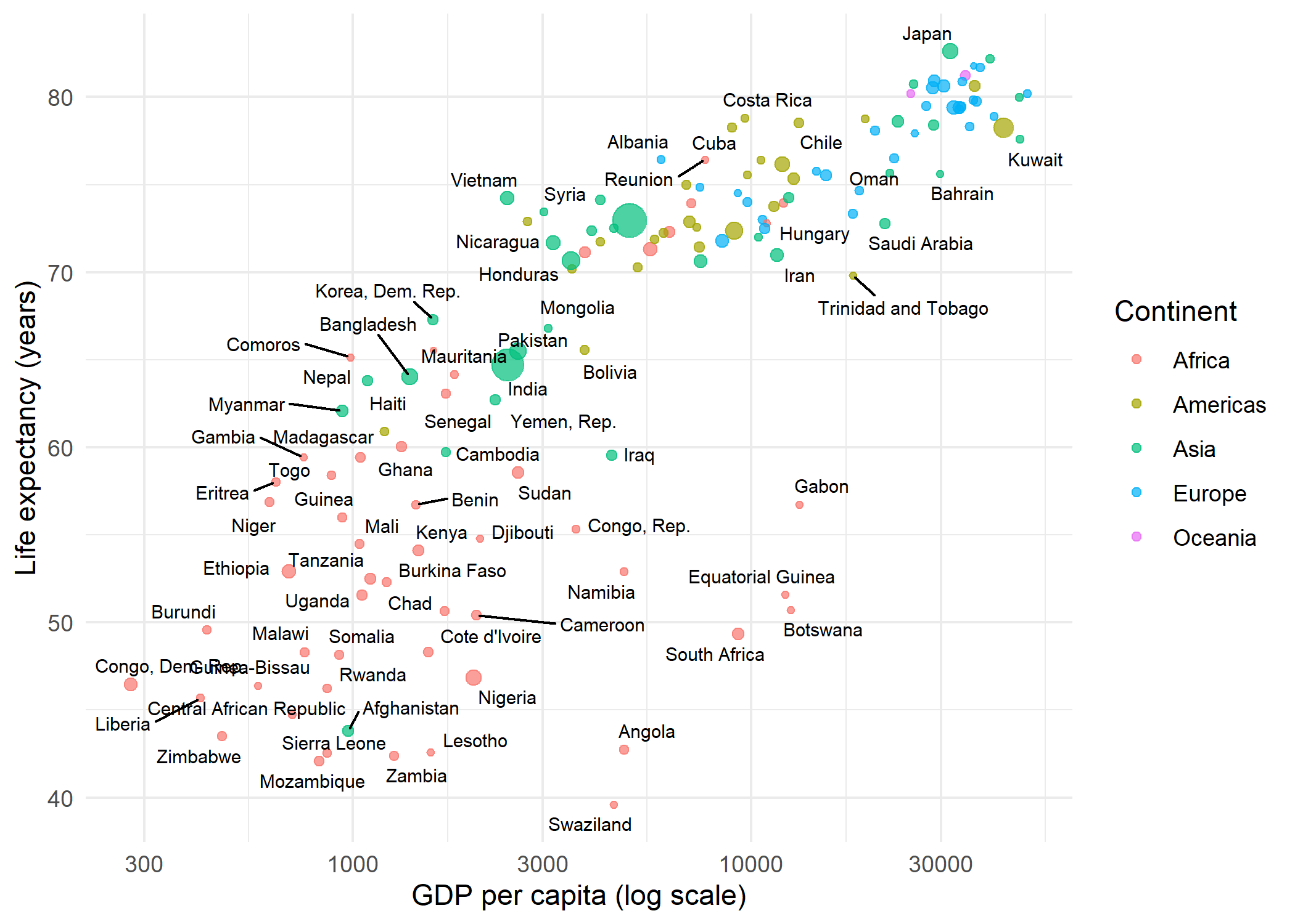
By default, geom_text_repel() suppresses labels when more than 10 would overlap in the same region (controlled by max.overlaps). Several parameters help fine-tune the placement:
-
max.overlaps- Maximum number of overlapping labels before a label is dropped. The default is 10; set toInfto display all labels regardless of overlap. -
box.padding- Extra padding around each label’s bounding box (default 0.25 lines). Increase for more spacing between labels. -
point.padding- Minimum distance between a label and its data point (default 0). -
min.segment.length- Segments shorter than this value are hidden (default 0.5 lines). Set to 0 to always show segments. -
seed- The repulsion algorithm has a stochastic component. Setting a seed ensures the same label positions every time the plot is rendered.
ggplot(dat, aes(x = gdpPercap, y = lifeExp)) +
  geom_point(aes(size = pop, color = continent), alpha = 0.7) +
  geom_text_repel(
    aes(label = country),
    size = 2.5,
    max.overlaps = 20,
    seed = 42
  ) +
  scale_x_log10() +
  scale_size_continuous(guide = "none") +
  labs(
    x = "GDP per capita (log scale)",
    y = "Life expectancy (years)",
    color = "Continent"
  ) +
  theme_minimal()
Warning: ggrepel: 35 unlabeled data points (too many overlaps). Consider
increasing max.overlaps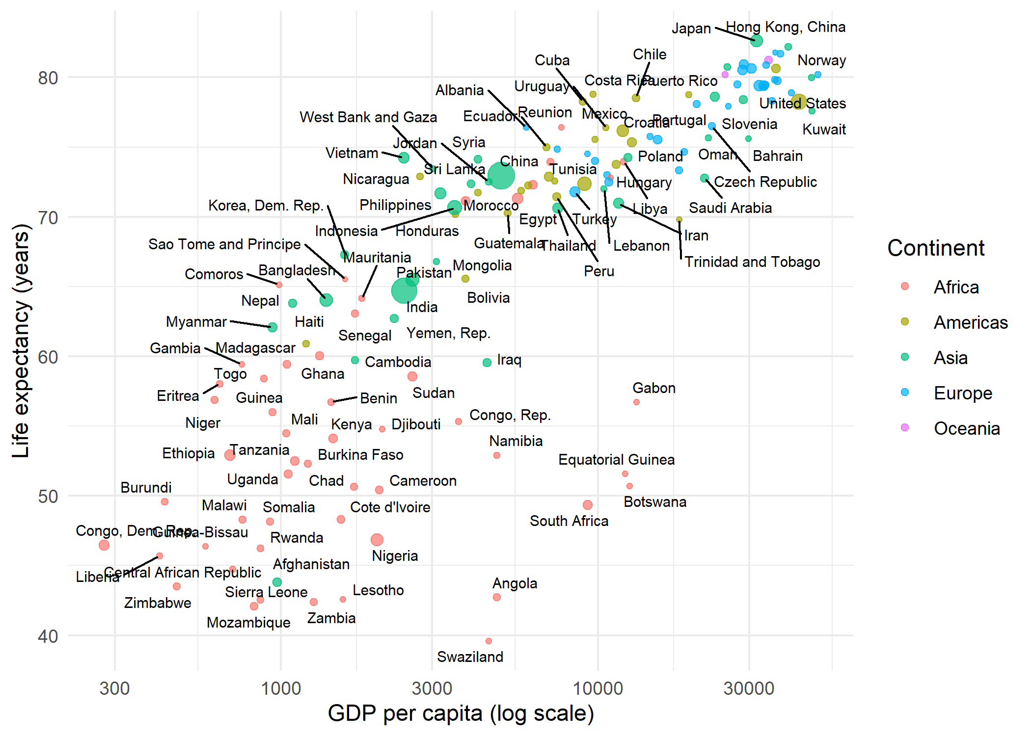
geom_label_repel
Where geom_text_repel() draws plain text, geom_label_repel() draws text inside a filled rectangle - useful when labels need to stand out against a busy background. The connector segments can be styled independently:
dat_small <- dat %>%
  filter(continent == "Europe")

ggplot(dat_small, aes(x = gdpPercap, y = lifeExp)) +
  geom_point(aes(size = pop), color = "#201E50", alpha = 0.7) +
  geom_label_repel(
    aes(label = country),
    size = 2.5,
    fill = "white",
    label.size = 0.2,
    segment.color = "grey50",
    segment.linetype = "dashed",
    seed = 42
  ) +
  scale_x_log10() +
  scale_size_continuous(guide = "none") +
  labs(
    x = "GDP per capita (log scale)",
    y = "Life expectancy (years)"
  ) +
  theme_minimal()
Warning: ggrepel: 2 unlabeled data points (too many overlaps). Consider
increasing max.overlaps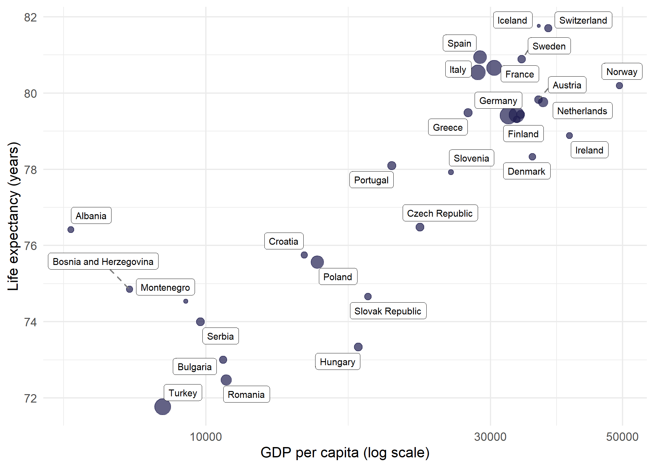
Since labeling all 142 countries at once is overwhelming even with repulsion, filtering to a single continent (here Europe, with 30 countries) makes geom_label_repel() much more effective.
Selective labeling
In many situations, labeling every point is neither necessary nor desirable. A common strategy is to label only the most interesting observations - for example, the countries with the highest life expectancy - and leave the rest as unlabeled points. This keeps the plot clean while still highlighting key data.
The approach is straightforward: create a helper column that contains the country name for points that should be labeled and NA for all others. geom_text_repel() skips NA values when na.rm = TRUE:
top5 <- dat %>%
  slice_max(lifeExp, n = 5) %>%
  pull(country)

dat_labeled <- dat %>%
  mutate(label_col = if_else(country %in% top5, as.character(country), NA_character_))

ggplot(dat_labeled, aes(x = gdpPercap, y = lifeExp)) +
  geom_point(aes(size = pop, color = continent), alpha = 0.7) +
  geom_text_repel(
    aes(label = label_col),
    size = 3,
    fontface = "bold",
    seed = 42,
    na.rm = TRUE
  ) +
  scale_x_log10() +
  scale_size_continuous(guide = "none") +
  labs(
    x = "GDP per capita (log scale)",
    y = "Life expectancy (years)",
    color = "Continent"
  ) +
  theme_minimal()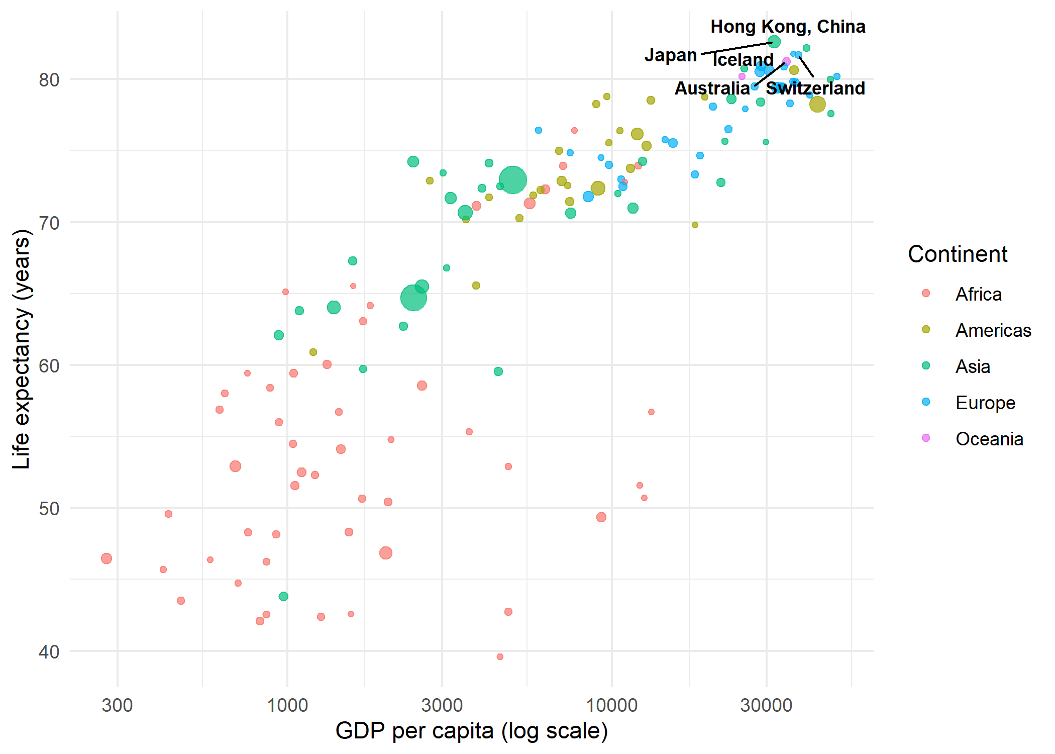
This technique scales well: one can label outliers, points above a threshold, or any subset defined by a logical condition - all without modifying the underlying dataset.
Side-aligned labels
A particularly clean labeling style places all labels on one side of the plot, aligned vertically. This avoids the scattered appearance of freely repelled labels and works well when the number of points is moderate. The key parameters are:
-
direction = "y"- restricts label movement to the vertical axis only, so labels stay at the same x-position -
hjust = 0- left-aligns the label text -
nudge_x- pushes all labels a fixed distance to the right of their data points -
expandon the x-axis - creates enough space on the right side for the labels
dat_europe <- dat %>%
  filter(continent == "Europe")

max_gdp <- max(dat_europe$gdpPercap)

ggplot(dat_europe, aes(x = gdpPercap, y = lifeExp)) +
  geom_point(color = "#201E50", alpha = 0.7) +
  geom_text_repel(
    aes(label = country),
    size = 2.5,
    direction = "y",
    hjust = 0,
    nudge_x = max_gdp - dat_europe$gdpPercap + 2000,
    segment.size = 0.3,
    segment.color = "grey60",
    seed = 42
  ) +
  scale_x_continuous(
    name = "GDP per capita (USD)",
    expand = expansion(mult = c(0.05, 0.3))
  ) +
  labs(y = "Life expectancy (years)") +
  theme_minimal()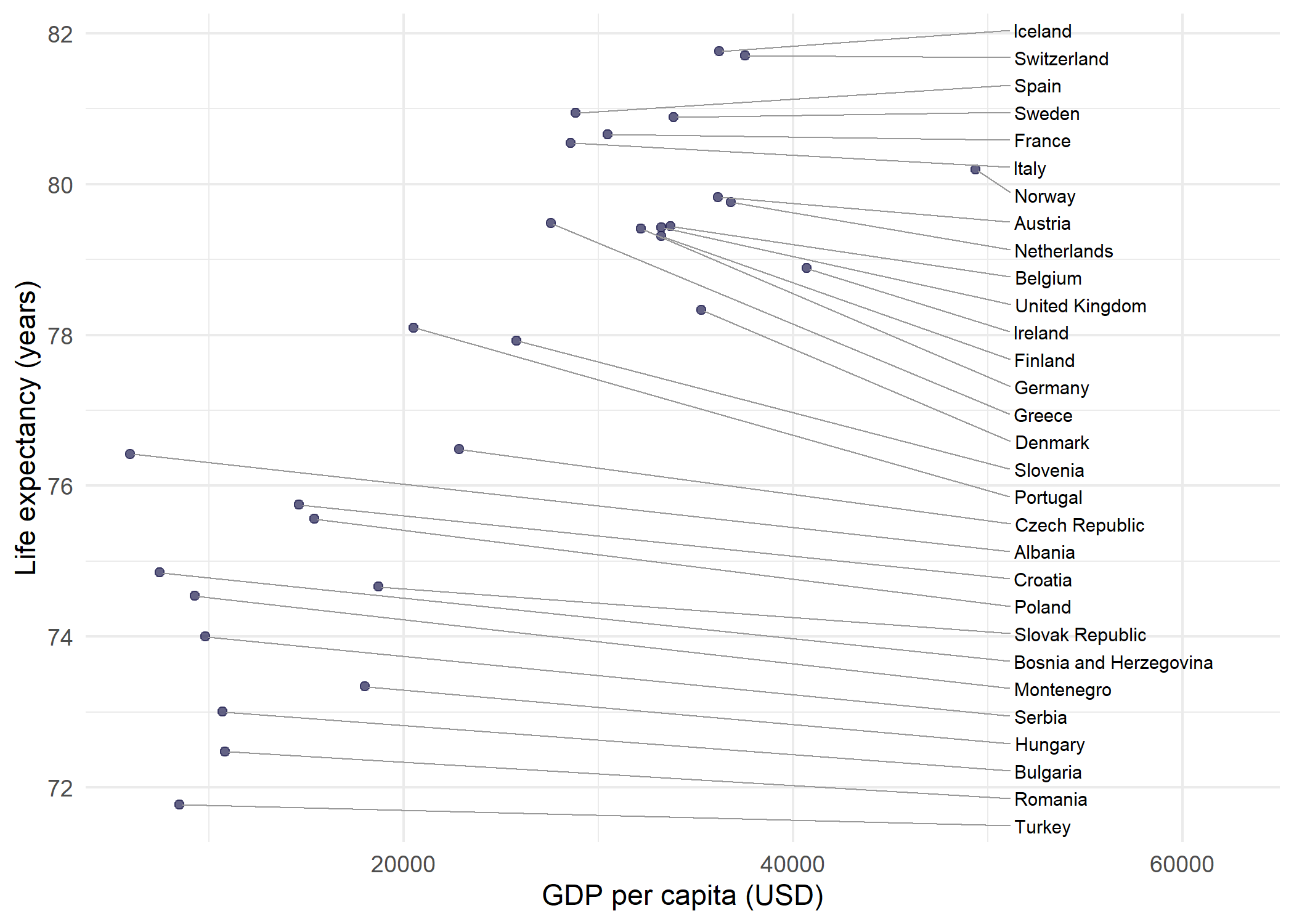
The trick is to calculate nudge_x per point as max(x) - x + offset, so every label lands at the same x-position regardless of where its data point sits. Combined with direction = "y", labels only spread vertically from that anchor, forming a neat column connected to their points by straight horizontal segments.
NotePerformance
With hundreds of labels, the repulsion algorithm can become slow. Two parameters help manage computation time: max.overlaps limits how many overlapping labels are attempted (dropping the rest), and max.time sets a time limit for the algorithm in seconds (default 0.5). For very dense plots, selective labeling as shown above is usually the better approach.
Citation
BibTeX citation:
@online{schmidt2026,
  author = {{Dr. Paul Schmidt}},
  publisher = {BioMath GmbH},
  title = {7. Ggrepel},
  date = {2026-03-12},
  url = {https://biomathcontent.netlify.app/content/ggplot2/07_ggrepel.html},
  langid = {en}
}
For attribution, please cite this work as:
Dr. Paul Schmidt. 2026. “7. Ggrepel.” BioMath GmbH. March
12, 2026. https://biomathcontent.netlify.app/content/ggplot2/07_ggrepel.html.