To install and load all the packages used in this chapter, run the following code:
Data
This dataset contains information from two farmers, Max and Peter, who applied different amounts of fertilizer to their crop fields and recorded the resulting increase in yield compared to unfertilized control plots1.
Import
Rows: 20 Columns: 3
── Column specification ────────────────────────────────────────────────────────
Delimiter: ","
chr (1): farmer
dbl (2): fert, yield_inc

ℹ Use `spec()` to retrieve the full column specification for this data.
ℹ Specify the column types or set `show_col_types = FALSE` to quiet this message.
# A tibble: 20 × 3
farmer fert yield_inc
<chr> <dbl> <dbl>
1 Max 1 0.2
2 Max 2 0.3
3 Max 3 0.5
4 Max 3 0.6
5 Max 4 0.6
6 Max 4 0.5
7 Max 4 0.7
8 Max 5 0.6
9 Max 7 0.8
10 Max 8 1
11 Peter 1 0.1
12 Peter 1 0.1
13 Peter 1 0.2
14 Peter 1 0.2
15 Peter 1 0.1
16 Peter 3 0.3
17 Peter 5 0.5
18 Peter 6 0.8
19 Peter 8 0.9
20 Peter 9 1.3Goal
The goal of this analysis is to answer the question of how fertilizer application relates to crop yield increase. Note that we can ignore the column farmer, since we do not care whether data came from Peter or Max. Thus, we only focus on the two numeric columns fert and yield_inc. For them, we will do a correlation and a regression analysis.
Exploring
In order to explore this dataset, we could first have a quick look at the data via
summary(dat) farmer fert yield_inc
Length:20 Min. :1.00 Min. :0.100
Class :character 1st Qu.:1.00 1st Qu.:0.200
Mode :character Median :3.50 Median :0.500
Mean :3.85 Mean :0.515
3rd Qu.:5.25 3rd Qu.:0.725
Max. :9.00 Max. :1.300 to learn that the amount of fertilizer applied ranges from 1 to 9 kg/ha with a mean of approximately 3.7 kg/ha, while the measured yield increases range from 0.1 to 1.3 tons/ha with a mean of about 0.5 tons/ha.
And now it is finally time to create our first ggplot. Our goal is to create it like so:
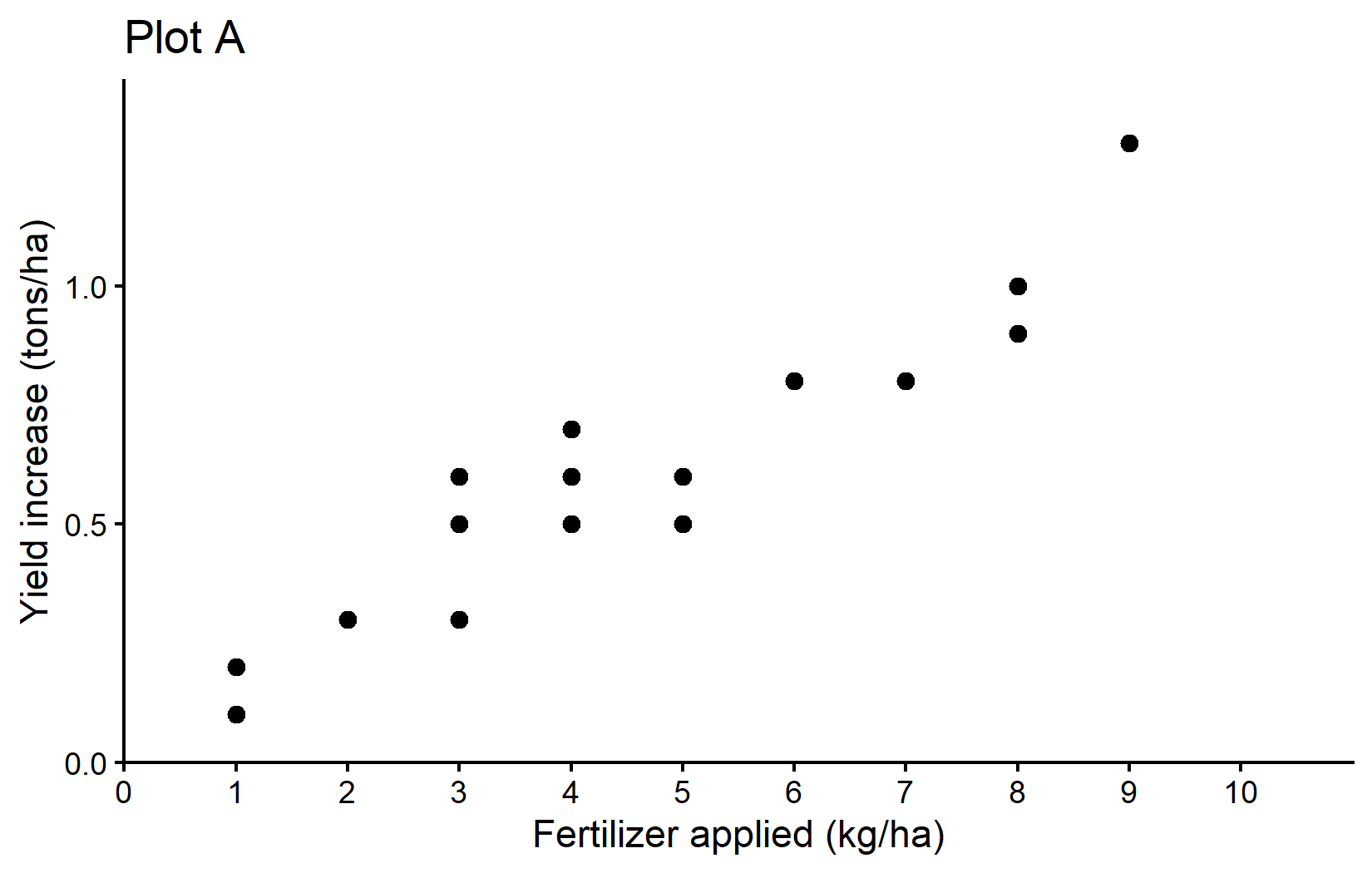
The plot shows a clear trend of increasing crop yields with higher fertilizer application - which is what we would expect.
To see and understand the code needed to create this ggplot and all other ggplots in this chapter, please go to the next chapter. You can do this right now or after reading through this chapter.
Correlation
One way of actually putting a number on this relationship is to estimate the correlation. When people talk about correlation (\(\rho\) or \(r\)) in statistics, they usually refer to the Pearson correlation coefficient, which is a measure of linear correlation between two numeric variables. Correlation can only have values between -1 and 1, where 0 means no correlation, while all other possible values are either negative or positive correlations. The farther away from 0, the stronger is the correlation. Here are a few examples:
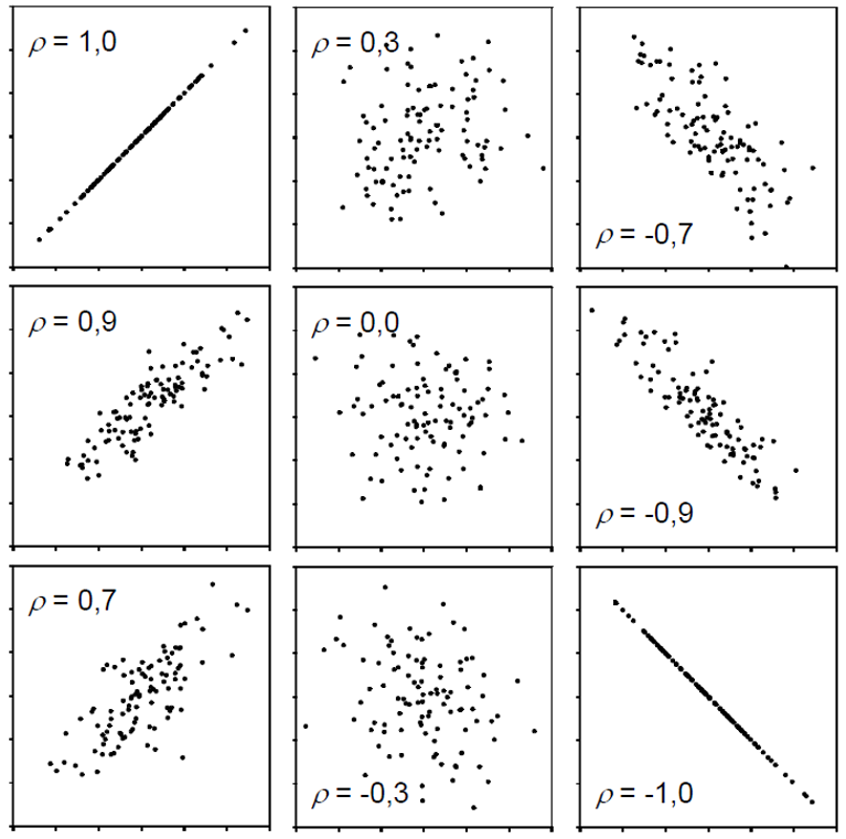
Simply put, a positive correlation means “if one variable gets bigger, the other also gets bigger” and a negative correlation means “if one variable gets bigger, the other gets smaller”. Therefore, it does not matter which of the two variables is the first (“x”) or the second (“y”) variable. Moreover, a correlation estimate is not like a model and it cannot make predictions. Finally, “correlation does not imply causation” means that just because you found a (strong) correlation between two things, you cannot conclude that there is a cause-and-effect relationship between the two.
- Have a look at these spurious-correlations for some funny examples of correlation without causation.
- Play around with this neat tool to get a better feeling for the relationshop between correlation and data.
Get it
If you only want to get the actual correlation estimate, you can use the function cor() and provide the two numeric variables (as vectors). So in our case, we can extract the column with fertilizer application from our data object dat with dat$fert and the column with yield increase with dat$yield_inc. Remember: the $ sign can be used to extract a column from a table. So the command to get the correlation between fertilizer application and yield increase looks like this:
cor(dat$fert, dat$yield_inc)[1] 0.9559151Accordingly, the correlation between fertilizer application and yield increase in our sample is very strong, since it is close to 1. This suggests that increasing fertilizer tends to be associated with increasing crop yield.
Test it
If you would like additional information, such as a confidence interval and a test resulting in a p-value, you can use cor.test() instead of cor().
mycor <- cor.test(dat$fert, dat$yield_inc)
mycor
    Pearson's product-moment correlation

data:  dat$fert and dat$yield_inc
t = 13.811, df = 18, p-value = 5.089e-11
alternative hypothesis: true correlation is not equal to 0
95 percent confidence interval:
 0.8897837 0.9827293
sample estimates:
      cor
0.9559151 The topic of hypothesis testing, p-values and statistical significance is a bit more complex and has its own chapter. You can read it now or after this chapter.
Looking at this longer output, you can see the sample estimate at the bottom, a confidence interval above it and a p-value with the corresponding test hypothesis above that. Run ?cor.test() and look at the “Details” section for more info. Here, our correlation estimate is significantly different from 0, since the p-value is much smaller than 0.05. Furthermore, the confidence interval shown means that we are 95% sure that the true correlation is somewhere in that range.
People would report this in their results section as e.g. “The correlation between fertilizer application and yield increase was 0.96 (95% CI: 0.89, 0.98) and statistically significant (p < 0.001).”
Simple linear regression
When people talk about regression in statistics, they usually refer to simple linear regression, which - simply put - finds the best straight line that goes through dots in a scatter plot of two numeric variables.
The linear model behind such a straight line is simply:
\[ y = \alpha + \beta x\]
where \(\alpha\) or \(a\) is the intercept and \(\beta\) or \(b\) is the slope, while \(y\) and \(x\) are our data points. Fitting such a regression is really just finding the optimal estimates for \(\alpha\) and \(\beta\).
In contrast to correlation, a simple linear regression is a model and it therefore matters which variable is \(y\) (dependent variable) and which is \(x\) (independent), because after fitting the regression, the latter can be used to predict the former.
Visit this website, type in “y=a+bx” in the box in the upper left corner, hit Enter and then play around with the values of \(a\) and \(b\) in the boxes below. You can see how changing the slope and intercept changes the line. The slope (\(b\)) indicates how much \(y\) increases when \(x\) increases by 1 unit, while the intercept (\(a\)) indicates the expected value of \(y\) when \(x\) is 0.
Get it
In R, we can use the lm() function for fitting linear models so that it fits the simple linear regression equation shown above easily:
reg <- lm(formula = yield_inc ~ fert,
          data = dat)
As you can see, we refer to our data object dat in the data = argument so that in the formula = argument we only need to write the names of the respective columns in dat. Furthermore, we store the results in the reg object. When looking at this object, we get the following results:
reg
Call:
lm(formula = yield_inc ~ fert, data = dat)

Coefficients:
(Intercept)         fert
    0.04896      0.12105
First, our command is repeated and then the “Coefficients” are shown, which are indeed the estimates for \(a\) and \(b\). So the best straight line is:
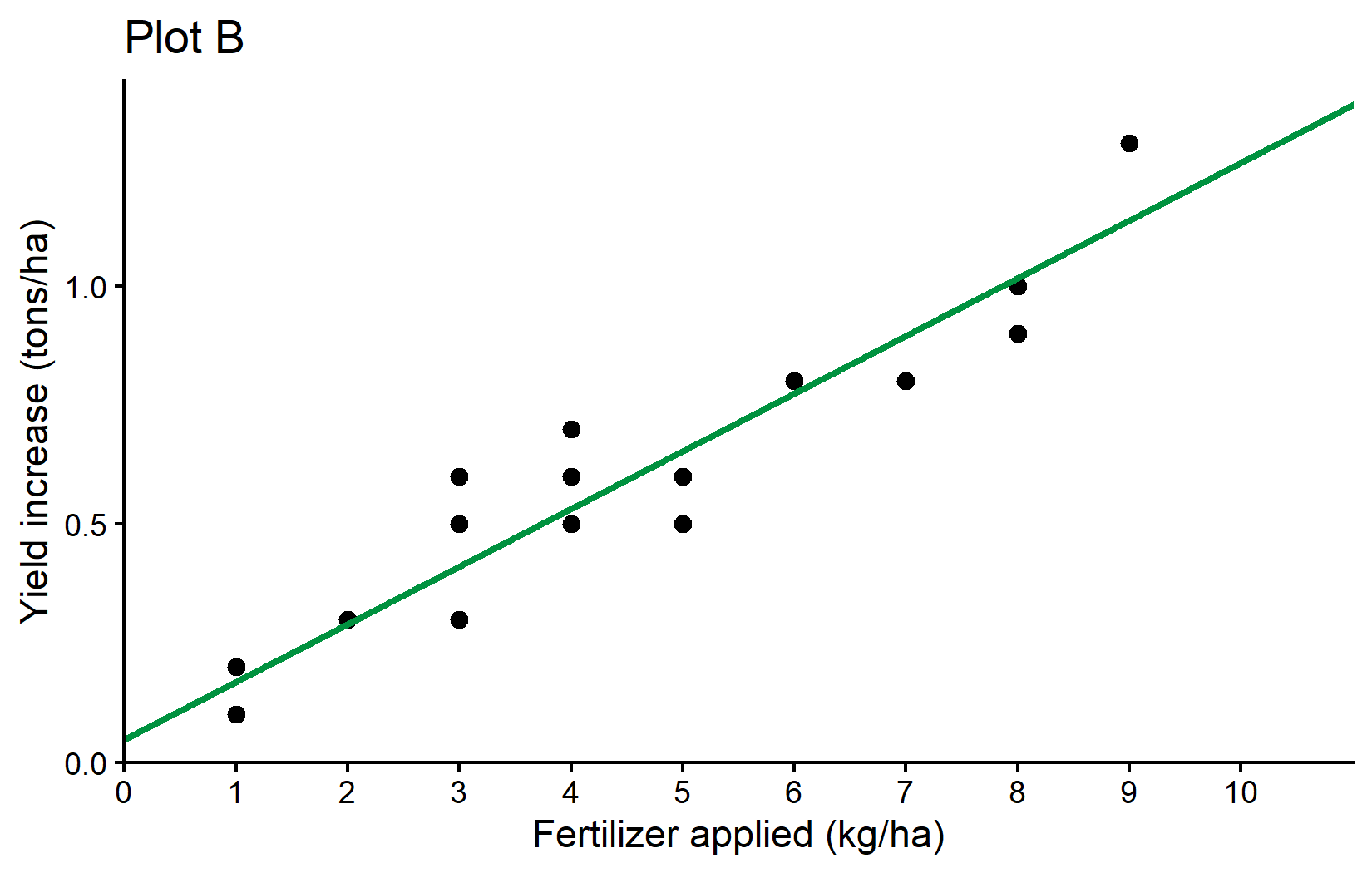
\[ yield\_inc = 0.049 + 0.121 * fert \]
which looks like this:
Here is a little more info why formula = yield_inc ~ fert leads to R estimating the \(a\) and \(b\) we want: What makes sense is that yield_inc is \(y\), fert is \(x\) and ~ would therefore be the \(=\) in our equation. However, why is it we never had to write anything about \(a\) or \(b\)? The answer is that (i) when fitting a linear model, there is usually always an intercept (=\(a\)) by default and (ii) when writing a numeric variable (=fert) as on the right side of the equation, it will automatically be assumed to have a slope (=\(b\)) multiplied with it. Accordingly, yield_inc ~ fert automatically translates to yield_inc = a + b*fert so to speak.
Is this right?
After fitting a model, you may use it to make predictions. Here is one way of obtaining the expected yield increase for applying 0 to 10 kg/ha of fertilizer according to our simple linear regression:
# A tibble: 11 × 2
    fert predicted_yield_inc
   <int>               <dbl>
 1     0              0.0490
 2     1              0.170
 3     2              0.291
 4     3              0.412
 5     4              0.533
 6     5              0.654
 7     6              0.775
 8     7              0.896
 9     8              1.02
10     9              1.14
11    10              1.26
You may notice that according to our model, the expected yield increase when applying 0 kg/ha of fertilizer is actually 0.049 tons/ha and thus larger than 0. This is unexpected. When no additional fertilizer is applied, there should be no additional yield compared to the unfertilized control plots. So what went wrong?
First of all, data will never be perfect. Even if the true value for something is 0, its estimate based on measured data will never be exactly 0.000000… . Instead, there is always “noise” in the data, e.g. measurement errors: The farmers may have miscalculated the exact amount of fertilizer or there might be errors in measuring the yield increase or random environmental influences etc.
So I would like you to think about the issue from two other angles:
- Are the results really saying the intercept is > 0?
- Did we even ask the right question or should we have fitted a different model?
Are the results really saying the intercept is > 0?
No, they are not. Yes, the sample estimate for the intercept is 0.049, but when looking at more detailed information via e.g. summary() we can see more:
summary(reg)
Call:
lm(formula = yield_inc ~ fert, data = dat)

Residuals:
      Min        1Q    Median        3Q       Max
-0.154206 -0.070011 -0.004206  0.039202  0.187891

Coefficients:
            Estimate Std. Error t value Pr(>|t|)
(Intercept) 0.048963   0.040592   1.206    0.243
fert        0.121049   0.008764  13.811 5.09e-11 ***
---
Signif. codes:  0 '***' 0.001 '**' 0.01 '*' 0.05 '.' 0.1 ' ' 1

Residual standard error: 0.1009 on 18 degrees of freedom
Multiple R-squared:  0.9138,    Adjusted R-squared:  0.909
F-statistic: 190.8 on 1 and 18 DF,  p-value: 5.089e-11
You can see that the p-value for the intercept is larger than 0.05 and thus saying that we could not find the intercept to be significantly different from 0 (see the Statistical Tests & p-values chapter for details on the interpretation of this).
Should we have fitted a different model?
We certainly could have and we will actually do it now. It must be clear that statistically speaking there was nothing wrong with our analysis. However, from an agronomic standpoint or in other words - because of our background knowledge and expertise as agricultural scientists - we could have indeed actively decided for a regression analysis that does not have an intercept and is thus forced to start at 0 in terms of yield increase. After all, statistics is just a tool to help us make conclusions. It is a powerful tool, but it will always be our responsibility to “ask the right questions” i.e. apply expedient methods.
A simple linear regression without an intercept is strictly speaking no longer “simple”, since it no longer has the typical equation, but instead this one:
\[ y = \beta x\]
To tell lm() that it should not estimate the default intercept, we simply add 0 + right after the ~. As expected, we only get one estimate for the slope:
reg_noint <- lm(formula = yield_inc ~ 0 + fert, data = dat)
reg_noint
Call:
lm(formula = yield_inc ~ 0 + fert, data = dat)

Coefficients:
  fert
0.1298
meaning that this regression with no intercept is estimated as
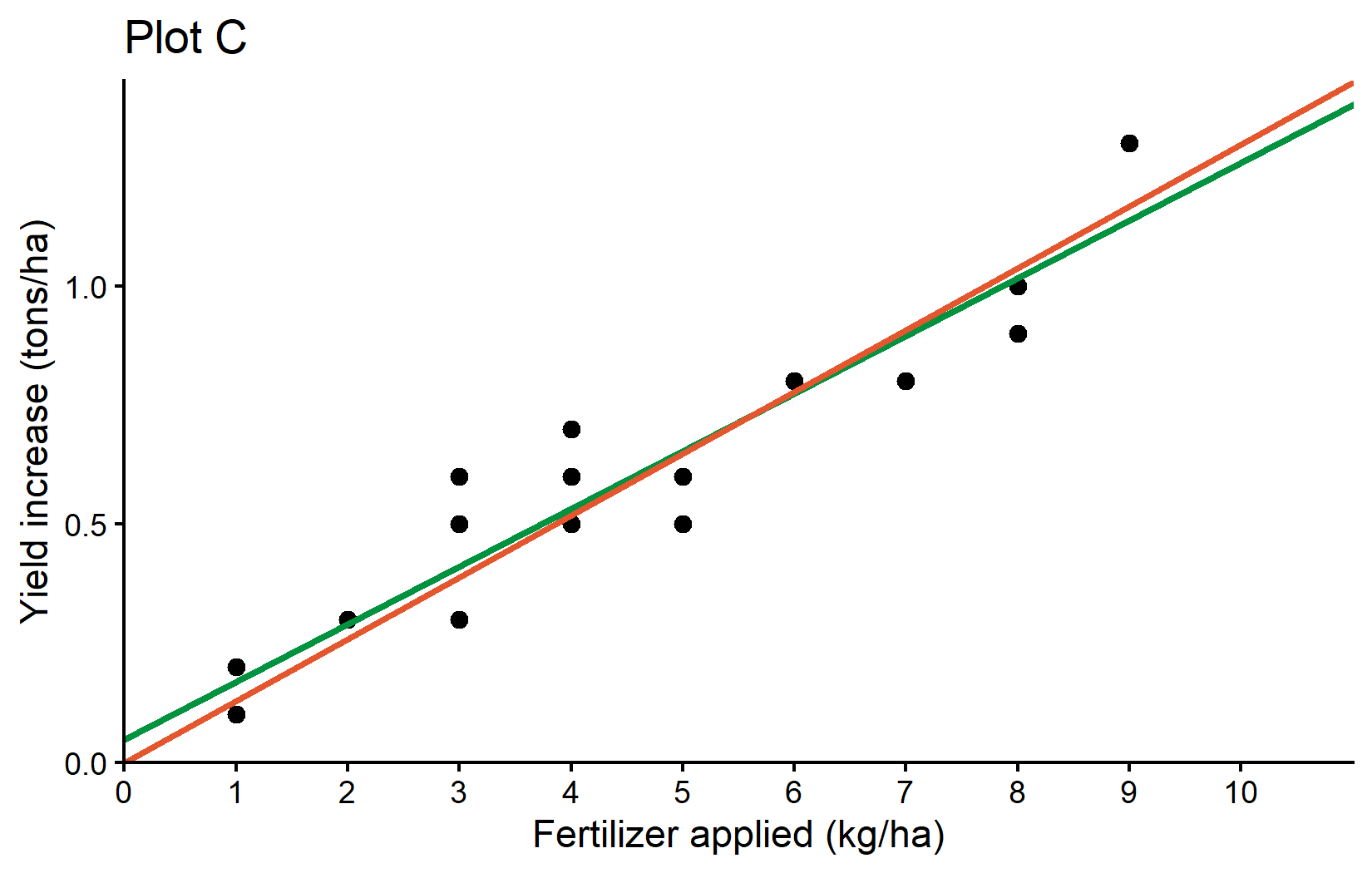
\[ yield\_inc = 0.1298 * fert \]
and must definitely predict 0 yield_inc when applying 0 kg/ha of fert. As a final result, we can compare both regression lines visually in a ggplot:
Finally, here is a little tip for you: The package {broom} is a very useful package for tidying up the output of models or other statistical analyses. It is not built-in, so you need to install it first with install.packages("broom") and load it with library(broom). You can then use its three functions tidy(), glance() and augment() to get the results of your statistical analysis in a “tidy” tibble format. This is especially useful if your goal is to export those results. For example, we can use tidy() on both our correlation and linear regression results:
# A tibble: 1 × 8
  estimate statistic  p.value parameter conf.low conf.high method    alternative
     <dbl>     <dbl>    <dbl>     <int>    <dbl>     <dbl> <chr>     <chr>
1 0.956 13.8 5.09e-11 18 0.890 0.983 Pearson'… two.sided tidy(reg)# A tibble: 2 × 5
term estimate std.error statistic p.value
<chr> <dbl> <dbl> <dbl> <dbl>
1 (Intercept) 0.0490 0.0406 1.21 2.43e- 1
2 fert 0.121 0.00876 13.8 5.09e-11Try running the code yourself and compare this to just running mycor and reg without the tidy() function. A list of all things that can be tidied up with this function is given here
Wrapping Up
Congratulations! You’ve learned the fundamentals of correlation and regression analysis, two of the most commonly used statistical techniques for analyzing relationships between numeric variables in agricultural research.
-
Correlation measures the strength and direction of a linear relationship between two variables:
- Values range from -1 to 1
- Closer to 1: Strong positive correlation
- Closer to -1: Strong negative correlation
- Near 0: Little to no correlation
- Correlation does not imply causation
-
Simple Linear Regression fits a straight line to data to model the relationship between variables:
- Formula: y = α + βx (with intercept) or y = βx (without intercept)
- Here, the slope (β) indicates how much yield increases when fertilizer application increases by 1 kg/ha
- Here, the intercept (α) indicates the expected yield increase when no fertilizer is applied
- Enables predictions of yield increases based on planned fertilizer applications
-
Model Evaluation is crucial for determining if your regression makes sense:
- Check if coefficients are statistically significant
-
Statistical vs. Practical Significance
- Sometimes domain knowledge (like knowing yield increase should be zero with zero fertilizer) may suggest constraints on what the model should look like.
- Remember that statistical tools are guides, but your expertise should inform your final interpretation and modeling choices.
Footnotes
Numbers for applied fertilizer in kg/ha and yield increase in t/ha are made up and chosen to be simple instead of realistic.↩︎
Citation
@online{schmidt2026,
  author = {{Dr. Paul Schmidt}},
  publisher = {BioMath GmbH},
  title = {4. {Correlation} \& {Regression}},
  date = {2026-06-08},
  url = {https://biomathcontent.netlify.app/content/r_intro/04_correlationregression.html},
  langid = {en}
}