To install and load all the packages used in this chapter, run the following code:
Introduction
This chapter will walk you through the creation of the ggplots used in the previous chapter. The goal is to explain how these plots were created step by step, helping you understand both the syntax of ggplot2 and the rationale behind each visualization choice.
In the previous chapter, we analyzed the relationship between fertilizer application and crop yield increases. Now, we’ll focus on how to effectively visualize this relationship using ggplot2, one of the most powerful visualization packages in R.
Data Preparation
First, let’s import the same dataset we used in the previous chapter and also fit the same regression models. By doing so, we have prepared everything we need to create the plots.
This dataset contains information from two farmers who applied different amounts of fertilizer and recorded the resulting yield increases.
Basic ggplot Structure
Before diving into our specific plots, let’s understand the fundamental structure of ggplot2. All ggplot2 visualizations follow a layered approach, where you:
- Start with a base
ggplot()function that defines your data and aesthetic mappings - Add layers using the
+operator - Customize various aspects like scales, labels, and themes
Our First Plot: Plot A
Let’s create the first plot from the Correlation & Regression chapter, which shows the relationship between fertilizer application and yield increase as a scatter plot.
Step 1: The Minimal Plot
We’ll start with the minimal code needed to create a scatter plot:
ggplot(data = dat) +
  aes(x = fert, y = yield_inc) +
  geom_point()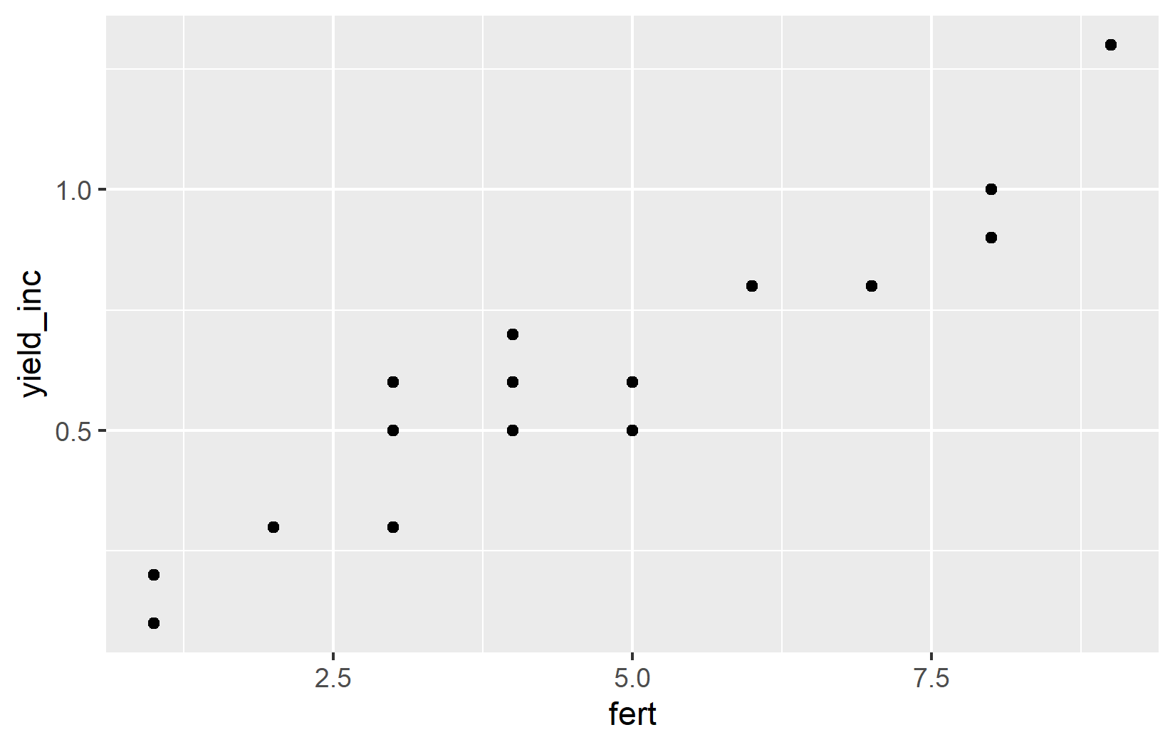
Let’s break down what each part does:
-
ggplot(data = dat): This initializes a ggplot object and specifies the dataset to be used. -
aes(x = fert, y = yield_inc): This defines the aesthetic mappings - which variables go on which axes. -
geom_point(): This adds a layer of points to create a scatter plot.
Simply put, the points created by geom_point() know where they should be drawn, because the aesthetics defined in aes() tell them which variables from the data to use for the x and y axes.
Note that there are actually two ways to include the aesthetic mappings:
# Method 1: aes() inside ggplot()
ggplot(data = dat, mapping = aes(x = fert, y = yield_inc)) +
  geom_point()

# Method 2: aes() as a separate layer
ggplot(data = dat) +
  aes(x = fert, y = yield_inc) +
  geom_point()
Both methods produce identical plots. In this tutorial, we’ll use the second method as it makes the code more readable, especially when we add multiple layers. However, you should be aware of both approaches to not get confused when you see them in other code.
Step 2: Customizing Point Appearance
Let’s make the points larger to improve visibility:
ggplot(data = dat) +
  aes(x = fert, y = yield_inc) +
  geom_point(size = 2)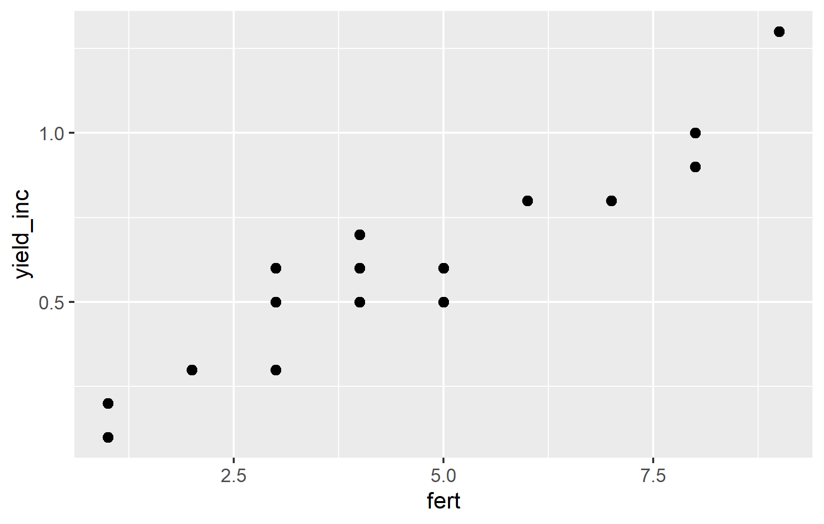
The size = 2 parameter increases the size of all points. The default size is 1.5, so we’re making them slightly larger.
Step 3: Improving Axis Labels and Ranges
Now, let’s customize the x and y axes to provide better context:
ggplot(data = dat) +
  aes(x = fert, y = yield_inc) +
  geom_point(size = 2) +
  scale_x_continuous(
    name = "Fertilizer applied (kg/ha)",
    limits = c(0, 10),
    breaks = seq(0, 10, by = 1)
  ) +
  scale_y_continuous(
    name = "Yield increase (tons/ha)",
    limits = c(0, NA)
  )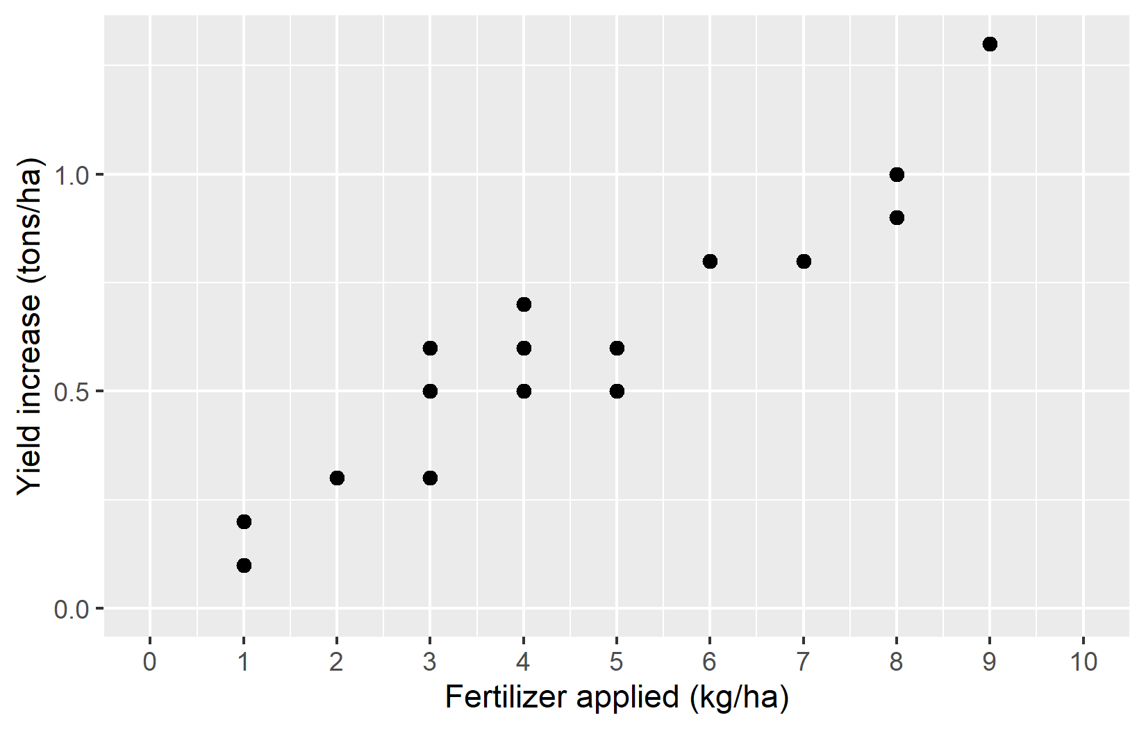
Let’s examine what we’ve added:
-
scale_x_continuous(): This customizes the x-axis, which represents a continuous variable (fertilizer application).-
name = "Fertilizer applied (kg/ha)": Sets a descriptive axis label with units. -
limits = c(0, 10): Sets the range of the x-axis from 0 to 10. -
breaks = seq(0, 10, by = 1): Creates tick marks at every integer from 0 to 10.
-
-
scale_y_continuous(): This customizes the y-axis (yield increase).-
name = "Yield increase (tons/ha)": Sets a descriptive axis label with units. -
limits = c(0, NA): Sets the lower limit to 0, but leaves the upper limit at its default value (NA means “use the default”).
-
Starting the y-axis at 0 is good practice for this type of data, as it shows the true magnitude of the yield increases without exaggeration.
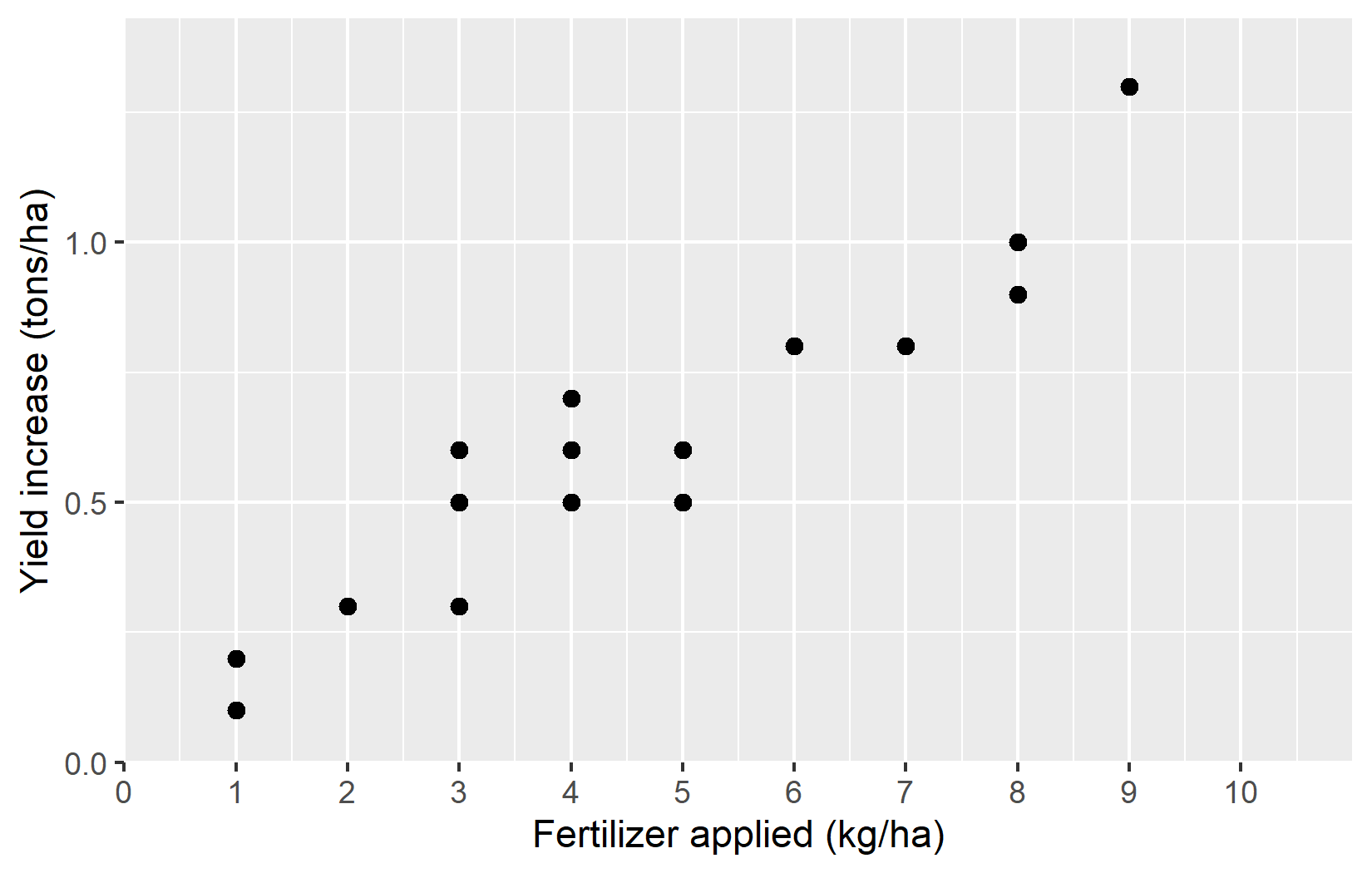
Step 4: Improving the Visual Spacing
For this specific plot, one could argue that it does not make sense to show values below 0 - at least for the applied fertilizer, since it is not possible to apply a negative amount of fertilizer. However, even after setting the lower limit to 0, ggplot adds a bit of extra space below that limit. To prevent this default behaviour, we can use the expand argument. While we could just set expand = c(0, 0) to remove all extra space - both below the lower limit and above the upper limit - this not an elegant solution, as it would then no longer be enough space at the upper limit. Instead, using expand = expansion(mult = c(0, 0.1)) is usually a better solution, as it will add 0% extra space at the lower limit and 10% extra space at the upper limit. This way, we can ensure that the plot looks balanced and visually appealing. And while expand = expansion(mult = c(0, 0.1)) may seem cryptic, the good thing about is that it can be copy-pasted to other plots with the same issue of wanting no extra space below 0.
ggplot(data = dat) +
  aes(x = fert, y = yield_inc) +
  geom_point(size = 2) +
  scale_x_continuous(
    name = "Fertilizer applied (kg/ha)",
    limits = c(0, 10),
    breaks = seq(0, 10, by = 1),
    expand = expansion(mult = c(0, 0.1))
  ) +
  scale_y_continuous(
    name = "Yield increase (tons/ha)",
    limits = c(0, NA),
    expand = expansion(mult = c(0, 0.1))
  )
Step 5: Applying a Theme
Finally, let’s apply a clean theme to our plot:
plotA <- ggplot(data = dat) +
  aes(x = fert, y = yield_inc) +
  geom_point(size = 2) +
  scale_x_continuous(
    name = "Fertilizer applied (kg/ha)",
    limits = c(0, 10),
    breaks = seq(0, 10, by = 1),
    expand = expansion(mult = c(0, 0.1))
  ) +
  scale_y_continuous(
    name = "Yield increase (tons/ha)",
    limits = c(0, NA),
    expand = expansion(mult = c(0, 0.1))
  ) +
  theme_classic() +
  labs(title = "Plot A")

plotA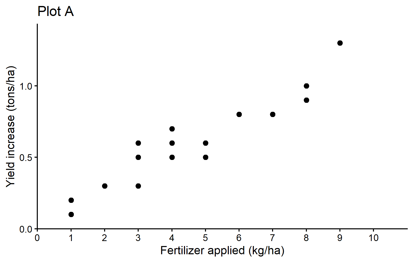
We’ve added: - theme_classic(): This applies a clean, simple theme with axis lines but no grid lines. - labs(title = "Plot A"): This adds a title to the plot.
We’ve also stored our plot in a variable called plotA so we can reuse it later.
Plot B: Adding a Regression Line
For Plot B, we’ll build on Plot A by adding a regression line. Remember that we stored the result of fitting the linear regression in the variable reg.
reg
Call:
lm(formula = yield_inc ~ fert, data = dat)

Coefficients:
(Intercept)         fert
    0.04896      0.12105
We could now manually copy-paste these values into an additional geom_abline() layer like so:
plotB <- plotA +
  geom_abline(
    intercept = 0.04896,  # The intercept from our regression
    slope = 0.12105,      # The slope from our regression
    color = "#00923f",    # A green color
    linewidth = 1         # Slightly thicker line
  ) +
  labs(title = "Plot B")

plotB
However, this is not a good idea, because if we later change the regression model, we would have to remember to update the intercept and slope values in the plot as well. Instead, we can use the reg object directly to extract the coefficients:
reg$coefficients(Intercept) fert
0.04896266 0.12104866 This will give us a vector with the intercept and slope values, which we can use in our geom_abline() layer. Here’s how to do it:
plotB <- plotA +
  geom_abline(
    intercept = reg$coefficients[1],  # The intercept from our regression
    slope = reg$coefficients[2],      # The slope from our regression
    color = "#00923f",                # A green color
    linewidth = 1                     # Slightly thicker line
  ) +
  labs(title = "Plot B")

plotB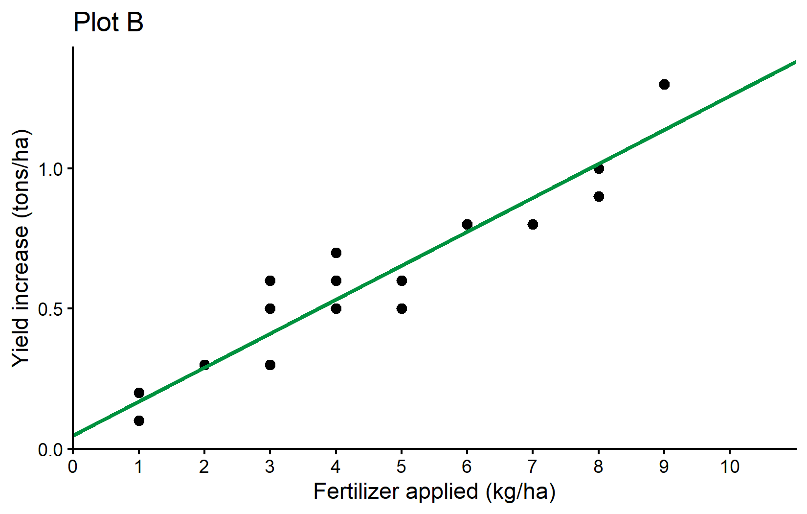
What’s new here is: - geom_abline(): This adds a straight line with a specified intercept and slope. - intercept = reg$coefficients[1]: Uses the intercept from our regression model. - slope = reg$coefficients[2]: Uses the slope from our regression model. - color = "#00923f": Sets the line color to a specific shade of green using hexadecimal color code. - linewidth = 1: Sets the thickness of the line (the default is 0.5).
The geom_abline() function is perfect for visualizing our regression line since it directly accepts intercept and slope parameters. We extract these values from our regression model using reg$coefficients.
Plot C: Comparing Two Regression Lines
Finally, let’s create Plot C, which compares both regression models - one with an intercept and one without. We basically repeat what we just did by adding another geom_abline() layer, but this time we use the reg_noint object to get the slope of the no-intercept model.
plotC <- plotB +
  geom_abline(
    intercept = 0,
    slope = reg_noint$coefficients[1],
    color = "#e4572e",
    linewidth = 1
  ) +
  labs(title = "Plot C")

plotC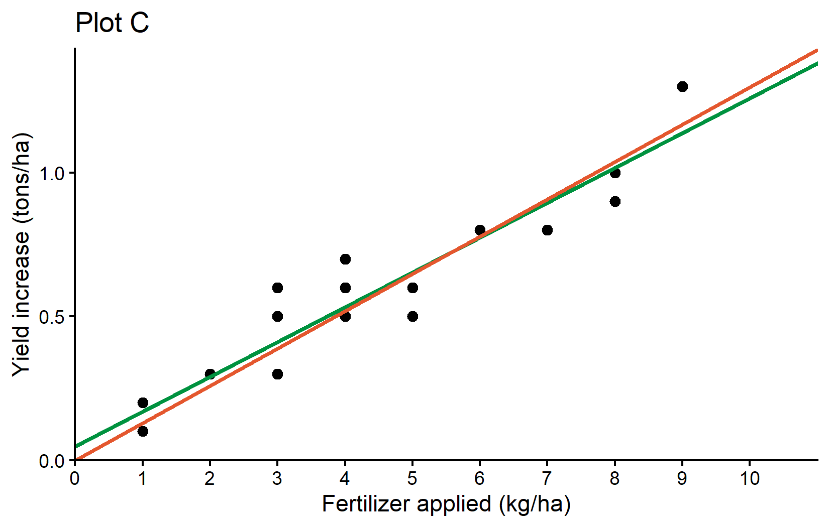
What’s new in this plot: - We’ve added a second geom_abline() with: - intercept = 0: This forces the line to pass through the origin - slope = reg_noint$coefficients[1]: Uses the slope from our no-intercept model - color = "#e4572e": Uses an orange-red color to distinguish it from the first line
This plot effectively compares two different modeling approaches - one that allows for a non-zero yield increase when no fertilizer is applied (green line) and one that forces the line through the origin (orange-red line).
Wrapping Up
Congratulations! You’ve now learned how to create three informative plots that visualize the relationship between fertilizer application and crop yield increase. These plots progressively built on each other to tell a complete story:
Plot A: Showed the raw data as a scatter plot Plot B: Added a regression line to visualize the linear relationship Plot C: Compared two different regression approaches
Along the way, you’ve learned several important ggplot2 concepts:
- Core Structure: Every ggplot consists of data, aesthetic mappings, and layers added with the + operator.
- Geometric Objects (geoms): Different geoms like geom_point() and geom_abline() create different visual elements.
- Scales: Functions like scale_x_continuous() control how variables are mapped to visual properties.
- Customization: You can control virtually every aspect of your plot, from axis limits to colors and text.
- Themes: Pre-defined themes like theme_classic() quickly set the overall visual style.
- Code Reusability: Storing plots in variables allows you to build upon them incrementally.
Remember that effective data visualization is about more than just making plots look nice - it’s about communicating insights clearly. The choices we made in these plots (starting axes at zero, using clear labels, adding informative regression lines) help ensure that the data is represented accurately and the story is told effectively.
For a more comprehensive introduction to ggplot2 with detailed examples, check out:
- “How I use ggplot2” - A tutorial by the author of this course with additional techniques and customization options.
- The {ggplot2} documentation for complete reference information.
Citation
@online{schmidt2025,
  author = {{Dr. Paul Schmidt}},
  publisher = {BioMath GmbH},
  title = {5. {Our} {First} Ggplots},
  date = {2025-10-09},
  url = {https://biomathcontent.netlify.app/content/r_intro/05_firstggplot.html},
  langid = {en}
}