Once you understand the basics of linear regression, the next question often arises: How do I present the results professionally? In reports and publications, you often see scatter plots that go far beyond a simple point plot - with regression lines, R² values, mean lines, and labeled data points.
This chapter shows step by step how to create such graphics in R. We extract the relevant statistics from the regression model and build a publication-ready plot from them.
Load packages
To install and load all the packages used in this chapter, run the following code:
Example data
As an example, we use (synthetic) regional data on unemployment rates in the 53 districts and independent cities of North Rhine-Westphalia, Germany.
set.seed(42)

# Real names of the 53 districts and independent cities in NRW
kreis_namen <- c(
  "Düsseldorf", "Duisburg", "Essen", "Krefeld", "Mönchengladbach",
  "Mülheim an der Ruhr", "Oberhausen", "Remscheid", "Solingen", "Wuppertal",
  "Kleve", "Mettmann", "Rhein-Kreis Neuss", "Viersen", "Wesel",
  "Bonn", "Köln", "Leverkusen", "Städteregion Aachen", "Düren",
  "Rhein-Erft-Kreis", "Euskirchen", "Heinsberg", "Oberbergischer Kreis",
  "Rheinisch-Bergischer Kreis", "Rhein-Sieg-Kreis", "Bottrop", "Gelsenkirchen",
  "Münster", "Borken", "Coesfeld", "Recklinghausen", "Steinfurt", "Warendorf",
  "Bielefeld", "Gütersloh", "Herford", "Höxter", "Lippe", "Minden-Lübbecke",
  "Paderborn", "Bochum", "Dortmund", "Hagen", "Hamm", "Herne",
  "Ennepe-Ruhr-Kreis", "Märkischer Kreis", "Olpe", "Siegen-Wittgenstein",
  "Soest", "Unna", "Hochsauerlandkreis"
)

n <- length(kreis_namen)

# Helper vectors for differentiated rates
staedte_hoch <- c("Gelsenkirchen", "Essen", "Duisburg", "Herne", "Dortmund")
kreise_niedrig <- c("Borken", "Coesfeld", "Höxter", "Olpe")

# Synthetic data with realistic relationships
dat <- tibble(
  district = kreis_namen,
  # Base random values
  unemp_rate = runif(n, 4, 9)
) %>%
  mutate(
    # Unemployment rate: differentiated by district type
    unemp_rate = case_when(
      district %in% staedte_hoch ~ runif(n(), 10, 14),
      district %in% kreise_niedrig ~ runif(n(), 2, 4),
      TRUE ~ unemp_rate
    ),
    # Change 2015-2023: positively correlated with rate
    unemp_change = -20 + 2.5 * unemp_rate + rnorm(n(), 0, 8),
    # Gross wage change: 15-40%
    wage_change = runif(n(), 15, 40),
    # Population change: negatively correlated with wage development
    pop_change = 5 - 0.3 * wage_change + rnorm(n(), 0, 3)
  ) %>%
  arrange(district)

dat
# A tibble: 53 × 5
district unemp_rate unemp_change wage_change pop_change
<chr> <dbl> <dbl> <dbl> <dbl>
1 Bielefeld 4.02 -17.1 15.8 -3.63
2 Bochum 6.18 -3.32 24.8 -8.44
3 Bonn 8.70 -2.73 26.6 -0.398
4 Borken 3.16 -15.1 23.3 -4.50
5 Bottrop 5.95 -2.04 33.3 -9.00
6 Coesfeld 3.64 -0.964 17.2 -4.96
7 Dortmund 12.9 5.93 19.0 0.310
8 Duisburg 10.2 6.40 36.7 -6.55
9 Düren 6.80 -12.7 23.2 -0.512
10 Düsseldorf 8.57 5.18 18.4 3.35
# ℹ 43 more rowsData preparation
Creating categories with cut()
The cut() function divides a continuous variable into categories. This is useful for grouping rates into categories like “low”, “medium”, “high”.
# A tibble: 4 × 2
  rate_category        n
  <fct>            <int>
1 low (<4%)            4
2 medium (4-7%)       22
3 elevated (7-10%)    22
4 high (>10%)          5
The parameter right = FALSE means that the intervals are closed on the left: [0, 4) includes 0 but not 4. With labels we assign meaningful names to the categories.
Date differences with lubridate
For analyses over time periods, differences between dates often need to be calculated. The lubridate package makes this easy.
# Example: observation period
dat <- dat %>%
  mutate(
    date_start = ymd("2015-01-01"),
    date_end = ymd("2023-12-31"),
    # Difference in days
    days = as.numeric(date_end - date_start),
    # Difference in years (exact)
    years = interval(date_start, date_end) / years(1)
  )

# Check result
dat %>%
  select(district, date_start, date_end, days, years) %>%
  head(3)
# A tibble: 3 × 5
district date_start date_end days years
<chr> <date> <date> <dbl> <dbl>
1 Bielefeld 2015-01-01 2023-12-31 3286 9.00
2 Bochum 2015-01-01 2023-12-31 3286 9.00
3 Bonn 2015-01-01 2023-12-31 3286 9.00The interval() function creates a time interval, which we then divide by years(1) to get the exact number of years. For simple differences in days, subtraction followed by conversion via as.numeric() is sufficient.
Linear regression
Before we visualize the data, we fit the regression model. We need the results - especially the slope, intercept, and R² - later for the plot.
Fit the model
Call:
lm(formula = unemp_change ~ unemp_rate, data = dat)

Residuals:
    Min      1Q  Median      3Q     Max
-16.378  -6.249   0.163   5.930  14.790

Coefficients:
            Estimate Std. Error t value Pr(>|t|)
(Intercept) -20.2319     3.2374  -6.249 8.32e-08 ***
unemp_rate    2.4302     0.4329   5.614 8.19e-07 ***
---
Signif. codes:  0 '***' 0.001 '**' 0.01 '*' 0.05 '.' 0.1 ' ' 1

Residual standard error: 7.31 on 51 degrees of freedom
Multiple R-squared:  0.382, Adjusted R-squared:  0.3698
F-statistic: 31.52 on 1 and 51 DF,  p-value: 8.194e-07
Extract results with broom
The broom package provides three central functions to convert model outputs into tidy tibbles:
# Coefficients with standard errors and p-values
tidy(mod)
# A tibble: 2 × 5
term estimate std.error statistic p.value
<chr> <dbl> <dbl> <dbl> <dbl>
1 (Intercept) -20.2 3.24 -6.25 0.0000000832
2 unemp_rate 2.43 0.433 5.61 0.000000819 # Model fit: R², adjusted R², F-statistic, etc.
glance(mod)# A tibble: 1 × 12
r.squared adj.r.squared sigma statistic p.value df logLik AIC BIC
<dbl> <dbl> <dbl> <dbl> <dbl> <dbl> <dbl> <dbl> <dbl>
1 0.382 0.370 7.31 31.5 0.000000819 1 -180. 365. 371.
# ℹ 3 more variables: deviance <dbl>, df.residual <int>, nobs <int># A tibble: 6 × 8
unemp_change unemp_rate .fitted .resid .hat .sigma .cooksd .std.resid
<dbl> <dbl> <dbl> <dbl> <dbl> <dbl> <dbl> <dbl>
1 -17.1 4.02 -10.5 -6.65 0.0524 7.32 0.0241 -0.934
2 -3.32 6.18 -5.22 1.90 0.0219 7.38 0.000774 0.263
3 -2.73 8.70 0.911 -3.64 0.0277 7.36 0.00364 -0.505
4 -15.1 3.16 -12.6 -2.56 0.0736 7.37 0.00525 -0.364
5 -2.04 5.95 -5.77 3.73 0.0236 7.36 0.00321 0.516
6 -0.964 3.64 -11.4 10.4 0.0610 7.22 0.0703 1.47 Save values for visualization
For the plot, we need the intercept, slope, and R²:
Calculate predicted values
With predict() we can obtain predictions for arbitrary x-values:
# A tibble: 4 × 2
  unemp_rate predicted
       <dbl>     <dbl>
1          3    -12.9
2          6     -5.65
3          9      1.64
4         12      8.93
Alternatively, augment() adds the predicted values directly to the original dataset (column .fitted).
Annotated scatter plots
Now we create a publication-ready plot step by step with all relevant annotations.
Basic scatter plot
The basic plot shows the relationship between the unemployment rate (x-axis) and its change over time (y-axis):
p <- ggplot(dat, aes(x = unemp_rate, y = unemp_change)) +
  geom_point(color = "#00923f", size = 3) +
  labs(
    x = "Unemployment rate 2023 in %",
    y = "Change in unemployment rate 2015-2023 in %"
  ) +
  theme_minimal()

p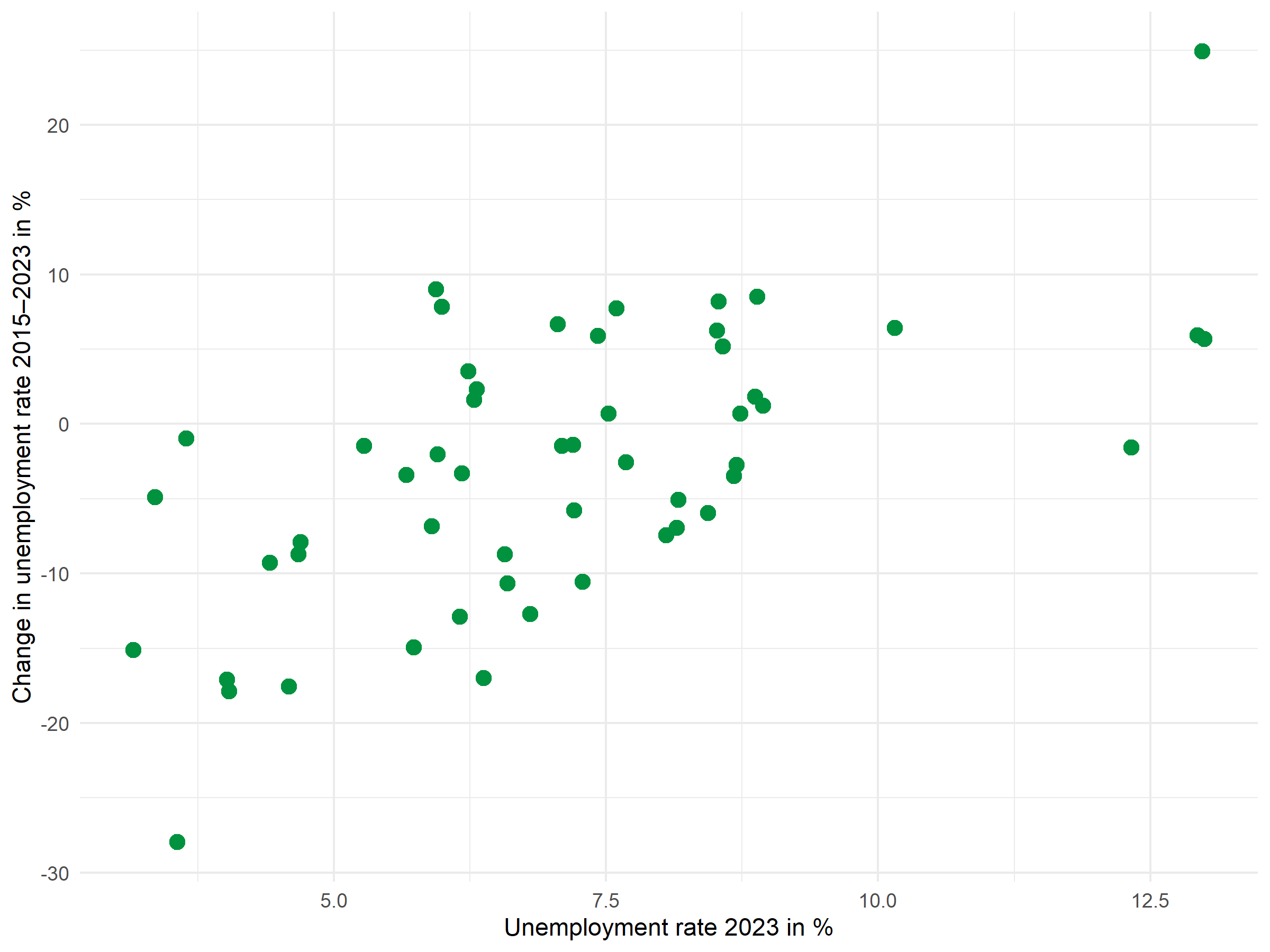
Point labels with ggrepel
The ggrepel package automatically positions labels so they don’t overlap:
p <- p +
  geom_text_repel(
    aes(label = district),
    size = 2.5,
    max.overlaps = 20,
    segment.color = "grey50",
    segment.size = 0.3
  )

p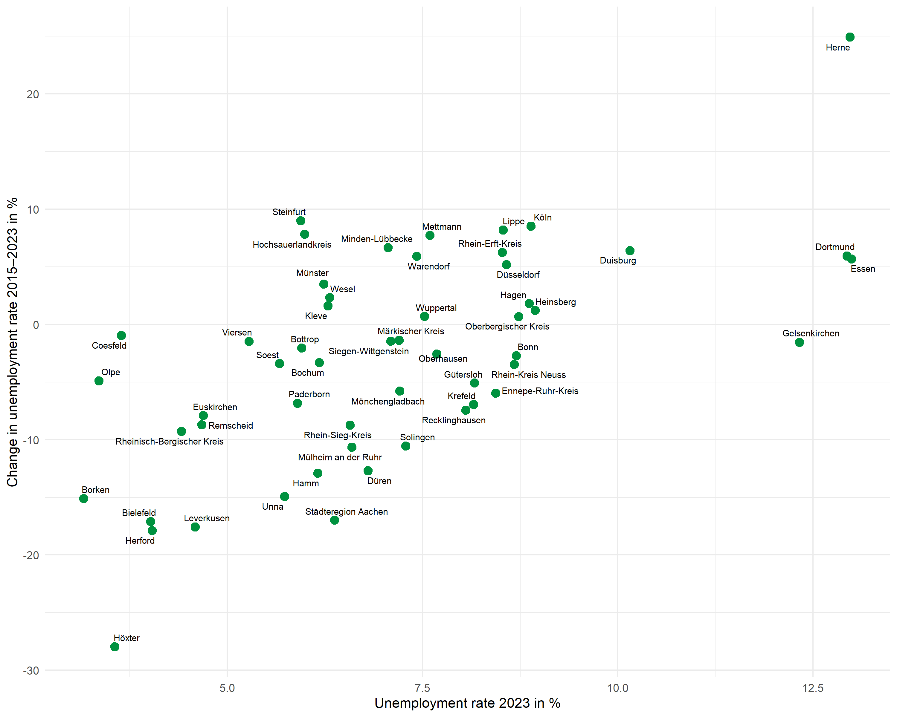
The max.overlaps parameter controls how many overlaps are tolerated - with many points, this value must be increased for all labels to be displayed.
Mean lines
Dashed lines mark the means of both variables and divide the plot into four quadrants:
# Calculate means
mean_x <- mean(dat$unemp_rate)
mean_y <- mean(dat$unemp_change)

p <- p +
  geom_hline(yintercept = mean_y, linetype = "dashed", color = "grey40") +
  geom_vline(xintercept = mean_x, linetype = "dashed", color = "grey40")

p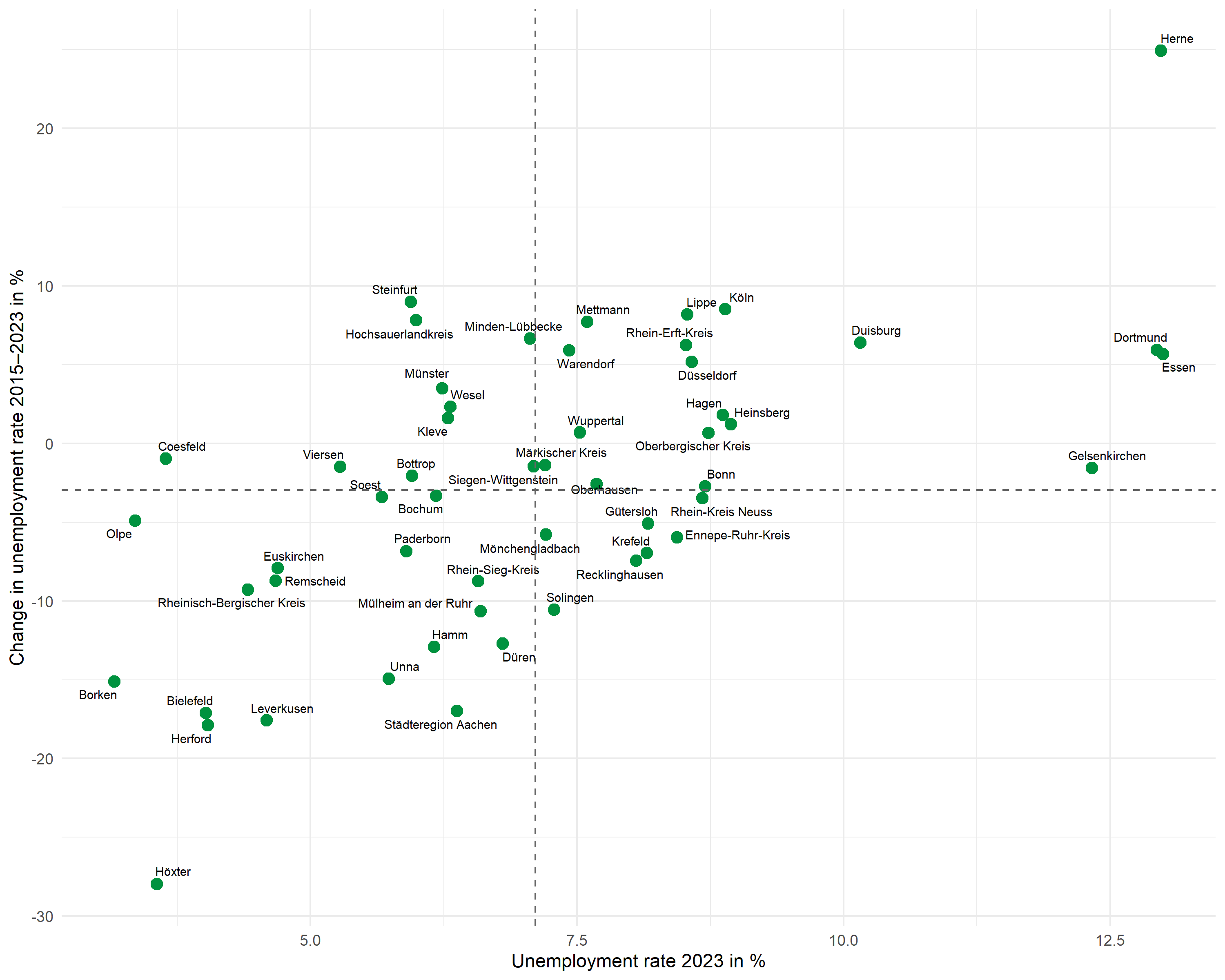
Regression line
Instead of geom_smooth(), we use geom_abline() with the previously extracted coefficients. This gives us full control over the displayed line:
p <- p +
  geom_abline(
    intercept = intercept,
    slope = slope,
    color = "#E31937",
    linewidth = 0.8
  )

p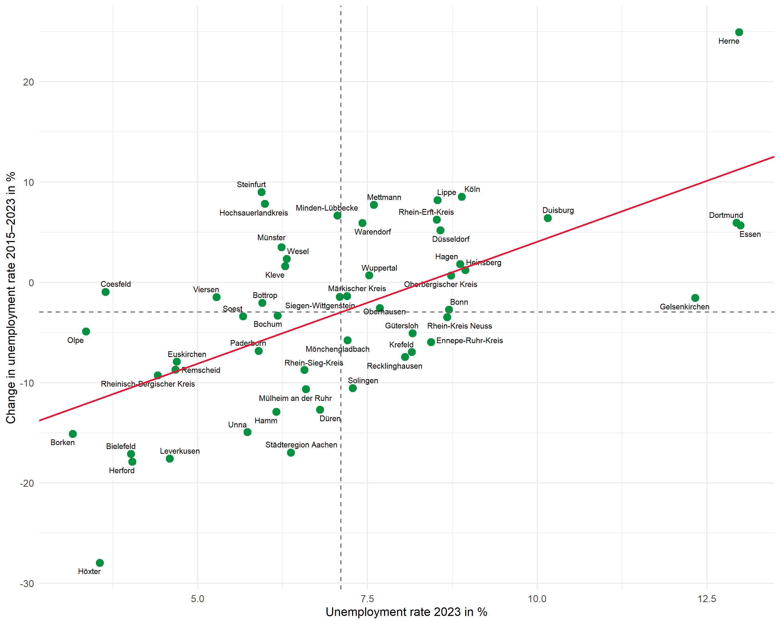
R2 annotation
We place the R² annotation with annotate(). We choose the position manually to fit the data range:
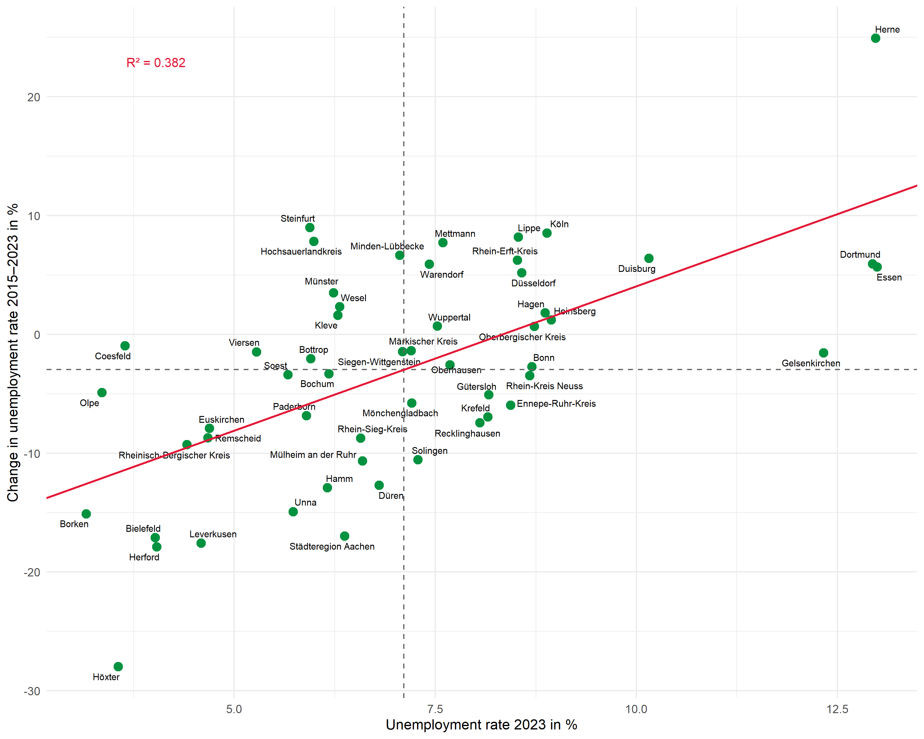
Complete plot
Here is the complete code for the finished plot:
# Means and regression parameters
mean_x <- mean(dat$unemp_rate)
mean_y <- mean(dat$unemp_change)
r2_label <- glue::glue("R² = {scales::number(r_squared, accuracy = 0.001)}")

ggplot(dat, aes(x = unemp_rate, y = unemp_change)) +
  # Points
  geom_point(color = "#00923f", size = 3) +
  # Labels
  geom_text_repel(
    aes(label = district),
    size = 2.5,
    max.overlaps = 25,
    segment.color = "grey50",
    segment.size = 0.3
  ) +
  # Mean lines
  geom_hline(yintercept = mean_y, linetype = "dashed", color = "grey40") +
  geom_vline(xintercept = mean_x, linetype = "dashed", color = "grey40") +
  # Regression line
  geom_abline(
    intercept = intercept,
    slope = slope,
    color = "#E31937",
    linewidth = 0.8
  ) +
  # R² annotation
  annotate(
    "text",
    x = min(dat$unemp_rate) + 0.5,
    y = max(dat$unemp_change) - 2,
    label = r2_label,
    hjust = 0,
    size = 3.5,
    color = "#E31937"
  ) +
  # Axis labels
  labs(
    x = "Unemployment rate 2023 in %",
    y = "Change in unemployment rate 2015-2023 in %"
  ) +
  theme_minimal(base_size = 11)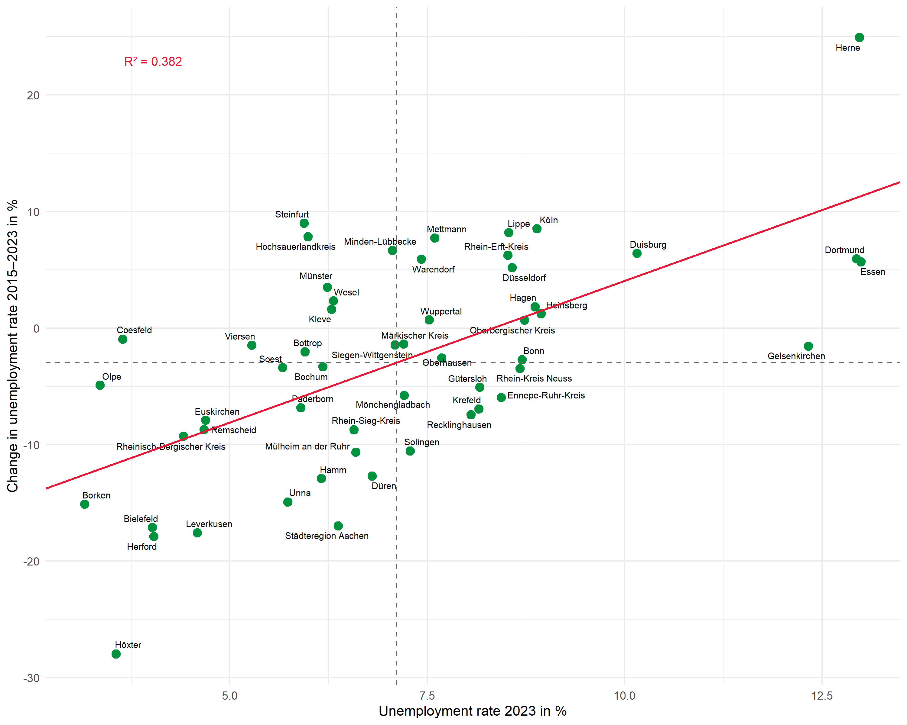
Second example: Wage development and population
The same workflow can be applied to other questions. Here we examine the relationship between gross wage development and population change:
# Fit regression
mod2 <- lm(pop_change ~ wage_change, data = dat)

# Extract values
intercept2 <- coef(mod2)[1]
slope2 <- coef(mod2)[2]
r_squared2 <- glance(mod2)$r.squared
r2_label2 <- glue::glue("R² = {scales::number(r_squared2, accuracy = 0.001)}")

# Plot
ggplot(dat, aes(x = wage_change, y = pop_change)) +
  geom_point(color = "#00923f", size = 3) +
  geom_text_repel(
    aes(label = district),
    size = 2.5,
    max.overlaps = 25,
    segment.color = "grey50"
  ) +
  geom_hline(yintercept = mean(dat$pop_change), linetype = "dashed", color = "grey40") +
  geom_vline(xintercept = mean(dat$wage_change), linetype = "dashed", color = "grey40") +
  geom_abline(intercept = intercept2, slope = slope2, color = "#E31937", linewidth = 0.8) +
  annotate(
    "text",
    x = max(dat$wage_change) - 1,
    y = max(dat$pop_change) - 0.5,
    label = r2_label2,
    hjust = 1,
    size = 3.5,
    color = "#E31937"
  ) +
  labs(
    x = "Change in gross wages 2015-2023 in %",
    y = "Population change 2015-2023 in %"
  ) +
  theme_minimal(base_size = 11)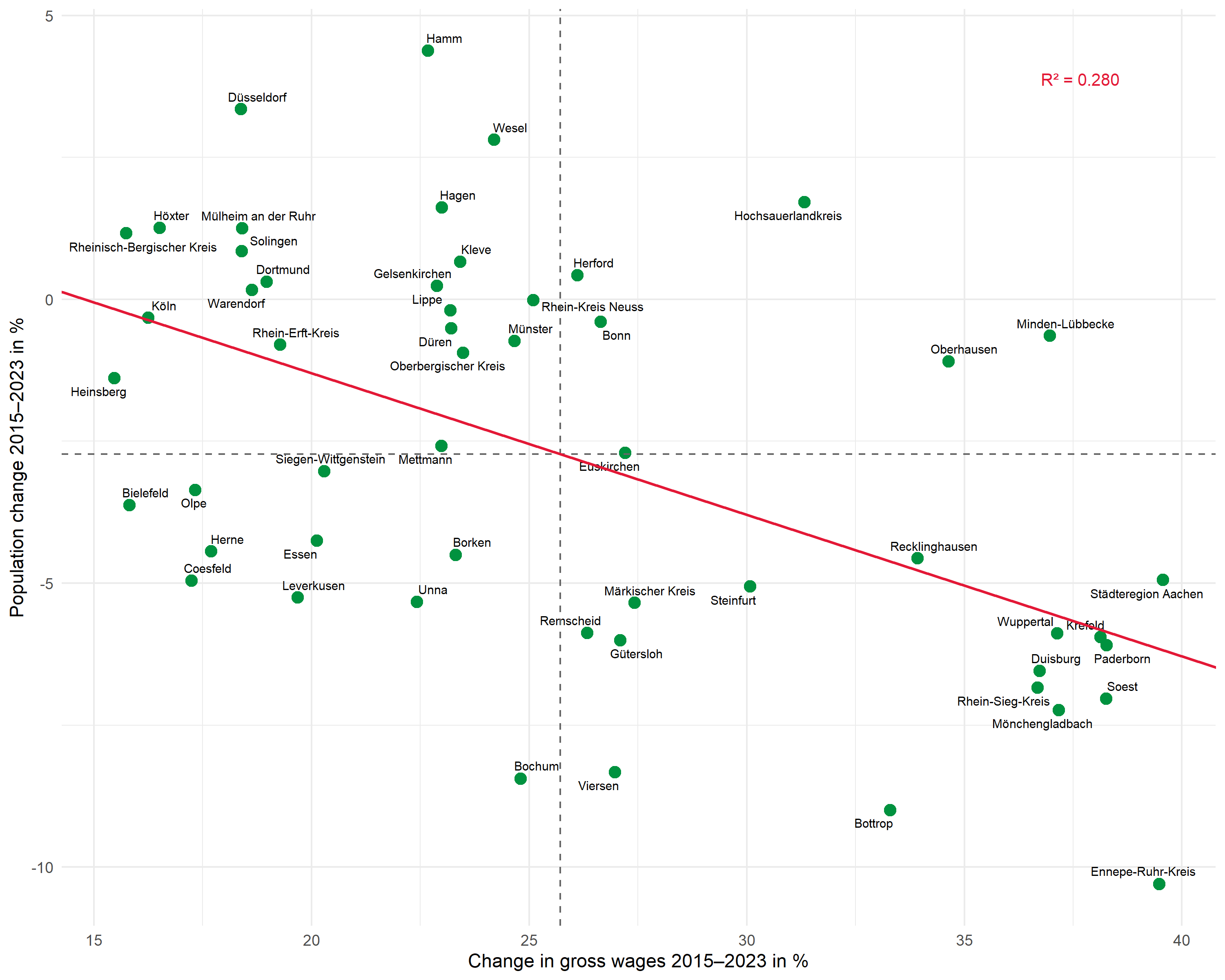
Bonus: Extended plot
In this section, we extend the plot with additional elements:
- Regression equation as annotation (in the form y = a + bx)
- Labeled means at the dashed lines
- Selective labeling - only the most extreme values are labeled
Create regression equation
We build the regression equation from the extracted coefficients:
# Format coefficients
a_fmt <- scales::number(intercept, accuracy = 0.01)
b_fmt <- scales::number(slope, accuracy = 0.01)

# Handle sign for b
sign_b <- if_else(slope >= 0, " + ", " − ")
b_abs <- scales::number(abs(slope), accuracy = 0.01)

# Build regression equation
formula_label <- glue::glue("y = {a_fmt}{sign_b}{b_abs}x")
formula_label
y = -20.23 + 2.43xPrepare selective labeling
With many data points, it can be useful to label only the most extreme values. Here we label all points that belong to the top or bottom 5 on at least one axis:
dat <- dat %>%
  mutate(
    # Calculate ranks (1 = lowest value)
    rank_x = rank(unemp_rate),
    rank_y = rank(unemp_change),
    # Label for extreme values on both axes
    label_selective = if_else(
      rank_x <= 5 | rank_x > n() - 5 | rank_y <= 5 | rank_y > n() - 5,
      district,
      NA_character_
    )
  )

# Check which districts are labeled
dat %>%
  filter(!is.na(label_selective)) %>%
  select(district, unemp_rate, rank_x, unemp_change, rank_y)
# A tibble: 17 × 5
district unemp_rate rank_x unemp_change rank_y
<chr> <dbl> <dbl> <dbl> <dbl>
1 Bielefeld 4.02 5 -17.1 4
2 Borken 3.16 1 -15.1 6
3 Coesfeld 3.64 4 -0.964 33
4 Dortmund 12.9 51 5.93 44
5 Duisburg 10.2 49 6.40 46
6 Essen 13.0 53 5.67 42
7 Gelsenkirchen 12.3 50 -1.56 29
8 Herford 4.04 6 -17.9 2
9 Herne 13.0 52 24.9 53
10 Hochsauerlandkreis 5.99 17 7.82 49
11 Höxter 3.56 3 -28.0 1
12 Köln 8.89 47 8.52 51
13 Leverkusen 4.59 8 -17.6 3
14 Lippe 8.53 41 8.19 50
15 Olpe 3.36 2 -4.91 22
16 Steinfurt 5.94 15 9.00 52
17 Städteregion Aachen 6.37 23 -17.0 5Extended plot
Now we combine all elements:
# Calculate means
mean_x <- mean(dat$unemp_rate)
mean_y <- mean(dat$unemp_change)

# Labels for means
mean_x_label <- glue::glue("Mean: {scales::number(mean_x, accuracy = 0.1)}")
mean_y_label <- glue::glue("Mean: {scales::number(mean_y, accuracy = 0.1)}")

# R² and formula combined
reg_label <- glue::glue("{formula_label}; R² = {scales::number(r_squared, accuracy = 0.001)}")

ggplot(dat, aes(x = unemp_rate, y = unemp_change)) +
  # Points
  geom_point(color = "#00923f", size = 3) +
  # Selective labels (only extreme values)
  geom_text_repel(
    aes(label = label_selective),
    size = 2.8,
    max.overlaps = 20,
    segment.color = "grey50",
    segment.size = 0.3,
    na.rm = TRUE
  ) +
  # Mean lines
  geom_hline(yintercept = mean_y, linetype = "dashed", color = "grey40") +
  geom_vline(xintercept = mean_x, linetype = "dashed", color = "grey40") +
  # Mean label (x-axis, at top)
  annotate(
    "text",
    x = mean_x,
    y = max(dat$unemp_change) + 1,
    label = mean_x_label,
    size = 2.5,
    color = "grey30"
  ) +
  # Mean label (y-axis, at right)
  annotate(
    "text",
    x = max(dat$unemp_rate) + 0.3,
    y = mean_y,
    label = mean_y_label,
    hjust = 0,
    size = 2.5,
    color = "grey30"
  ) +
  # Regression line
  geom_abline(
    intercept = intercept,
    slope = slope,
    color = "#E31937",
    linewidth = 0.8
  ) +
  # R² and regression equation combined
  annotate(
    "text",
    x = min(dat$unemp_rate) + 0.5,
    y = max(dat$unemp_change) - 1,
    label = reg_label,
    hjust = 0,
    size = 3.5,
    color = "#E31937"
  ) +
  # Axes with scale_x/y_continuous
  scale_x_continuous(
    name = "Unemployment rate 2023 in %",
    limits = c(min(dat$unemp_rate) - 0.5, max(dat$unemp_rate) + 3),
    expand = c(0, 0)
  ) +
  scale_y_continuous(
    name = "Change in unemployment rate 2015-2023 in %",
    limits = c(min(dat$unemp_change) - 2, max(dat$unemp_change) + 3),
    expand = c(0, 0)
  ) +
  theme_minimal(base_size = 11)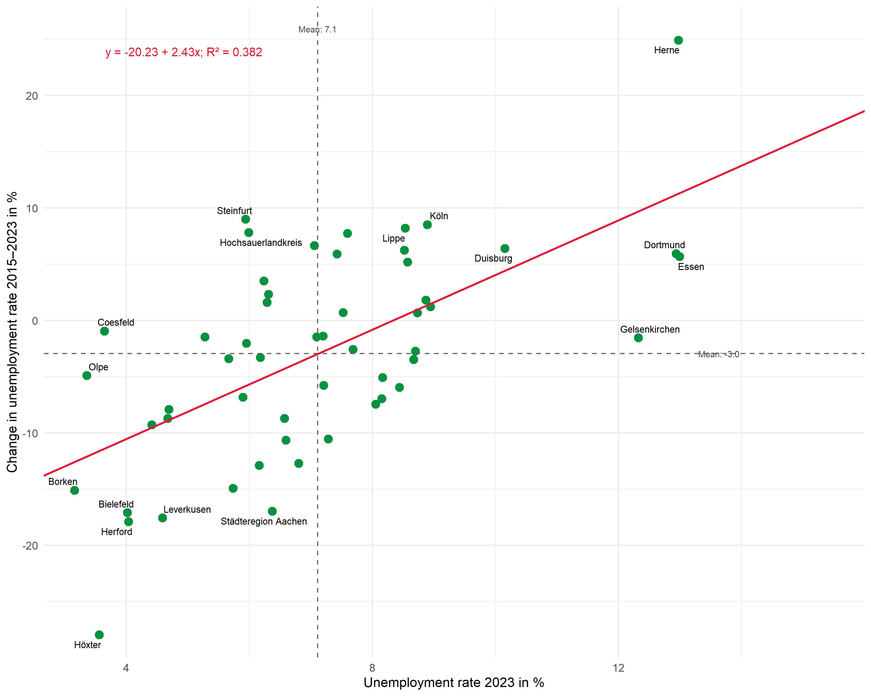
This extended plot shows:
- Selective labeling: Only the extreme values on both axes (top/bottom 5 each) are labeled - the rest remains uncluttered
- Labeled means: The average values are displayed directly at the dashed lines
- Regression equation and R²: Both pieces of information compactly in one annotation
Summary
The workflow for professionally presented regression plots:
-
Fit model:
lm()for regression -
Extract values:
broomfunctions provide coefficients, R², and predicted values as tibbles -
Build plot step by step:
-
geom_point()for data points -
geom_text_repel()for non-overlapping labels -
geom_hline()/geom_vline()for mean lines -
geom_abline()for the regression line -
annotate()withglue()for R², regression equation, and means
-
- Extend as needed: Selective labeling, regression equation, labeled means
Citation
@online{schmidt2026,
  author = {{Dr. Paul Schmidt}},
  publisher = {BioMath GmbH},
  title = {7. {Presenting} {Regression} {Results} {Professionally}},
  date = {2026-03-12},
  url = {https://biomathcontent.netlify.app/content/r_more/07_regression_scatterplot.html},
  langid = {en}
}