for (pkg in c("ggplot2", "scales")) {
  if (!require(pkg, character.only = TRUE)) install.packages(pkg)
}
Note
This chapter builds on the ggplot2 basics covered in First ggplot. If you are not yet comfortable with ggplot(), aes(), and basic geoms, we recommend starting there.
When we create a plot, the default axis labels are simply the column names from the data, the axis range is determined automatically, and tick marks appear at positions chosen by ggplot2. While these defaults are reasonable for a quick look, they rarely meet the standards of a polished graphic - whether for a report, a presentation, or a publication. The scale_x_* and scale_y_* functions give us full control over these details.
Throughout this chapter, we use the built-in PlantGrowth dataset and build our plot step by step. Since weight is a continuous variable, we use scale_y_continuous(). Since group is categorical, we use scale_x_discrete(). This distinction matters: continuous and discrete scales share the same arguments (name, limits, breaks, labels, expand), but their behavior differs in important ways, as we will see below.
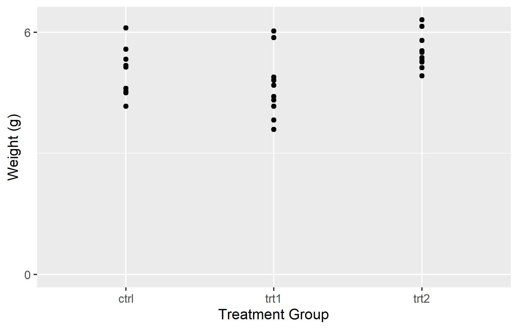
myplot <- ggplot(data = PlantGrowth) +
  aes(y = weight, x = group) +
  geom_point()

myplot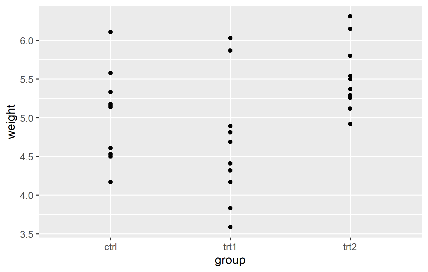
Name
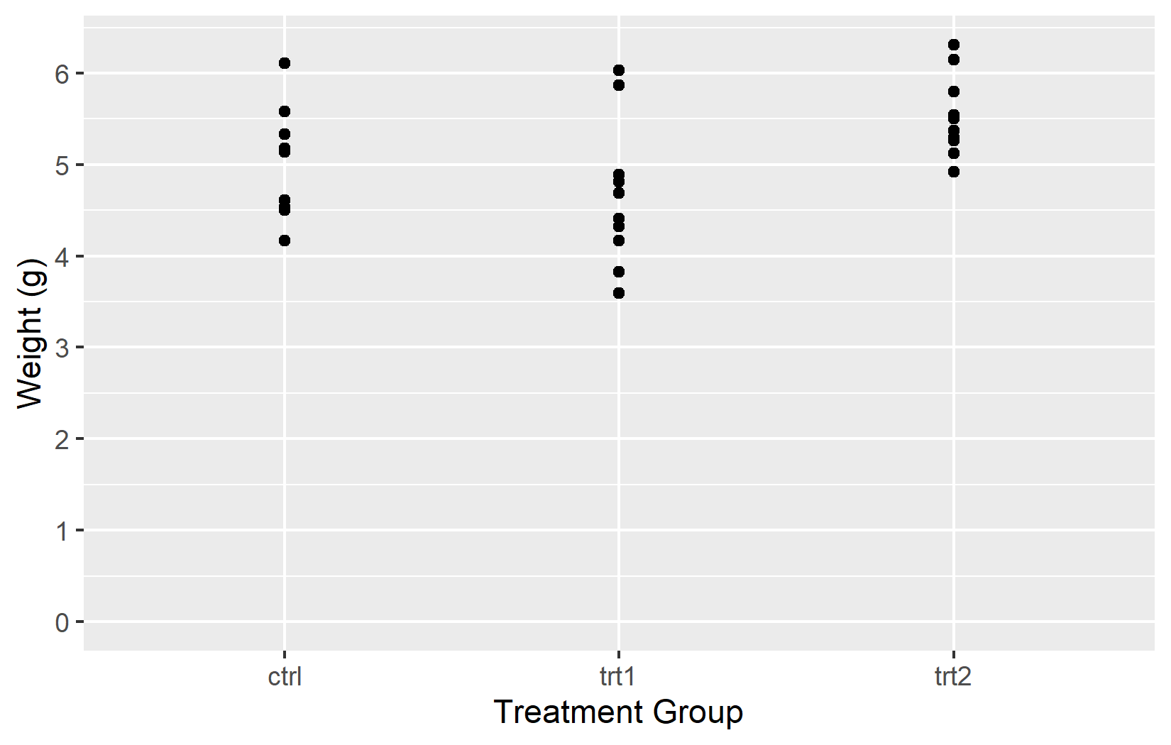
The most basic customization is the axis title. By default, ggplot2 uses the column name from the data - weight and group in our case. These are fine for exploratory work, but for any shared output one should provide informative titles that include units where applicable. The name argument does exactly this:
myplot +
  scale_y_continuous(name = "Weight (g)") +
  scale_x_discrete(name = "Treatment Group")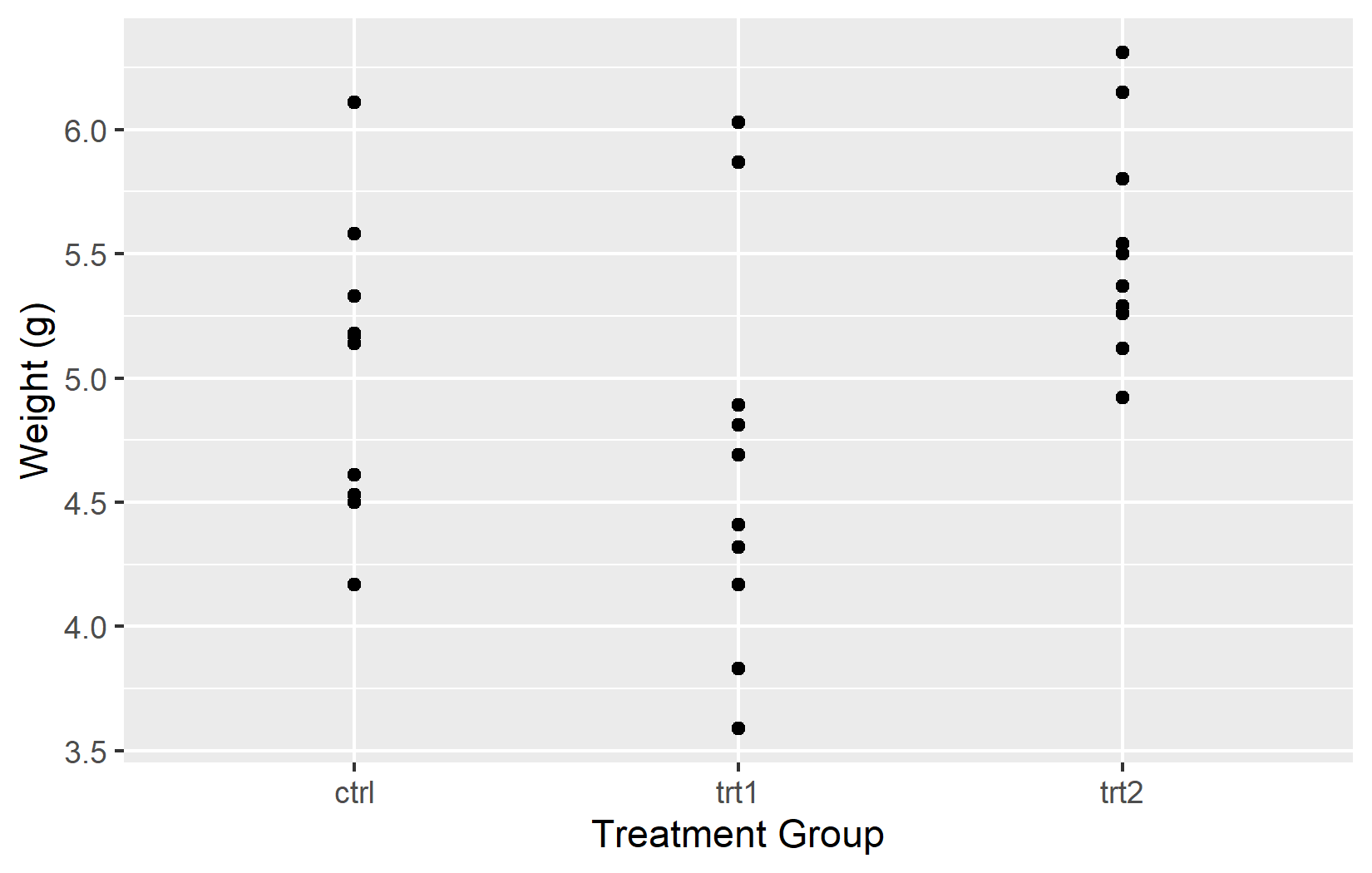
Limits
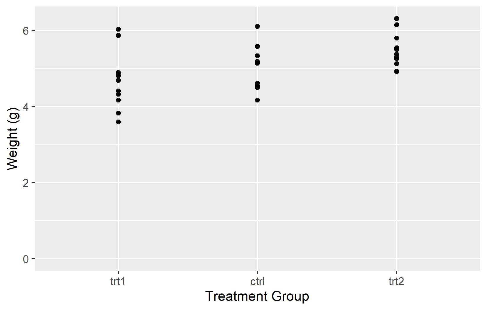
The limits argument controls which values are displayed on the axis. This is where continuous and discrete scales behave quite differently: for a continuous scale, limits defines the numeric range (e.g. 0 to 7). For a discrete scale, it determines which factor levels appear and - importantly - their order from left to right.
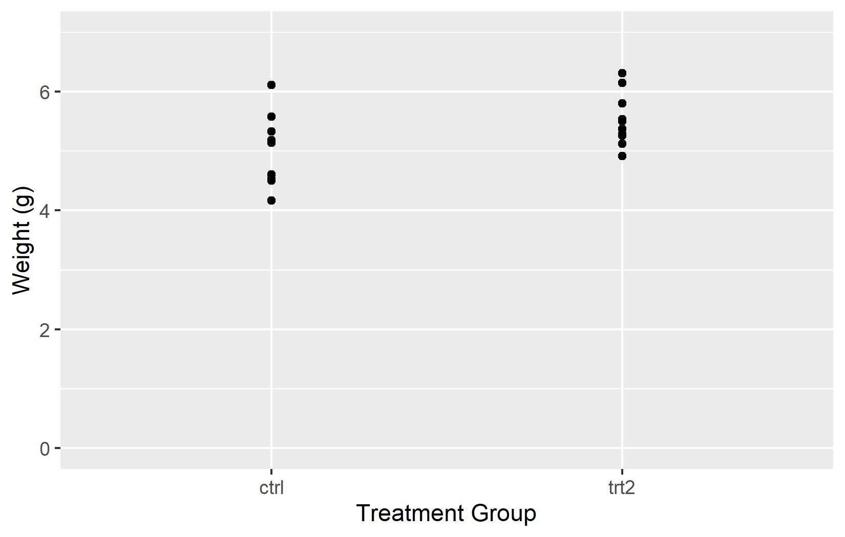
In the left plot, setting limits = c(0, 7) on the y-axis works as expected. However, including only “ctrl” and “trt2” in the discrete scale means “trt1” disappears entirely - limits on a discrete scale must include all levels to display.
In the right plot, using NA for the upper y-limit tells ggplot2 to determine it from the data. Listing all three groups in a custom order controls their arrangement on the x-axis.
Important
Setting limits can exclude data outside the specified range. The excluded data will not be considered when calculating statistics or generating geoms. This is a common pitfall when combining limits with statistical layers like geom_smooth() - the regression line will only be based on the visible data.
Breaks
While limits defines the range of the axis, the breaks argument controls where tick marks appear within that range. Choosing good break positions makes a plot easier to read - too few and the reader cannot estimate values; too many and the axis looks cluttered.
In the left plot, only two tick marks appear at 0 and 6. In the right plot, seq(0, 6) places tick marks at every integer from 0 to 6.
Tip
Instead of manually writing the maximum value, there are more flexible alternatives:
-
breaks = seq(0, max(PlantGrowth$weight))automatically finds the data maximum -
breaks = scales::breaks_width(1)simply defines the width between breaks
Labels
So far we have controlled where tick marks appear. The labels argument controls what text is displayed at each tick mark. This is especially useful for discrete axes, where the raw factor levels (like ctrl, trt1, trt2) are often abbreviations that mean nothing to a reader unfamiliar with the data.

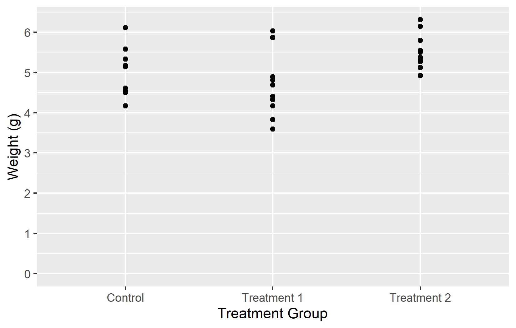
In the first example, a simple vector of labels works as long as the levels are in the expected order. In the second example, a named vector ensures that each label is correctly associated with its level, regardless of order. Using named vectors is generally the safer option.
Tip
For continuous axes, the {scales} package offers convenient label_*() functions:
-
labels = label_number()- format numbers with custom decimal marks, suffixes, etc. -
labels = label_percent()- display 0.05 as 5%, 0.4 as 40% -
labels = label_log()- display logarithmic labels like 10^1, 10^2, 10^3
Expand
By default, ggplot2 adds a small buffer of empty space between the data and the axis boundaries. This prevents data points from sitting directly on the axis lines. Most of the time this default is fine, but there are common situations where one wants to adjust it - for example, when a bar chart should start exactly at zero with no gap below the bars. The expand argument and the expansion() helper function provide this control.

In the left plot, expand = c(0, 0) removes all extra space, but the plot is cut off right at the maximum observation. In the right plot, expansion(mult = c(0, 0.05)) removes space below 0 while keeping 5% padding above the data - a much more practical default for plots where the y-axis should start at zero.
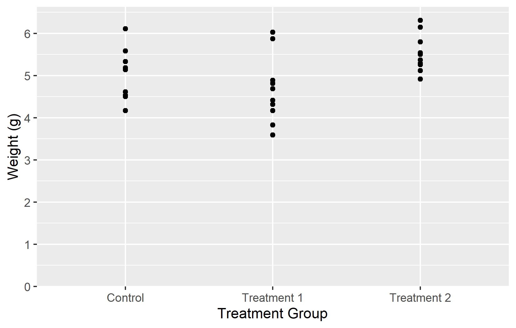
Summary
Now that we have covered all five key arguments - name, limits, breaks, labels, and expand - let us put them all together into one polished plot:
myplot <- ggplot(data = PlantGrowth) +
  aes(y = weight, x = group) +
  geom_point() +
  scale_y_continuous(
    name = "Weight (g)",
    limits = c(0, NA),
    breaks = seq(0, 6),
    expand = expansion(mult = c(0, 0.05))
  ) +
  scale_x_discrete(
    name = "Treatment Group",
    labels = c(
      ctrl = "Control",
      trt1 = "Treatment 1",
      trt2 = "Treatment 2"
    )
  )

myplot
This myplot object serves as the starting point for the next chapters, where we add colors and themes on top of these axis settings.
Citation
BibTeX citation:
@online{schmidt2026,
  author = {{Dr. Paul Schmidt}},
  publisher = {BioMath GmbH},
  title = {1. {Axes}},
  date = {2026-03-12},
  url = {https://biomathcontent.netlify.app/content/ggplot2/01_axes.html},
  langid = {en}
}
For attribution, please cite this work as:
Dr. Paul Schmidt. 2026. “1. Axes.” BioMath GmbH. March 12,
2026. https://biomathcontent.netlify.app/content/ggplot2/01_axes.html.