for (pkg in c("tidyverse", "gapminder", "showtext", "ggtext", "patchwork", "cowplot")) {
  if (!require(pkg, character.only = TRUE)) install.packages(pkg)
}

showtext::showtext_opts(dpi = 300)
Scientific publications and presentations often require multiple related plots in a single figure - a bar chart next to a dumbbell plot, or a time series above a scatter plot. While facet_wrap() handles cases where the same plot type is repeated for different subsets, it cannot combine fundamentally different plot types or datasets. The {patchwork} package by Thomas Lin Pedersen fills this gap with an intuitive operator-based syntax for composing ggplot2 objects.
In this chapter we recreate the bar chart and dumbbell plot from Chapter 5 and combine them into multi-panel figures using patchwork’s layout operators.
Setup
We reproduce the plots from Chapter 5. The code below is collapsed since it is a repetition of earlier material:
show/hide code
sysfonts::font_add_google("Kanit", "kanit")
showtext::showtext_auto()

dat <- gapminder::gapminder %>%
  filter(year == 1952 | year == 2007) %>%
  filter(country %in% c(
    "Canada", "Germany", "Japan",
    "Netherlands", "Nigeria", "Vietnam", "Zimbabwe"
  )) %>%
  mutate(year = as.factor(year)) %>%
  droplevels()

sorted_countries <- dat %>%
  filter(year == "2007") %>%
  arrange(lifeExp) %>%
  pull(country) %>%
  as.character()

dat <- dat %>%
  mutate(country = fct_relevel(country, sorted_countries))

year_colors <- c("1952" = "#F7AA59", "2007" = "#37A9E1")

theme_nature <- function(base_size = 12) {
  theme_minimal(base_size = base_size) +
    theme(
      text = element_text(family = "kanit"),
      plot.title.position = "plot",
      plot.title = element_text(size = 15, face = "bold"),
      plot.subtitle = ggtext::element_textbox_simple(
        size = 10, margin = margin(0, 0, 10, 0)
      ),
      axis.line.y = element_blank(),
      axis.text.x = element_text(color = "#AAAAAA"),
      axis.ticks.x = element_line(color = "#AAAAAA", linewidth = 0.4),
      axis.ticks.length.x = unit(4, "pt"),
      axis.line.x = element_line(color = "black", linewidth = 0.6),
      legend.position = "top",
      legend.box.just = "left",
      legend.justification = "left",
      legend.title = element_text(face = "bold"),
      legend.key.size = unit(0.4, "cm"),
      legend.margin = margin(-5, 0, 0, 0),
      panel.grid.minor = element_blank(),
      panel.grid.major.y = element_blank(),
      panel.grid.major.x = element_line(
        linetype = "dotted", color = "#AAAAAA", linewidth = 0.3
      )
    )
}

long_subtitle <- "The data reflect a world where life expectancy in <b style='color:#37A9E1;'>2007</b> often mirrors an improved quality of life compared to <b style='color:#F7AA59;'>1952</b>."

# Bar chart
p_bar <- ggplot(data = dat) +
  aes(x = lifeExp, y = country, fill = fct_rev(year)) +
  geom_col(position = position_dodge()) +
  geom_text(
    mapping = aes(label = round(lifeExp), group = fct_rev(year)),
    position = position_dodge(width = 0.9),
    hjust = 1.1, color = "white", family = "kanit"
  ) +
  scale_y_discrete(name = NULL, expand = c(0, 0)) +
  scale_x_continuous(name = NULL, expand = expansion(mult = c(0, 0.05))) +
  scale_fill_manual(
    guide = "none", name = "Year",
    limits = names(year_colors), values = year_colors
  ) +
  labs(title = "LIFE EXPECTANCY", subtitle = long_subtitle) +
  theme_nature()

# Dumbbell plot
dat_wide <- dat %>%
  select(country, year, lifeExp) %>%
  pivot_wider(
    names_from = year, values_from = lifeExp, names_prefix = "year_"
  ) %>%
  mutate(
    max_x = pmax(year_2007, year_1952),
    diff = year_2007 - year_1952,
    diff_lab = sprintf("%+d", round(diff))
  )

p_dumbbell <- ggplot(data = dat) +
  aes(x = lifeExp, y = country, color = fct_rev(year)) +
  geom_segment(
    data = dat_wide,
    aes(x = year_1952, xend = year_2007, y = country, yend = country),
    color = "#AAAAAA", linewidth = 1
  ) +
  geom_point(size = 3) +
  geom_text(
    mapping = aes(label = round(lifeExp)),
    size = 2.5, vjust = -1, family = "kanit"
  ) +
  geom_text(
    data = dat_wide,
    mapping = aes(x = max_x, label = diff_lab),
    size = 2.5, hjust = 0,
    position = position_nudge(x = 1),
    color = "#AAAAAA", family = "kanit"
  ) +
  scale_color_manual(
    name = "Year", limits = c("1952", "2007"),
    values = year_colors, guide = "none"
  ) +
  scale_y_discrete(name = NULL) +
  scale_x_continuous(name = NULL) +
  labs(title = "LIFE EXPECTANCY", subtitle = long_subtitle) +
  theme_nature()

# Simple scatter plot for GDP
p_gdp <- ggplot(
  data = gapminder::gapminder %>% filter(year == 2007),
  aes(x = gdpPercap, y = lifeExp, size = pop, color = continent)
) +
  geom_point(alpha = 0.7) +
  scale_x_log10() +
  scale_size_continuous(guide = "none") +
  labs(x = "GDP per capita", y = "Life expectancy", color = "Continent") +
  theme_minimal(base_size = 12) +
  theme(text = element_text(family = "kanit"))
We now have three plot objects: p_bar (grouped bar chart), p_dumbbell (dumbbell plot), and p_gdp (scatter plot).
Combining plots
The simplest way to combine two plots is with the + operator. By default, patchwork arranges plots side by side:
p_bar + p_dumbbell
Side by side: the | operator
The | operator is the explicit version of side-by-side arrangement. It behaves identically to + for two plots but makes the intent clearer in complex layouts:
p_bar | p_dumbbell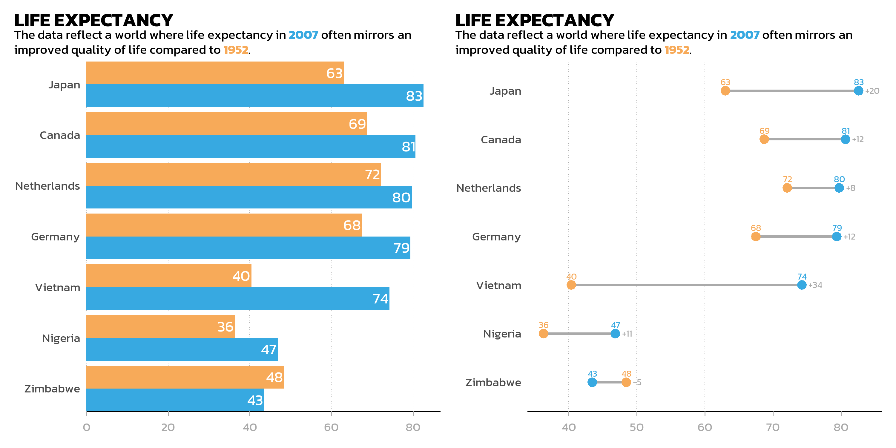
Stacked: the / operator
The / operator places plots on top of each other:
p_bar / p_dumbbell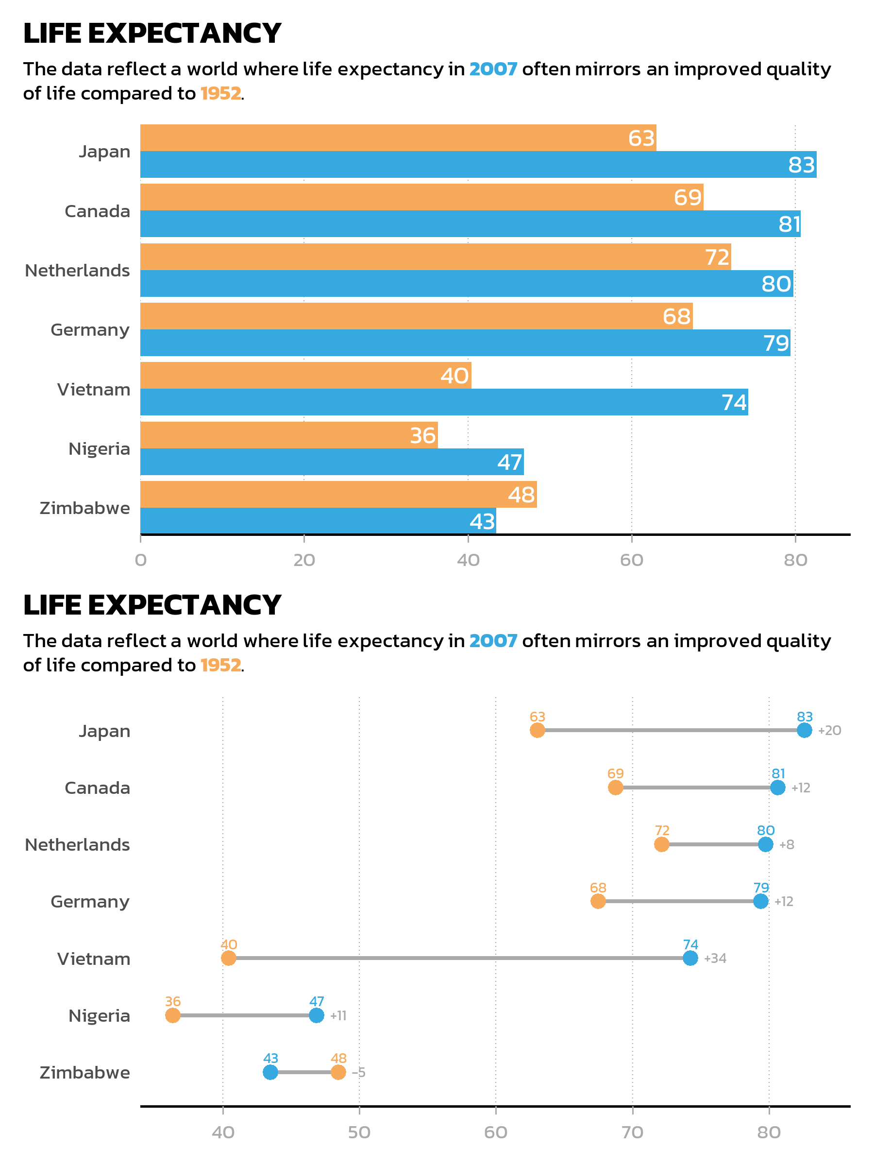
Operator precedence
When combining operators, precedence matters. The / operator (stacking) binds more tightly than | (side-by-side), so p1 | p2 / p3 is interpreted as p1 | (p2 / p3) rather than (p1 | p2) / p3. The + operator has the lowest precedence of all. In practice, this means one should always use parentheses to make the intended layout explicit — relying on precedence rules leads to surprises.
Nesting layouts
Parentheses make the layout structure explicit and readable. For example, two plots side by side on top, with a third plot spanning the full width below:
(p_bar | p_dumbbell) / p_gdp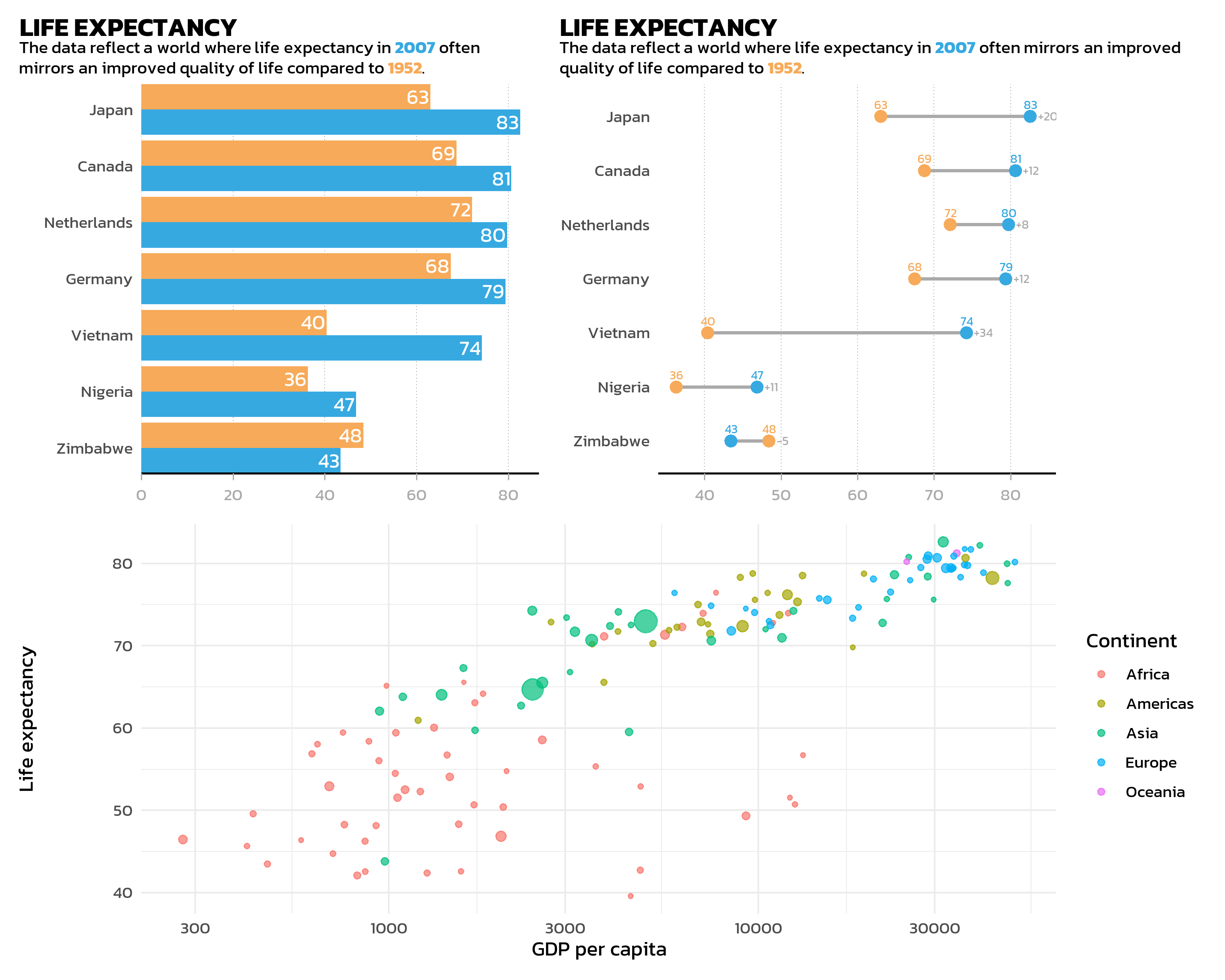
Layout control
The plot_layout() function provides fine-grained control over the arrangement:
(p_bar | p_dumbbell) / p_gdp +
  plot_layout(heights = c(2, 1))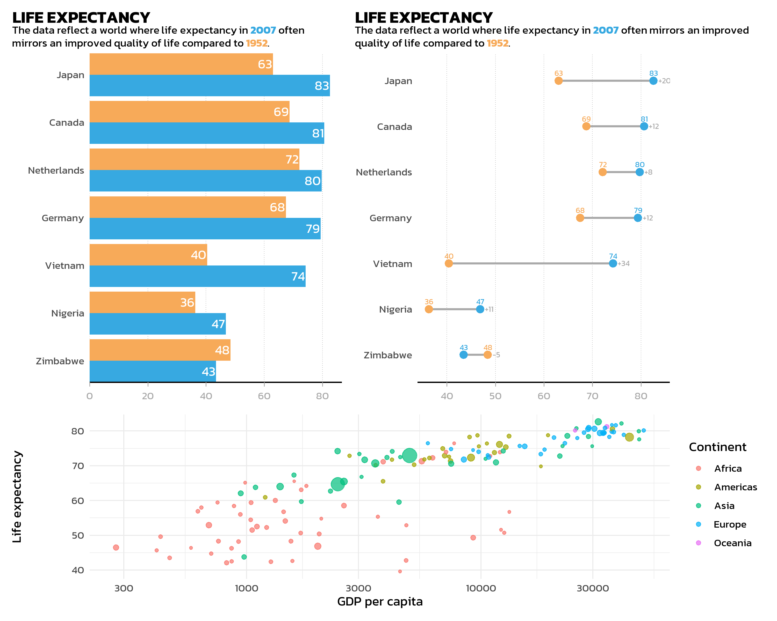
Key arguments:
-
widthsandheights: Relative sizes of columns and rows.heights = c(2, 1)makes the top row twice as tall as the bottom row. -
ncolandnrow: Force a specific grid layout. -
guides = "collect": Collects identical legends from all plots and shows them once. This is especially useful when multiple plots share the same color scale.
p1 <- ggplot(gapminder::gapminder %>% filter(year == 2007),
  aes(x = gdpPercap, y = lifeExp, color = continent)) +
  geom_point() + scale_x_log10() + theme_minimal(base_size = 11) +
  theme(text = element_text(family = "kanit")) +
  labs(title = "GDP vs. Life Expectancy")

p2 <- ggplot(gapminder::gapminder %>% filter(year == 2007),
  aes(x = pop, y = lifeExp, color = continent)) +
  geom_point() + scale_x_log10() + theme_minimal(base_size = 11) +
  theme(text = element_text(family = "kanit")) +
  labs(title = "Population vs. Life Expectancy")

p1 + p2 + plot_layout(guides = "collect")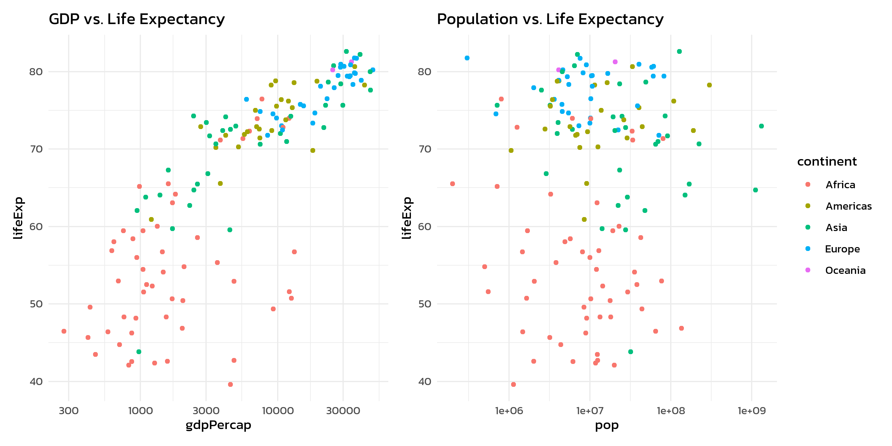
Without guides = "collect", each plot would show its own continent legend - redundant and space-wasting.
Annotations
plot_annotation() adds titles, subtitles, captions, and automatic panel tags to the combined figure:
p1 + p2 +
  plot_layout(guides = "collect") +
  plot_annotation(
    title = "Gapminder 2007",
    subtitle = "Two perspectives on global development",
    tag_levels = "A"
  ) &
  theme(
    text = element_text(family = "kanit"),
    plot.tag = element_text(face = "bold")
  )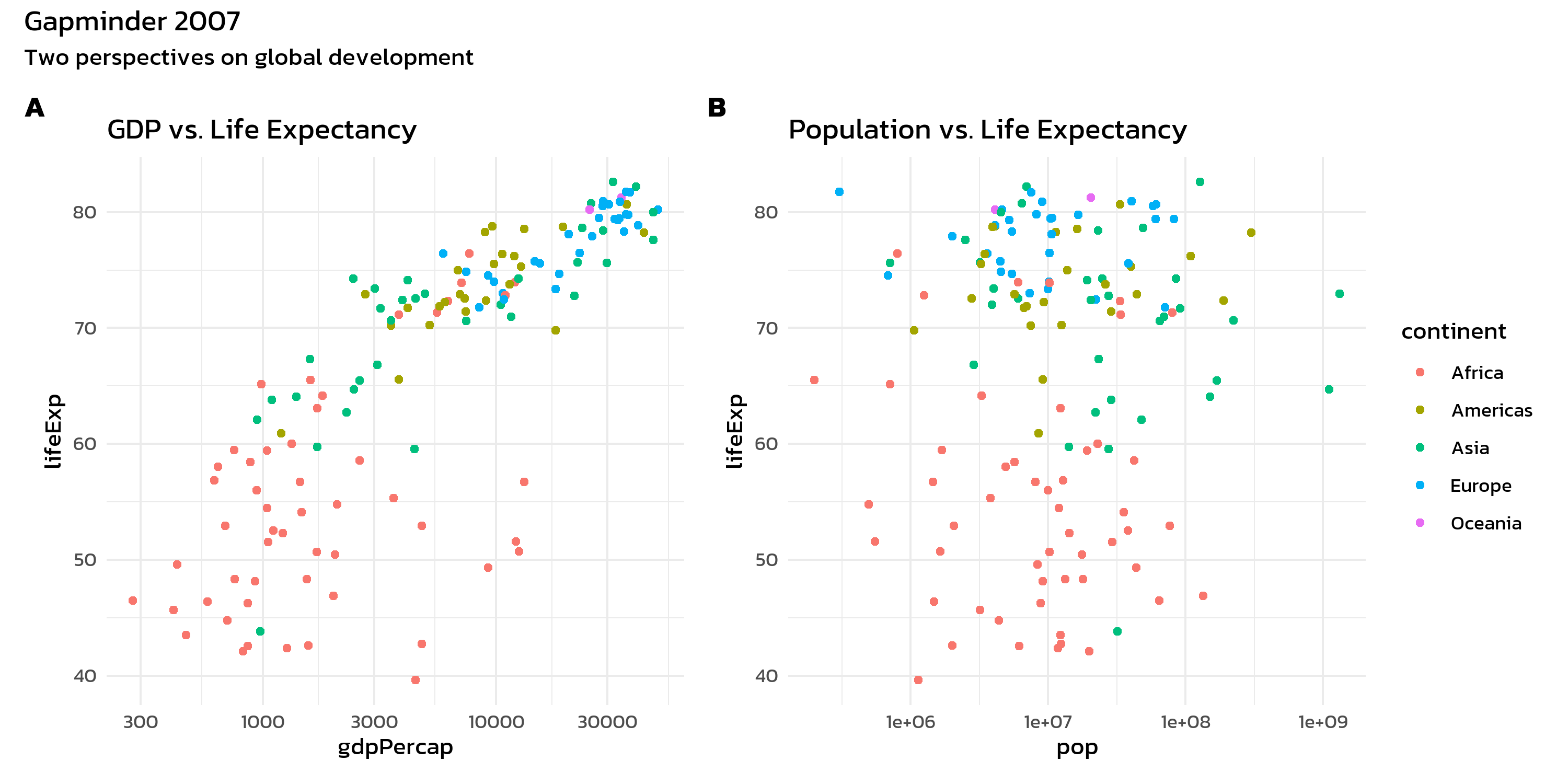
The tag_levels argument automatically labels panels as “A”, “B”, “C” (or “1”, “2”, “3”, “a”, “b”, “c”, “I”, “II”, “III”). This is essential for journal figures where panels need to be referenced in the text.
The & operator
Notice the & operator in the last example. This is one of patchwork’s most useful features:
-
+adds a theme modification only to the last plot -
&applies a theme modification to all plots in the composition
This distinction matters when one wants to apply a consistent theme across all panels:
p1 + p2 +
  plot_layout(guides = "collect") +
  plot_annotation(tag_levels = "A") &
  theme_minimal(base_size = 11) &
  theme(text = element_text(family = "kanit"))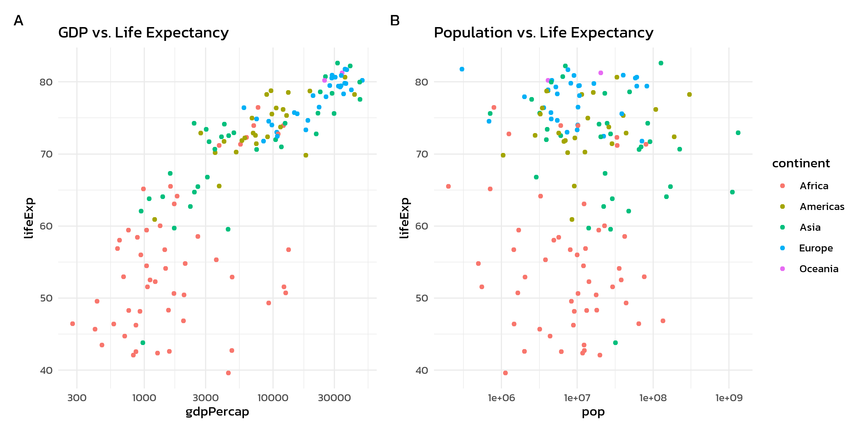
Beyond patchwork: cowplot
The {cowplot} package by Claus Wilke offers complementary functionality for combining plots. While patchwork excels at grid-based layouts with its operator syntax, cowplot shines in two specific areas: automatic panel labels and inset plots.
Basic grid with cowplot
The cowplot::plot_grid() function works similarly to patchwork’s + operator, but provides panel labels directly through the labels argument:
cowplot::plot_grid(p1, p2, labels = "AUTO")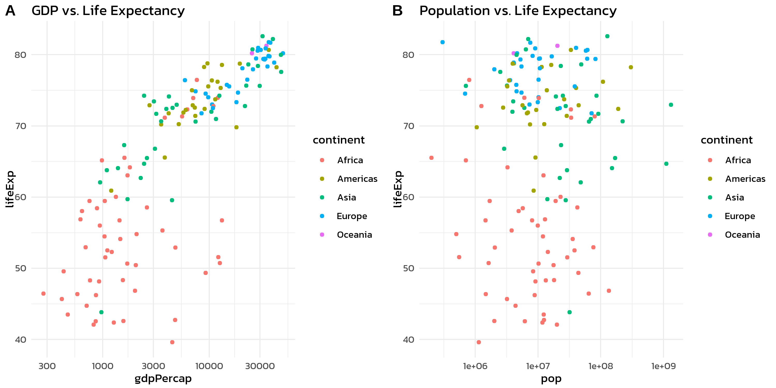
labels = "AUTO" generates uppercase labels (A, B, C, …), while labels = "auto" produces lowercase ones (a, b, c, …).
Inset plots
Sometimes one wants to place a small plot inside a larger one - an inset plot. This is useful for showing a zoomed-in detail, a summary statistic, or a complementary view within the same figure. Both patchwork (via inset_element()) and cowplot (via ggdraw() + draw_plot()) support this. The cowplot version is shown here because its coordinate system tends to be more intuitive for first-time users:
dat_2007 <- gapminder::gapminder %>% filter(year == 2007)

p_main <- ggplot(dat_2007, aes(x = gdpPercap, y = lifeExp, color = continent)) +
  geom_point(alpha = 0.7) +
  scale_x_log10() +
  labs(x = "GDP per capita", y = "Life expectancy", color = "Continent") +
  theme_minimal(base_size = 12) +
  theme(text = element_text(family = "kanit"))

p_inset <- ggplot(dat_2007, aes(x = continent, fill = continent)) +
  geom_bar(show.legend = FALSE) +
  labs(x = NULL, y = "Count") +
  theme_minimal(base_size = 8) +
  theme(
    text = element_text(family = "kanit"),
    axis.text.x = element_text(angle = 45, hjust = 1),
    plot.background = element_rect(fill = "white", color = "grey80")
  )

cowplot::ggdraw(p_main) +
  cowplot::draw_plot(p_inset, x = 0.55, y = 0.15, width = 0.4, height = 0.4)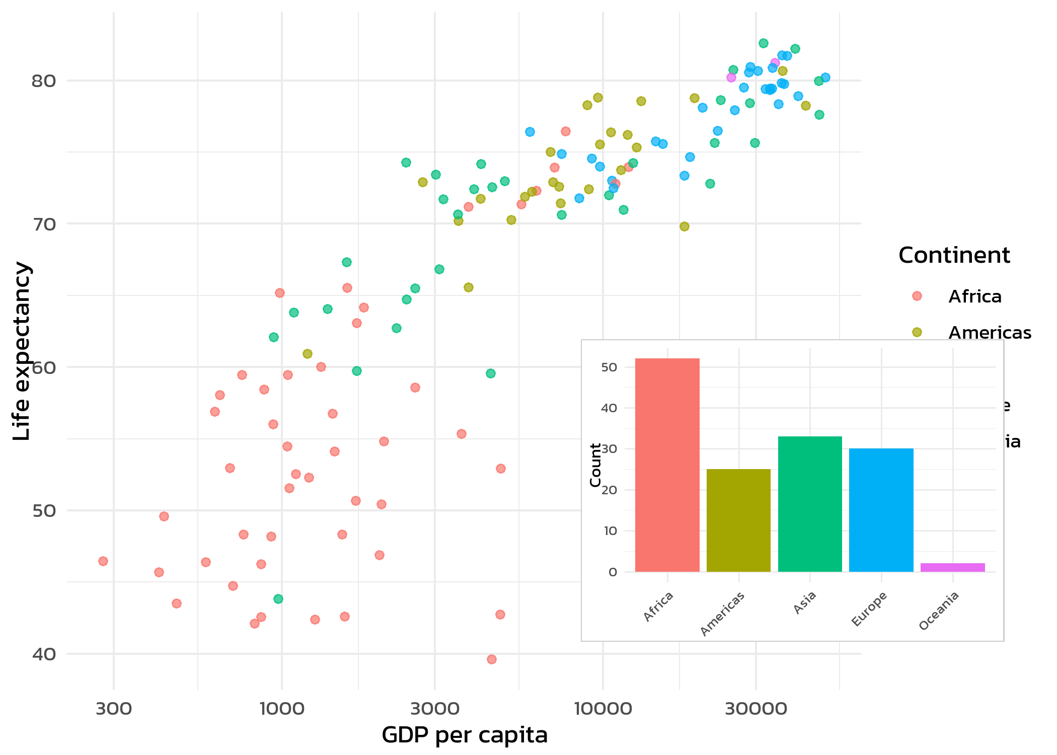
The x, y, width, and height arguments in draw_plot() use relative coordinates (0 to 1), where (0, 0) is the bottom-left corner. Adjusting these values positions and sizes the inset plot within the main figure. Patchwork’s inset_element() works on the same principle but composes via the + operator, so it integrates naturally with the rest of a patchwork layout.
For most multi-panel layouts, patchwork remains the better choice due to its cleaner syntax and automatic alignment. cowplot is worth reaching for when one prefers the plot_grid() interface for simple side-by-side arrangements with automatic labels.
TipWhen to use facets vs. patchwork
Both tools create multi-panel figures, but they serve different purposes:
-
Facets (
facet_wrap(),facet_grid()): Same plot type, same data structure, split by a grouping variable. Axes are shared or individually scaled. Best for systematic comparisons within one dataset. - Patchwork: Different plot types, different datasets, or different aesthetic mappings. Each panel is a fully independent ggplot. Best for combining complementary views of the data.
A good rule of thumb: if one can describe the panels as “the same plot for different groups”, use facets. If the panels show fundamentally different things, use patchwork.
Citation
BibTeX citation:
@online{schmidt2026,
  author = {{Dr. Paul Schmidt}},
  publisher = {BioMath GmbH},
  title = {9. Patchwork},
  date = {2026-06-08},
  url = {https://biomathcontent.netlify.app/content/ggplot2/09_patchwork.html},
  langid = {en}
}
For attribution, please cite this work as:
Dr. Paul Schmidt. 2026. “9. Patchwork.” BioMath GmbH. June
8, 2026. https://biomathcontent.netlify.app/content/ggplot2/09_patchwork.html.