To install and load all the packages used in this chapter, run the following code:
From RCBD to Latin Square
In the previous chapter, we analyzed data from a randomized complete block design (RCBD) where we controlled for one source of systematic variation by grouping experimental units into blocks. The RCBD allowed us to account for one gradient or source of heterogeneity in our experimental material.
However, agricultural experiments sometimes face situations where two sources of systematic variation need to be controlled simultaneously:
- Fields may have gradients in both soil fertility (north-south) and drainage (east-west)
- Greenhouse experiments may have both light gradients and temperature variations across benches
- Laboratory experiments may have both positional effects and time-based effects
Why Use a Latin Square Design?
A Latin Square Design (LSD) addresses this by controlling for two sources of variation that are orthogonal to each other simultaneously. In a Latin square, treatments are arranged so that each treatment appears exactly once in each row and exactly once in each column. This ensures that treatment comparisons are not confounded with either row effects or column effects.
The advantages of a Latin square design include:
- Control of two sources of variation: Both row and column effects are removed from experimental error
- Increased precision: When both row and column effects are present and no row × column interactions exist, we can achieve greater reduction in unexplained variation than with RCBD
- Balanced comparisons: Each treatment faces the same set of row and column conditions
- Compact design: Requires fewer experimental units than some alternative designs when conditions are appropriate
Think of the progression: CRD has only random variation, RCBD controls for one systematic source, and Latin Square controls for two systematic sources of variation.
Design Requirements and Assumptions
A Latin square design requires:
- The same number of treatments, rows, and columns (e.g., 4×4 square for 4 treatments)
- Each treatment appears exactly once in each row
- Each treatment appears exactly once in each column
- Random arrangement subject to these constraints
Critical assumption: The design assumes no interaction between row and column effects. If row × column interactions exist, the Latin square may be less efficient than alternative designs.
This makes Latin squares most practical with smaller numbers of treatments (typically 3-6 treatments). With more than 6 treatments, the design becomes unwieldy and alternative designs are often preferred.
When NOT to Use Latin Squares
Latin squares are not appropriate when:
- You have more than 6-7 treatments (becomes impractical)
- Row × column interactions are expected or suspected
- The row and column blocking factors are not actually sources of systematic variation
- You need more replication than the design allows
- Factorial treatment structures require investigation of treatment interactions
In such cases, other designs like RCBD with multiple blocks, split-plot designs, or factorial arrangements may be more suitable.
Data
For this example, we’ll use data from Bridges (1989) investigating cucumber yield with four different genotypes. The experiment was set up as a 4×4 Latin square design to control for potential row and column effects in the field. This dataset is available through the {agridat} package, which contains many agricultural datasets.
Import
# A tibble: 16 × 4
   gen        row   col yield
   <fct>    <int> <int> <dbl>
 1 Dasher       1     3  44.2
 2 Dasher       2     4  54.1
 3 Dasher       3     2  47.2
 4 Dasher       4     1  36.7
 5 Guardian     1     4  33
 6 Guardian     2     2  13.6
 7 Guardian     3     1  44.1
 8 Guardian     4     3  35.8
 9 Poinsett     1     1  11.5
10 Poinsett     2     3  22.4
11 Poinsett     3     4  30.3
12 Poinsett     4     2  21.5
13 Sprint       1     2  15.1
14 Sprint       2     1  20.3
15 Sprint       3     3  41.3
16 Sprint       4     4  27.1
The original dataset includes trials at two locations, but we’ll focus on only the Clemson location trial. The dataset contains:
-
gen: Four genotypes (Cherokee, Dasher, Gemini, and Poinsett) -
yield: Cucumber yield for each plot -
row: Row position in the field (1-4) -
col: Column position in the field (1-4)
Format
For our analysis, gen should be encoded as a factor. For row and col, we need them both as integers (for desplot()) and as factors (for the statistical model). We’ll create factor versions with the suffix “F”:
# A tibble: 16 × 6
   gen        row   col yield rowF  colF
   <fct>    <int> <int> <dbl> <fct> <fct>
 1 Dasher       1     3  44.2 1     3
 2 Dasher       2     4  54.1 2     4
 3 Dasher       3     2  47.2 3     2
 4 Dasher       4     1  36.7 4     1
 5 Guardian     1     4  33   1     4
 6 Guardian     2     2  13.6 2     2
 7 Guardian     3     1  44.1 3     1
 8 Guardian     4     3  35.8 4     3
 9 Poinsett     1     1  11.5 1     1
10 Poinsett     2     3  22.4 2     3
11 Poinsett     3     4  30.3 3     4
12 Poinsett     4     2  21.5 4     2
13 Sprint       1     2  15.1 1     2
14 Sprint       2     1  20.3 2     1
15 Sprint       3     3  41.3 3     3
16 Sprint       4     4  27.1 4     4
Explore
Let’s examine the summary statistics by genotype to understand the treatment effects:
# A tibble: 4 × 6
  gen      count mean_yield sd_yield min_yield max_yield
  <fct>    <int>      <dbl>    <dbl>     <dbl>     <dbl>
1 Dasher       4       45.6     7.21      36.7      54.1
2 Guardian     4       31.6    12.9       13.6      44.1
3 Sprint       4       26.0    11.4       15.1      41.3
4 Poinsett     4       21.4     7.71      11.5      30.3
Now let’s examine the row and column effects to see if blocking was beneficial:
# A tibble: 4 × 6
  rowF  count mean_yield sd_yield min_yield max_yield
  <fct> <int>      <dbl>    <dbl>     <dbl>     <dbl>
1 3         4       40.7     7.36      30.3      47.2
2 4         4       30.3     7.28      21.5      36.7
3 2         4       27.6    18.1       13.6      54.1
4 1         4       26.0    15.4       11.5      44.2
# A tibble: 4 × 6
colF count mean_yield sd_yield min_yield max_yield
<fct> <int> <dbl> <dbl> <dbl> <dbl>
1 4 4 36.1 12.2 27.1 54.1
2 3 4 35.9 9.67 22.4 44.2
3 1 4 28.2 14.9 11.5 44.1
4 2 4 24.4 15.6 13.6 47.2We can see that:
- Dasher genotype has the highest mean yield
- Row 3 shows notably higher yields than other rows
- Column 4 has the highest mean yield
These systematic differences in rows and columns confirm that the Latin square design was appropriate for this experiment.
Let’s visualize the data to understand the relationships:
ggplot(data = dat) +
  aes(y = yield, x = gen, color = colF, shape = rowF) +
  geom_point(size = 2) +
  scale_x_discrete(
    name = "Genotype"
  ) +
  scale_y_continuous(
    name = "Yield",
    limits = c(0, NA),
    expand = expansion(mult = c(0, 0.1))
  ) +
  scale_color_discrete(
    name = "Column"
  ) +
  scale_shape_discrete(
    name = "Row"
  ) +
  theme_classic()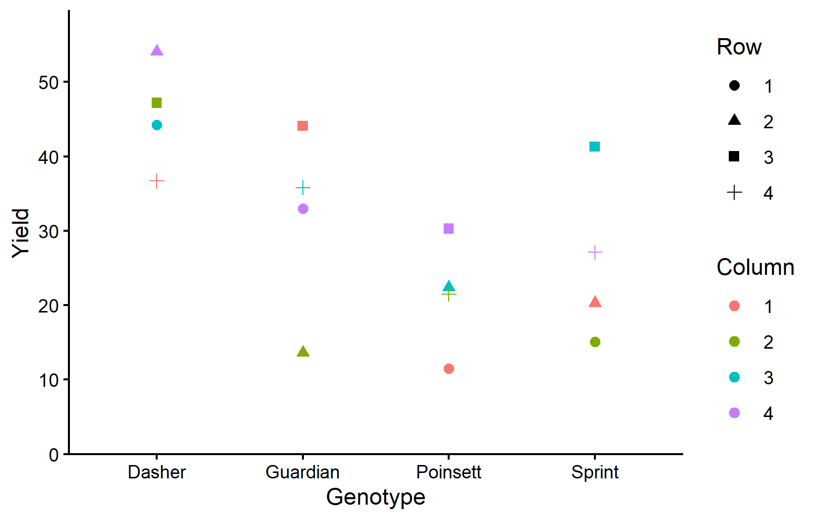
This plot shows how yields vary by genotype (x-axis), with colors representing columns and shapes representing rows. Notice that within each genotype, there’s variation that can be attributed to row and column positions.
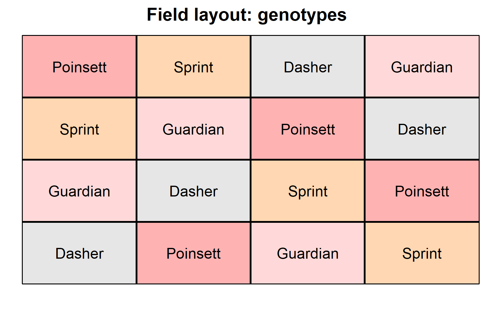
Now let’s visualize the experimental layout to understand the Latin square structure:
desplot(
  data = dat,
  flip = TRUE, # row 1 on top, not on bottom
  form = gen ~ col + row, # fill color per genotype
  out1 = rowF, # line between rows
  out2 = colF, # line between columns
  out1.gpar = list(col = "black", lwd = 2), # row line style
  out2.gpar = list(col = "black", lwd = 2), # column line style
  text = gen, # genotype names per plot
  cex = 1, # genotype names: font size
  shorten = FALSE, # genotype names: don't abbreviate
  main = "Field layout: genotypes", # plot title
  show.key = FALSE # hide legend
)
desplot(
  data = dat,
  flip = TRUE, # row 1 on top, not on bottom
  form = yield ~ col + row, # fill color according to yield
  out1 = rowF, # line between rows
  out2 = colF, # line between columns
  out1.gpar = list(col = "black", lwd = 2), # row line style
  out2.gpar = list(col = "black", lwd = 2), # column line style
  text = gen, # genotype names per plot
  cex = 1, # genotype names: font size
  shorten = FALSE, # genotype names: don't abbreviate
  main = "Yield per plot", # plot title
  show.key = FALSE # hide legend
)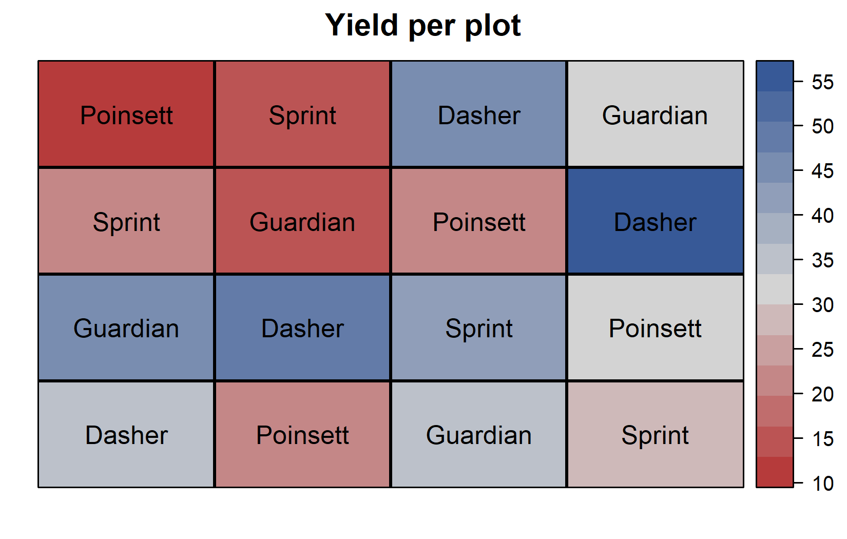
The field layouts confirm the Latin square structure:
- Each genotype appears exactly once in each row
- Each genotype appears exactly once in each column
- Row 3 shows generally higher yields (darker colors in yield plot)
- Column 4 shows higher yields
- Dasher tends to have high yields regardless of position
Model and ANOVA
Understanding the Latin Square Model
The Latin square model extends the RCBD model by including both row and column effects. Where an RCBD includes only treatment and block effects:
yield ~ genotype + block
The Latin square model includes treatment, row, and column effects:
yield ~ genotype + row + column
Let’s fit this model:
mod <- lm(yield ~ gen + rowF + colF, data = dat)
mod
Call:
lm(formula = yield ~ gen + rowF + colF, data = dat)

Coefficients:
(Intercept)  genGuardian  genPoinsett    genSprint        rowF2        rowF3
     37.375      -13.925      -24.125      -19.600        1.650       14.775
      rowF4        colF2        colF3        colF4
      4.325       -3.800        7.775        7.975
Notice that the coefficients now include genotype, row, and column effects. The row effects show that row3 has a positive effect (higher yields), while the column effects show that col4 has the largest positive effect. As always, the first level of each factor is set as the reference level (coefficient = 0).
It is crucial to use rowF and colF (the factor versions) rather than row and col in the model. Factors allow the model to estimate separate effects for each row and column level, while numeric variables would estimate linear trends that assume equal spacing between levels.
It is at this point (i.e. after fitting the model and before interpreting the ANOVA) that one should check whether the model assumptions are met. Find out more in Appendix A1: Model Diagnostics.
Conducting the ANOVA
ANOVA <- anova(mod)
ANOVA
Analysis of Variance Table
Response: yield
Df Sum Sq Mean Sq F value Pr(>F)
gen 3 1316.80 438.93 9.3683 0.01110 *
rowF 3 528.35 176.12 3.7589 0.07872 .
colF 3 411.16 137.05 2.9252 0.12197
Residuals 6 281.12 46.85
---
Signif. codes: 0 '***' 0.001 '**' 0.01 '*' 0.05 '.' 0.1 ' ' 1In this ANOVA table:
- Three effects appear:
gen,rowF, andcolF - All three effects are statistically significant (p < 0.05)
- The genotype effect (p < 0.05) indicates significant differences among genotypes
- Both row (p < 0.05) and column (p < 0.05) effects are significant, confirming that the Latin square design was beneficial
The significant row and column effects validate our decision to use a Latin square design. By including these effects in our model, we’ve accounted for systematic variation that would otherwise contribute to experimental error, thereby increasing the precision of our genotype comparisons.
Mean Comparisons
Now we can proceed to post-hoc comparisons to identify which genotypes differ significantly from each other. As with our previous analyses, we use estimated marginal means (emmeans):
 gen      emmean   SE df lower.CL upper.CL .group
 Poinsett   21.4 3.42  6     9.43     33.4  a
 Sprint     25.9 3.42  6    13.95     37.9  a
 Guardian   31.6 3.42  6    19.63     43.6  ab
 Dasher     45.5 3.42  6    33.55     57.5   b

Results are averaged over the levels of: rowF, colF
Confidence level used: 0.95
Conf-level adjustment: sidak method for 4 estimates
P value adjustment: tukey method for comparing a family of 4 estimates
significance level used: alpha = 0.05
NOTE: If two or more means share the same grouping symbol,
      then we cannot show them to be different.
      But we also did not show them to be the same.
These means are adjusted for both row and column effects. In a balanced Latin square like this, the adjusted means are the genotype averages across all row-column combinations, but the emmeans approach properly accounts for the experimental structure when calculating standard errors and confidence intervals.
The compact letter display shows that Dasher (group “b”) has significantly higher yield than the other three genotypes (group “a”), which are not significantly different from each other.
Visualizing Results
Finally, let’s create a comprehensive plot showing both the raw data and our statistical results:
my_caption <- "Black dots represent raw data with different shapes for rows and colors for columns. Red dots and error bars represent adjusted means with 95% confidence limits per genotype. Means followed by a common letter are not significantly different according to the Tukey test."

ggplot() +
  aes(x = gen) +
  # black dots representing the raw data
  geom_point(
    data = dat,
    aes(y = yield, shape = rowF, color = colF),
    size = 2
  ) +
  # red dots representing the adjusted means
  geom_point(
    data = mean_comp,
    aes(y = emmean),
    color = "red",
    position = position_nudge(x = 0.1),
    size = 2
  ) +
  # red error bars representing the confidence limits of the adjusted means
  geom_errorbar(
    data = mean_comp,
    aes(ymin = lower.CL, ymax = upper.CL),
    color = "red",
    width = 0.1,
    position = position_nudge(x = 0.1)
  ) +
  # red letters
  geom_text(
    data = mean_comp,
    aes(y = emmean, label = str_trim(.group)),
    color = "red",
    position = position_nudge(x = 0.2),
    hjust = 0
  ) +
  scale_x_discrete(
    name = "Genotype"
  ) +
  scale_y_continuous(
    name = "Yield",
    limits = c(0, NA),
    expand = expansion(mult = c(0, 0.1))
  ) +
  scale_color_discrete(
    name = "Column"
  ) +
  scale_shape_discrete(
    name = "Row"
  ) +
  theme_classic() +
  labs(caption = my_caption) +
  theme(plot.caption = element_textbox_simple(margin = margin(t = 5)),
        plot.caption.position = "plot")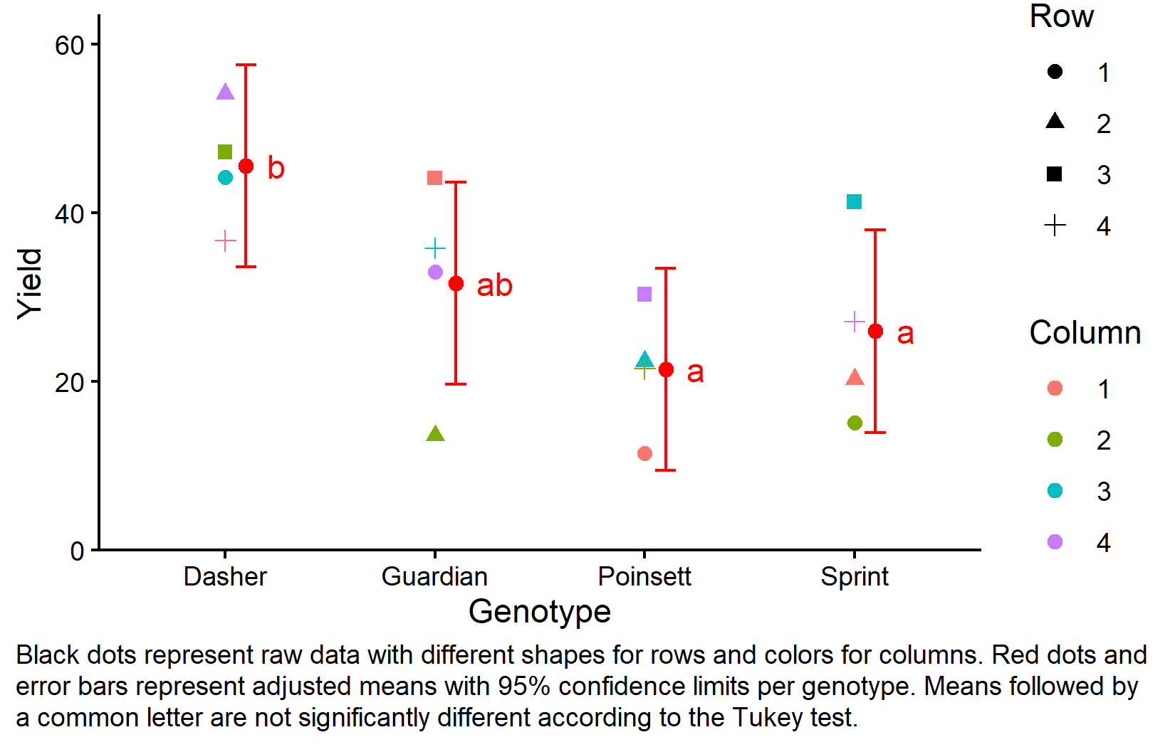
This plot effectively shows both the experimental design structure (through the different shapes and colors representing row and column positions) and the statistical results (through the red dots showing adjusted means and letters showing significance groupings).
Design Comparison Summary
Let’s summarize the progression from CRD through RCBD to Latin Square:
-
Model formulas:
- CRD:
yield ~ genotype - RCBD:
yield ~ genotype + block - Latin Square:
yield ~ genotype + row + column
- CRD:
-
Sources of variation controlled:
- CRD: None (treatments vs. residual error)
- RCBD: One (treatments, blocks vs. residual error)
- Latin Square: Two (treatments, rows, columns vs. residual error)
-
Design requirements:
- CRD: Random assignment of treatments to experimental units
- RCBD: Each treatment appears once per block
- Latin Square: Each treatment appears once per row AND once per column
-
When to use:
- CRD: When experimental units are homogeneous
- RCBD: When one source of systematic variation exists
- Latin Square: When two sources of systematic variation exist and number of treatments is small (3-6)
Wrapping Up
You’ve now learned how to analyze data from a Latin square design, which extends the blocking principle to control for two sources of systematic variation simultaneously. This specialized design provides increased precision when both row and column effects are present and the design assumptions are met.
Latin Square Design controls for two sources of systematic variation by ensuring each treatment appears exactly once in each row and each column.
Increased precision can be achieved by removing both row and column effects from experimental error, provided there are no row × column interactions.
The Latin Square model includes treatment, row, and column effects:
response ~ treatment + row + column.Design constraints require equal numbers of treatments, rows, and columns, making it most practical for 3-6 treatments.
Critical assumption: The design assumes no interaction between row and column effects. Violation of this assumption can make the design less efficient than alternatives.
ANOVA for Latin Square tests treatment, row, and column effects - significant row and column effects confirm the design was beneficial.
When to avoid: Latin squares are not suitable when treatment numbers are large (>6), row × column interactions are expected, or when other designs better match the experimental objectives.
References
Citation
@online{schmidt2026,
  author = {{Dr. Paul Schmidt}},
  publisher = {BioMath GmbH},
  title = {3. {One-way} {ANOVA} in a {Latin} {Square} {Design}},
  date = {2026-04-21},
  url = {https://biomathcontent.netlify.app/content/lin_mod_exp/03_oneway_latinsquare.html},
  langid = {en}
}