To install and load all the packages used in this chapter, run the following code:
Introduction
In real-world data analysis, datasets rarely come in perfect condition. Missing values, potential outliers, and other data quality issues are common challenges. This chapter focuses on how to identify and handle these issues, and how they might affect your statistical analyses.
Data
For this chapter, we’ll work with a dataset collected during a hypothetical research project where participants’ age and vision quality (on a scale of 1-10) were recorded. The data was collected by asking 29 people around a university campus.
Import
dat <- read_excel(here("data", "vision fixed.xls"))
head(dat, n = 5)
# A tibble: 5 × 9
Person Ages Gender Civil_state Height Profession Vision Distance perc_dist
<chr> <dbl> <chr> <chr> <dbl> <chr> <dbl> <dbl> <dbl>
1 Andrés 25 M S 180 Student 10 1.5 15
2 Anja 29 F S 168 Profession… 10 4.5 45
3 Armando 31 M S 169 Profession… 9 4.5 50
4 Carlos 25 M M 185 Profession… 8 6 75
5 Cristina 23 F <NA> 170 Student 10 3 30It’s often good practice to clean up column names to ensure they’re consistent and easy to work with. You could use the rename() function from the {dplyr} package, but it can be tedious for large datasets with many columns. Instead, you can use the clean_names() function from the {janitor} package to automatically convert column names to a consistent format (e.g., all lowercase, underscores instead of spaces):
dat <- dat %>% clean_names()
head(dat, n = 5)
# A tibble: 5 × 9
person ages gender civil_state height profession vision distance perc_dist
<chr> <dbl> <chr> <chr> <dbl> <chr> <dbl> <dbl> <dbl>
1 Andrés 25 M S 180 Student 10 1.5 15
2 Anja 29 F S 168 Profession… 10 4.5 45
3 Armando 31 M S 169 Profession… 9 4.5 50
4 Carlos 25 M M 185 Profession… 8 6 75
5 Cristina 23 F <NA> 170 Student 10 3 30This is the only time we will use the janitor package in this workshop, but it is a very useful package for cleaning up messy datasets, so feel free to check out its other functions.
Goal
Similar to the previous chapter on correlation and regression, our goal is to analyze the relationship between two numeric variables: ages and vision. However, this dataset presents two additional challenges:
- It contains missing values
- It appears to have a potential outlier
Exploring
Let’s start by getting a summary of our data and visualizing the relationship between age and vision:
summary(dat) person ages gender civil_state
Length:29 Min. :22.00 Length:29 Length:29
Class :character 1st Qu.:25.00 Class :character Class :character
Mode :character Median :26.00 Mode :character Mode :character
Mean :30.61
3rd Qu.:29.50
Max. :55.00
NA's :1
height profession vision distance
Min. :145.0 Length:29 Min. : 3.000 Min. :1.500
1st Qu.:164.8 Class :character 1st Qu.: 7.000 1st Qu.:1.500
Median :168.0 Mode :character Median : 9.000 Median :3.000
Mean :168.2 Mean : 8.357 Mean :3.466
3rd Qu.:172.8 3rd Qu.:10.000 3rd Qu.:4.500
Max. :190.0 Max. :10.000 Max. :6.000
NA's :1 NA's :1
perc_dist
Min. : 15.00
1st Qu.: 20.24
Median : 40.18
Mean : 45.45
3rd Qu.: 57.19
Max. :150.00
NA's :1 ggplot(data = dat) +
aes(x = ages, y = vision) +
geom_point(size = 2) +
scale_x_continuous(
name = "Person's age",
limits = c(20, 60),
expand = expansion(mult = c(0, 0.05))
) +
scale_y_continuous(
name = "Person's vision",
limits = c(0, NA),
breaks = seq(0, 10, 2),
expand = expansion(mult = c(0, 0.05))
) +
theme_classic()Warning: Removed 1 row containing missing values or values outside the scale range
(`geom_point()`).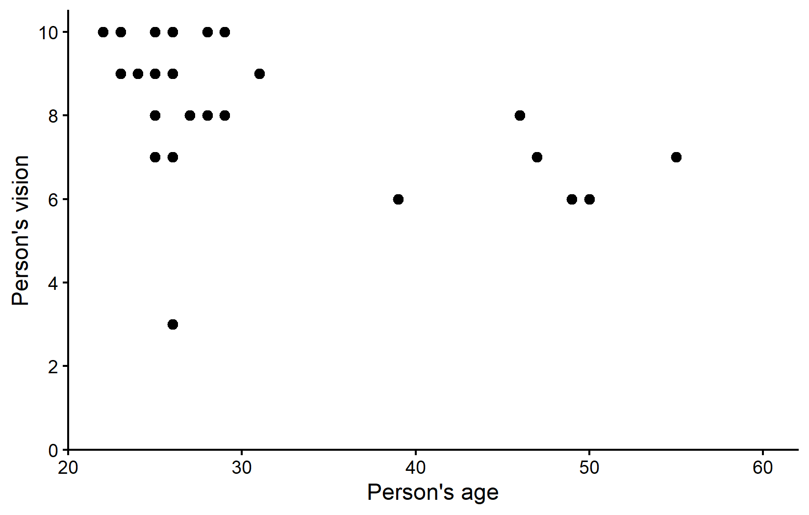
The visualization suggests that most participants are in their 20s with relatively good vision scores. There appears to be a trend where older people tend to have slightly worse vision. However, there’s also a noticeable potential outlier: someone in their mid-20s with a vision score of only 3, which is substantially lower than their peers.
Handling Missing Data
While the dataset contains 29 rows, we only have complete information on 28 people. This is because there’s an NA (Not Available) value for vision for one person.
Identifying Missing Values
In R, missing values are represented by NA and require special handling. For example, to filter rows with missing values, you cannot use == NA; instead, you must use the is.na() function:
# A tibble: 1 × 9
  person   ages gender civil_state height profession   vision distance perc_dist
  <chr>   <dbl> <chr>  <chr>        <dbl> <chr>         <dbl>    <dbl>     <dbl>
1 Enrique    NA <NA>   <NA>            NA Professional     NA        6        NA
Here is an even smaller example for this:
c(1, 2, 3, NA) == NA # does not work properly[1] NA NA NA NASome functions are sensitive to NAs
Some functions in R automatically exclude missing values, while others do not. For example, the mean() function will return NA if any of the values are missing:
In order for it to ignore the missing value and compute the mean of all remaining values, you need to set the na.rm argument to TRUE:
If we were to compute the average age per profession in our dataset, we would need to set the na.rm argument to TRUE in order to ignore the missing values:
# A tibble: 2 × 2
  profession   mean_age
  <chr>           <dbl>
1 Professional     NA
2 Student 24.4# A tibble: 2 × 2
profession mean_age
<chr> <dbl>
1 Professional 34.6
2 Student 24.4Also note that when we created the ggplot above, we got a warning message about missing values: “Warning: Removed 1 row containing missing values or values outside the scale range (geom_point()).” This is because the geom_point() function automatically excludes any rows with missing values in the x or y aesthetics. The plot was still created as intended, but ggplot wants to make sure we don’t miss that there was a missing value in the data. This is a good thing, as it helps us catch potential issues early on.
Counting Missing Values
To count missing values in a dataset, the basic approach is to use sum(is.na(column)). For non-missing values, you can use sum(!is.na(column)):
# A tibble: 2 × 4
  profession   n_rows n_missing n_complete
  <chr>         <int>     <int>      <int>
1 Professional     18         1         17
2 Student          11         0         11
The {naniar} package provides specialized functions for working with missing data that are much nicer to use:
# A tibble: 2 × 4
  profession   n_rows n_missing n_complete
  <chr>         <int>     <int>      <int>
1 Professional     18         1         17
2 Student          11         0         11
These results show that we have one missing vision value in the “Student” profession category. We have already seen this one row of data above, when we filtered out Enrique via filter(is.na(vision)). At this point, let’s just remove this row from our dataset, as it won’t contribute to our analysis anyway and this way we prevent the ggplot-warning showing up every time we plot something:
Initial Correlation and Regression Analysis
Let’s proceed with our correlation and regression analysis on the dataset as is (with missing values automatically excluded).
# A tibble: 1 × 8
  estimate statistic p.value parameter conf.low conf.high method     alternative
     <dbl>     <dbl>   <dbl>     <int>    <dbl>     <dbl> <chr>      <chr>
1 -0.497 -2.92 0.00709 26 -0.734 -0.153 Pearson's… two.sided # A tibble: 2 × 5
term estimate std.error statistic p.value
<chr> <dbl> <dbl> <dbl> <dbl>
1 (Intercept) 11.1 0.996 11.2 1.97e-11
2 ages -0.0910 0.0311 -2.92 7.09e- 3We have a moderate negative correlation of approximately -0.5, which is statistically significant (p < 0.05). The regression equation is:
vision = 11.14 - 0.09 × ages
Let’s visualize this relationship with our regression line:
ggplot(data = dat) +
  aes(x = ages, y = vision) +
  geom_point(size = 2) +
  geom_abline(
    intercept = reg$coefficients[1],
    slope = reg$coefficients[2],
    color = "#00923f",
    linewidth = 1
  ) +
  scale_x_continuous(
    name = "Person's age",
    limits = c(20, 55),
    expand = expansion(mult = c(0, 0.05))
  ) +
  scale_y_continuous(
    name = "Person's vision",
    limits = c(0, NA),
    breaks = seq(0, 10, 2),
    expand = expansion(mult = c(0, 0.05))
  ) +
  theme_classic()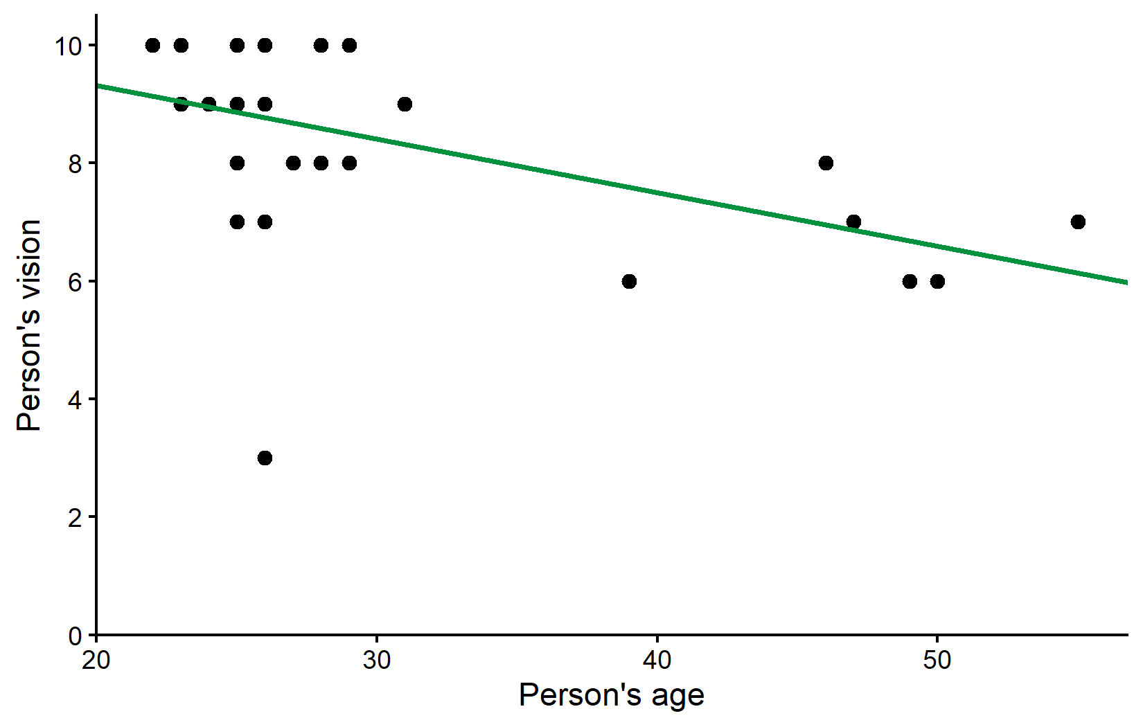
Dealing with Outliers
Looking at our plot, there appears to be one data point that stands out: someone in their mid-20s with a vision score of only 3, which is considerably lower than all other participants of similar age.
Step 1: Investigate the Potential Outlier
When you identify a potential outlier, the first step is to investigate it further. Let’s find out more about this data point:
# A tibble: 1 × 9
  person   ages gender civil_state height profession   vision distance perc_dist
  <chr>   <dbl> <chr>  <chr>        <dbl> <chr>         <dbl>    <dbl>     <dbl>
1 Rolando    26 M      M              180 Professional      3      4.5       150
We find that the potential outlier is a 26-year-old named Rolando with a vision score of 3.
Step 2: Make an Informed Decision
In real research, at this point you would:
- Check your original data collection records to confirm this wasn’t a recording error
- Consider your knowledge of the participant (if applicable) to determine if there were any special circumstances
- Decide whether this value is a genuine observation or an error that should be corrected or removed
For this example, let’s assume we’ve decided to analyze our data both with and without this potential outlier to see how it affects our results.
Analysis Without the Outlier
Let’s create a new dataset excluding Rolando:
Now, let’s repeat our correlation and regression analysis:
Comparing Results
Let’s compare the correlation results:
# A tibble: 1 × 4
  estimate p.value conf.low conf.high
     <dbl>   <dbl>    <dbl>     <dbl>
1   -0.497 0.00709   -0.734    -0.153
# A tibble: 1 × 4
estimate p.value conf.low conf.high
<dbl> <dbl> <dbl> <dbl>
1 -0.696 0.0000548 -0.851 -0.430The correlation coefficient increased from -0.5 to -0.7 after removing the outlier, indicating a stronger negative relationship between age and vision. This is a quite drastic change considering that we removed only a single data point.
And the regression results:
# A tibble: 2 × 3
  term        estimate std.error
  <chr>          <dbl>     <dbl>
1 (Intercept)  11.1       0.996
2 ages         -0.0910    0.0311
# A tibble: 2 × 3
term estimate std.error
<chr> <dbl> <dbl>
1 (Intercept) 11.7 0.679
2 ages -0.102 0.0211These values did actually not change so much it seems. Before removing Rolando the estimated model was vision = 11.1 - 0.0910*ages and after removing him it is vision = 11.7 - 0.102*ages. We can also visualize the regression line without the outlier (orange) side-by-side with the regression line including the outlier (green) from before:
ggplot() +
  aes(x = ages, y = vision) +
  # Plot all points of dat_no_outlier in standard black
  geom_point(
    data = dat_no_outlier,
    size = 2
  ) +
  # Plot only Rolando as green point
  geom_point(
    data = dat %>% filter(person == "Rolando"),
    color = "#00923f",
    size = 2
  ) +
  # Plot regression line with outlier in green
  geom_abline(
    intercept = reg$coefficients[1],
    slope = reg$coefficients[2],
    color = "#00923f",
    linewidth = 1
  ) +
  # Plot regression line without outlier in orange
  geom_abline(
    intercept = reg_no_outlier$coefficients[1],
    slope = reg_no_outlier$coefficients[2],
    color = "#e4572e",
    linewidth = 1
  ) +
  scale_x_continuous(
    name = "Person's age",
    limits = c(20, 55),
    expand = expansion(mult = c(0, 0.05))
  ) +
  scale_y_continuous(
    name = "Person's vision",
    limits = c(0, NA),
    breaks = seq(0, 10, 2),
    expand = expansion(mult = c(0, 0.05))
  ) +
  theme_classic()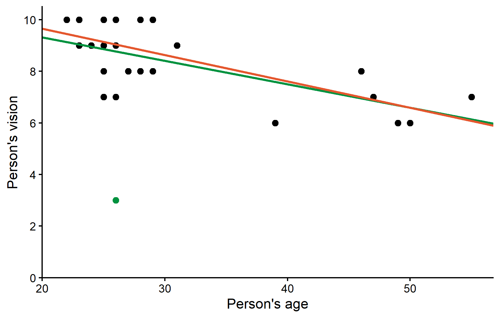
So the correlation estimate changed quite a bit, but the regression estimates did not change that much. However, at this point it makes sense to ask how well each fitted regression line fits the respective dataset:
Coefficient of Determination
A useful metric for comparing regression models is the coefficient of determination (R²), which measures the proportion of variance explained by the model. We can get this information from our fitted regression models (reg and reg_no_outlier) either via summary() or once again with a function from the {broom} package, i.e. glance():
# A tibble: 1 × 2
  r.squared adj.r.squared
      <dbl>         <dbl>
1     0.247         0.218
# A tibble: 1 × 2
r.squared adj.r.squared
<dbl> <dbl>
1 0.485 0.464So while the regression lines (or rather their parameter estimates) may not have changed that much, the explanatory power of our model nearly doubled after removing the outlier. The R² value increased from 25% to 49%, indicating that the model without the outlier explains a much larger proportion of the variance in vision scores. In other words: The orange line explains all data points except Rolando much better than the green line explains all data points including Rolando.
Wrapping Up
This chapter has demonstrated the importance of carefully examining your data for quality issues before conducting statistical analyses. We’ve seen how a single outlier can substantially impact correlation and regression results.
Summary & Key Takeaways
- Data Quality Assessment:
-
Handling Missing Data:
- R typically excludes missing values (
NA) automatically in functions likecor.test()andlm() - Packages like {naniar} provide specialized tools for working with missing data
- Always document how many values were missing and how they were handled
- R typically excludes missing values (
-
Dealing with Outliers:
- Investigate potential outliers to determine if they represent errors or genuine observations
- Consider analyzing data both with and without outliers to understand their impact
- Be transparent about any data points removed and the rationale
-
Impact on Statistical Analysis:
- Removing Rolando (our outlier) changed the correlation from -0.5 to -0.7
- The R² value increased from 25% to 49% after removing the outlier
- While parameter estimates didn’t change dramatically, the explanatory power of our model nearly doubled
-
Best Practices:
- Never remove outliers solely to improve your results
- Document all data cleaning decisions
- Consider reporting results both with and without outliers when appropriate
Remember that while statistical tools can help identify potential issues, the decision to include or exclude data points should be based on sound scientific reasoning rather than statistical convenience, if feasible. Always be transparent about your data handling decisions in any research report.
Citation
@online{schmidt2026,
  author = {{Dr. Paul Schmidt}},
  publisher = {BioMath GmbH},
  title = {7. {Missing} {Data} \& {Outliers}},
  date = {2026-06-08},
  url = {https://biomathcontent.netlify.app/content/r_intro/07_naoutlier.html},
  langid = {en}
}