To install and load all the packages used in this chapter, run the following code:
Throughout the previous chapters we have used emmeans() to obtain a mean per treatment, and more than once we mentioned in passing that these model-based means are not necessarily the same as a plain arithmetic average. This chapter finally takes a closer look at that remark: when do the two coincide, when do they part ways, and what exactly is the model “adjusting” for?
A model-based, or adjusted, mean is reconstructed from a fitted model rather than computed directly from the raw observations. It therefore answers a slightly different question than a raw average: not “what was the average of the plots this treatment happened to receive?” but “what would this treatment’s mean be under a fair, balanced comparison?”. When the design is balanced and the model simple, the two answers are identical. As soon as the design is unbalanced, carries a covariate, or has a non-trivial variance-covariance structure, they can diverge - sometimes in the estimate itself, sometimes only in its standard error. We will meet both kinds of difference below.
Throughout this chapter adjusted means is shorthand for means estimated from a fitted model rather than computed directly from the raw observations. Depending on the software or textbook these are also called:
-
estimated marginal means (the name used by the
{emmeans}package), -
least-squares means (historically
lsmeansin SAS and older R packages), - model-based or predicted means.
They all refer to the same idea: a mean reconstructed from the model’s coefficients, which therefore corrects for the other terms in the model (blocks, covariates, …).
The Quick Version
A simple arithmetic mean averages exactly the observations a variety received. If a variety happened to be tested only in good conditions (or, as below, missed the best block entirely), that luck leaks straight into its mean. An adjusted mean instead asks: what would this variety’s mean be if every variety had faced the same set of conditions? It answers that by averaging over all block levels using the fitted model, even for blocks a variety never appeared in.
In a perfectly balanced design the two are identical. The moment the design is unbalanced - missing plots, unequal replication, covariates - they diverge, and the adjusted mean is the fair comparison. And there is a second, subtler difference: even when the estimates match the raw averages exactly, their standard errors can disagree once the model carries a variance-covariance structure (random effects, heterogeneous or correlated errors). We return to that at the end.
A motivating example: the variety that skipped the best block
We construct a small variety trial laid out as a randomized complete block design (RCBD) with four varieties (A, B, C, D) and four blocks (B1-B4). The data are built from a clean additive structure - a variety effect plus a block effect plus a little noise - so we know the ground truth:
- Variety
Dis genuinely the best (highest variety effect), followed byC,B,A. - Block
B4is a “super-block”: for whatever reason (a wetter corner of the field, a better greenhouse bench) everything grown there yields far more.
The twist: variety D is missing from the super-block B4. Perhaps those plots failed, or D’s seed ran out. This single missing plot is enough to break the balance and mislead the naive analysis.
set.seed(42)

variety_effect <- c(A = 50, B = 55, C = 60, D = 65) # D is truly the best
block_effect   <- c(B1 = 0, B2 = 3, B3 = 6, B4 = 30) # B4 is the super-block

dat <- expand_grid(
  variety = names(variety_effect),
  block   = names(block_effect)
) %>%
  mutate(
    yield = variety_effect[variety] + block_effect[block] + rnorm(n(), 0, 2),
    yield = round(yield, 1)
  ) %>%
  # variety D never made it into the super-block B4
  filter(!(variety == "D" & block == "B4")) %>%
  mutate(across(c(variety, block), as.factor))

dat
# A tibble: 15 × 3
variety block yield
<fct> <fct> <dbl>
1 A B1 52.7
2 A B2 51.9
3 A B3 56.7
4 A B4 81.3
5 B B1 55.8
6 B B2 57.8
7 B B3 64
8 B B4 84.8
9 C B1 64
10 C B2 62.9
11 C B3 68.6
12 C B4 94.6
13 D B1 62.2
14 D B2 67.4
15 D B3 70.7We have 15 plots instead of the full 16: every variety appears in B1, B2 and B3, but only A, B and C appear in B4.
Explore
A quick look at the block means confirms that B4 is in a league of its own:
# A tibble: 4 × 3
  block mean_yield     n
  <fct>      <dbl> <int>
1 B1          58.7     4
2 B2          60       4
3 B3          65       4
4 B4          86.9     3
Block B4 averages around 87, while the other three sit near 60. Now plot yield by variety, coloured by block:
ggplot(data = dat) +
  aes(y = yield, x = variety, color = block) +
  geom_point(size = 2) +
  scale_x_discrete(name = "Variety") +
  scale_y_continuous(
    name = "Yield",
    limits = c(0, NA),
    expand = expansion(mult = c(0, 0.1))
  ) +
  scale_color_discrete(name = "Block") +
  theme_classic()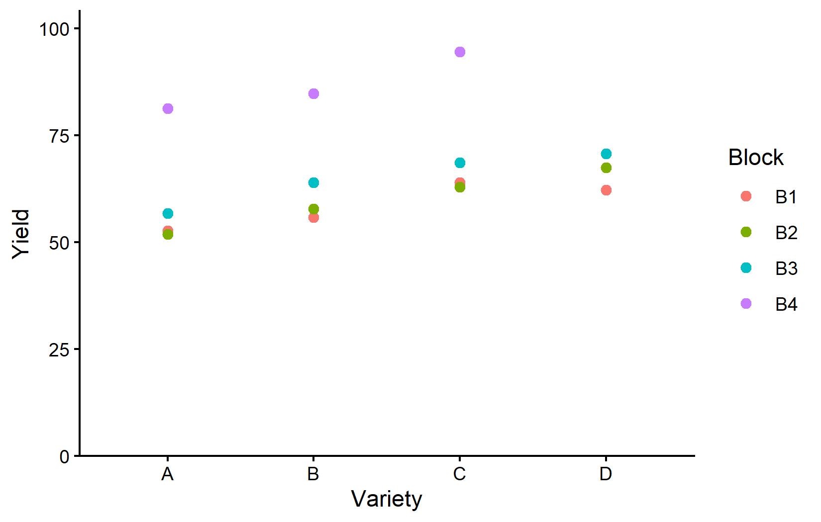
The super-block points (B4) sit far above the rest - and crucially, variety D has no B4 point at all. Every other variety got a large boost from one super-block plot; D did not. Keep this picture in mind: it is the entire reason the two kinds of mean will disagree.
The naive approach and why it misleads
The most natural thing to do is to average yield within each variety:
# A tibble: 4 × 3
  variety naive_mean     n
  <fct>        <dbl> <int>
1 C             72.5     4
2 D             66.8     3
3 B             65.6     4
4 A             60.6     4
Read at face value, this table says variety C is the best (about 72.5), with the truly-best variety D only in second place. That conclusion is wrong, and the reason is structural rather than random:
- Varieties
A,BandCeach average over four plots, one of which is a super-block plot worth roughly+30. That one plot pulls their averages up by about30 / 4 = 7.5. - Variety
Daverages over only three plots, none of them in the super-block. It never received that upward pull.
So D is penalised in the ranking not because it grows worse, but because it missed the block where everyone looked good. The arithmetic mean has no way to know this: it simply averages whatever observations exist.
Adjusted means to the rescue
Now fit the RCBD model that accounts for the block effect, and ask emmeans() for the variety means:
Analysis of Variance Table

Response: yield
          Df  Sum Sq Mean Sq F value    Pr(>F)
variety    3  285.25   95.08   35.72 5.570e-05 ***
block      3 1793.33  597.78  224.56 4.646e-08 ***
Residuals  8   21.30    2.66
---
Signif. codes:  0 '***' 0.001 '**' 0.01 '*' 0.05 '.' 0.1 ' ' 1
Both variety and block are highly significant - unsurprising, since we built both effects into the data. With the model in hand we obtain estimated marginal means and a compact letter display in one step:
 variety emmean    SE df lower.CL upper.CL .group
 A         60.6 0.816  8     58.8     62.5  a
 B         65.6 0.816  8     63.7     67.5   b
 C         72.5 0.816  8     70.6     74.4    c
 D         73.6 0.980  8     71.4     75.9    c

Results are averaged over the levels of: block
Confidence level used: 0.95
significance level used: alpha = 0.05
NOTE: If two or more means share the same grouping symbol,
      then we cannot show them to be different.
      But we also did not show them to be the same.
Note the footer: Results are averaged over the levels of: block. The ranking is now correct - variety D comes out on top (about 73.6), just ahead of C (72.5). The model has recognised that D’s three observations all come from ordinary blocks and has estimated what D would have yielded in the super-block too.
One more detail worth noticing: D’s standard error (0.98) is slightly larger than the others (0.82). That is honest bookkeeping - D rests on three plots instead of four and was never observed in B4, so the model is a little less certain about it.
What “adjusted for block” actually means
The key sentence from the output is averaged over the levels of block. An estimated marginal mean for a variety is computed by:
- taking the fitted model’s prediction for that variety in each block level, then
- averaging those predictions with equal weight across all four blocks.
For varieties A, B and C this changes nothing relative to the arithmetic mean, because they really were observed once in every block - equal weighting and plain averaging coincide. That is why their naive and adjusted means are identical here. (This exact agreement reflects how mild the imbalance is - a single missing cell. Under more severe imbalance, even a treatment present in every block can shift a little.)
For variety D, block B4 was never observed. The additive model nevertheless predicts D’s yield in B4 as
\[ \widehat{y}_{D, B4} = \hat\mu + \hat\tau_D + \hat\beta_{B4}, \]
where \(\hat\beta_{B4}\) - the super-block bonus - is estimated from the varieties that were there (A, B, C). The adjusted mean for D then averages over B1-B4 including this reconstructed B4 value, which is why it lands above every yield D actually produced.
Filling in the missing B4 cell only works because the model assumes no variety-by-block interaction - block shifts every variety by the same amount. If that assumption is wrong (some varieties thrive in the super-block more than others), the extrapolated mean for D is unreliable, because there is no data to check it against. Whether additivity is reasonable is exactly the kind of thing to inspect with Appendix A1: Model Diagnostics. Adjusted means are powerful, but they are only as trustworthy as the model behind them.
Side by side
Putting both columns next to each other makes the correction explicit:
# A tibble: 4 × 4
  variety     n naive_mean adjusted_mean
  <fct>   <int>      <dbl>         <dbl>
1 D           3       66.8          73.6
2 C           4       72.5          72.5
3 B           4       65.6          65.6
4 A           4       60.6          60.6
The balanced varieties (A, B, C) are untouched; only the unbalanced variety D moves - and it moves enough to overturn the ranking.
We can show the same story in one figure: the black dots are the raw observations, the red dots and intervals are the adjusted means with 95% confidence limits, and the letters are the compact letter display.
my_caption <- "Black dots represent raw data.
Red dots and error bars represent adjusted means (estimated marginal means)
with 95% confidence limits per variety. Means followed by a common letter are
not significantly different (Fisher's LSD, no multiplicity adjustment)."

ggplot() +
  aes(x = variety) +
  # black dots: raw data
  geom_point(
    data = dat,
    aes(y = yield, shape = block)
  ) +
  # red dots: adjusted means
  geom_point(
    data = mean_comp,
    aes(y = emmean),
    color = "red",
    position = position_nudge(x = 0.1)
  ) +
  # red error bars: confidence limits
  geom_errorbar(
    data = mean_comp,
    aes(ymin = lower.CL, ymax = upper.CL),
    color = "red",
    width = 0.1,
    position = position_nudge(x = 0.1)
  ) +
  # red letters: compact letter display
  geom_text(
    data = mean_comp,
    aes(y = emmean, label = str_trim(.group)),
    color = "red",
    position = position_nudge(x = 0.2),
    hjust = 0
  ) +
  scale_x_discrete(name = "Variety") +
  scale_y_continuous(
    name = "Yield",
    limits = c(0, NA),
    expand = expansion(mult = c(0, 0.1))
  ) +
  scale_shape_discrete(name = "Block") +
  theme_classic() +
  labs(caption = my_caption) +
  theme(plot.caption = element_textbox_simple(margin = margin(t = 5)),
        plot.caption.position = "plot")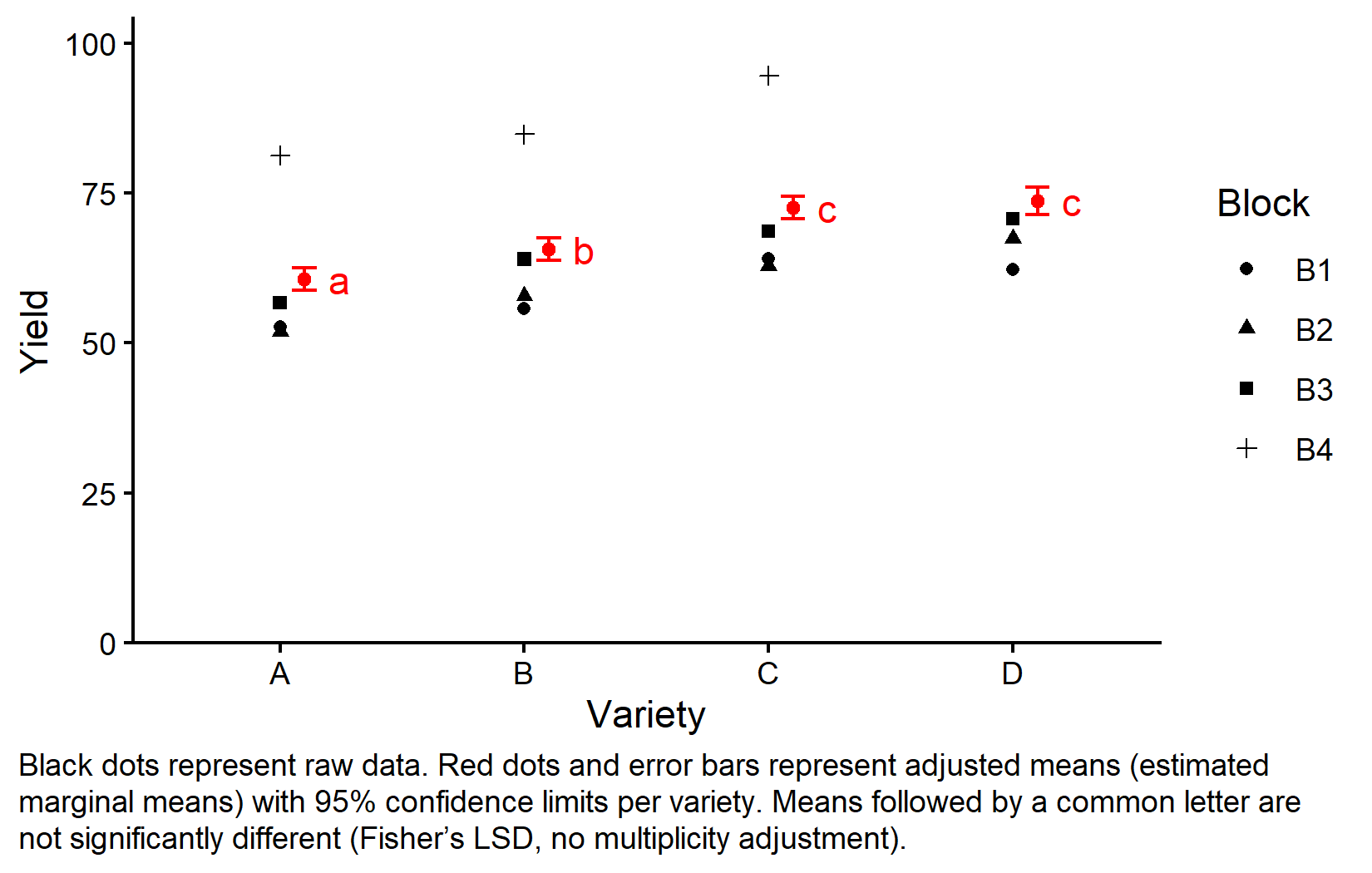
Look at variety D: its red adjusted mean floats above all three of its black raw points. That is the extrapolation into the unobserved super-block made visible. For C, whose raw points include a super-block plot near 95, the red mean sits comfortably among its data.
A second example: adjusting for a covariate
The block example adjusted for a categorical nuisance variable. The same logic applies to a continuous one - and this is in fact where the term “adjusted means” originally comes from, in the analysis of covariance (ANCOVA).
Imagine three treatments compared on yield, where we also recorded a baseline covariate x - say each plot’s initial plant height, measured before the treatments were applied. Because the plots were not perfectly matched, the three groups happen to start at different average heights:
set.seed(123)

# helper: one group with its own baseline mean and true treatment effect
make_group <- function(trt, x_mean, effect, n = 6) {
  tibble(treatment = trt, x = round(rnorm(n, x_mean, 2), 1)) %>%
    mutate(yield = round(effect + 1.5 * x + rnorm(n, 0, 2), 1))
}

dat_cov <- bind_rows(
  make_group("A", x_mean = 10, effect = 30), # truly best, but lowest baseline
  make_group("B", x_mean = 15, effect = 28),
  make_group("C", x_mean = 20, effect = 26)  # truly worst, but highest baseline
) %>%
  mutate(treatment = as.factor(treatment))

dat_cov
# A tibble: 18 × 3
treatment x yield
<fct> <dbl> <dbl>
1 A 8.9 44.3
2 A 9.5 41.7
3 A 13.1 48.3
4 A 10.1 44.3
5 A 10.3 47.9
6 A 13.4 50.8
7 B 15.8 53.1
8 B 15.2 49.9
9 B 13.9 46.7
10 B 18.6 55.5
11 B 16 49.9
12 B 11.1 43.2
13 C 18.7 54.9
14 C 16.6 50.3
15 C 21.7 60.3
16 C 20.3 58.2
17 C 17.7 54.2
18 C 22.5 61.1# A tibble: 3 × 3
treatment naive_yield mean_x
<fct> <dbl> <dbl>
1 C 56.5 19.6
2 B 49.7 15.1
3 A 46.2 10.9The naive ranking puts treatment C on top. But look at mean_x: group C also started from the highest baseline (around 20), while A started lowest (around 11). Part of C’s apparent advantage is simply that its plots were ahead before any treatment was applied. A fair comparison has to put all treatments on a common baseline.
Test for parallel slopes first
Before adjusting, we check that the covariate behaves the same way in every group - that the regression lines are parallel (a common slope). We compare a model with separate slopes against one with a common slope:
Analysis of Variance Table

Model 1: yield ~ treatment + x
Model 2: yield ~ treatment * x
  Res.Df    RSS Df Sum of Sq      F Pr(>F)
1     14 27.322
2     12 26.465  2   0.85669 0.1942  0.826
The interaction is far from significant (p around 0.83), so a common slope is justified and we keep the simpler parallel-lines model. This test is not a formality: if the slopes genuinely differed, no single adjusted mean could summarise a treatment, because the gap between treatments would change with x (see the note below).
emmeans(mod_parallel, specs = ~ treatment) treatment emmean SE df lower.CL upper.CL
A 53.4 0.896 14 51.5 55.3
B 49.9 0.570 14 48.6 51.1
C 49.2 0.907 14 47.2 51.1
Confidence level used: 0.95 Adjusted to the common mean height, the ranking flips to A on top, exactly reversing the naive order. The model has removed the head start that C enjoyed.
The picture shows why. Each treatment gets its own parallel regression line; the adjusted means (diamonds) are the heights of those lines at the common covariate value (dashed line at the mean of x):
# regression lines from the common-slope model
pred <- expand_grid(
  treatment = levels(dat_cov$treatment),
  x = seq(min(dat_cov$x), max(dat_cov$x), length.out = 50)
)
pred$yield <- predict(mod_parallel, newdata = pred)

# adjusted means, placed at the mean covariate value
emm_pts <- mod_parallel %>%
  emmeans(specs = ~ treatment) %>%
  as_tibble() %>%
  mutate(x = mean(dat_cov$x))

ggplot(dat_cov, aes(x = x, y = yield, color = treatment)) +
  geom_point() +
  geom_line(data = pred) +
  geom_vline(xintercept = mean(dat_cov$x), linetype = "dashed") +
  geom_point(data = emm_pts, aes(y = emmean), size = 4, shape = 18) +
  scale_x_continuous(name = "Baseline covariate x (initial height)") +
  scale_y_continuous(name = "Yield") +
  scale_color_discrete(name = "Treatment") +
  theme_classic()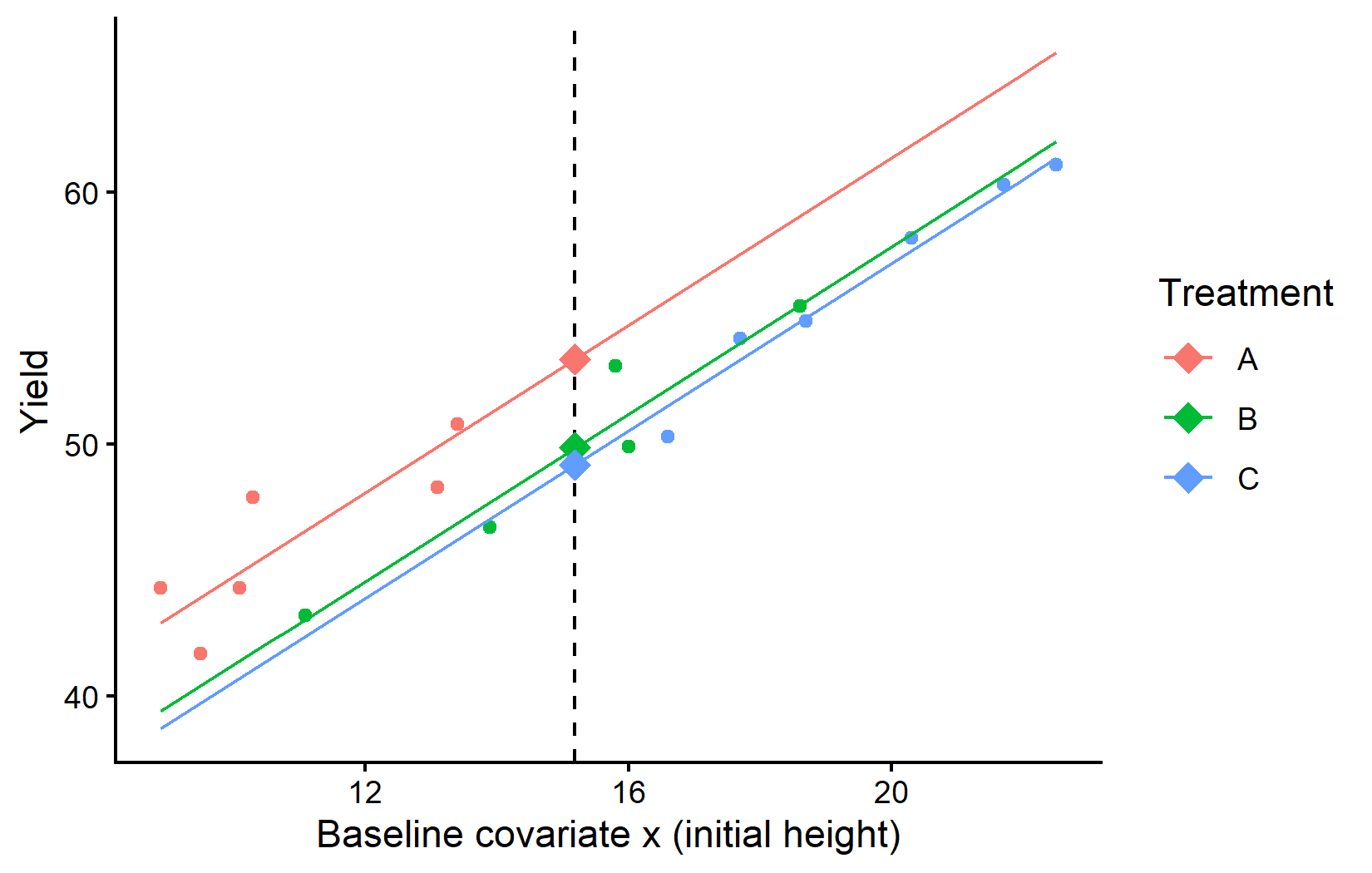
Choosing where to evaluate: emmeans(at = …)
By default emmeans() evaluates the means at the mean of the covariate. We can ask for any other value(s) with the at argument. The | x in the specification matters: it keeps the chosen x values side by side (one block of results each). Without it - writing just ~ treatment with the same at - emmeans() would average over the listed values and collapse them into a single mean per treatment, which is rarely what you want when you deliberately picked several covariate values:
x = 10:
 treatment emmean    SE df lower.CL upper.CL
 A           44.7 0.588 14     43.5     46.0
 B           41.2 0.998 14     39.1     43.4
 C           40.5 1.640 14     37.0     44.1

x = 20:
 treatment emmean    SE df lower.CL upper.CL
 A           61.4 1.570 14     58.0     64.8
 B           57.9 0.971 14     55.8     60.0
 C           57.2 0.574 14     56.0     58.4

Confidence level used: 0.95
At x = 10 and at x = 20 the absolute means differ - taller plants yield more - but the differences between treatments are identical (A beats C by about 4.2 at either value). That is the signature of parallel lines: the covariate value you pick shifts the whole set of means up or down without changing the comparisons, which is why a single adjusted mean (at the mean of x) is a fair summary here. Notice also that the standard errors grow as x moves away from a group’s own baseline - evaluating a mean far from where that treatment was actually observed is an extrapolation, and the model reports it as less certain.
Had the equal-slopes test been significant, the lines would cross and the treatment differences would depend on x: a treatment could win at low x and lose at high x. Then there is no single “adjusted mean”, and at = ... becomes essential - one must report the comparison at the covariate values that matter for the question, not at one arbitrary point. This is why the parallel-slopes test always comes before trusting a covariate-adjusted mean.
When do adjusted and arithmetic means coincide?
It is worth being clear that adjusted means are not always different - and when they are equal, that is reassuring rather than redundant:
-
Balanced designs. If every treatment appears equally often in every block (a complete, balanced RCBD or a balanced CRD), the adjusted means equal the arithmetic means exactly. This is why, in the one-way CRD chapter,
emmeans()returns the same numbers asmean(): with nothing to adjust for, there is nothing to correct. (The standard errors can still differ even here - see the next section.) - Unbalanced designs. Missing plots, unequal replication, or any departure from balance makes the arithmetic mean a biased summary of the treatment effect, and the adjusted mean the fair one. The example above is the mildest possible case - a single missing plot - and it was already enough to flip the winner.
- Covariates and mixed models. Once a model includes a continuous covariate, or random effects, “the mean” is no longer even well defined without specifying at what covariate value or averaged over which random levels. Adjusted means make that explicit, and the gap from the arithmetic mean typically grows. This matters even more for the unbalanced designs in Appendix A6: Linear Mixed Models.
The practical rule of thumb: report arithmetic means for a quick descriptive sanity check, but base your inference - rankings, comparisons, letters, confidence intervals - on adjusted means from a model that reflects how the experiment was actually run.
It is not only the estimate: precision can differ too
So far the difference has been in the value of the mean. But adjusted means depart from arithmetic means along a second, independent axis: their precision. Here the point estimate can be exactly the raw average, while the standard error - and, more importantly, the standard error of a difference between two means (the SED, the quantity that actually drives comparisons and letter displays) - is different, because it is built from the model’s variance-covariance structure rather than from a single pooled error variance.
This happens as soon as the model is more than a plain lm() with independent, equally-variable errors:
-
Random block effects. Fit a balanced RCBD with
blockas a random effect and the treatment estimates are still the arithmetic means, but their standard errors now absorb the between-block variance component. (With unbalanced data the estimates shift too, through what is called recovery of inter-block information.) - Heterogeneous variances. Allow each group its own residual variance and, in a balanced design, the estimates do not move - but the standard errors stop being identical across groups. This is exactly the phenomenon dissected in Appendix A2.
- Correlated observations (split-plot, repeated measures). When errors are correlated, the SED depends on which two means are compared. In a split-plot design, a comparison within the same main plot is more precise than one across main plots, so the same set of means carries several different SEDs - even though each mean may equal its raw average.
In all of these cases the headline numbers - the means themselves - can look identical to a quick group_by() %>% summarise(), while the inference resting on them (confidence intervals, p-values, compact letters) differs and, when the variance-covariance structure is specified correctly, is more trustworthy. Getting the means right is only half the task; getting their uncertainty right is the other half.
Wrapping Up
Adjusted means are not a more complicated way of computing an average; they are a fairer way. By reconstructing each treatment mean from a model that knows about the blocks (and covariates, and random effects), they correct for the accidents of an unbalanced design that a raw average silently bakes in.
Arithmetic means average exactly the observations a treatment received; adjusted means estimate what its mean would be under a fair, balanced comparison.
In a balanced design the two are identical. In an unbalanced design they diverge, and the arithmetic mean can rank treatments wrongly.
Adjusted means can differ from raw averages in two independent ways: the estimate itself (driven by imbalance or covariates) and its precision - the SE and especially the SED (driven by the model’s variance-covariance structure: random effects, heterogeneous or correlated errors). The second can occur even when the estimates are identical.
“Adjusted for block” means averaging the model’s predictions over all block levels with equal weight, including blocks a treatment never appeared in.
This extrapolation relies on additivity (no treatment-by-block interaction) - a modelling assumption worth checking (Appendix A1).
For any analysis beyond a balanced one-way layout, base inference on adjusted means, not raw averages.
Further reading
-
{emmeans}vignette: Basics of estimated marginal means - Russell Lenth’s own introduction to what EMMs are and how they are computed. -
{emmeans}vignette: Estimated marginal means for unbalanced and missing-cell designs - the technical treatment of exactly the situation in this chapter. - Appendix A2 - Why are the Standard Errors all the same? - the companion question about the standard errors of adjusted means.
- Appendix A1 - Model Diagnostics - how to check the additivity and homoscedasticity assumptions the adjusted means rely on.
Citation
@online{schmidt2026,
  author = {{Dr. Paul Schmidt}},
  title = {A8. {Adjusted} {Means} Vs. {Arithmetic} {Means}},
  date = {2026-06-08},
  url = {https://biomathcontent.netlify.app/content/lin_mod_exp/a8_adjustedmeans.html},
  langid = {en}
}