---
title: "5. Tables with flextable"
subtitle: "Publication-ready tables for Word documents"
---
The default R output for tables looks unprofessional in Word documents - it appears as console output with monospace font. In this chapter, you will learn how to create professional, formatted tables using the flextable package that integrate seamlessly into Word documents.
```{r}
#| label: qrt-tables-setup
#| include: false
library(tidyverse)
library(palmerpenguins)
library(flextable)
library(officer)
adelie <- penguins %>%
filter(species == "Adelie") %>%
drop_na()
```
# Why flextable?
There are several R packages for tables (kable, gt, huxtable, flextable), but for Word output, **flextable** is the best choice:
- Native Word format (no detour via HTML)
- Full control over formatting
- Actively maintained and well documented
- Part of the "Officeverse" ecosystem
:::{.callout-note}
The **gt** package is excellent for HTML output, but its Word support is more limited. For Word documents, I recommend flextable.
:::
# Basics
## Creating a simple table
The simplest way to create a flextable:
```{r}
#| label: qrt-tables-basic
adelie %>%
  head(5) %>%
  select(island, bill_length_mm, bill_depth_mm, body_mass_g) %>%
  flextable()
```
This already looks much better than `print(df)`! But the column widths are not optimal yet.
## Automatic column widths
With `autofit()`, flextable automatically adjusts column widths:
```{r}
#| label: qrt-tables-autofit
adelie %>%
  head(5) %>%
  select(island, bill_length_mm, bill_depth_mm, body_mass_g) %>%
  flextable() %>%
  autofit()
```
:::{.callout-tip}
`autofit()` should generally be placed at the end of the flextable pipeline, after all other formatting has been applied.
:::
# Renaming and formatting columns
## Changing column headers
The automatic column names from the dataframe are often not ideal for a report:
```{r}
#| label: qrt-tables-headers
adelie %>%
  head(5) %>%
  select(island, bill_length_mm, bill_depth_mm, body_mass_g) %>%
  flextable() %>%
  set_header_labels(
    island = "Island",
    bill_length_mm = "Bill Length (mm)",
    bill_depth_mm = "Bill Depth (mm)",
    body_mass_g = "Body Mass (g)"
  ) %>%
  autofit()
```
## Formatting numbers
For scientific tables, you often need a specific number of decimal places:
```{r}
#| label: qrt-tables-colformat
adelie %>%
  head(5) %>%
  select(island, bill_length_mm, bill_depth_mm, body_mass_g) %>%
  flextable() %>%
  set_header_labels(
    island = "Island",
    bill_length_mm = "Bill Length (mm)",
    bill_depth_mm = "Bill Depth (mm)",
    body_mass_g = "Body Mass (g)"
  ) %>%
  colformat_double(j = c("bill_length_mm", "bill_depth_mm"), digits = 1) %>%
  colformat_double(j = "body_mass_g", digits = 0) %>%
  autofit()
```
# Formatting and styling
## Font and size
```{r}
#| label: qrt-tables-font
adelie %>%
  head(5) %>%
  select(island, bill_length_mm, body_mass_g) %>%
  flextable() %>%
  font(fontname = "Arial", part = "all") %>%
  fontsize(size = 10, part = "body") %>%
  fontsize(size = 11, part = "header") %>%
  autofit()
```
## Alignment
```{r}
#| label: qrt-tables-align
adelie %>%
  head(5) %>%
  select(island, bill_length_mm, body_mass_g) %>%
  flextable() %>%
  align(j = 1, align = "left", part = "all") %>%
  align(j = 2:3, align = "center", part = "all") %>%
  autofit()
```
## Borders
```{r}
#| label: qrt-tables-borders
adelie %>%
  head(5) %>%
  select(island, bill_length_mm, body_mass_g) %>%
  flextable() %>%
  border_remove() %>%
  hline_top(border = fp_border(width = 2), part = "header") %>%
  hline_bottom(border = fp_border(width = 1), part = "header") %>%
  hline_bottom(border = fp_border(width = 2), part = "body") %>%
  autofit()
```
## Bold headers
```{r}
#| label: qrt-tables-bold
adelie %>%
  head(5) %>%
  select(island, bill_length_mm, body_mass_g) %>%
  flextable() %>%
  bold(part = "header") %>%
  autofit()
```
# Creating a summary table
For our penguin report, we create a descriptive statistics table:
```{r}
#| label: qrt-tables-summary
summary_table <- adelie %>%
  summarise(
    n = n(),
    bill_length_mean = mean(bill_length_mm),
    bill_length_sd   = sd(bill_length_mm),
    bill_depth_mean  = mean(bill_depth_mm),
    bill_depth_sd    = sd(bill_depth_mm),
    body_mass_mean   = mean(body_mass_g),
    body_mass_sd     = sd(body_mass_g)
  )

summary_table %>%
  flextable() %>%
  colformat_double(digits = 1) %>%
  colformat_double(j = "n", digits = 0) %>%
  set_header_labels(
    n                = "N",
    bill_length_mean = "Bill Length (mm)",
    bill_length_sd   = "SD",
    bill_depth_mean  = "Bill Depth (mm)",
    bill_depth_sd    = "SD",
    body_mass_mean   = "Body Mass (g)",
    body_mass_sd     = "SD"
  ) %>%
  bold(part = "header") %>%
  autofit()
```
# Grouped tables
A table with statistics per island:
```{r}
#| label: qrt-tables-grouped
adelie %>%
  group_by(island) %>%
  summarise(
    N = n(),
    `Bill Length` = mean(bill_length_mm),
    `Body Mass` = mean(body_mass_g),
    .groups = "drop"
  ) %>%
  flextable() %>%
  set_header_labels(island = "Island") %>%
  colformat_double(j = c("Bill Length"), digits = 1) %>%
  colformat_double(j = c("Body Mass"), digits = 0) %>%
  bold(part = "header") %>%
  hline_top(border = fp_border(width = 2), part = "header") %>%
  hline_bottom(border = fp_border(width = 1), part = "header") %>%
  hline_bottom(border = fp_border(width = 2), part = "body") %>%
  autofit()
```
# Table captions in Quarto
To add a table caption, use the chunk option `tbl-cap`:
````markdown
```{r}
#| label: tbl-summary
#| tbl-cap: "Descriptive statistics of Adelie penguins"

summary_table %>%
  flextable() %>%
  autofit()
```
````
The label must start with `tbl-` for Quarto to recognize it as a table and enable cross-references (see Chapter 7).
# Usage in Word documents
For correct display in Word documents, the chunk option `output: asis` is recommended (see also Chapter 3). It tells Quarto to treat the chunk's output as raw markup so that flextable's HTML/OOXML output is passed through untouched:
````markdown
```{r}
#| label: tbl-example
#| output: asis

my_table %>%
  flextable() %>%
  autofit()
```
````
# Complete example
Here is a complete, publication-ready table:
```{r}
#| label: qrt-tables-complete
adelie %>%
  group_by(island, sex) %>%
  summarise(
    N = n(),
    `Bill Length (mm)` = mean(bill_length_mm),
    `Body Mass (g)` = mean(body_mass_g),
    .groups = "drop"
  ) %>%
  flextable() %>%
  set_header_labels(
    island = "Island",
    sex = "Sex"
  ) %>%
  colformat_double(j = "Bill Length (mm)", digits = 1) %>%
  colformat_double(j = "Body Mass (g)", digits = 0) %>%
  font(fontname = "Arial", part = "all") %>%
  fontsize(size = 10, part = "all") %>%
  bold(part = "header") %>%
  align(align = "center", part = "header") %>%
  align(j = 1:2, align = "left", part = "body") %>%
  align(j = 3:5, align = "right", part = "body") %>%
  border_remove() %>%
  hline_top(border = fp_border(width = 1.5), part = "header") %>%
  hline_bottom(border = fp_border(width = 0.75), part = "header") %>%
  hline_bottom(border = fp_border(width = 1.5), part = "body") %>%
  autofit()
```
In a rendered Word document, this table looks like this:
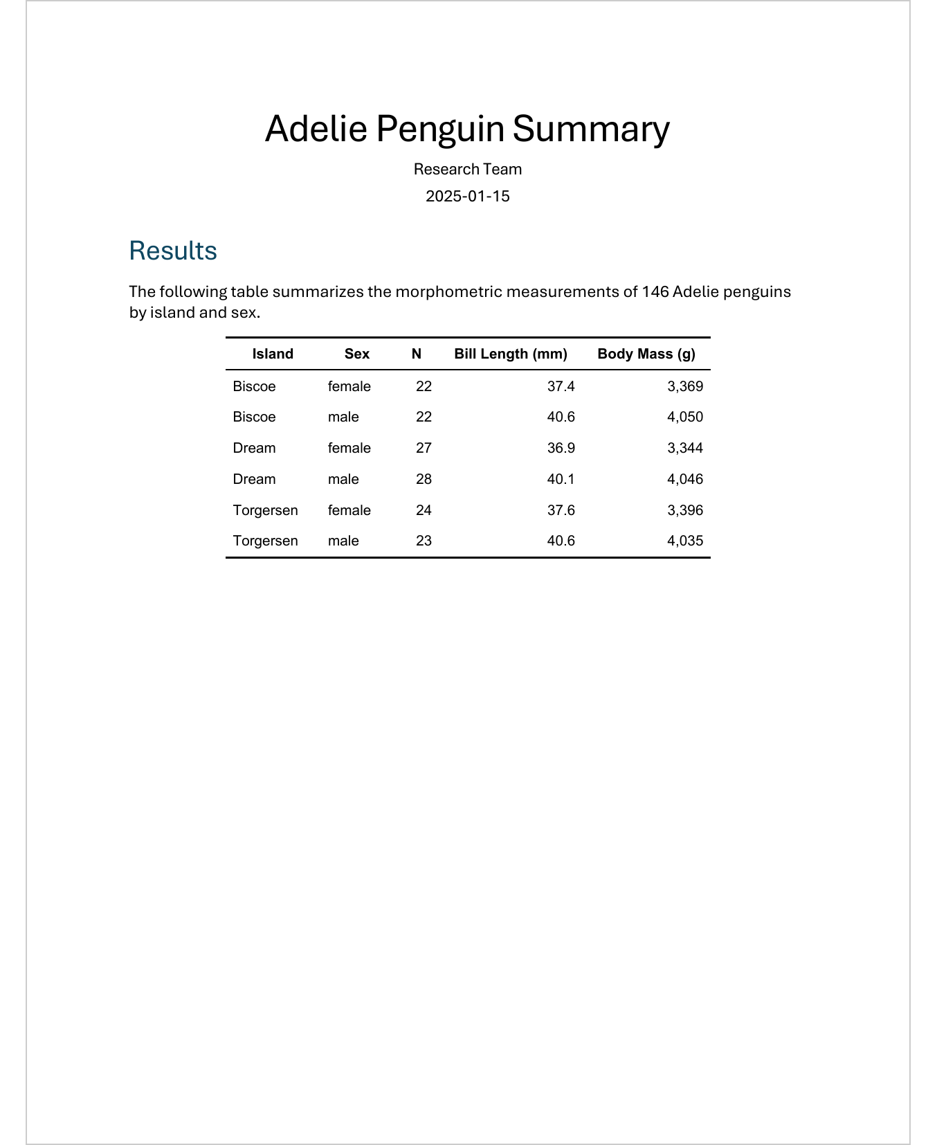{width=70%}
:::{.callout-tip collapse="false"}
## Exercise: Create a summary table
1. Create a table with the number of penguins per island and sex
2. Add a column with the average weight
3. Format the table professionally (font, borders, alignment)
4. Add a table caption with `tbl-cap`
:::
# Further resources
- [flextable book](https://ardata-fr.github.io/flextable-book/) - Comprehensive documentation
- [flextable gallery](https://ardata-fr.github.io/flextable-gallery/) - Examples and inspiration
- [Officeverse](https://ardata-fr.github.io/officeverse/) - The ecosystem around flextable
# What is next
Now we can create professional tables. In Chapter 6, we will learn how to optimally integrate ggplot2 graphics into Quarto documents - with the right size, resolution, and captions.
