ggplot(adelie, aes(x = bill_length_mm, y = bill_depth_mm)) +
  geom_point() +
  labs(
    x = "Bill Length (mm)",
    y = "Bill Depth (mm)"
  )
ggplot2 graphics are automatically embedded in Word documents by Quarto. But without further settings, they are often too small, have the wrong resolution, or unreadable labels. In this chapter, you will learn how to optimally configure plots for Word documents.
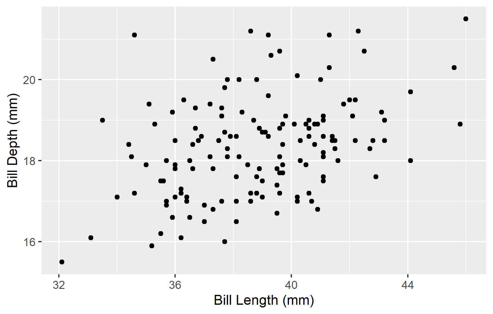
Let us start with a scatterplot of bill measurements:
ggplot(adelie, aes(x = bill_length_mm, y = bill_depth_mm)) +
  geom_point() +
  labs(
    x = "Bill Length (mm)",
    y = "Bill Depth (mm)"
  )
The plot appears, but the size and proportions may not be ideal for the document.
The most important chunk options for plot sizes are fig-width and fig-height (in inches):
ggplot(adelie, aes(x = bill_length_mm, y = bill_depth_mm)) +
  geom_point() +
  labs(
    x = "Bill Length (mm)",
    y = "Bill Depth (mm)"
  )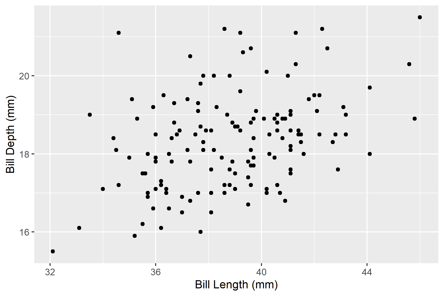
Typical sizes for Word documents:
fig-width: 6.5 (corresponds to text width with standard margins)fig-width: 3.25
fig-width: 4, fig-height: 4
For certain plot types, certain aspect ratios are better suited:
| Plot type | Recommended ratio |
|---|---|
| Scatterplot | 4:3 or 16:9 |
| Bar chart (horizontal) | wider than tall |
| Bar chart (vertical) | taller than wide |
| Time series | 16:9 or 2:1 |
Resolution is controlled with fig-dpi (dots per inch):
ggplot(adelie, aes(x = bill_length_mm, y = bill_depth_mm)) +
geom_point() +
labs(
x = "Bill Length (mm)",
y = "Bill Depth (mm)"
)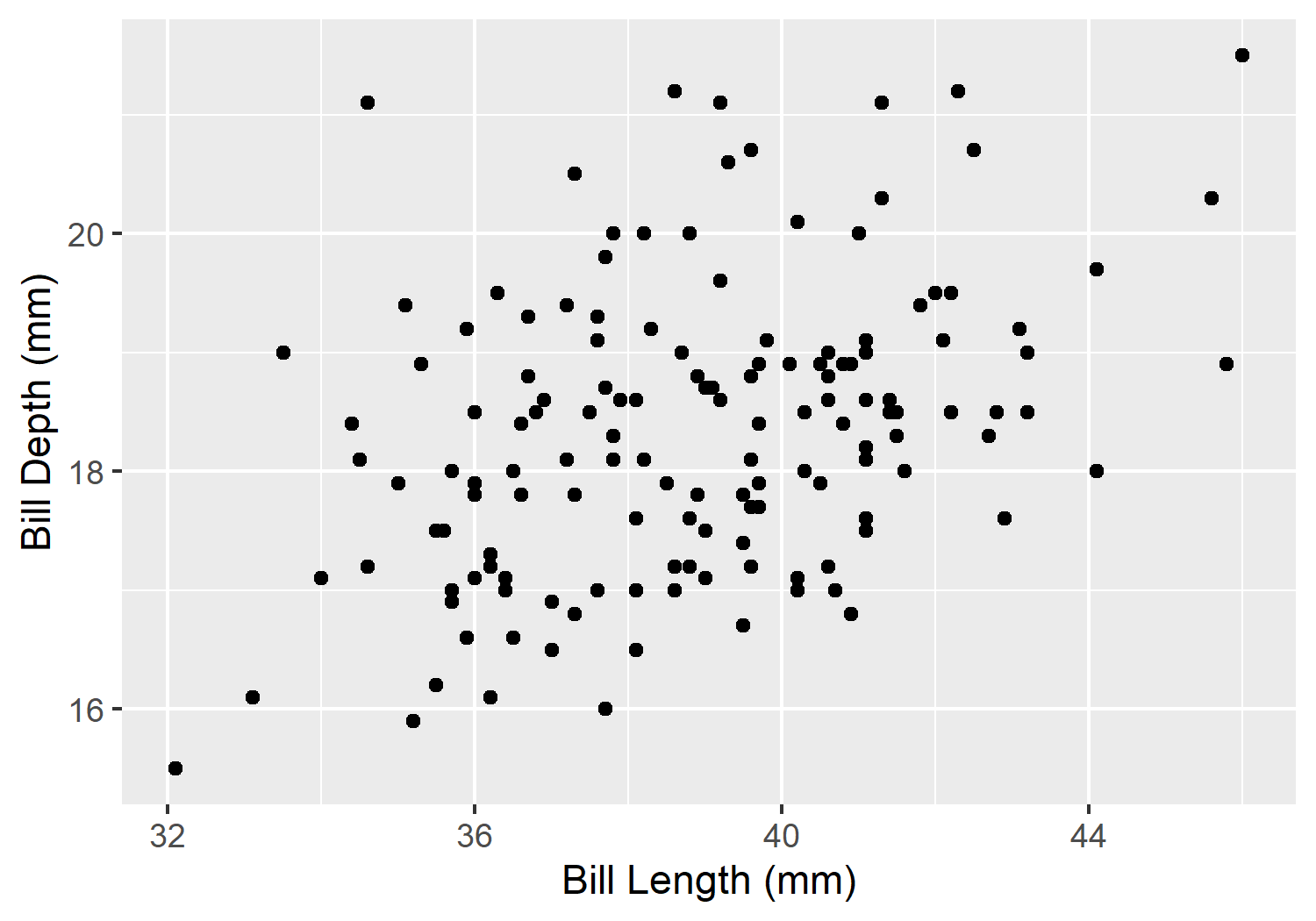
Recommendations:
Higher DPI means larger files and longer render times. For drafts, you can work with lower resolution and only increase to 300 dpi for the final version.
A figure caption is added with fig-cap:
ggplot(adelie, aes(x = bill_length_mm, y = bill_depth_mm)) +
  geom_point(alpha = 0.6) +
  labs(
    x = "Bill Length (mm)",
    y = "Bill Depth (mm)"
  ) +
  theme_minimal()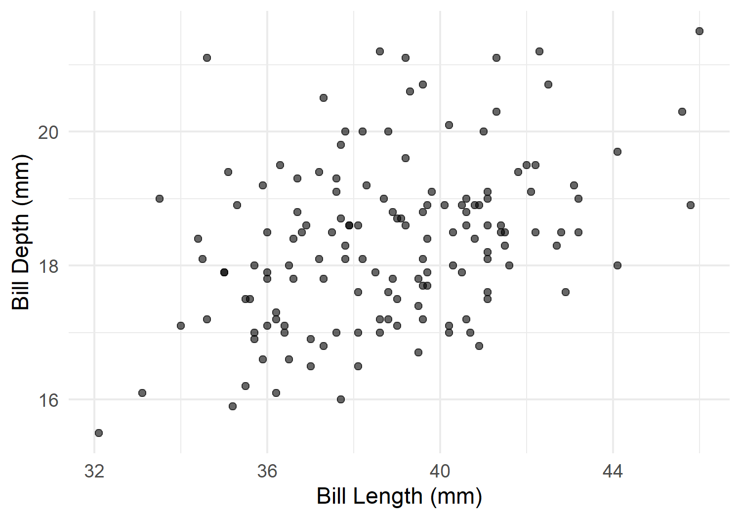
For cross-references (Chapter 7), the label must start with fig-!
ggplot2 offers several built-in themes:
p <- ggplot(adelie, aes(x = bill_length_mm, y = bill_depth_mm)) +
  geom_point(alpha = 0.6) +
  labs(x = "Bill Length (mm)", y = "Bill Depth (mm)")

p + theme_gray() + ggtitle("theme_gray (default)")
p + theme_minimal() + ggtitle("theme_minimal")
p + theme_classic() + ggtitle("theme_classic")
p + theme_bw() + ggtitle("theme_bw")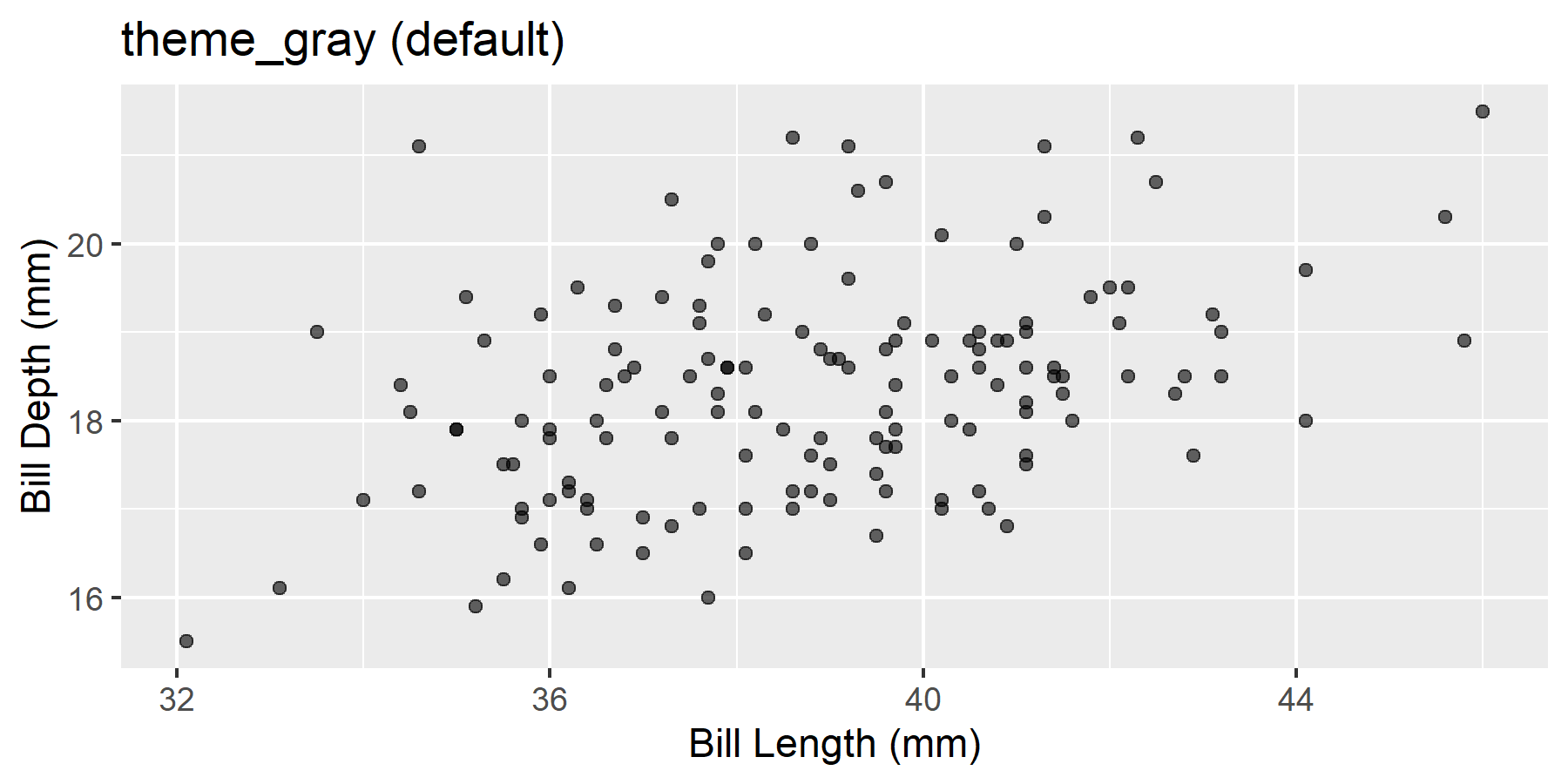
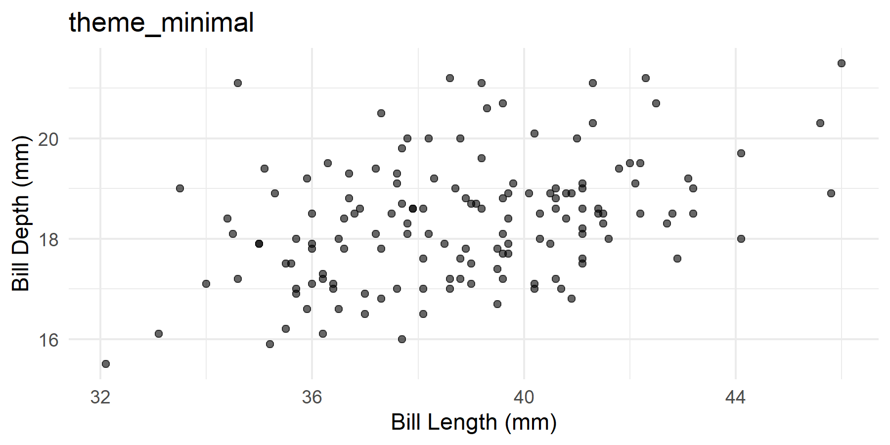
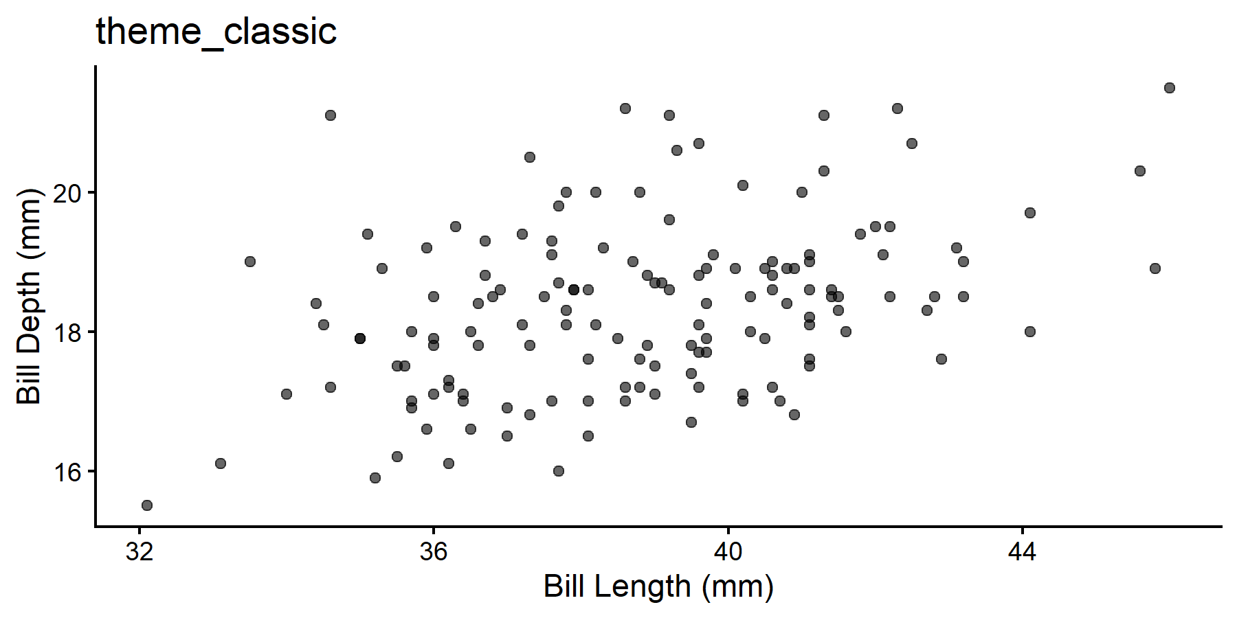
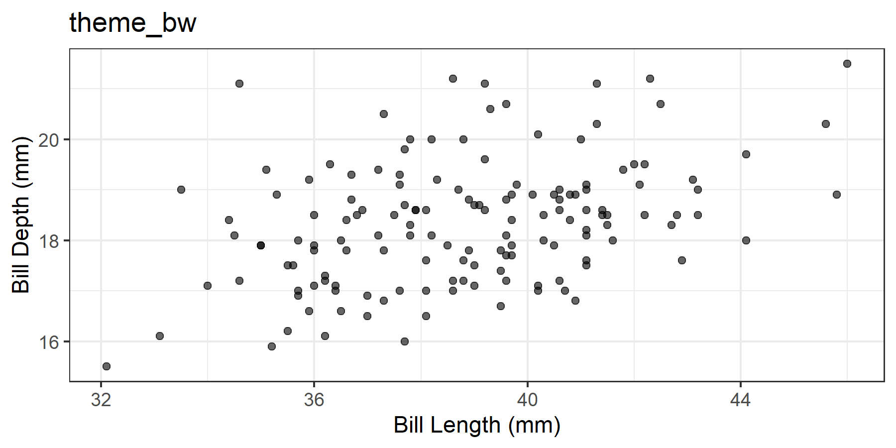
For scientific publications, theme_minimal(), theme_classic(), or theme_bw() are most common.
A common problem: Labels are too small in the rendered document. This can be fixed with theme():
ggplot(adelie, aes(x = bill_length_mm, y = bill_depth_mm)) +
  geom_point(alpha = 0.6) +
  labs(
    x = "Bill Length (mm)",
    y = "Bill Depth (mm)",
    title = "Bill measurements of Adelie penguins"
  ) +
  theme_minimal(base_size = 12) +
  theme(
    axis.title = element_text(size = 11),
    plot.title = element_text(size = 13, face = "bold")
  )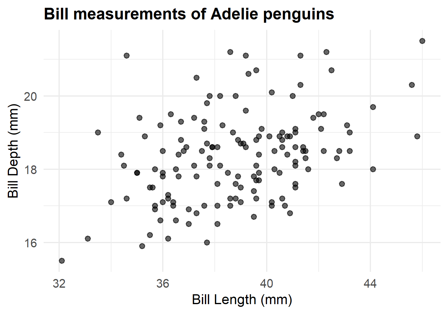
base_size in theme_minimal(base_size = 12) scales all text elements proportionally. This is often easier than adjusting each element individually.
ggplot(adelie, aes(x = bill_length_mm, y = bill_depth_mm, color = island)) +
  geom_point(alpha = 0.7, size = 2) +
  labs(
    x = "Bill Length (mm)",
    y = "Bill Depth (mm)",
    color = "Island"
  ) +
  theme_minimal(base_size = 11) +
  theme(legend.position = "bottom")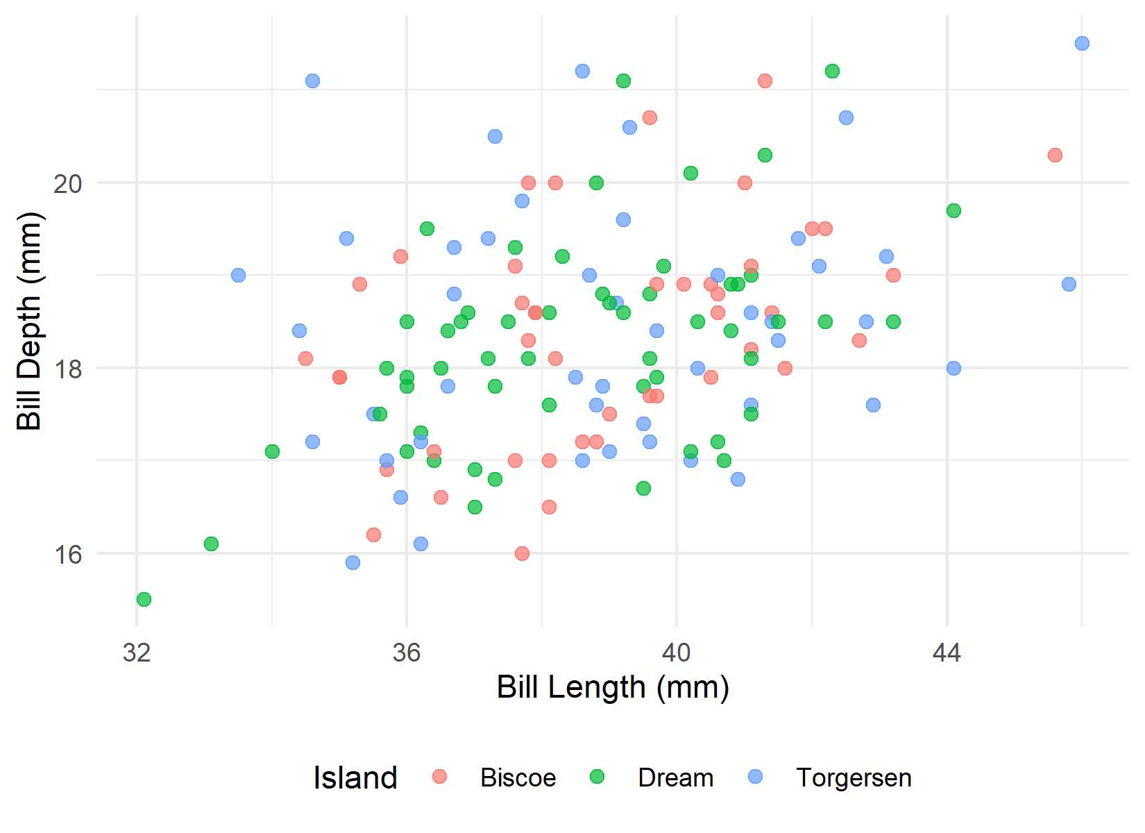
For scientific publications, I recommend colorblind-friendly palettes:
ggplot(adelie, aes(x = bill_length_mm, y = bill_depth_mm, color = island)) +
  geom_point(alpha = 0.7, size = 2) +
  scale_color_brewer(palette = "Set2") +
  labs(
    x = "Bill Length (mm)",
    y = "Bill Depth (mm)",
    color = "Island"
  ) +
  theme_minimal(base_size = 11) +
  theme(legend.position = "bottom")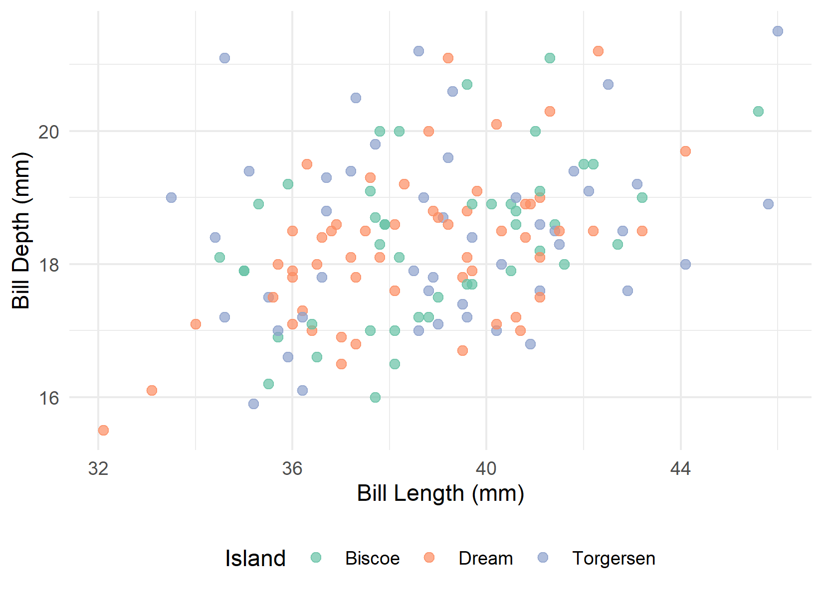
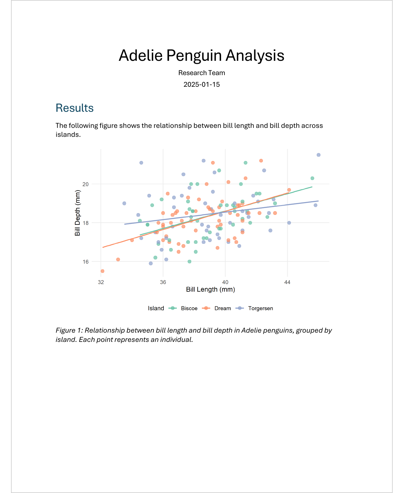
Here is a complete, publication-ready plot for our penguin report:
ggplot(adelie, aes(x = bill_length_mm, y = bill_depth_mm, color = island)) +
  geom_point(alpha = 0.7, size = 2.5) +
  geom_smooth(method = "lm", se = FALSE, linewidth = 0.8) +
  scale_color_brewer(palette = "Set2") +
  labs(
    x = "Bill Length (mm)",
    y = "Bill Depth (mm)",
    color = "Island"
  ) +
  theme_minimal(base_size = 11) +
  theme(
    legend.position = "bottom",
    panel.grid.minor = element_blank(),
    axis.title = element_text(size = 11),
    legend.title = element_text(size = 10),
    legend.text = element_text(size = 9)
  )
`geom_smooth()` using formula = 'y ~ x'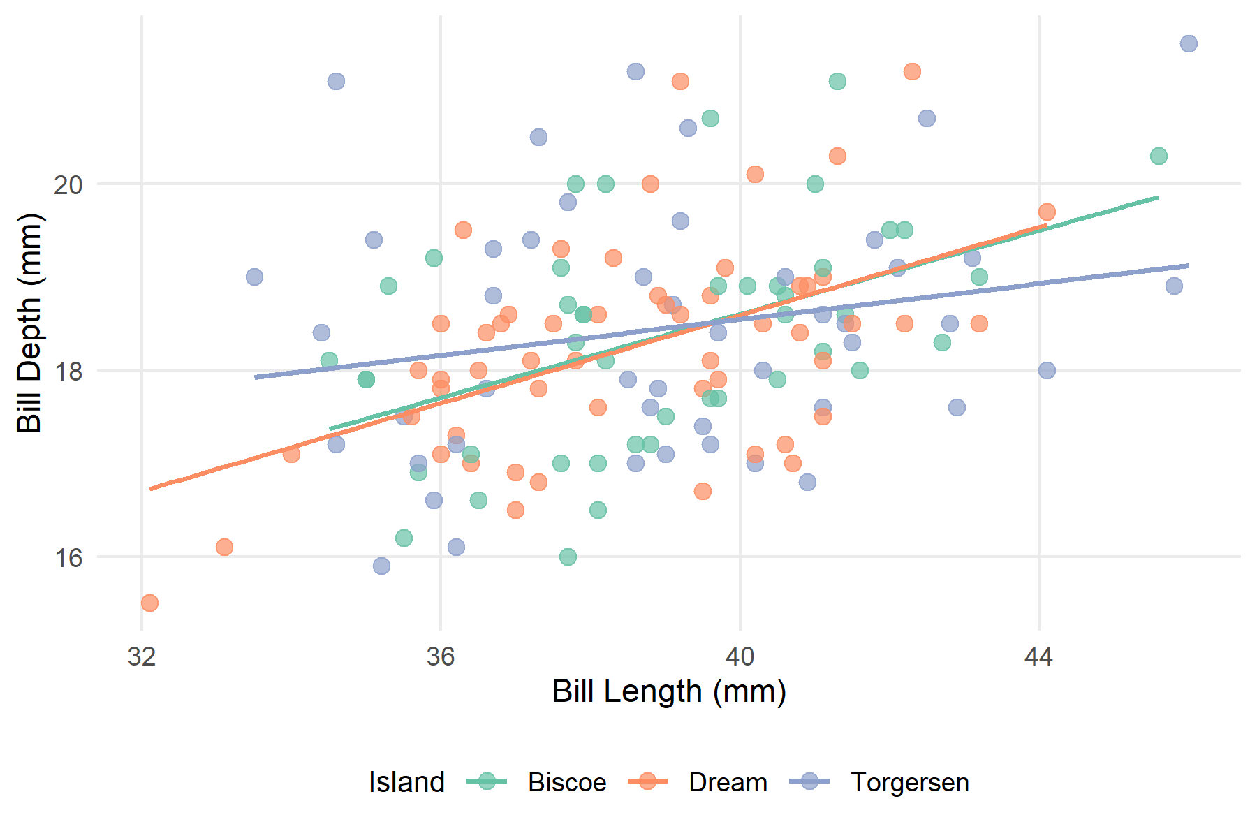
In a Word document, this plot - including its caption - looks like this:
To avoid repeating the same options in every chunk, you can set global settings in the YAML header:
---
title: "My Report"
format: docx
knitr:
  opts_chunk:
    fig-width: 6
    fig-height: 4
    fig-dpi: 300
---
Or with execute: for Quarto-specific options:
execute:
  fig-width: 6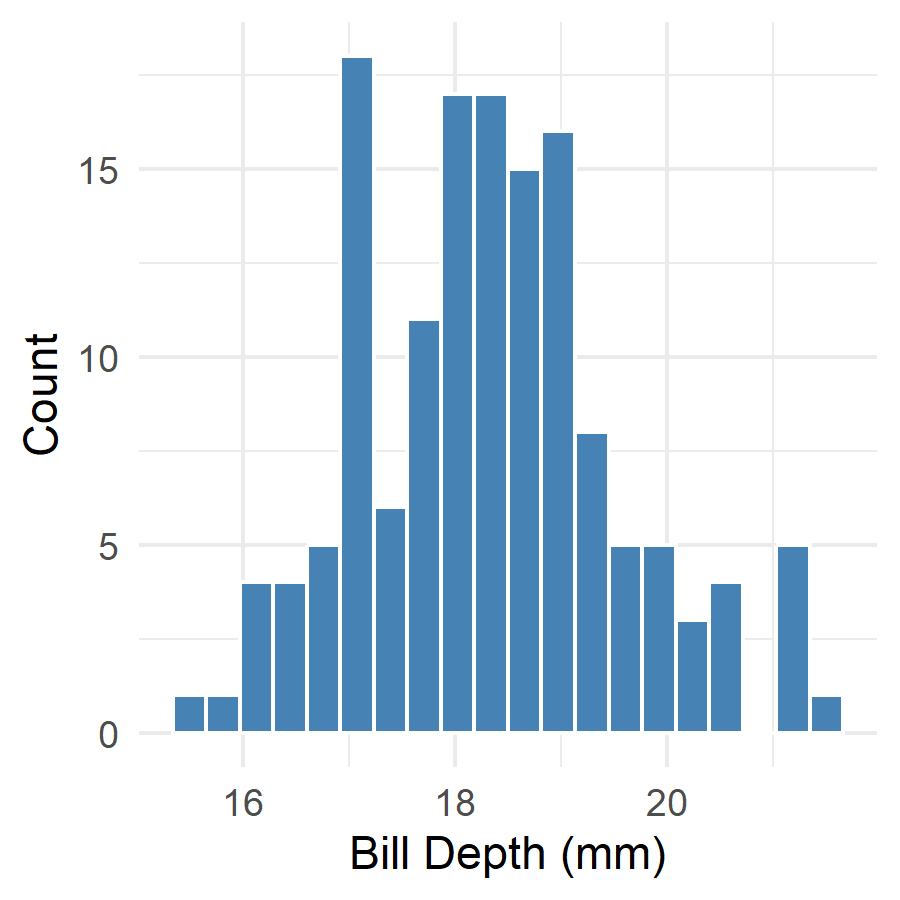
fig-height: 4With layout-ncol, you can arrange multiple plots side by side:
ggplot(adelie, aes(x = bill_length_mm)) +
  geom_histogram(bins = 20, fill = "steelblue", color = "white") +
  labs(x = "Bill Length (mm)", y = "Count") +
  theme_minimal()
ggplot(adelie, aes(x = bill_depth_mm)) +
  geom_histogram(bins = 20, fill = "steelblue", color = "white") +
  labs(x = "Bill Depth (mm)", y = "Count") +
  theme_minimal()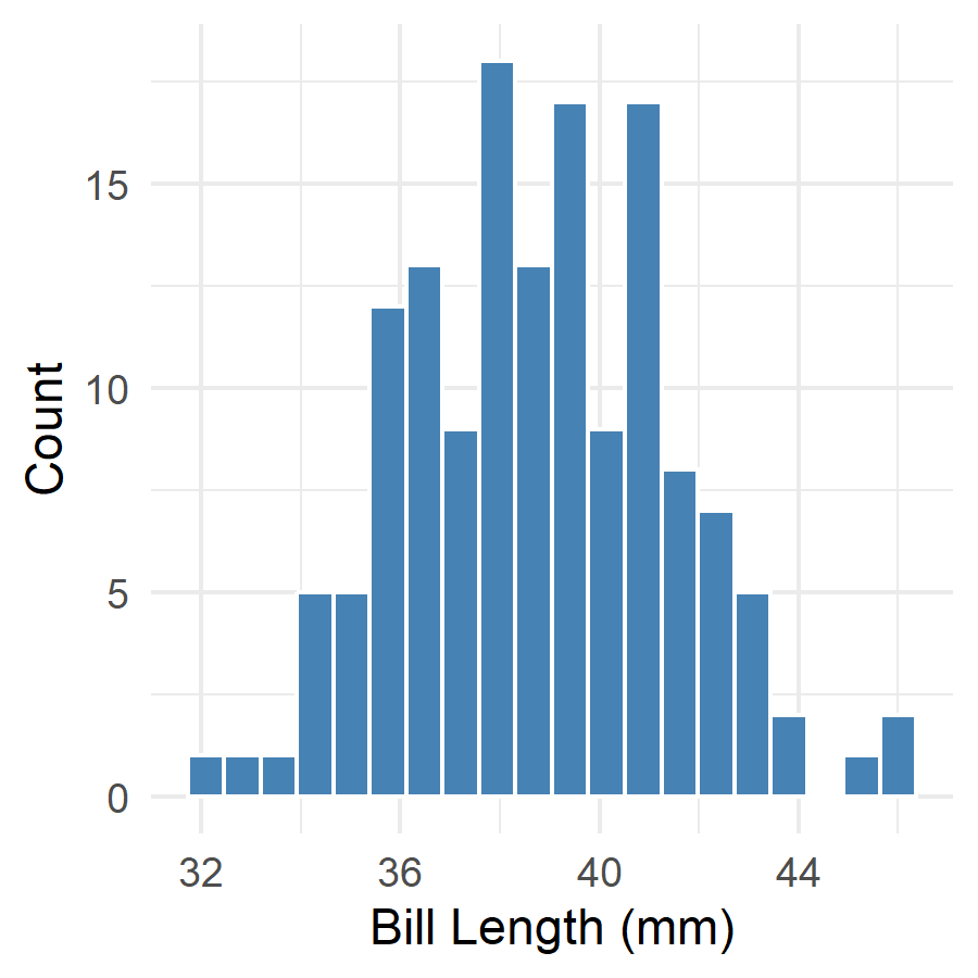
body_mass_g) by islandtheme_minimal() with adjusted base_size
fig-cap
fig-width and fig-height valuesWe can now create tables and plots. In Chapter 7, we will learn how to use cross-references to refer to these elements - “as shown in Figure 1” or “see Table 2”.
@online{schmidt2026,
  author = {{Dr. Paul Schmidt}},
  publisher = {BioMath GmbH},
  title = {6. {Plots} in {Quarto}},
  date = {2026-03-12},
  url = {https://biomathcontent.netlify.app/content/quarto/06_plots.html},
  langid = {en}
}